A Bold Campaign That Celebrated Sauces
Client
Heinz
Agency
The Grand Union
My Role
Creative Director
Skills Used
Creative Direction
Design Direction
UX/UI Design
Illustration
Visual Design
The Challenge
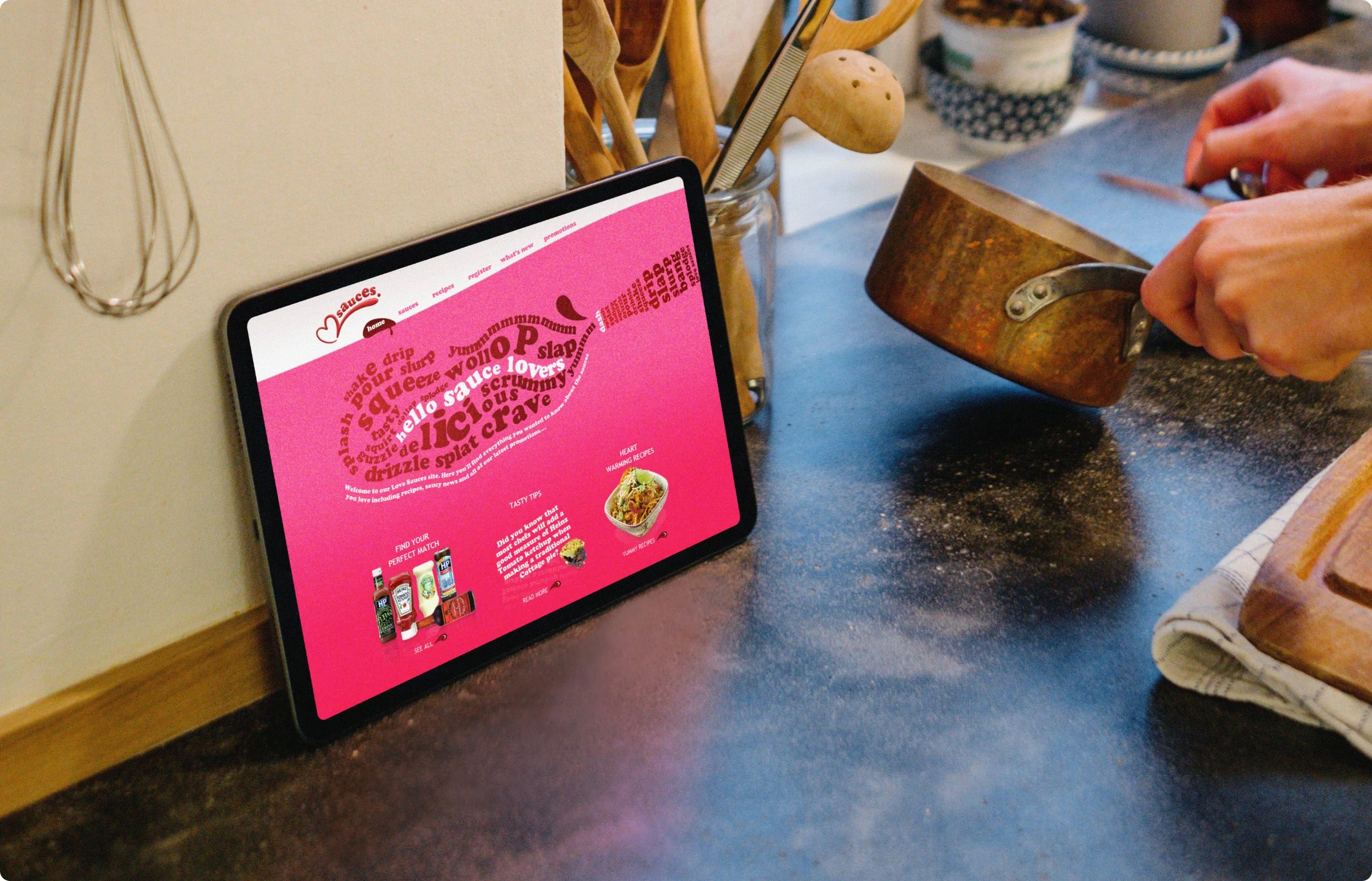
Following several rejected creative directions from a previous team, I was tasked with creating a microsite dedicated to Heinz’s favourite sauces. The mandate was to deliver a fresh, modern, and simple solution that cut through market noise, avoiding the “chintzy” feel of earlier attempts.
The Solution
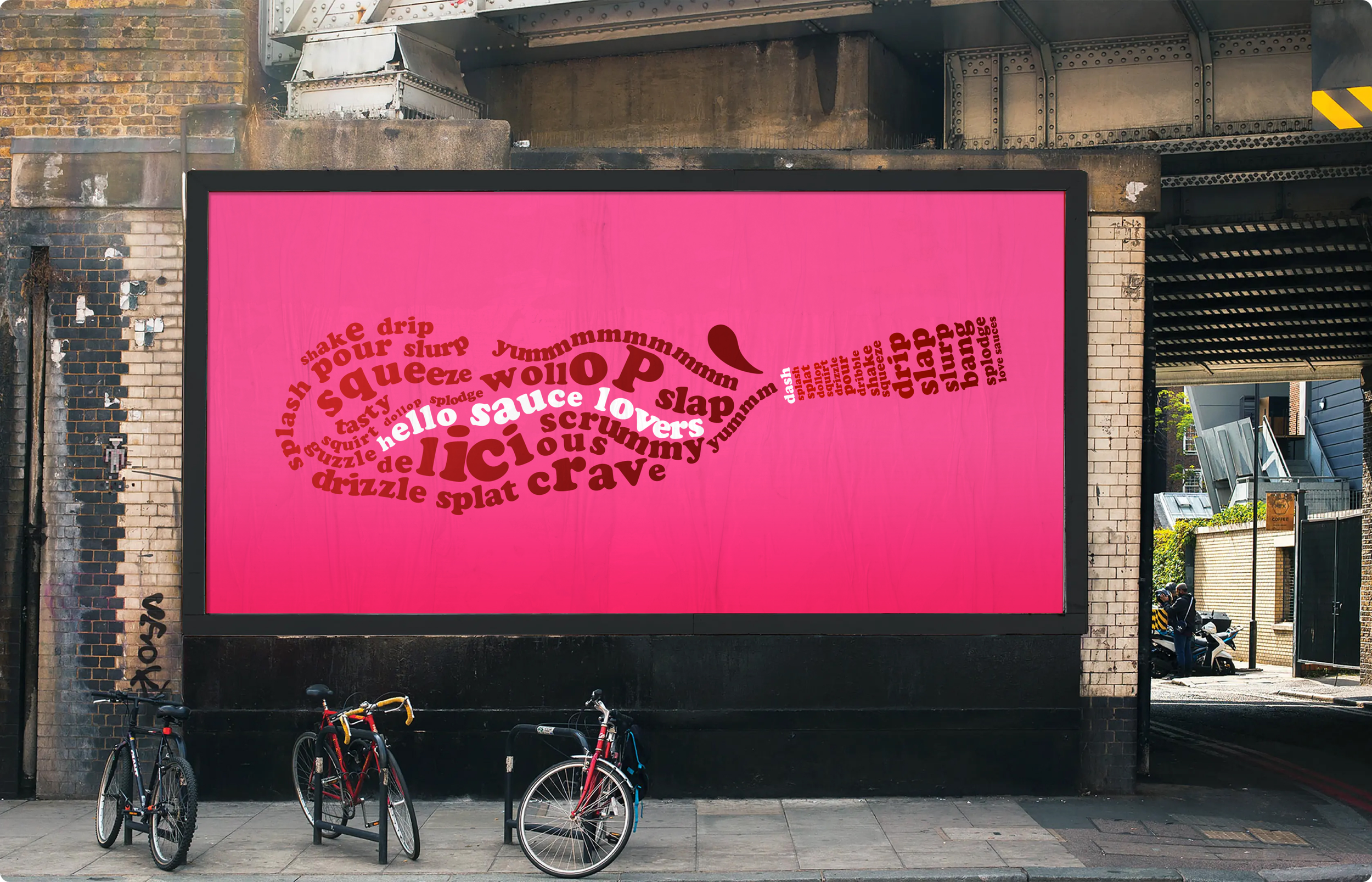
I explored a wide range of directions, then cut quickly to a bold typographic system featuring vivid colour and confident scale. The palette brought freshness and energy without being excessive, while the layouts centred the experience on flavour and playfulness. By stripping away non-essential decoration and focusing on rhythm and hierarchy, the site gained immediate clarity and strong brand character.
The Impact
Heinz approved the new direction on first review. The microsite launched with a modern voice, successfully avoiding the cluttered feel of earlier attempts. It provided a simple, vivid, and memorable foundation that was flexible enough for future campaign work across the brand portfolio.
Design Iterations
In the preliminary design stages I explored using halftones, inspired by the punk ethos of poster creation. This approach exuded a bold and striking presence, reminiscent of an era defined by its impactful visuals. Each idea carried a subtle undertone of nostalgia, evoking a sense of longing for bygone times.
Saucy Out Takes!
At the heart of the project lay the subject of sauces. It was impossible to avoid the temptation to experiment with the tactile and sensory aspects that make sauces so endearing.
“A few things you should know about Robinson. Paul has an artists eye for detail and can create beautiful, powerful and playful designs. He gets how people engage with the world, how to keep them captivated and enlighten them with innovative ideas. Above all he is reliable chap and fun to work with.”
Stuart Hallybone - Creative Director - Grand Union


