

Designing PayPal’s Real World Charity Donation Product
Client
PayPal
Agency
Homemade Digital
My Role
UX/UI Design Director
Skills Used
Project Leadership
Strategy
Creative Direction
Design Direction
UX/UI Design
Product Design
Prototyping
Testing (Guerrilla & Ergonomics)
Physical Prototyping / Hardware Design
The Challenge
Design a system that enabled charities to securely accept donations via PayPal Here at street and event level. The product needed to run on volunteers' own devices, carry each charity's branding, and feel simple and authentic in public fundraising contexts.
The Solution
I defined an end-to-end solution spanning app UX/UI, backend tools, and physical device concepts. Donation flows were adaptable and supported charity branding to maintain trust. Recognising technology anxiety among volunteers, I refined flows through guerrilla testing and built cardboard device prototypes to test ergonomics. These low-fidelity 3D models uncovered insights no screen-based design could, shaping a product that felt natural and safe to use in public.
The Impact
The system enabled charities to seamlessly collect donations at events and on the street, significantly extending their fundraising reach and modernising the giving experience. It demonstrated how PayPal could combine trust, innovation, and design craft to make public fundraising secure and intuitive.


Research
Background Research
In 2015 PayPal saw a sharp rise in contactless transactions, yet NGOs were lagging behind commercial innovation. Barriers included device cost, Gift Aid complexities, limited donor data capture and a lack of awareness. For volunteers, many of whom were not confident with technology, these solutions often felt complicated or risky to use in public.
Bespoke development was rarely an option. It was seen as too costly, especially if the technology was judged only as a replacement for cash bucket collections. PayPal asked HomeMade to validate user needs and design a scalable solution that charities worldwide could adopt with confidence.
What have we found in the sector?
Trials from PayPal, Barclays and others showed strong interest in contactless giving, but uptake remained slow. Existing products often supported only chip and PIN or only contactless, and rarely captured donor data, missing opportunities for Gift Aid and long-term engagement. High device costs, connectivity issues, training gaps and usability challenges reinforced the perception that these tools were costly, risky and complex, particularly for volunteers.
What did we discover about context?
Discussions with charities revealed three key areas where technology could have the greatest impact: street collections where contactless could replace anonymous cash while increasing average gift values, community fundraising events such as marathons and coffee mornings that required simple and reliable tools, and special events like galas and auctions where a branded and trustworthy experience was essential for high-value giving.

IA & UX
Creative UX Design Solutions
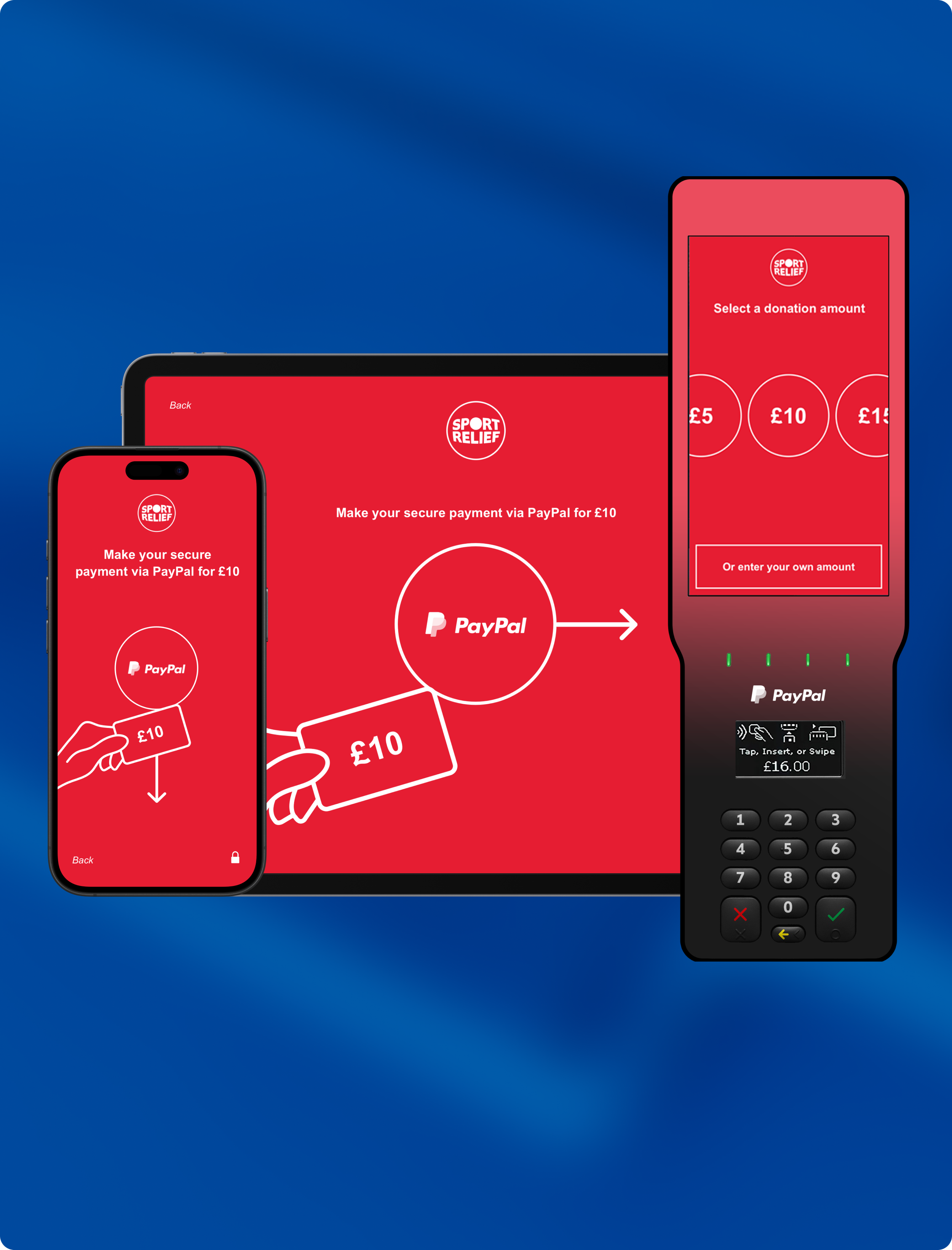
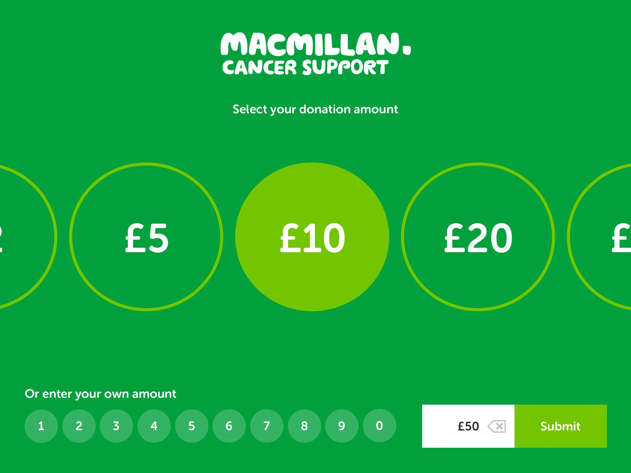
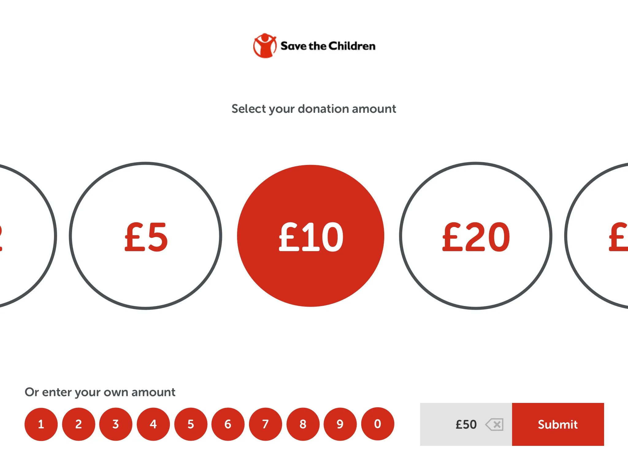
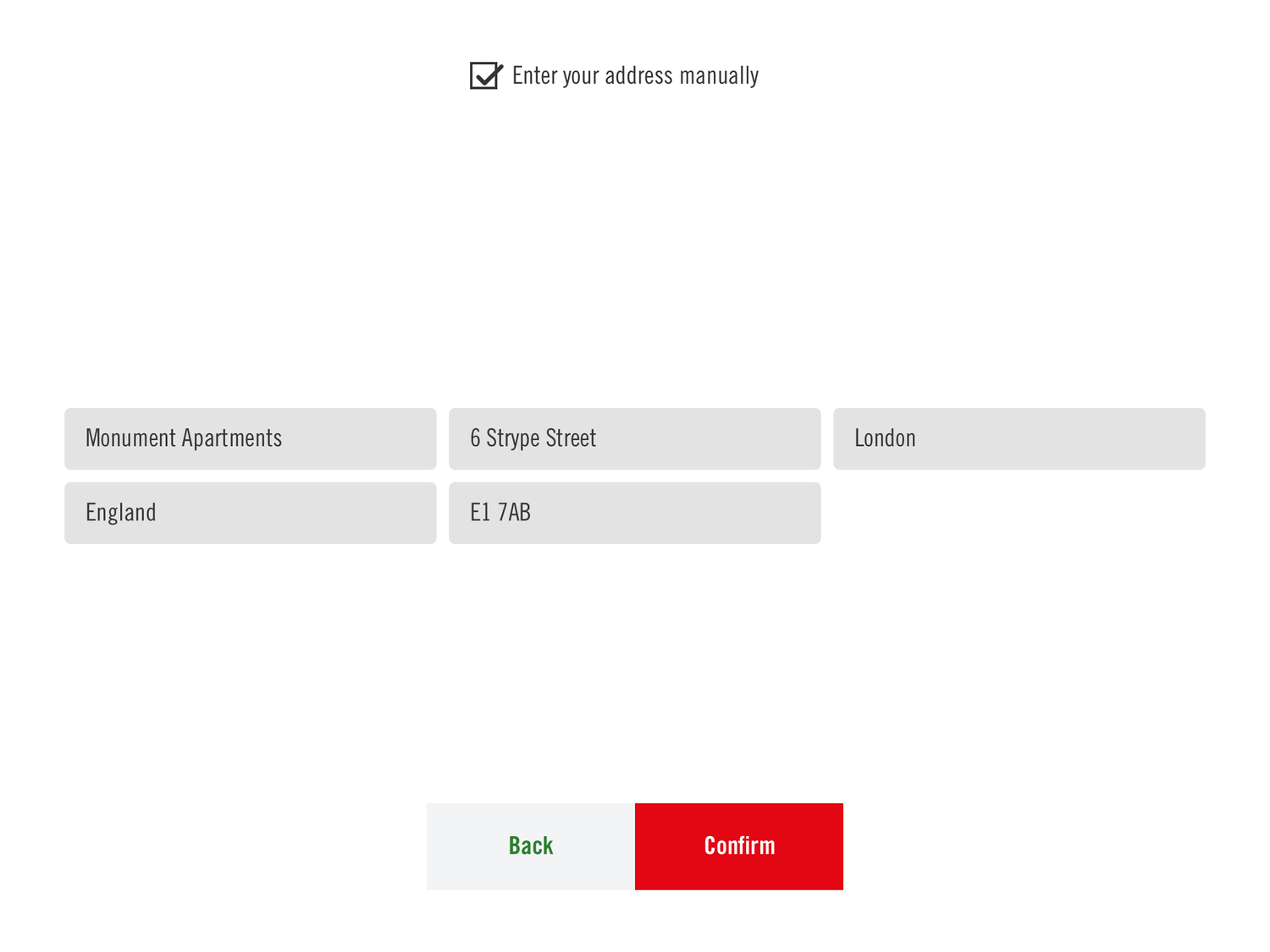
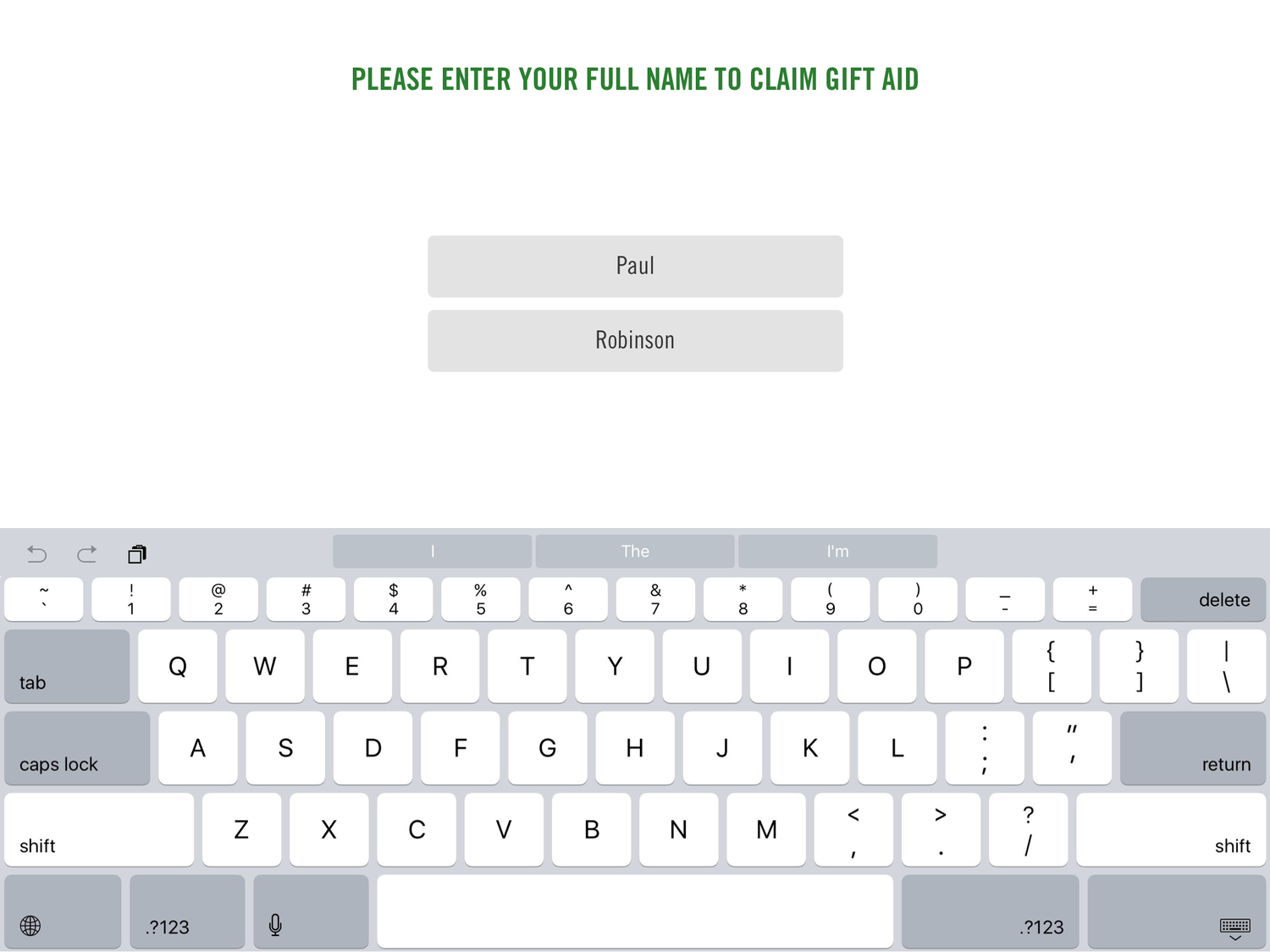
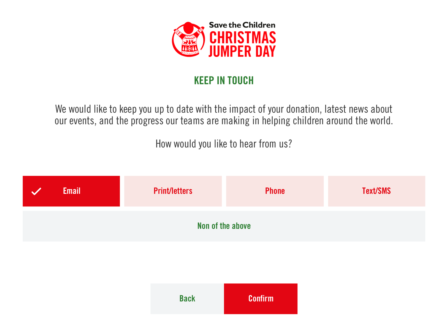
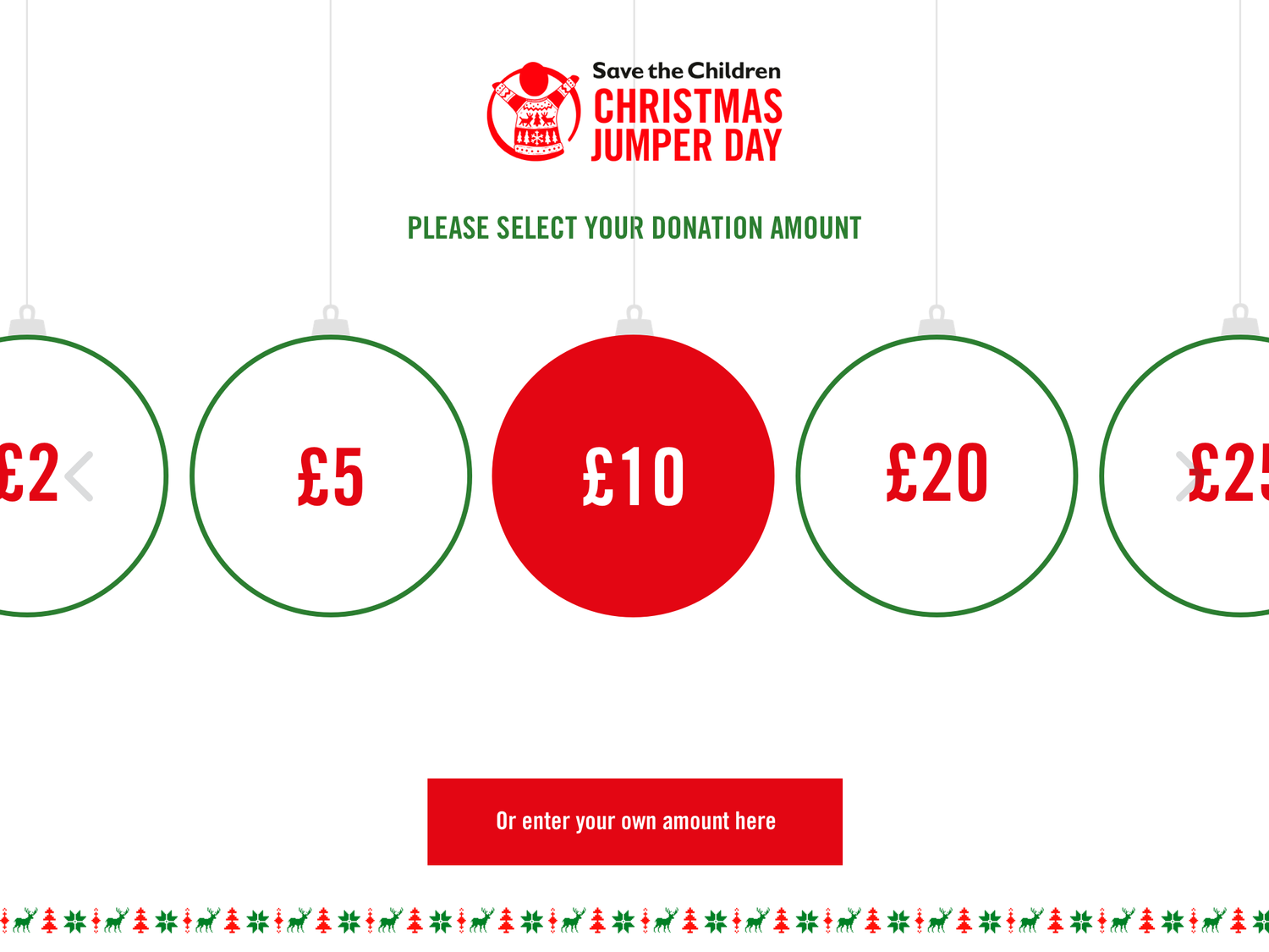
Research showed a one-size-fits-all flow wouldn’t work. I designed adaptable UX journeys tailored to street collections, community events and galas. Each supported custom branding across backend, app and hardware, creating a seamless experience that felt both trustworthy and unique to the charity.

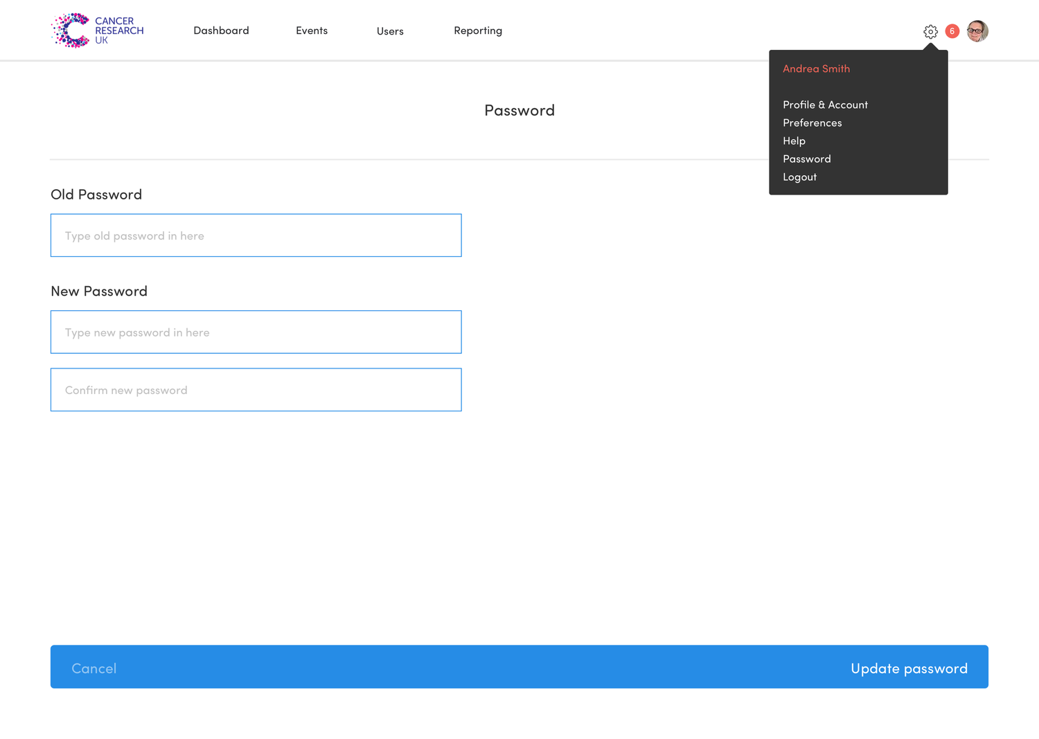
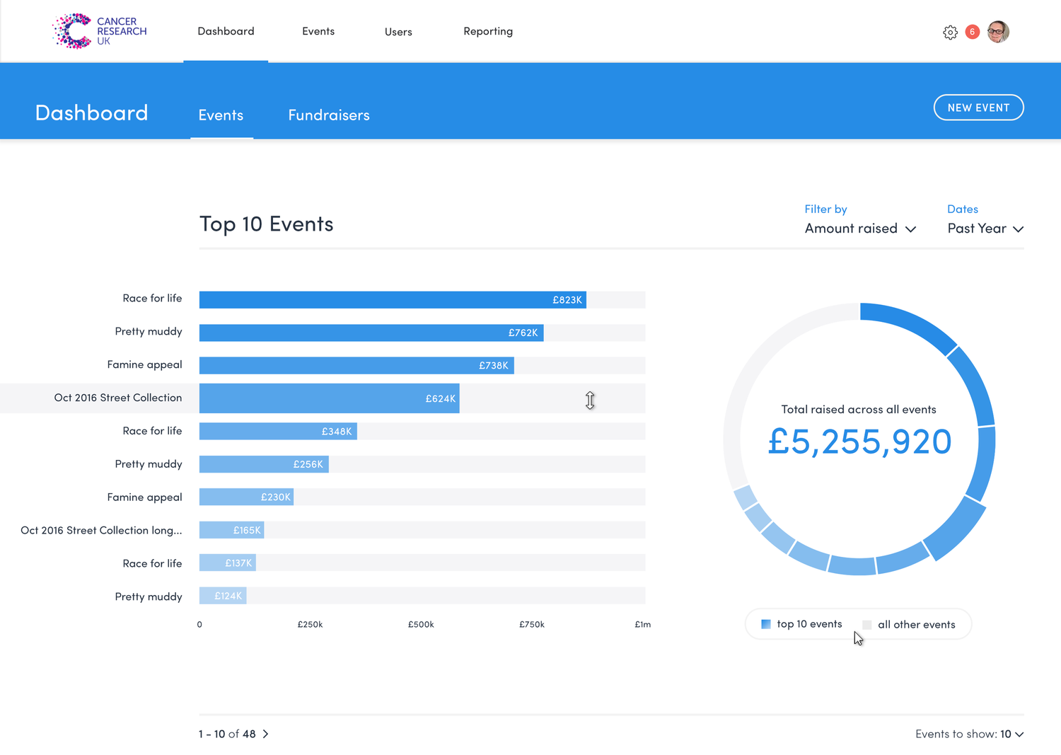
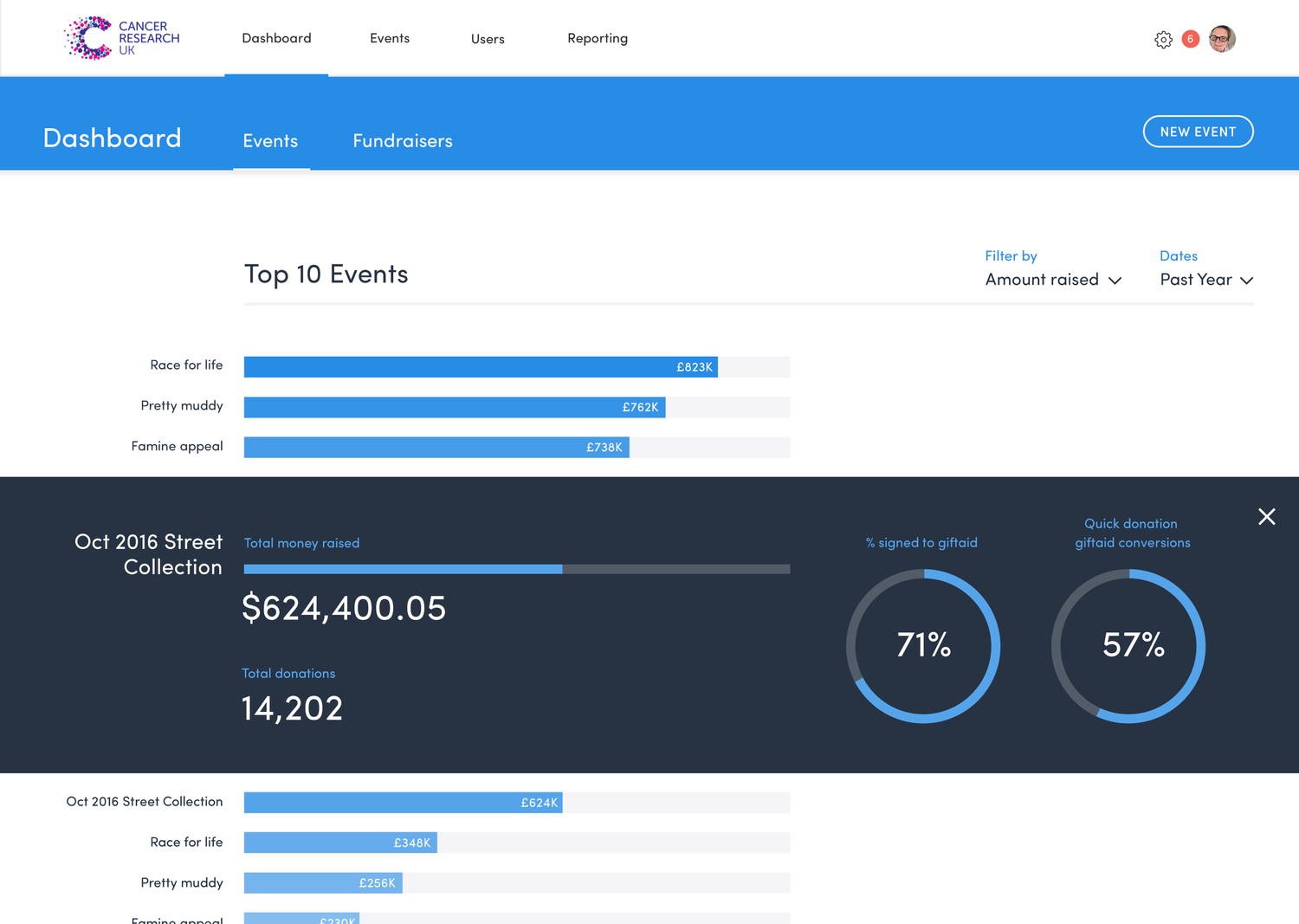
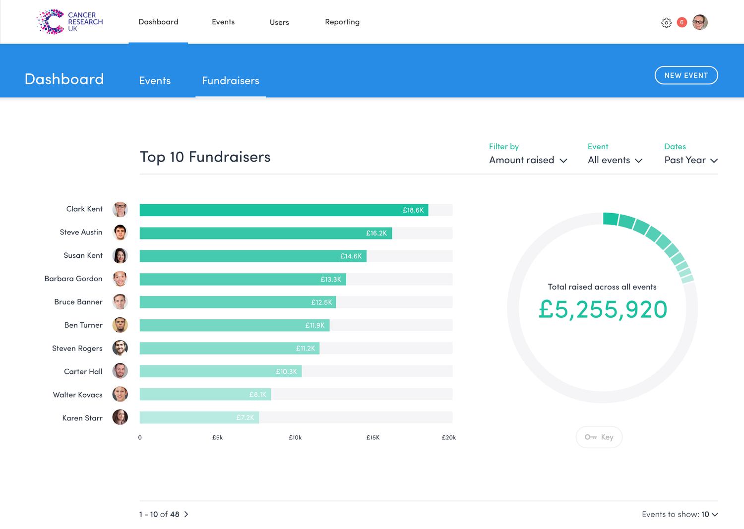
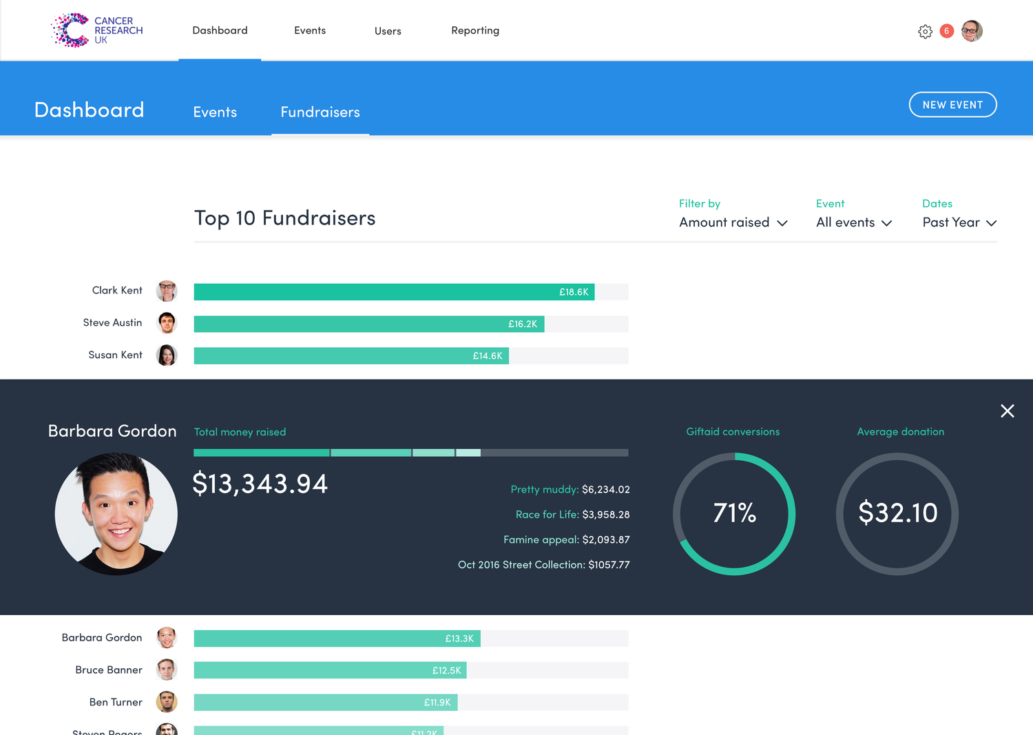
Management UX/UI
Back End Donation System
I designed a management platform for charities to run events, track fundraisers and control branding. Dashboards and admin tools simplified complex processes like Gift Aid, receipts and communications, making them easy to manage and act on.


Prototype & Testing
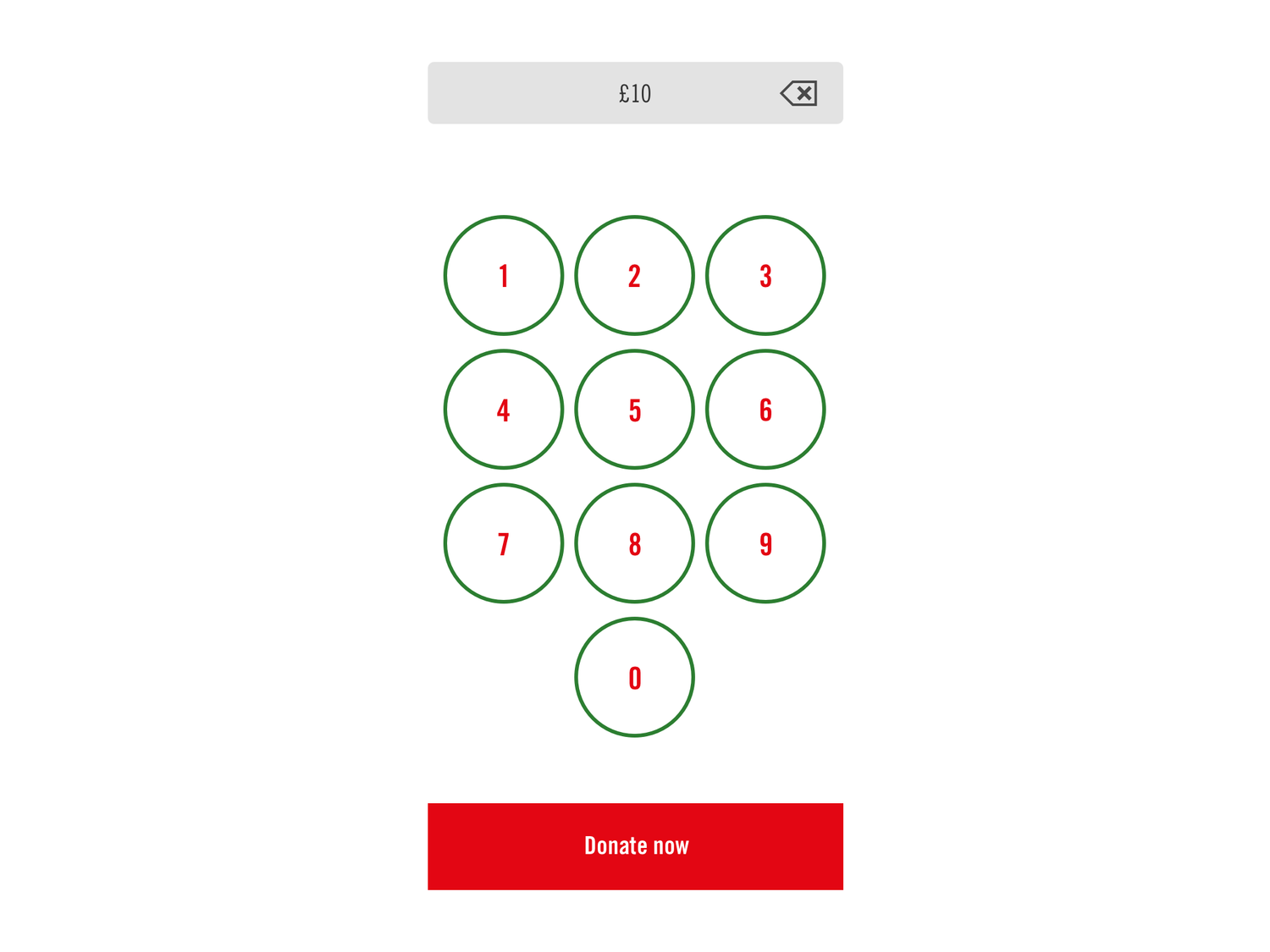
Interactive Prototype & Testing
I built an interactive prototype to map all routes through the app. Guerrilla testing with real people gave fast feedback on clarity, trust and engagement. This user-centric approach uncovered friction points and directly shaped the donation flow into an intuitive experience.

White Label UI
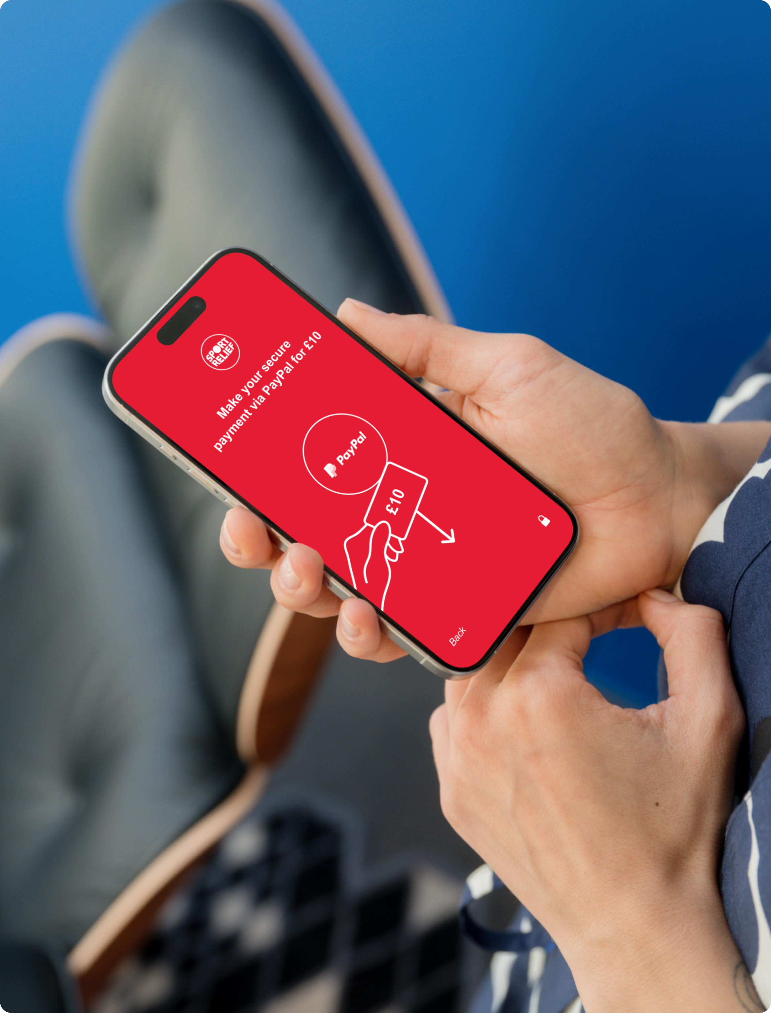
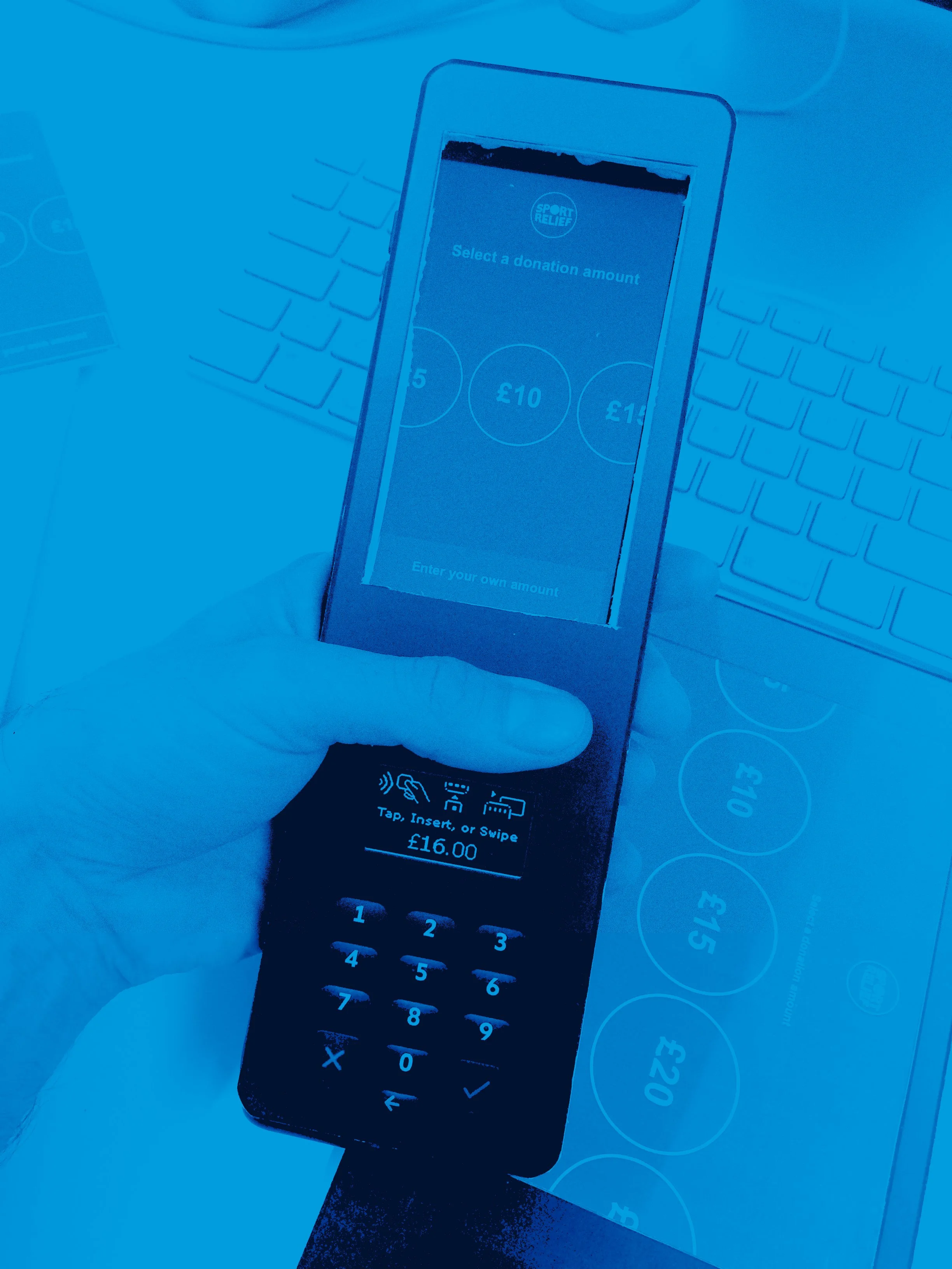
Front End White Label
The white-label app allowed each charity to apply its identity without altering the core experience. These examples show how colour, logo and typography could flex, while the UX remained consistent and clear.


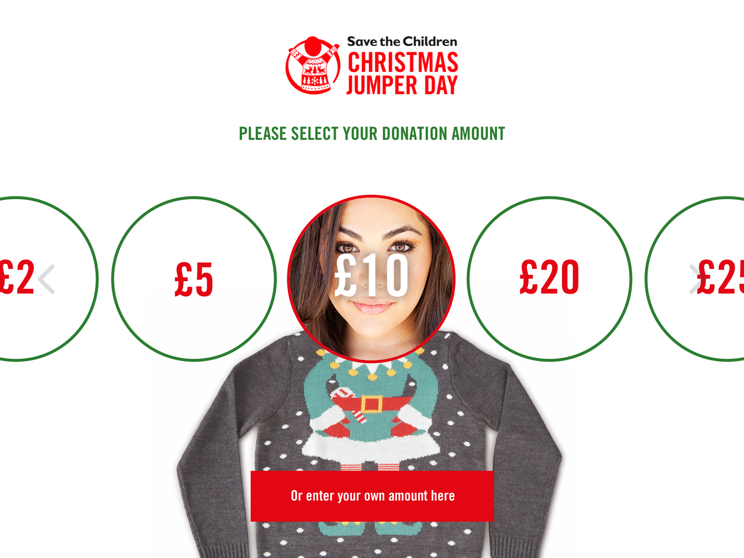


Psychological Engagement
Linking a donor’s face with the donation amount created a subtle psychological bond. What looked playful actually made giving feel more personal, meaningful and memorable.


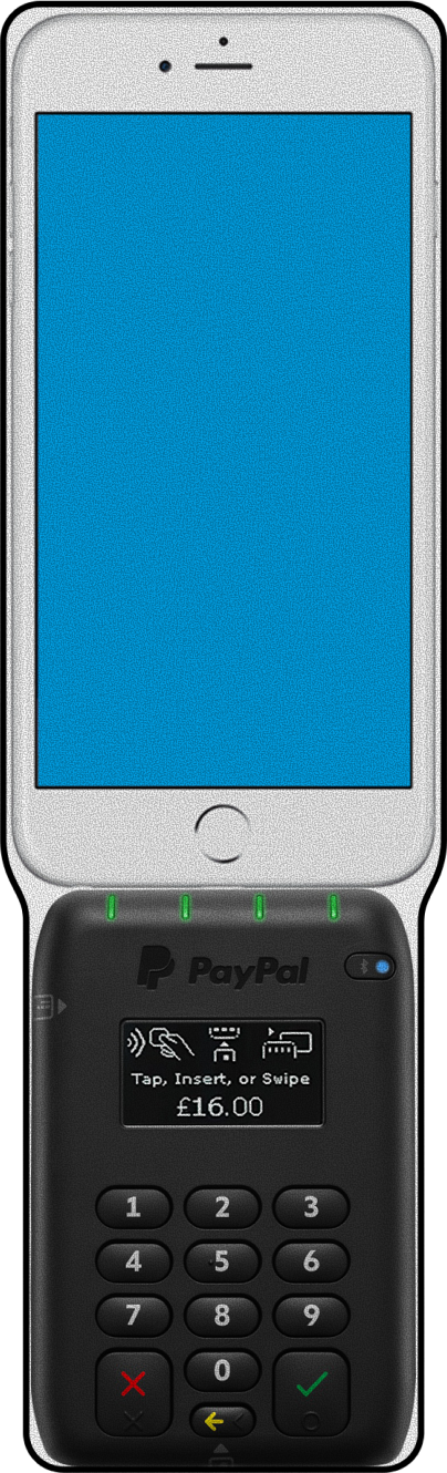
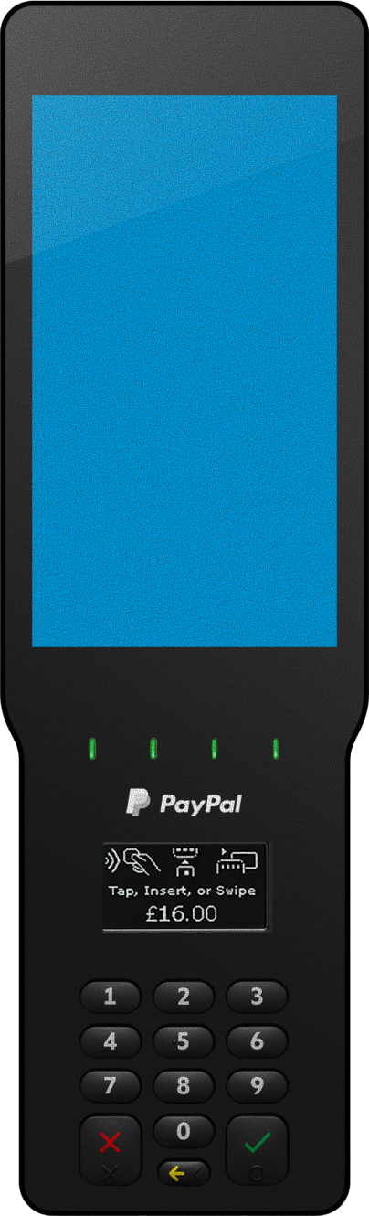
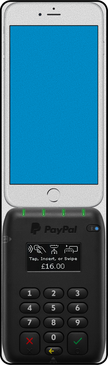
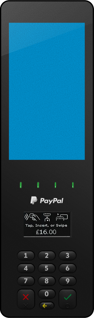
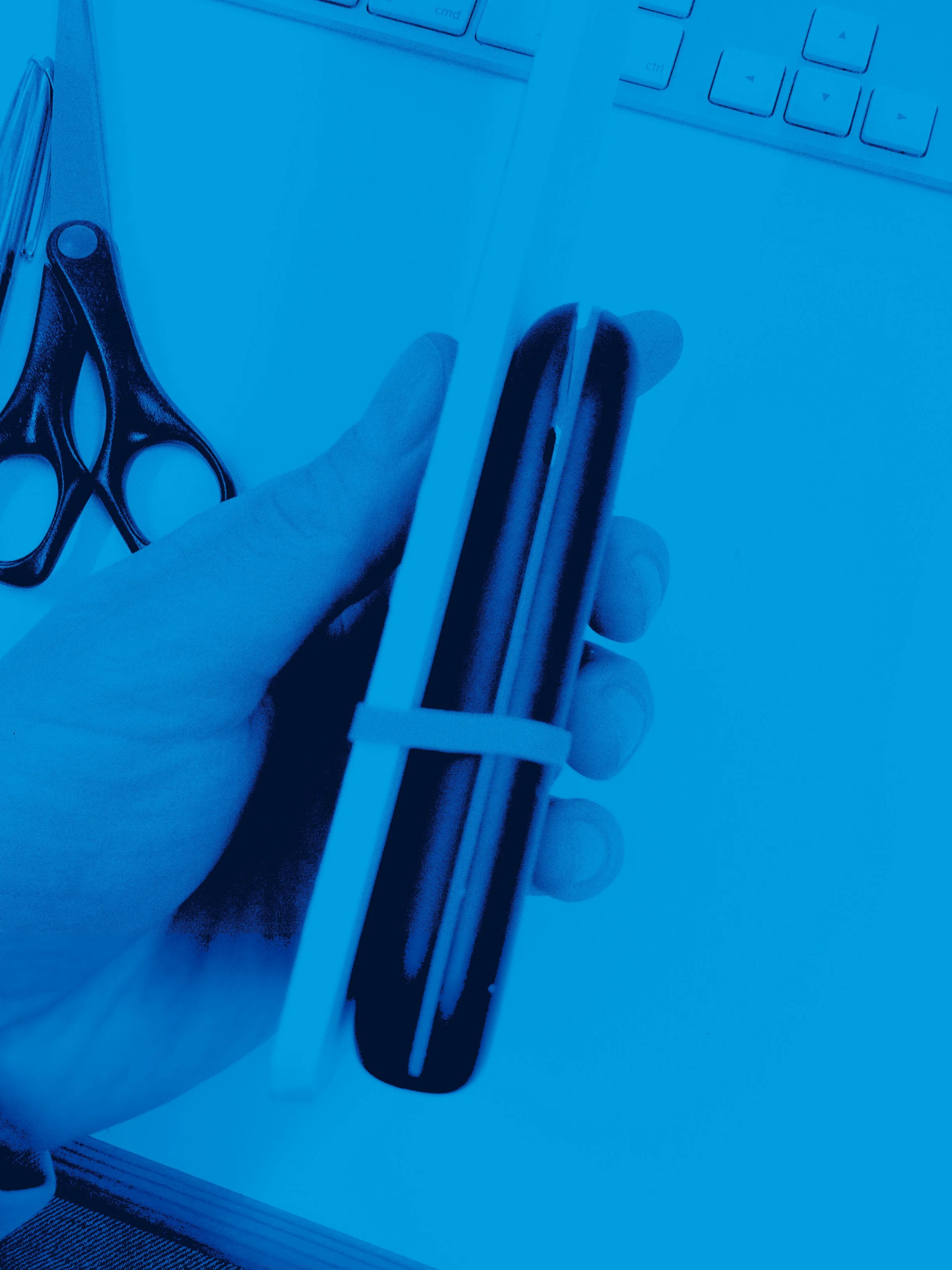
Physical Device Design
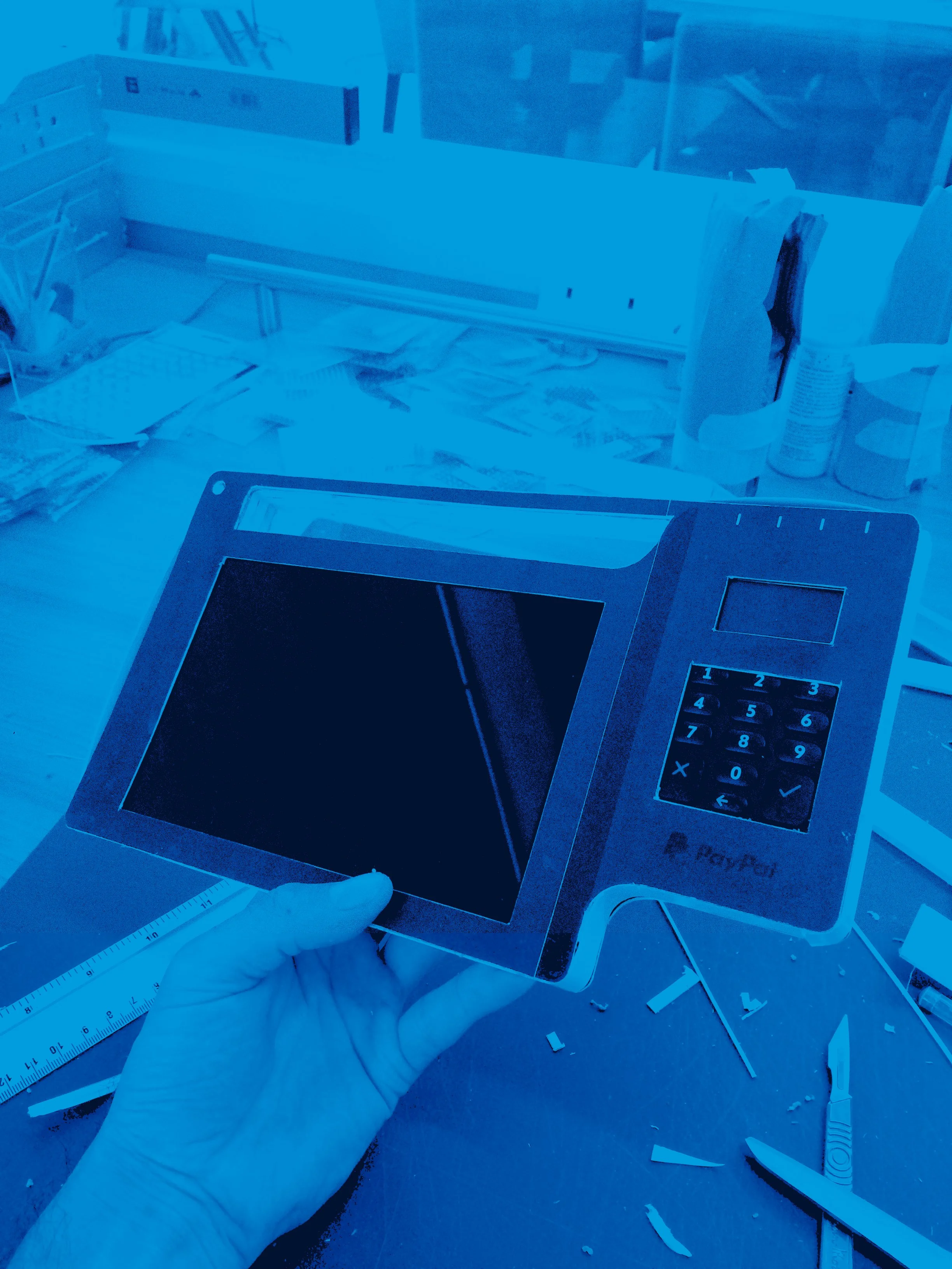
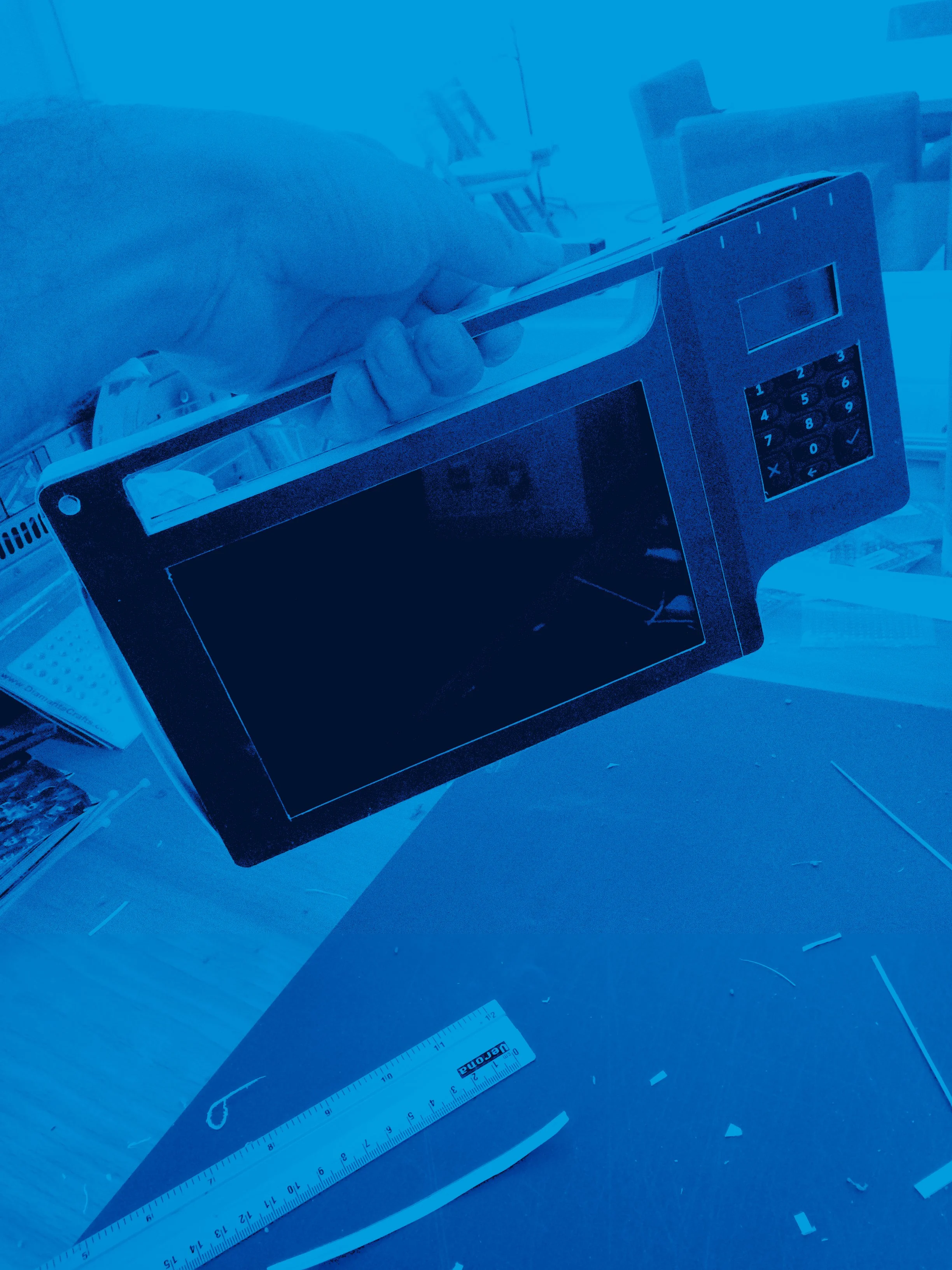
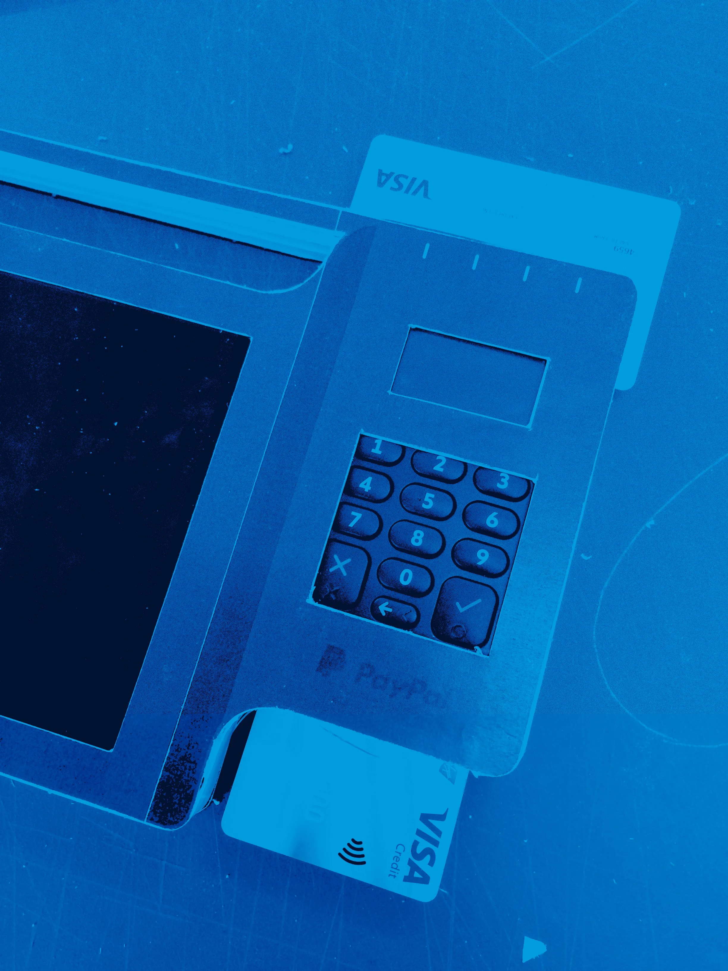
Product Arrangements
For the physical device I prototyped different device layouts (phone + PayPal) to find the most natural, intuitive arrangement. Testing variations helped refine ergonomics, accessibility and screen compatibility, ensuring the final setup felt effortless in use.


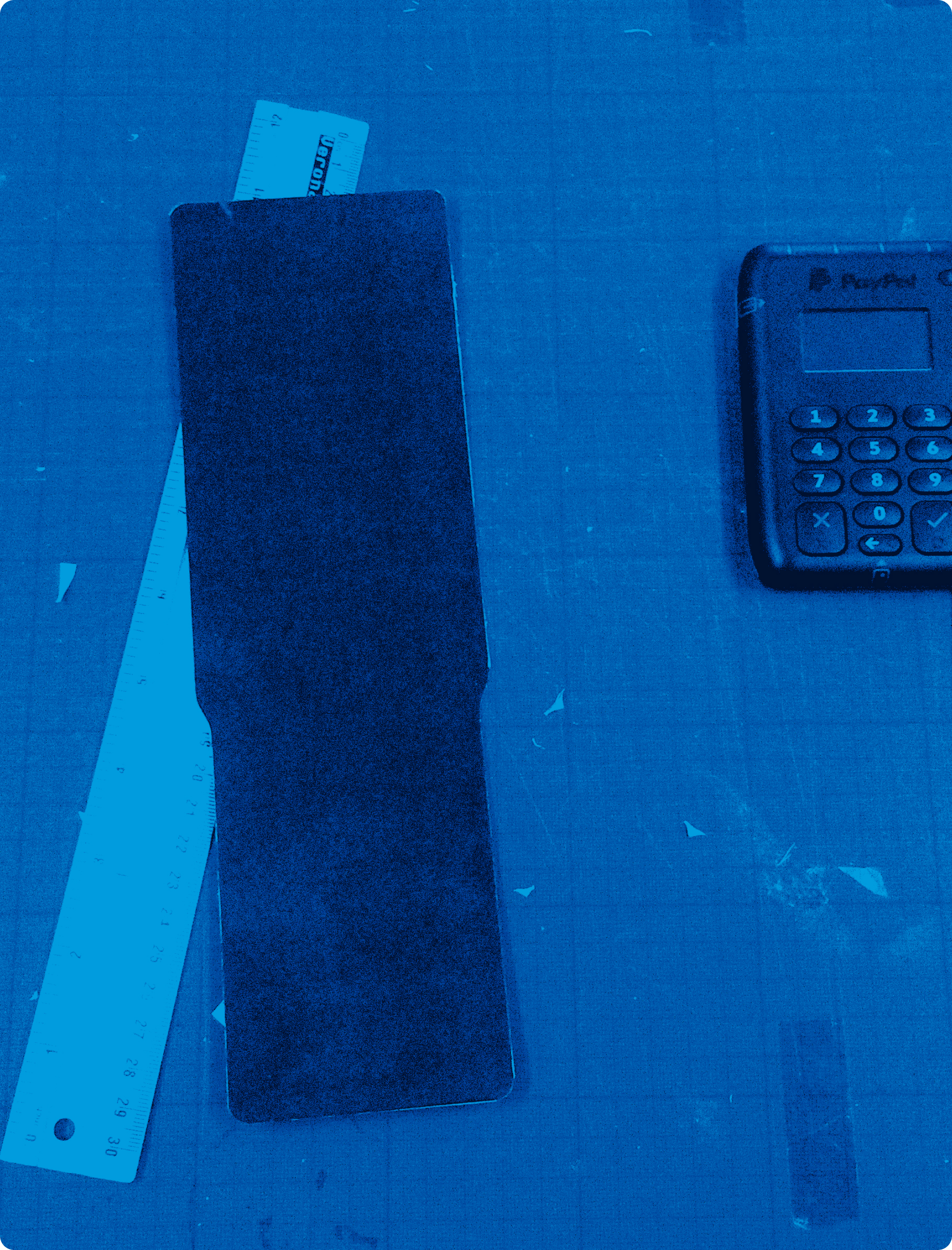
Real World Product Maquettes
I built rapid cardboard models to test weight, balance and ergonomics in real use. These low-fi prototypes revealed insights digital tools missed, showing how the device felt for both donors and fundraisers. Quick iterations on form and grip resolved issues early, shaping a design that was intuitive, comfortable and production-ready.


Tactile Validation
Physical prototyping gave me a more intuitive grasp of weight, comfort, and usability than screen-based mockups could provide.
Ergonomic Testing
I fine-tuned shape and handling to suit different hand sizes and real-world interaction contexts.
User-Led Design
Every adjustment was rooted in the actual experience of charity staff and the public, ensuring the product would be practical and intuitive to use.
Fast Iteration
The low-fi nature of cardboard made iteration rapid and responsive, allowing me to adapt based on informal testing and direct feedback.
Pre-Production Insight
By building and handling the maquette, I could anticipate manufacturing limitations and address assembly concerns early in the process.
Holistic Evaluation
These models gave a richer understanding of the product experience - tactile, ergonomic, and emotional - far beyond what screen-based design could deliver.


Outcome
Conclusion
The project delivered a user-centred donation system combining app, backend and physical product. Adaptable UX, custom branding and rapid prototyping created a solution that felt modern, intuitive and trustworthy, giving charities a practical way to embrace contactless giving and donors a more personal, meaningful experience.
