

A Mobile First Experience Designed for Clarity, Speed, and Conversion
Client
TravelSupermarket
Agency
In-House
My Role
Head of UX, Design, & Creative
Skills Used
Cross functional in house leadership
Strategy
Product and Design Leadership
Creative Direction
UX/UI Design
Prototyping
Accessibility
Testing (Guerrilla, Quant & Qual)
Component Design & Optimisation
Working with CPO
The Challenge
TravelSupermarket required an new app that would surpass the performance of the dot-com experience. My team was briefed to design solutions optimised for mobile, avoiding direct replication of desktop patterns.
The Solution
I reimagined core booking and comparison flows for mobile speed and clarity. I designed a custom navigation that significantly outperformed the native approach in user testing, simplified selectors and filters with familiar gestures, and positioned primary actions within easy reach to drive conversion. Accessibility was engineered from the start. In parallel, I established the in-house design capability so the app could evolve and scale long term.
The Impact
User testing showed a 100% preference for the custom navigation. Journeys became faster and completion rates improved significantly. The app delivered a more personal experience, proving that a dedicated app strategy can lift both usability and business performance.


App Architecture
App Screen Flow
Having designed the .com experience and mysuitcase, the app was envisioned as a refined counterpart. Leveraging our established blueprint, the app's screen flow was a matter of streamlining, ensuring a sleek and sophisticated user experience.


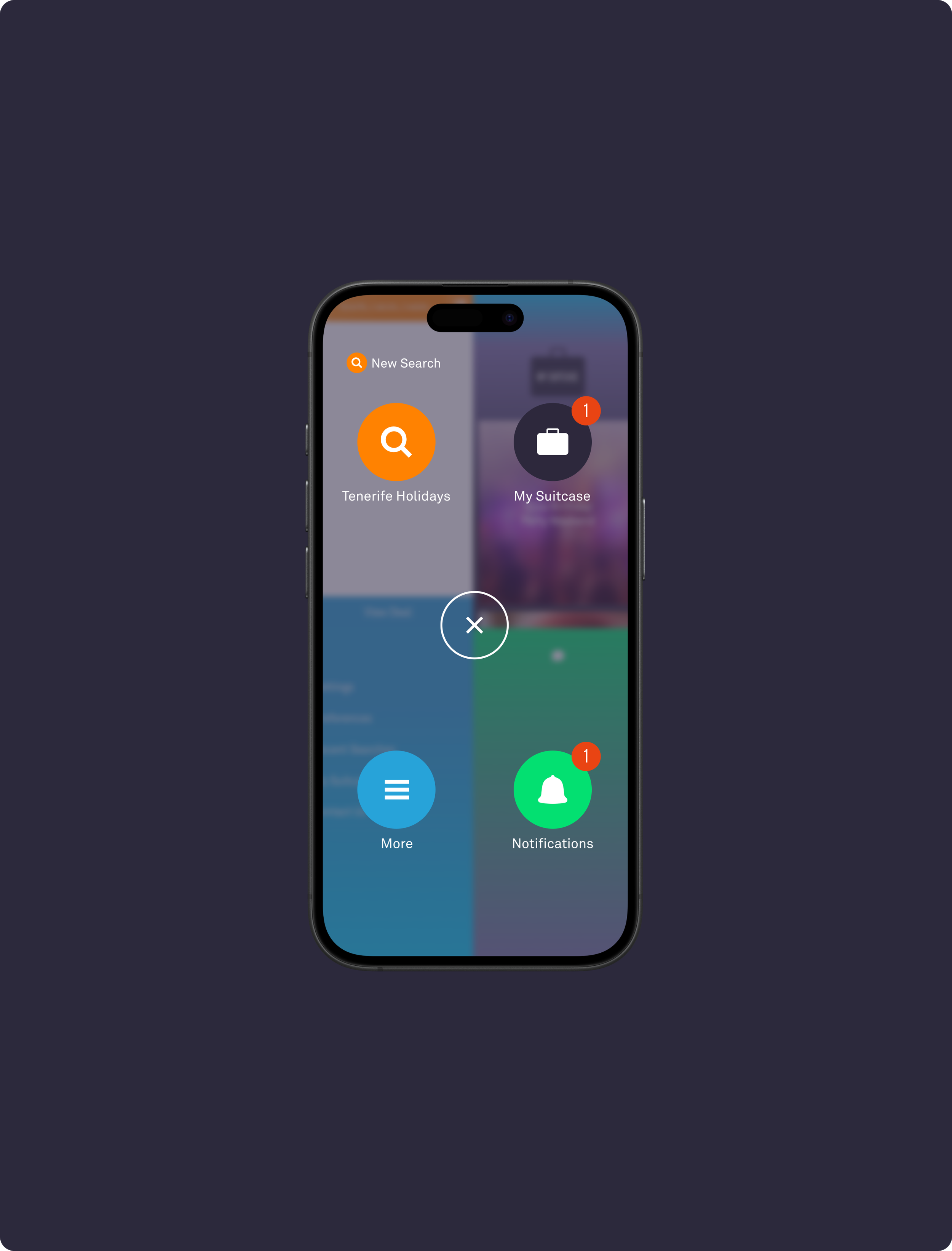
Fluid Global Navigation & Bookmarking
Innovating Navigation Within The App
User testing of two prototypes revealed a 100% preference for the custom navigation over the native option. Participants highlighted its speed, clarity, and the seamless flow between sections.

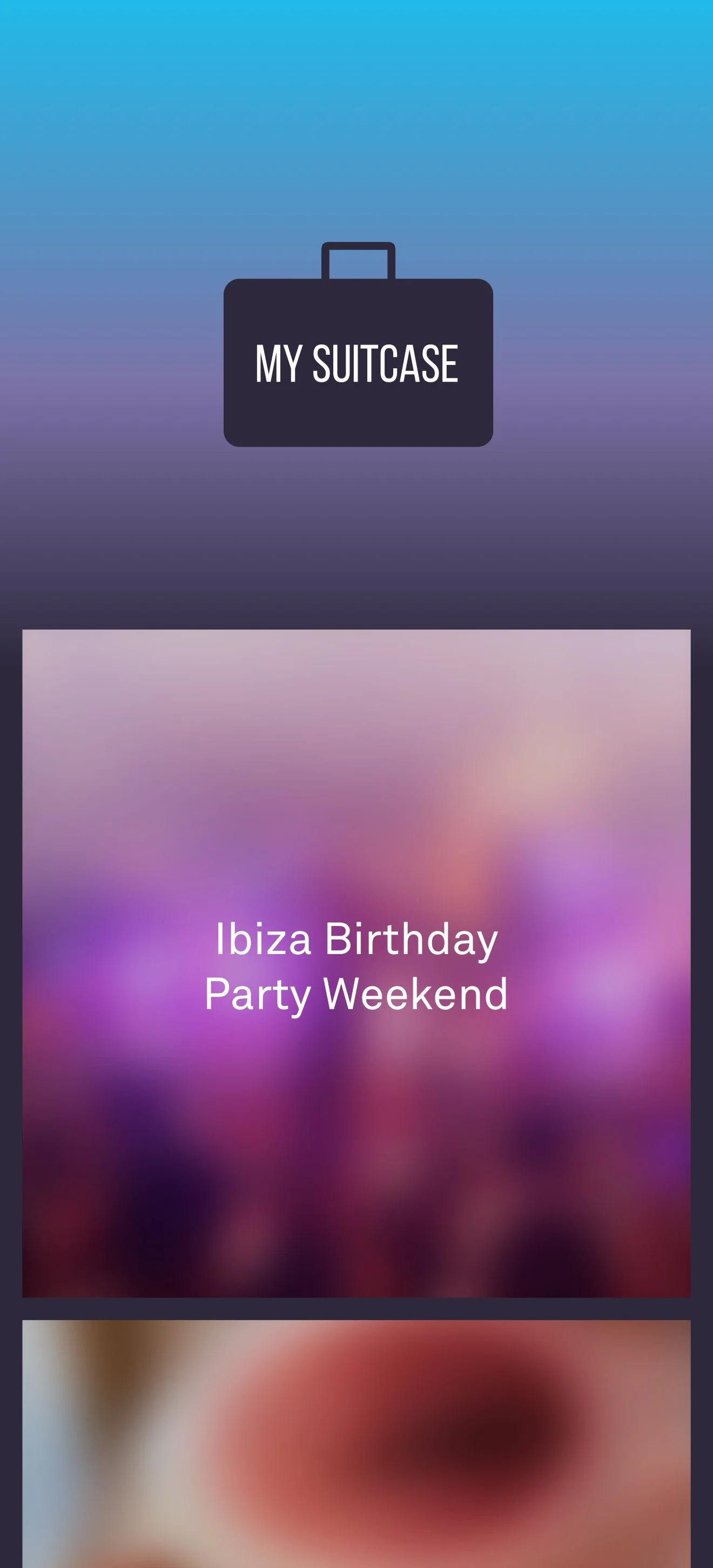

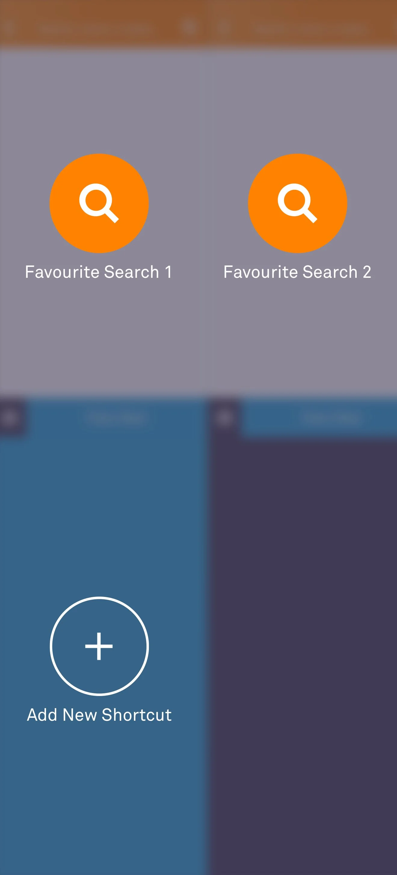
The Menu
Once the menu has been tapped it reveals all sections of the app and gives users the ability to bookmark their searches.


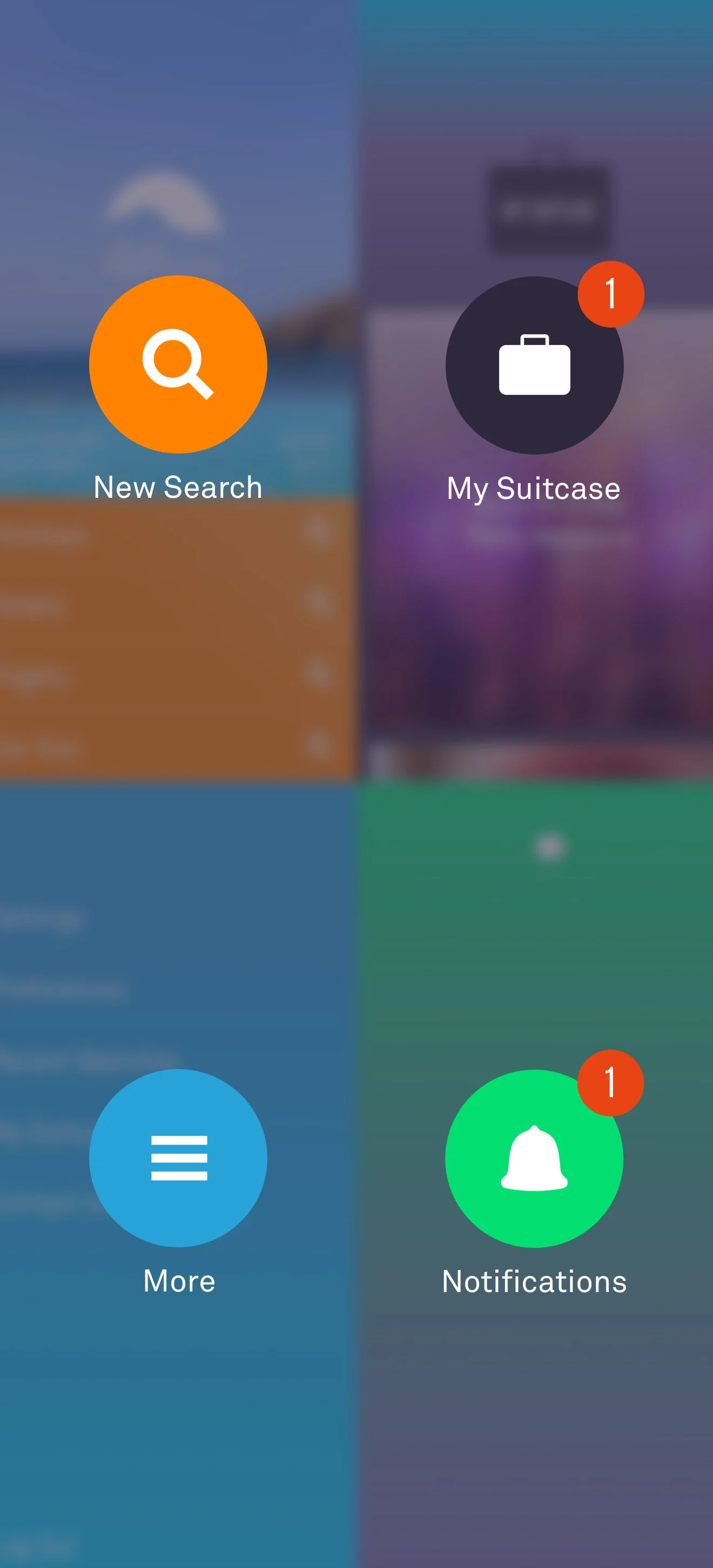
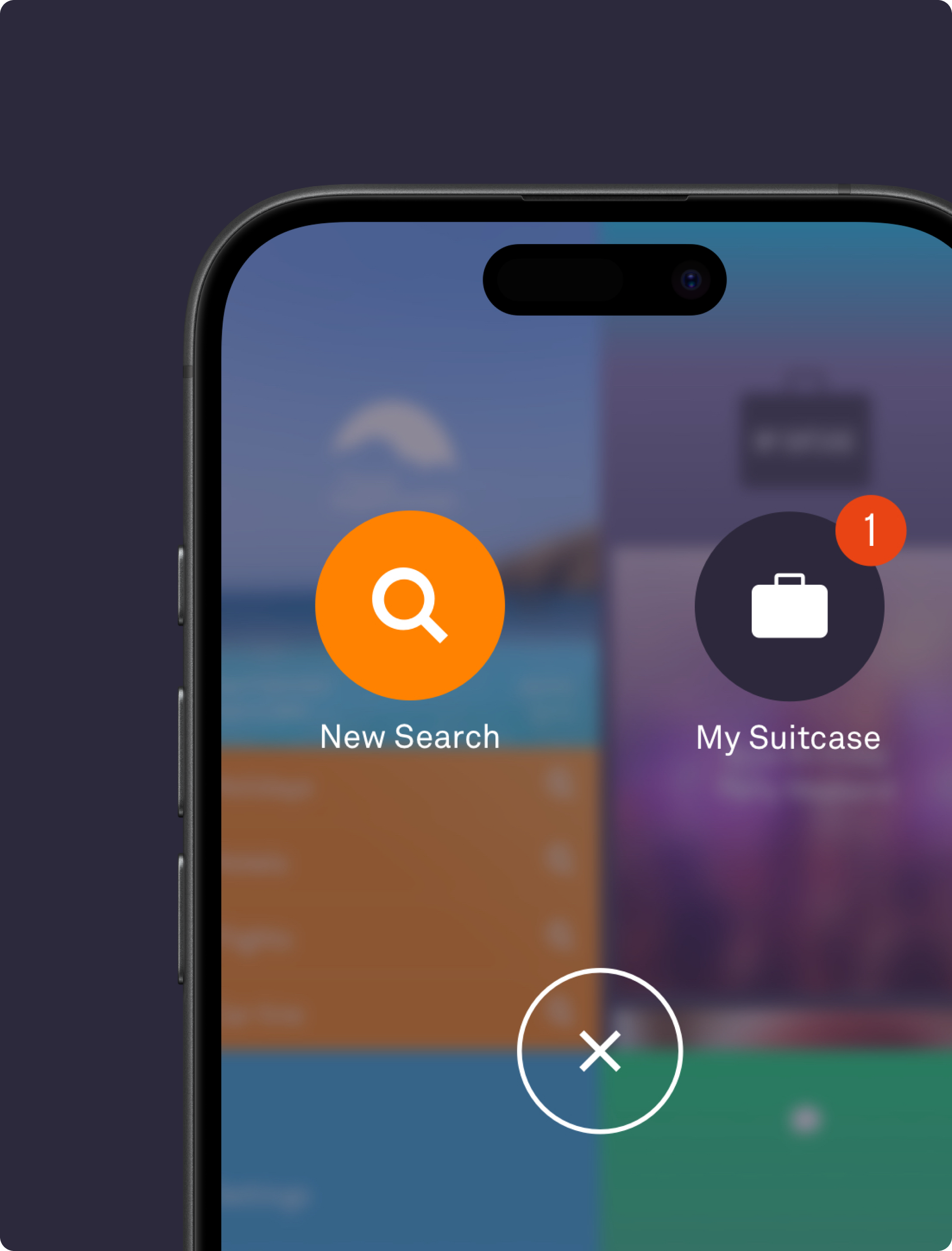
Contextual Display
When users opens the navigation they see a clear snapshot of their place in the journey, with contextual links like starting a new search if they are midway through.
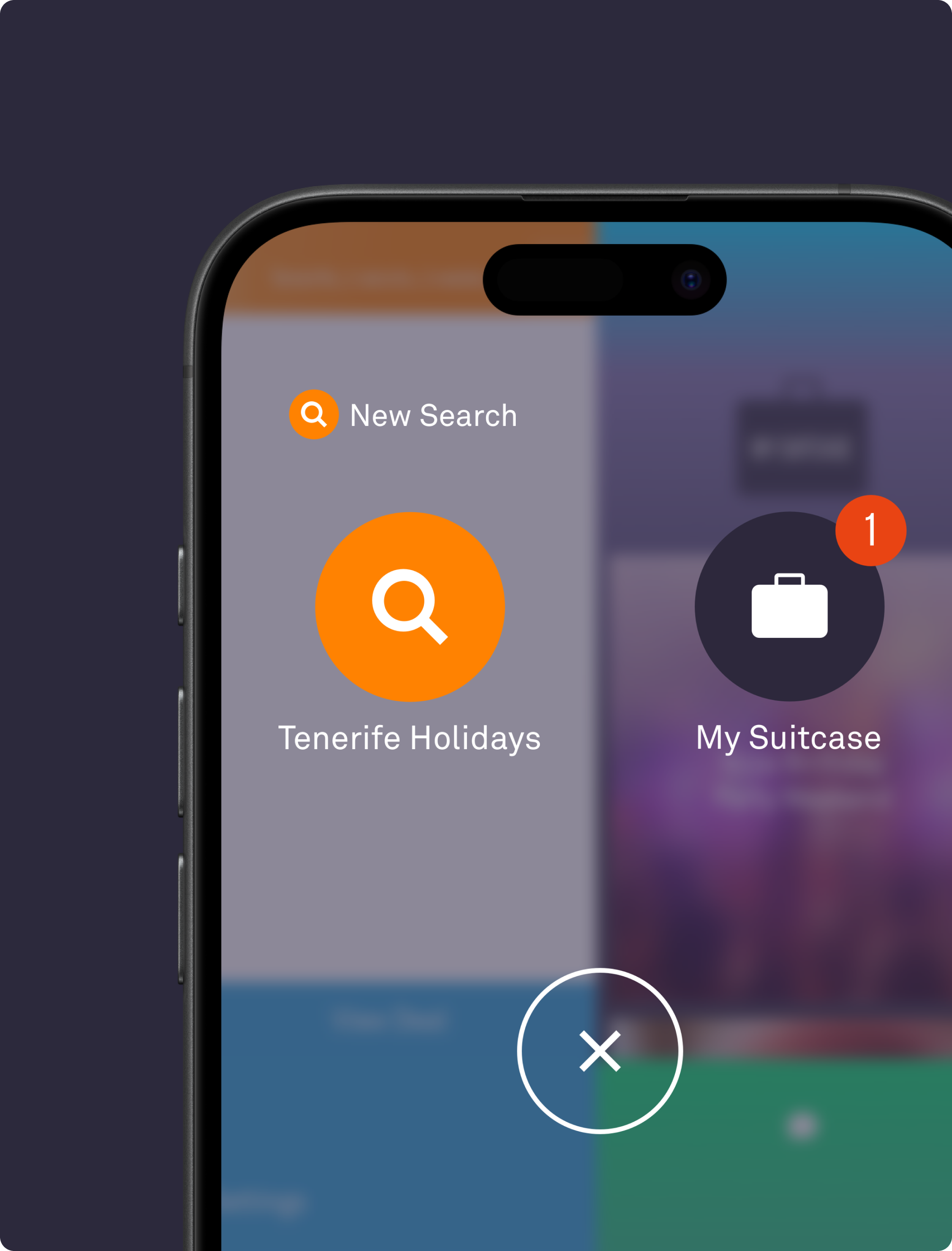
Primary CTA
Our custom navigation replaced the native bottom nav, letting us place the primary CTA as the first touchpoint. Directly driving revenue from each deal viewed.


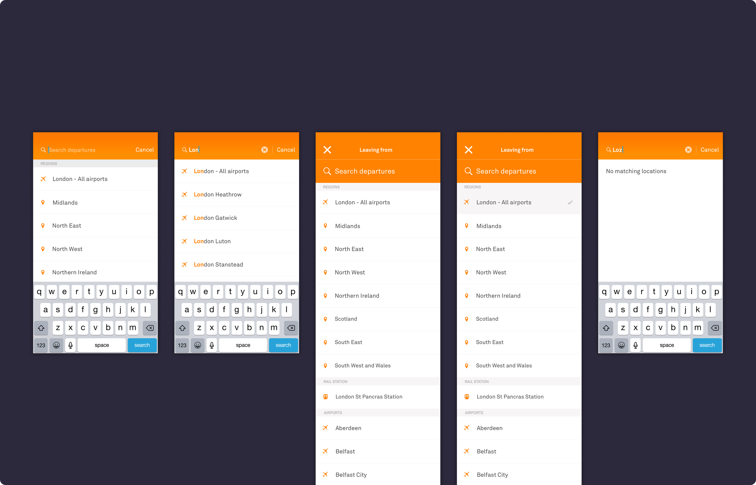
Filtering
Filtering
To tackle common booking pain points, I redesigned key selectors like dates and destinations. Drawing on familiar patterns such as swiping for filtering, I made search faster, more intuitive, and more playful. The primary call to action, our most valuable conversion driver, was placed within easy thumb reach to ensure accessibility and maximise results.


Outcomes
Key Features
Fluid global navigation that enables effortless movement across the app with fewer taps.
Contextual quick links that appear during key actions to maintain flow.
Playful, intuitive filters inspired by familiar swipe gestures.
Optimised selectors that reduce errors when choosing dates and locations.
Conversion focused layout with primary actions positioned for easy reach

“Paul consistently demonstrated an extraordinary openness to new ideas. His enthusiasm for innovation pushed our projects further and enabled cutting-edge solutions.”
Will Jutsum - Principal Engineer - TravelSupermarket
“Paul is a dynamic Creative Director and strategic thinker who aligns design with business objectives and bridges creative vision with technical implementation.”
Byron Manly - Senior Developer - TravelSupermarket