

Design Leadership That Modernised CMC Markets’ Web Experience
Client
CMC Markets
Agency
In House
My Role
Head of UX, Design, & Creative
Skills Used
Creative Direction
Design Direction
UX/UI Design
Information Architecture
Design
Content
In House Leadership
Site Audits and Optimisation
IA – Restructuring Site Maps
The Challenge
CMC Markets needed to strategically redesign its retail web experience and strengthen the brand proposition with clearer customer journeys and a more cohesive digital identity.
The Solution
I began with a full audit of the existing site, uncovering extensive duplication from outdated SEO practices. I streamlined the structure into a user focused site map, mapping clear journeys for new traders and information seekers. The homepage was redesigned as a storefront, spotlighting priority instruments and campaigns. I replaced static product tours with interactive video demos that made complex offerings clearer. To support consistency, I designed icons and created original photography to replace generic stock imagery.
The Impact
The redesign delivered a cleaner, more intuitive experience. Navigation improved, and the homepage drove deeper engagement. The interactive product tour became a stronger entry point, and key design components were adopted into the core trading platform. Multi-language sites with optimised targeting increased CTR by over 70% while meeting strict regulatory requirements. The new visual identity reinforced credibility and cohesion, modernising CMC’s digital presence.

Audit Old Site Map
I audited the existing site and uncovered extensive content duplication from poor SEO practices. Each page was reviewed in detail, with clear recommendations on what to remove, merge or reposition. The aim was not only to reduce clutter but to simplify navigation and align the structure with real user journeys.
New Site Map
I redesigned the site map to be streamlined and user-focused, mapping clear journeys for three key groups: new traders, switchers, and information seekers. The new structure made navigation more intuitive and ensured each user could quickly reach what they needed, improving both usability and engagement.


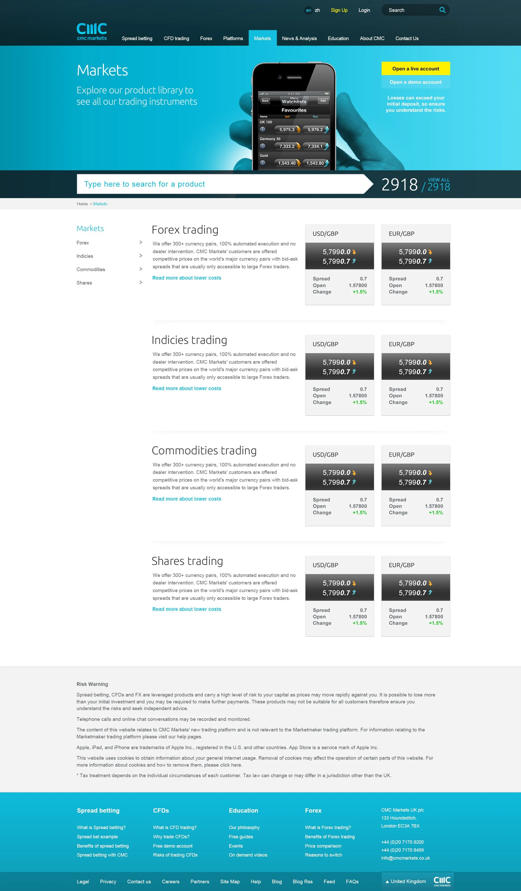
CMC Markets Home
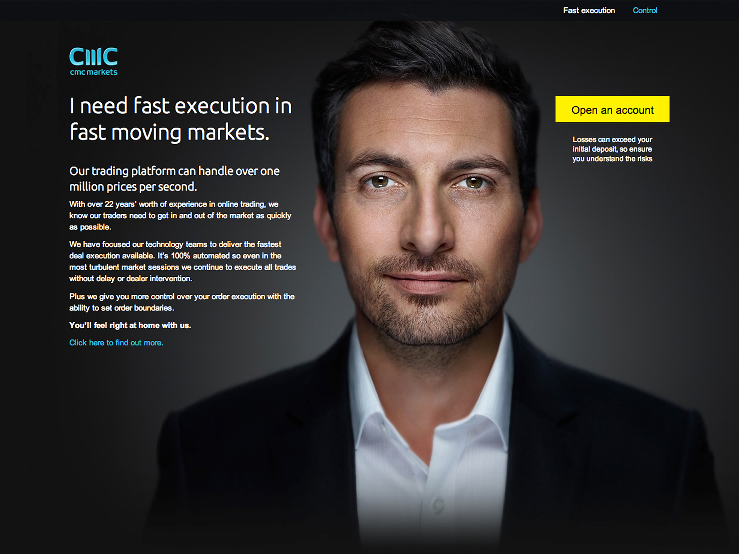
I designed the homepage as a storefront, spotlighting priority instruments and campaigns to create a high-impact entry point that drives engagement.


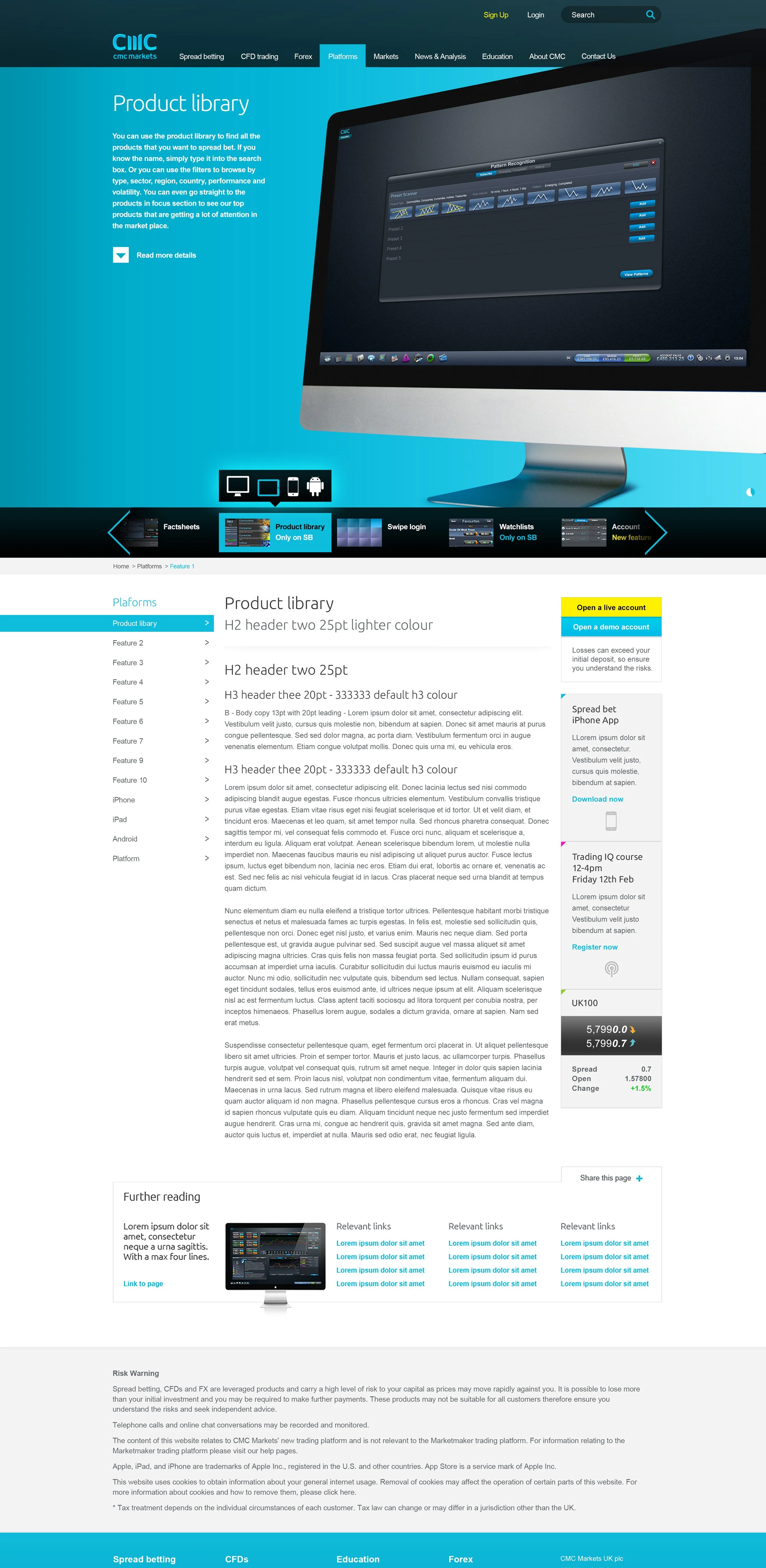
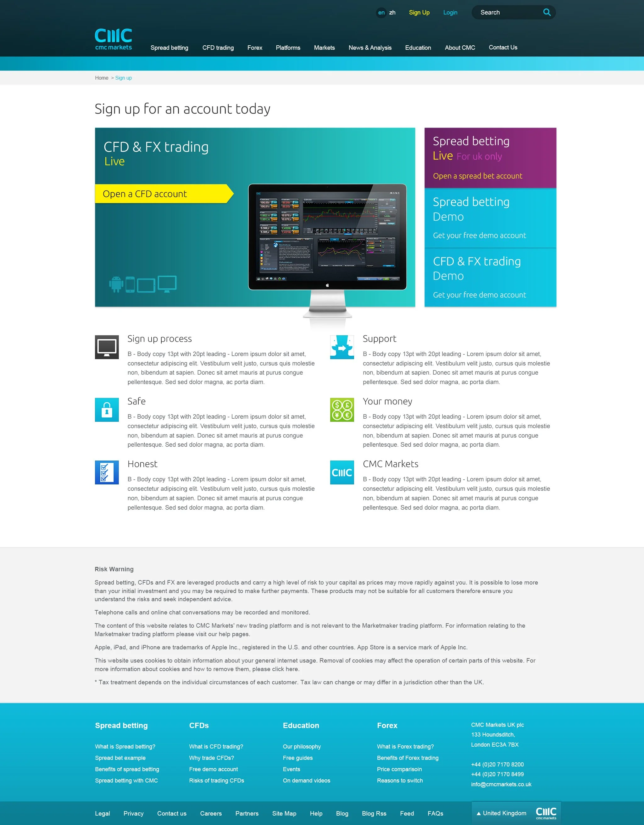
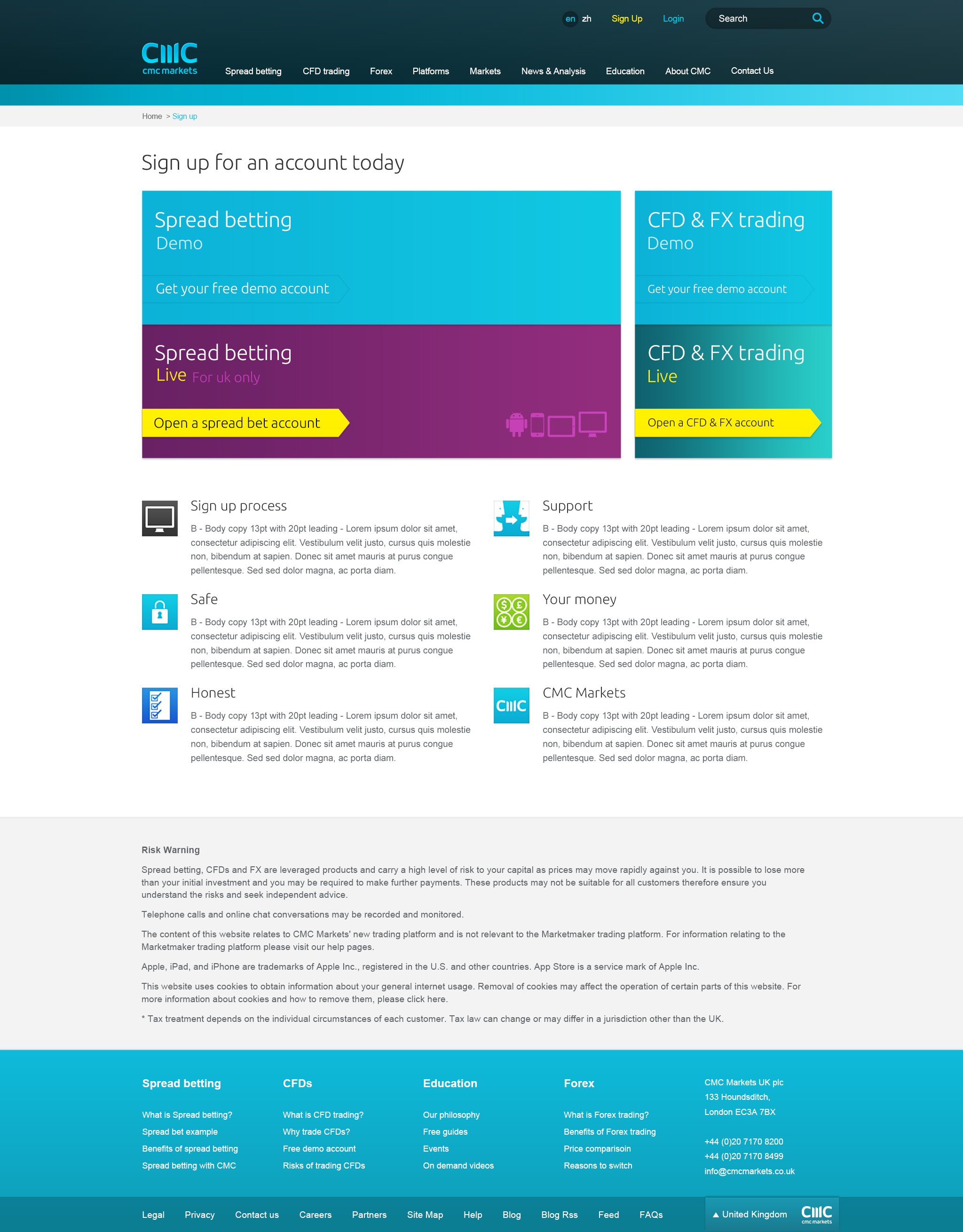
Product Tour
I reimagined the CMC Markets product tour, replacing static images and dense text with interactive video demos across devices. SEO copy was retained but moved below the fold, creating a modern, dynamic experience that made the product clearer and more engaging for customers.
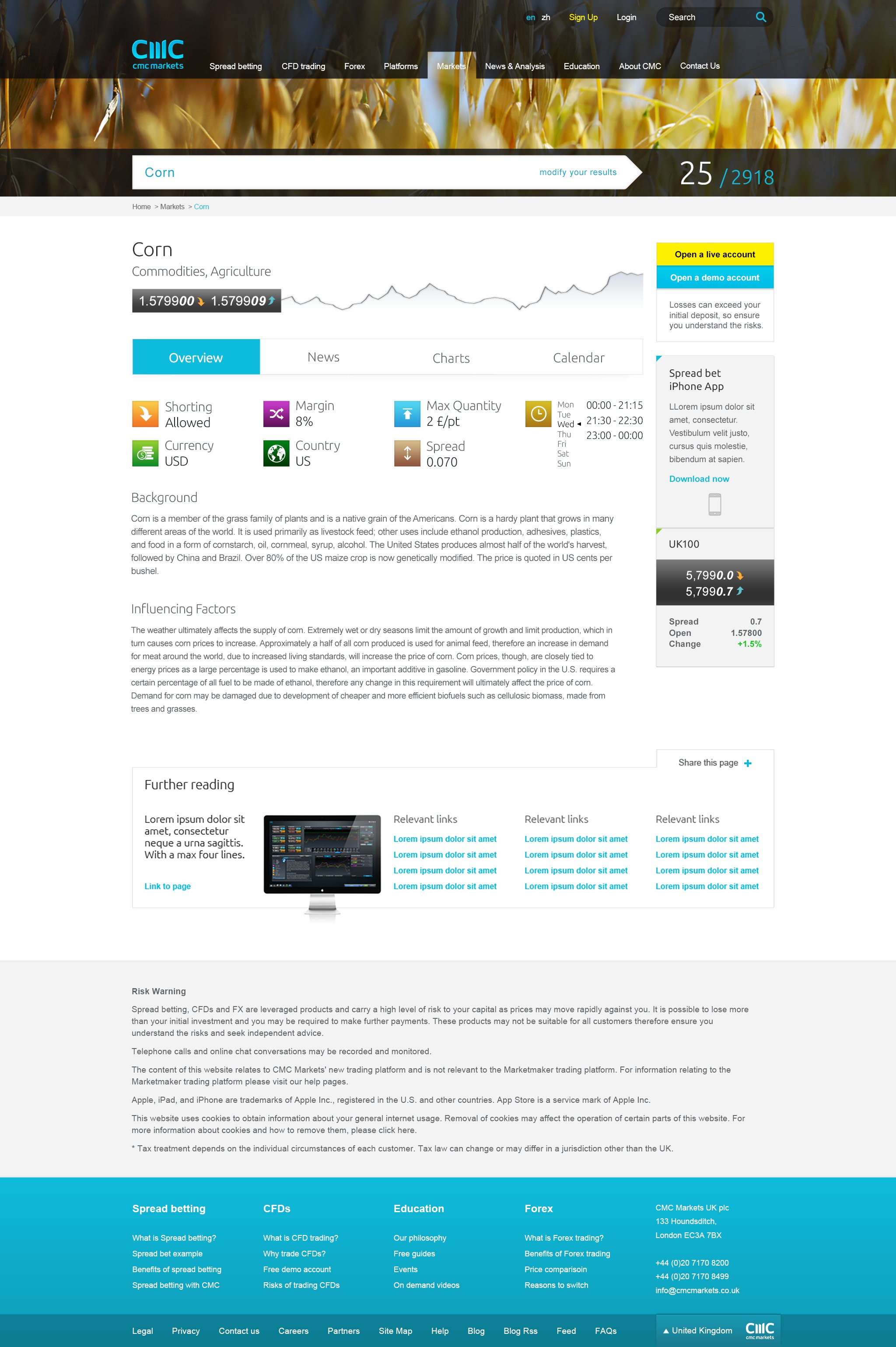
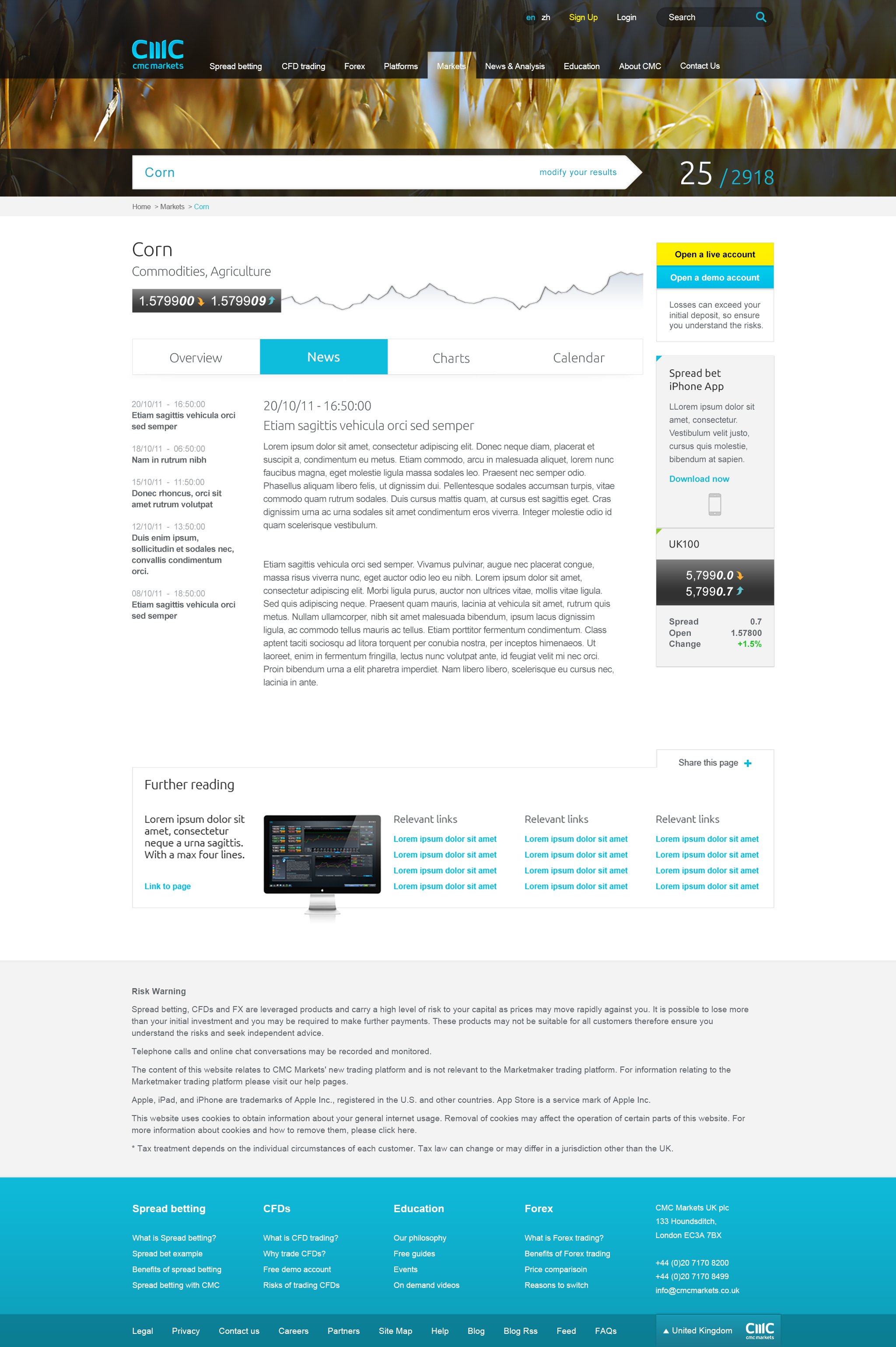


Icons
I designed hundreds of flat icons to enhance clarity and consistency. The minimalist style created a cohesive visual language that felt clean, modern and highly adaptable across the project.


Photography
I shot and replaced clichéd stock imagery with a more authentic, aspirational style that aligned with the brand, bringing credibility and energy to CMC’s visual identity.


“Paul brings a wealth of experience and is an enormously talented Creative & Product Director. His attention to detail and ability to absorb our brand proposition into what he created has been exceptional.”
Wil Lynch, Group Head of Marketing, CMC Markets