


Leadership That Drove Transformation and Quadrupled Engagement
Client
TravelSupermarket
Agency
In House
My Role
Head of UX, Design, and Creative
Skills Used
Cross functional in house leadership
Strategy
Product and Design Leadership
Creative Direction
UX/UI Design
Prototyping
Testing Guerrilla, Quant, and Qual
CRO
Partnered with MD, CPO, and CTO
Team Growth 1 to 30
Technology Strategy and Change
Content Strategy and Migration
Design Governance and Operating Model
Innovation Funding Strategy
The Challenge
The business faced the challenge of replatforming an aging technology stack, redesigning all customer booking channels, and migrating 6,000 SEO rich pages without losing critical search performance.
The Solution
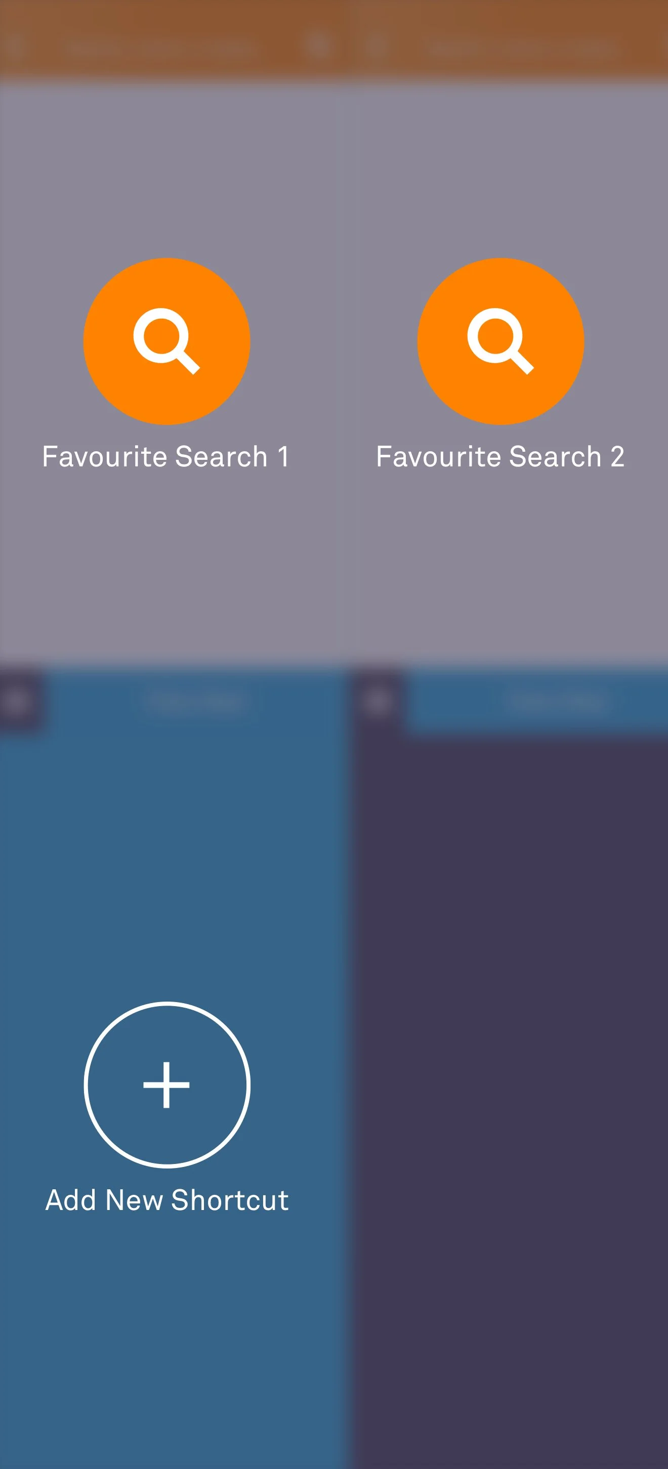
I aligned product, technology, and design strategy at executive level while remaining hands on in design delivery. I led the replatform and redesign across every major channel, including hotels, flights, car hire, holidays, and insurance. We replaced more than 20 legacy templates with a modular system, raised accessibility standards, and shifted the model from cluttered paid media towards cleaner, conversion focused design. I built the design team from the first individual hire to an embedded team of thirty, and in parallel I directed a dedicated content team to migrate 6,000 SEO pages, ensuring brand and accessibility guidelines were met in full.
The Impact
The transformation delivered at scale. 6,000 SEO pages migrated without loss, traffic doubled from 2.4M to 4.8M, and the My Suitcase product increased customer value 4x. Conversions rose across every booking channel. I grew the design team from 1 to 30 and secured £5M in innovation funding, proving how hands on leadership can deliver measurable enterprise growth.
Dark Orange
FF8201
Light Orange
FFA030
Dark Blue
27A3D9
Light Blue
00D3FE
Dark Purple
2D283C
Medium Purple
403A54
Light Purple
7C72A7
Black
000000
Dark Grey
4C4C4C
Medium Grey
9A9A9A
Med Light Grey
E1E1E1
Light Grey
F7F5F6
Research
I conducted research into worldwide travel brands and consumer reach, collaborating with agencies to ensure that all my design decisions were informed by data and market trends


Digital Transformation
I led the strategic redesign of Travel Supermarket’s digital platform, modernising the experience while maintaining SEO performance. The overhaul delivered a 100% increase in unique visitors and improved conversion rates across all channels.
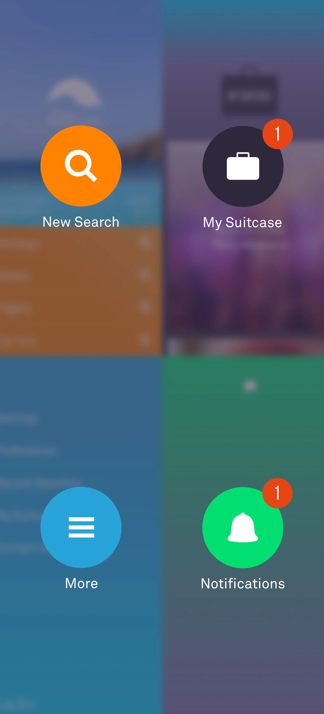
As part of a wider CRM initiative, I conceived and launched My Suitcase, a user-centric tool for curating, comparing, and sharing options. It drove deeper engagement and delivered 4x higher customer value.
Success
Doubled traffic from 2.4 million to 4.8 million
Improved conversion across all channels
4 X higher value customer on ‘My Suitcase’


Logo Evolution
I modernised the logo using a clean, contemporary typeface that brought cohesion to the brand’s visual identity. The shift from a gradient to a bold flat colour wasn’t just a style update, it improved legibility and made the logo far more adaptable across print, digital, and broadcast media.
Sky Colour Gradients
Gradients became a signature part of the Travel SuperMarket brand, blending orange, electric blue, and deep purples to echo the energy of sunrise and the calm of sunset.
My Suitcase
The My Suitcase brand extended the Travel Supermarket rebrand. Drawing again from the sky, purple, pink, and blue echoed the twilight horizon, while an electric blue introduced a subtle nod to technology.

My Suitcase Logo
The My Suitcase logo tucks a heart into a suitcase, adding charm and warmth. A pop of blue makes saving and bookmarking feel unmistakably yours.


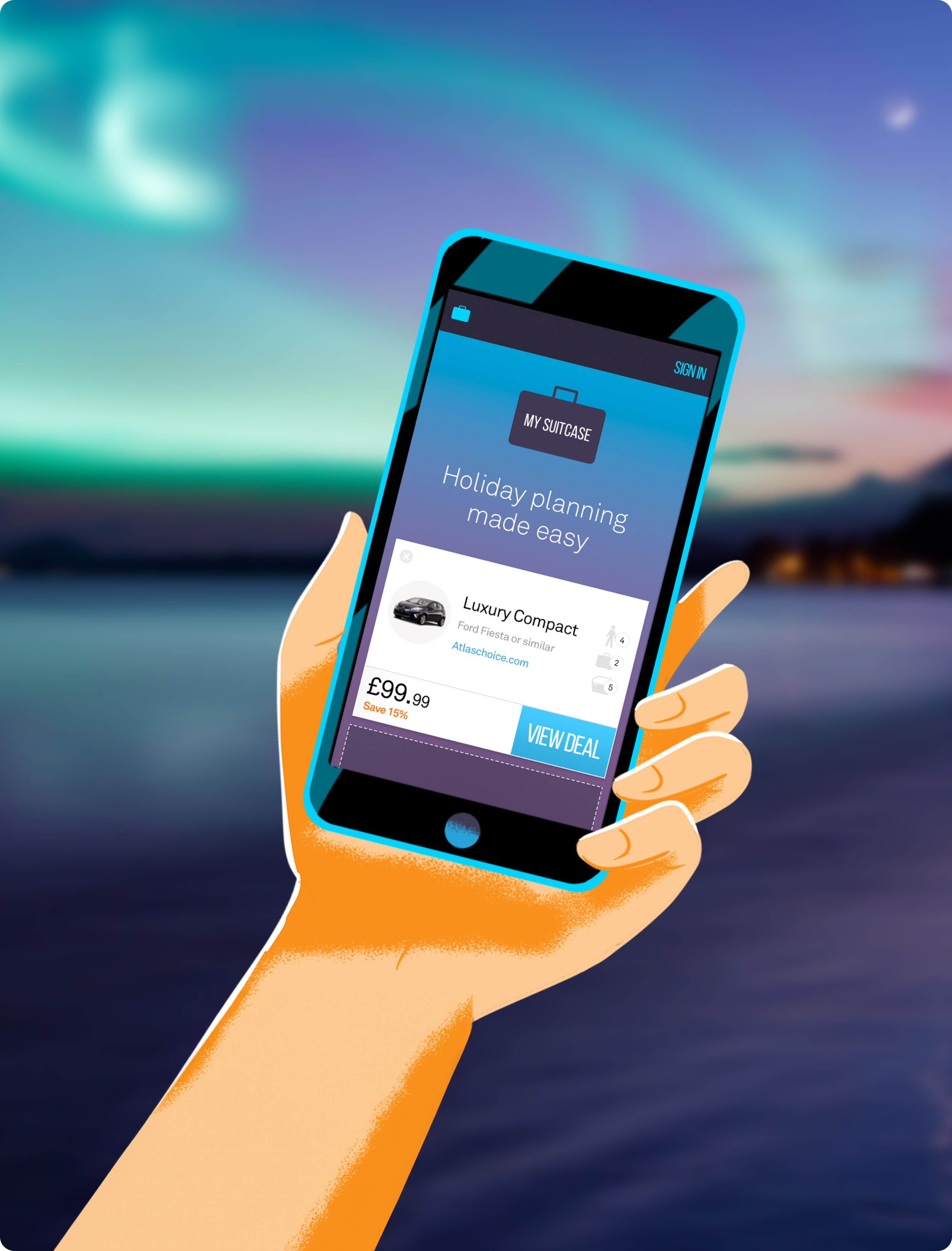

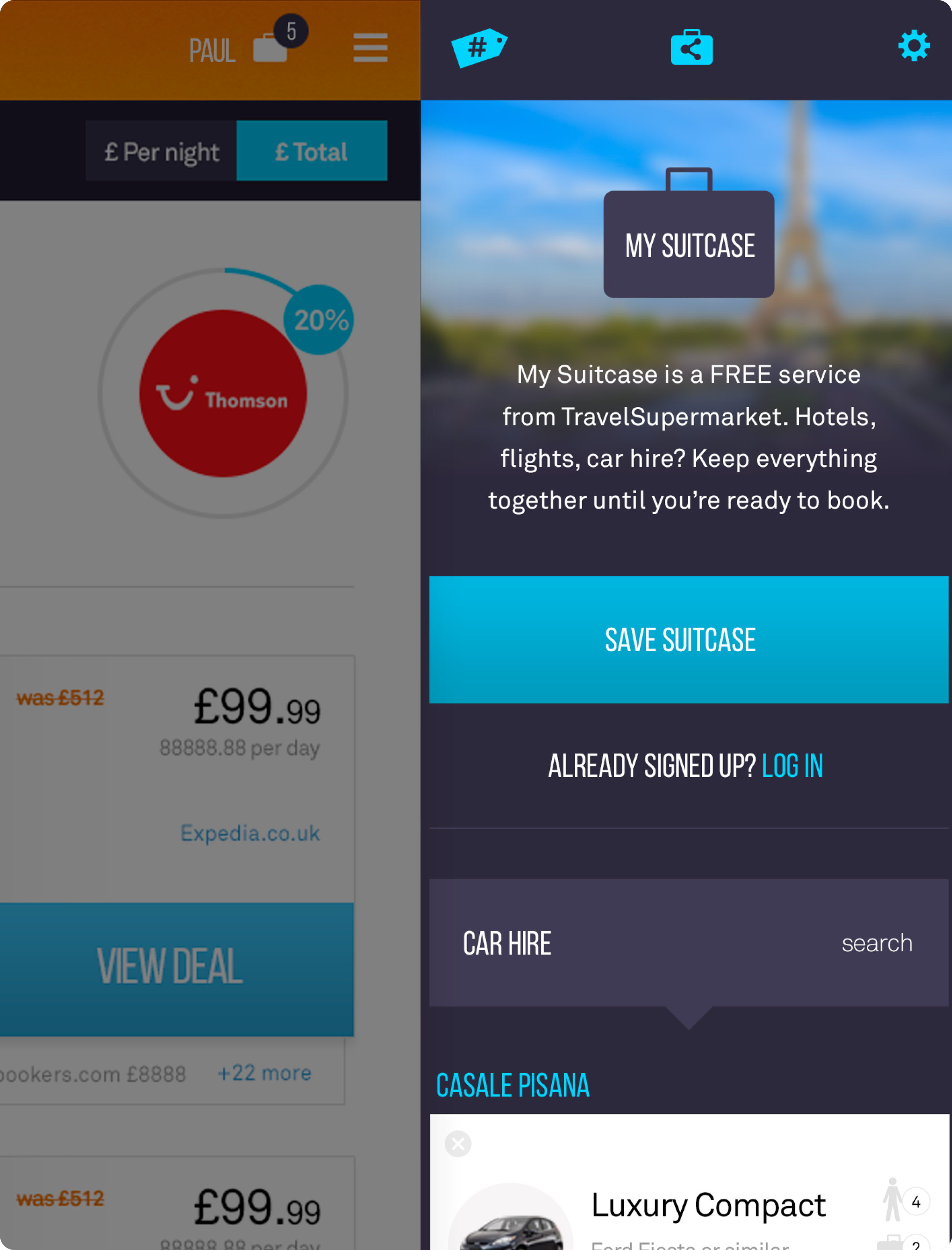

Illustration Style
Incorporating illustration into our brand's palette played a pivotal role in communicating intricate ideas. It facilitated the assimilation of concepts in an enjoyable, approachable, and uncomplicated fashion.


Inspirational Clicks
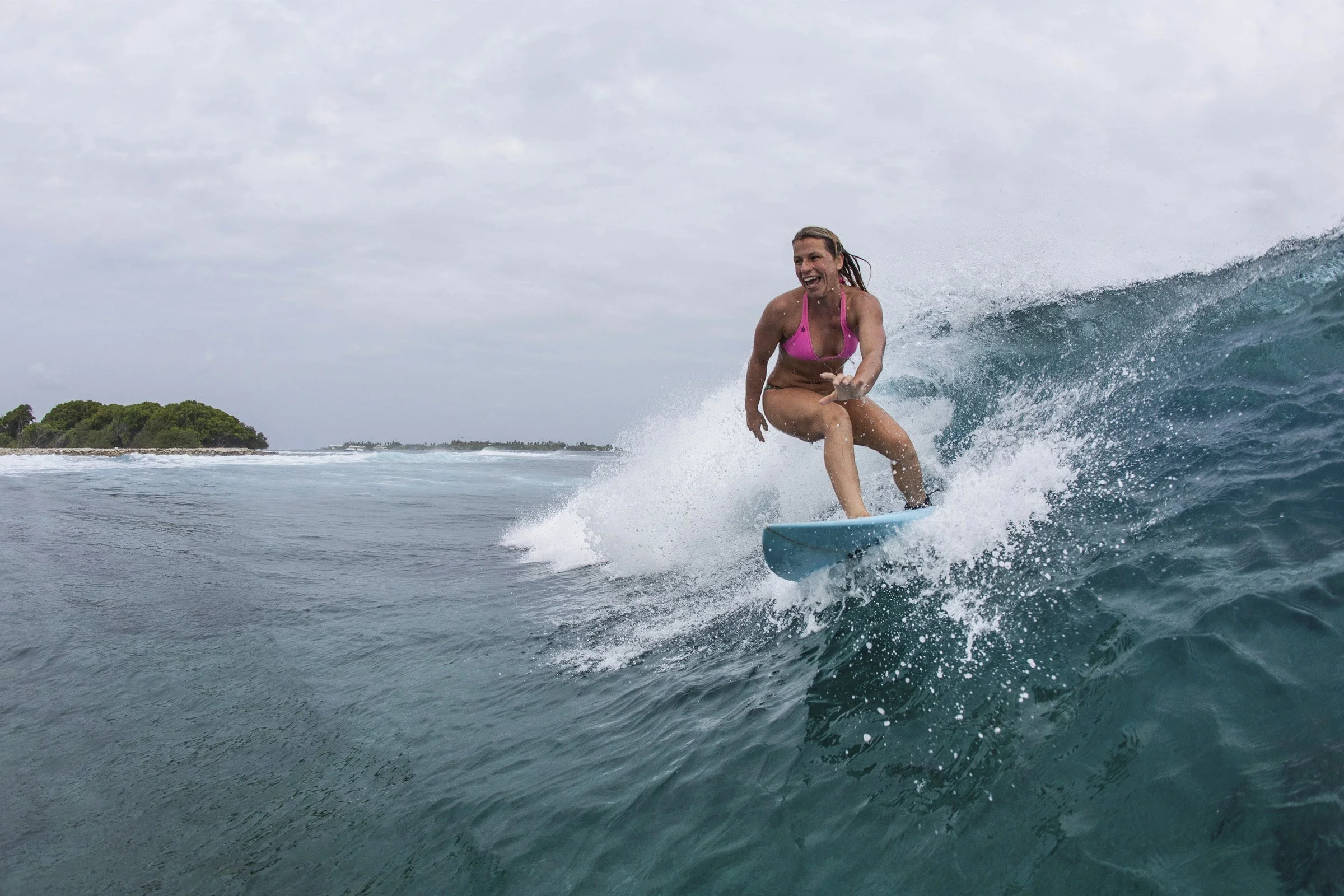
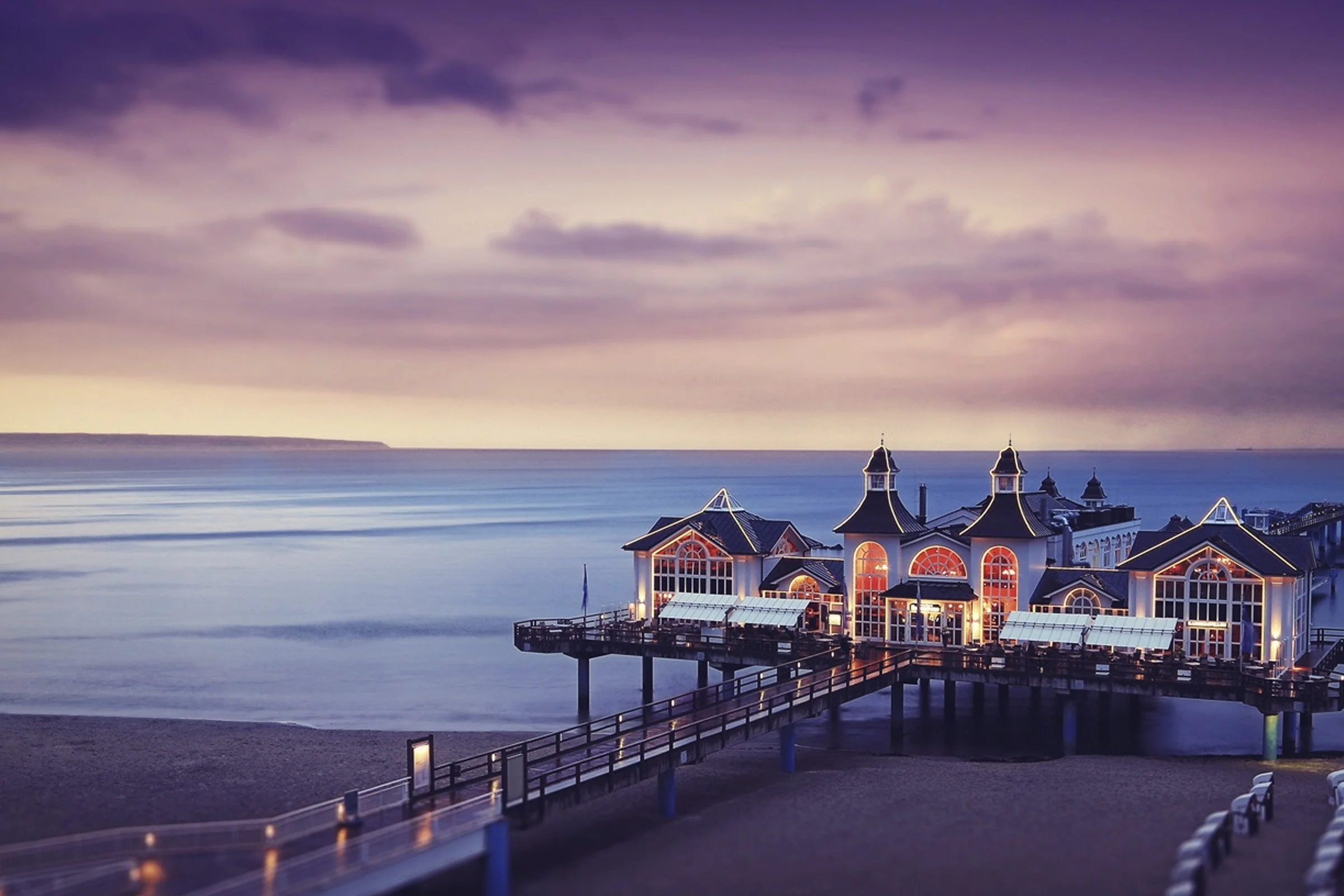
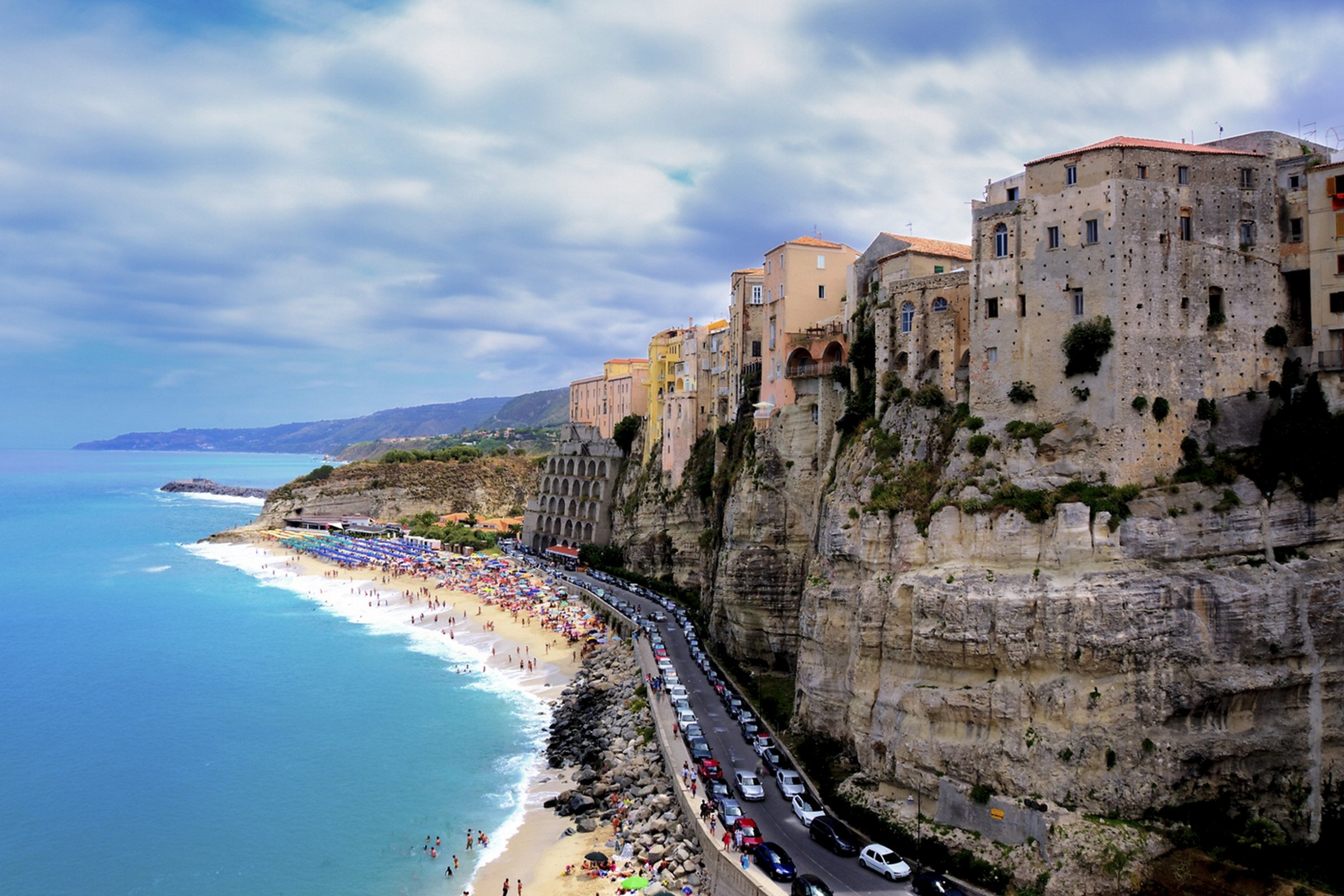
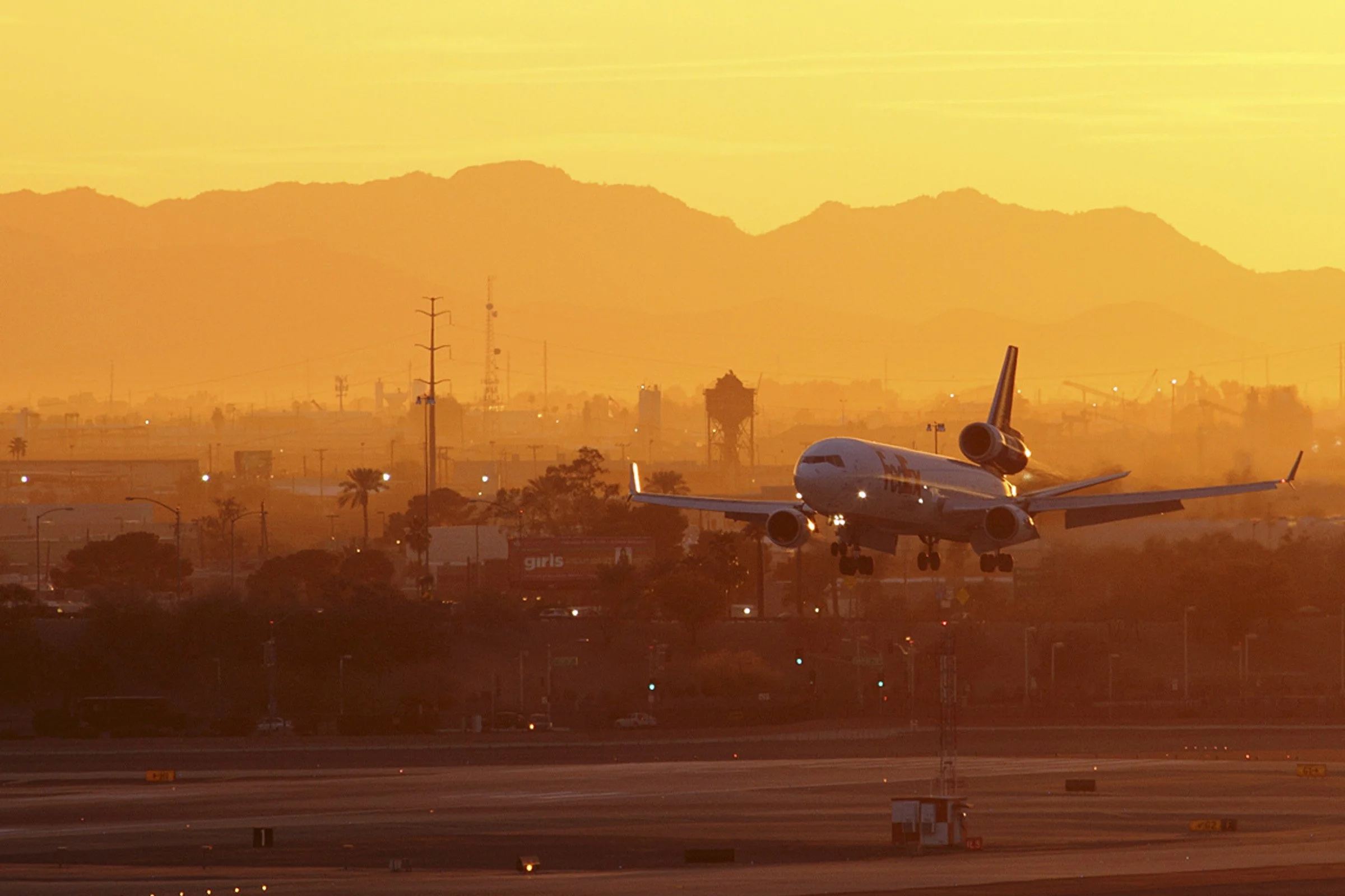
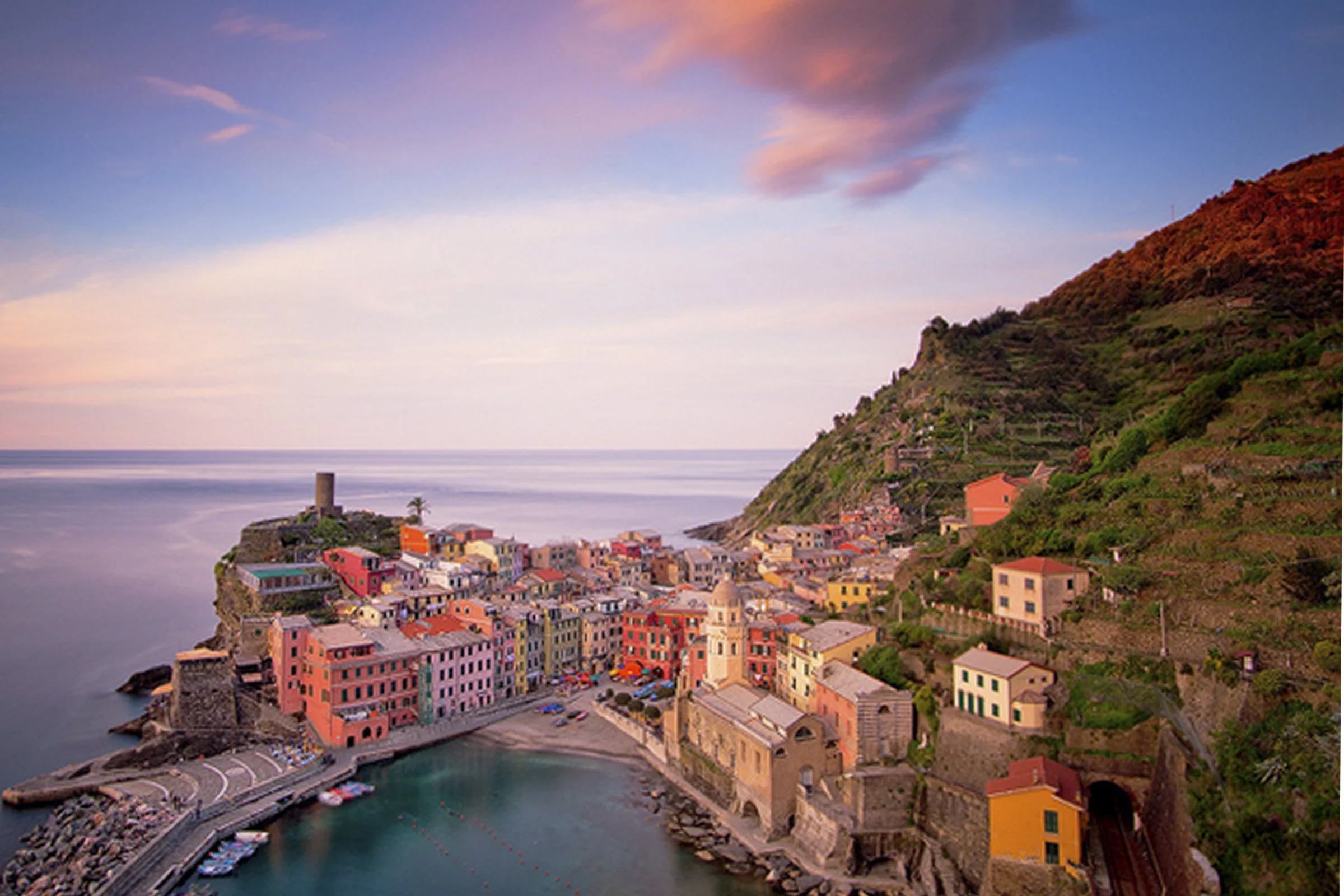
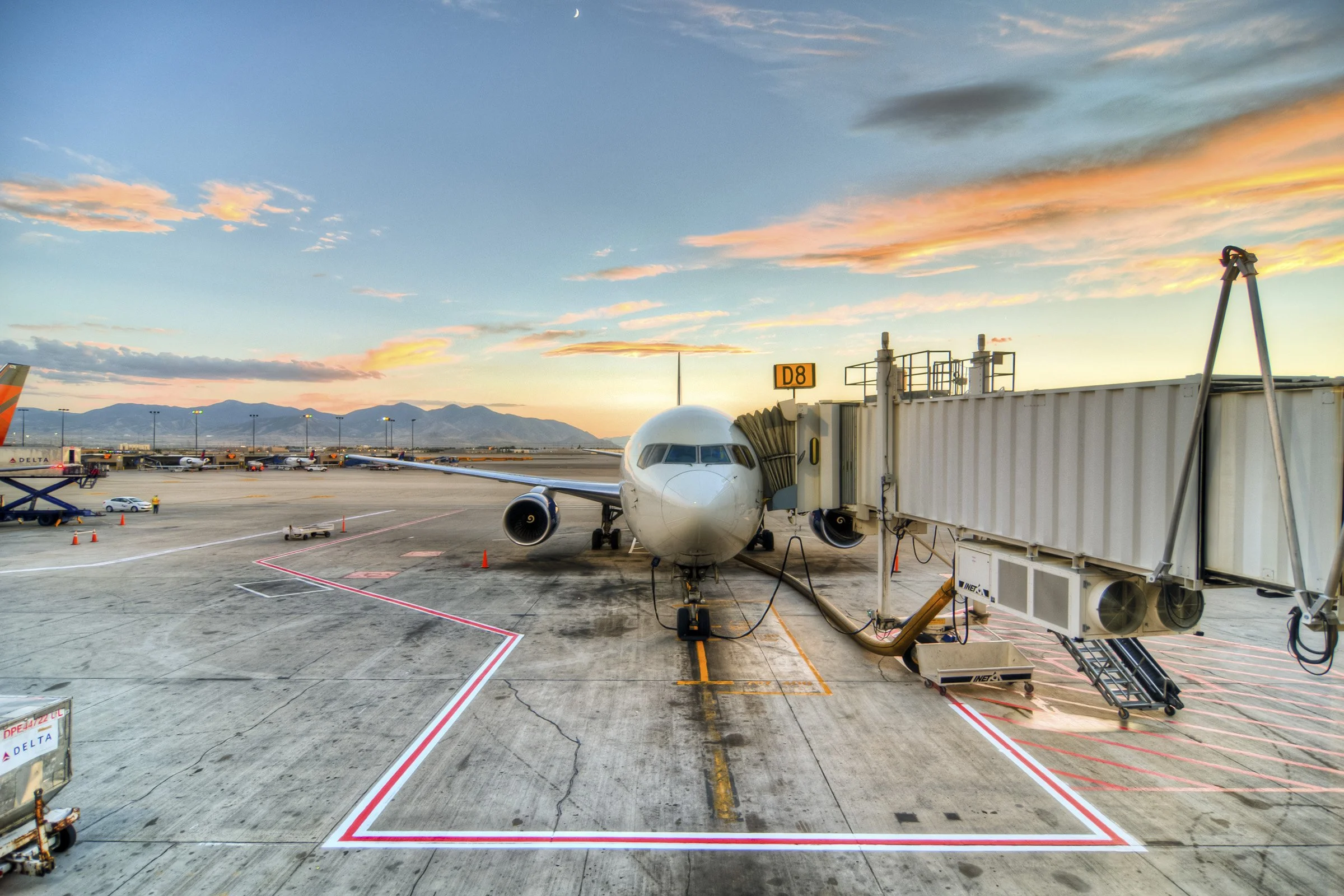
All photography was carefully curated to meet strict specifications for the website, aligning horizons at 50% and following the rule of thirds while shifting towards elegant, inspirational landscapes over clichéd silhouettes and staged smiles.


SEO Creative Campaigns
I elevated the quality of all creative touch points, with a particular focus on campaigns aimed at significantly boosting SEO impact. The emphasis was on developing creative strategies that not only enhanced the brand's image but also contributed meaningfully to SEO.


Office Space
Our London offices underwent a transformation and the walls were adorned with travel-themed vinyls and surfboards.


“Paul brings a wealth of experience and is an enormously talented Creative & Product Director. His attention to detail and ability to absorb our brand proposition into what he created was exceptional, and he worked seamlessly with creative, tech and web development teams to deliver transformation at scale.”
Wil Lynch, Chief Product Officer, TravelSupermarket