
Making Heinz.co.uk as Iconic as It Is on the Shelf
Client
Heinz
Agency
The Grand Union
My Role
Design Director
Skills Used
Design Direction
UX/UI Design
Visual Design
The Challenge
Following the success of the Love Sauces project, I was tasked with revamping Heinz.co.uk in alignment with the It has to be Heinz campaign. The goal was to strategically elevate brand awareness through a refreshed, iconic digital presence.
The Solution
I designed a bold new look for Heinz, starting from a strategic proposal to make the logo the hero. This elevated brand recognition by placing the icon at the centre of the experience. The design blended nostalgia and modernity with rounded corners and soft gradients that felt familiar yet current. I balanced usability with personality, ensuring the site became a brand touchpoint as strong as the packaging on the shelf.
The Impact
Heinz approved the approach quickly, recognising that the simplicity of the solution could scale. The decision to make the logo the hero remains a defining choice that lifted the brand’s digital identity.
Heinz
BF002C
Pasta
FECB00
Weight Watchers
561A64
Beanz
008497
Soups
8E000E
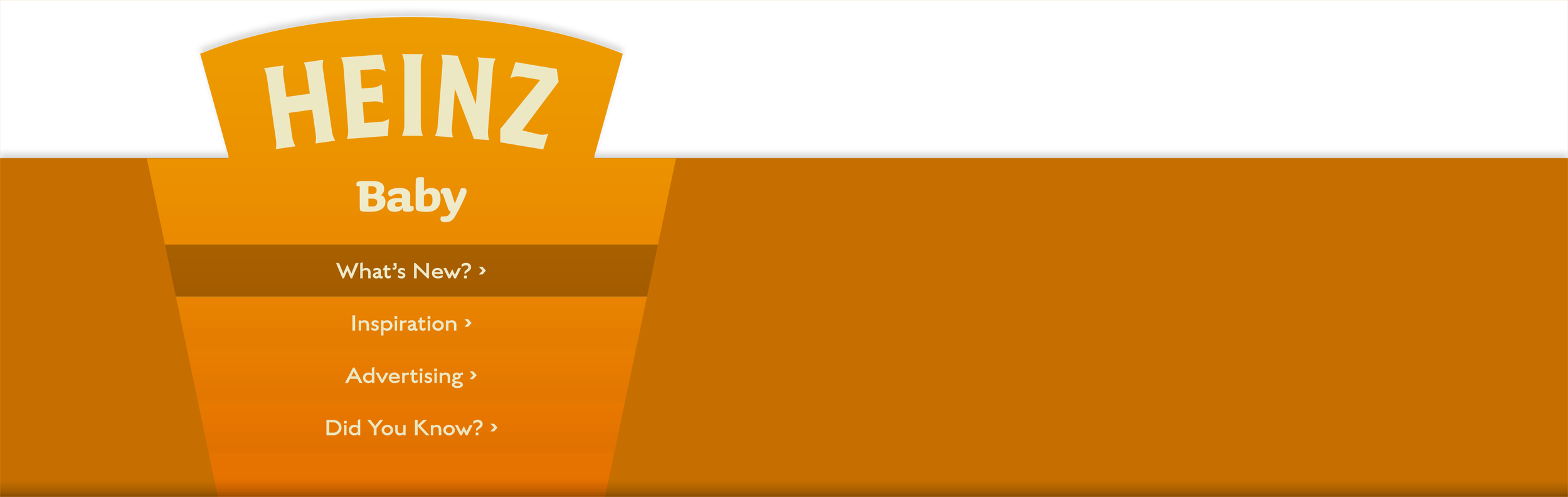
Baby
C67700
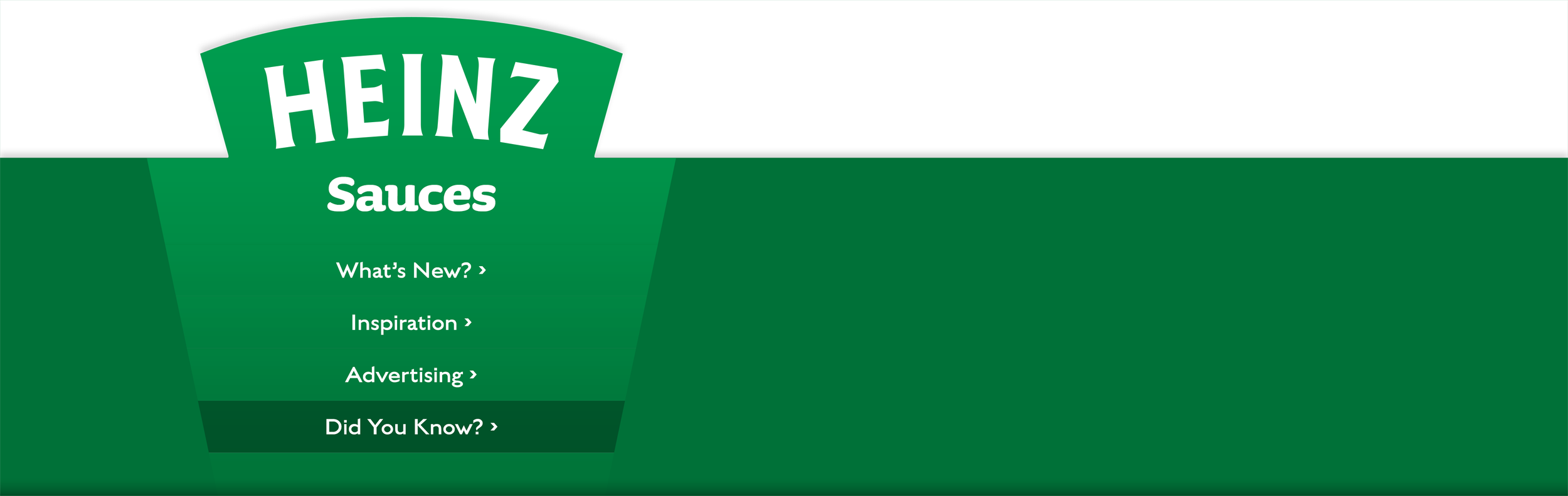
Sauces
007138

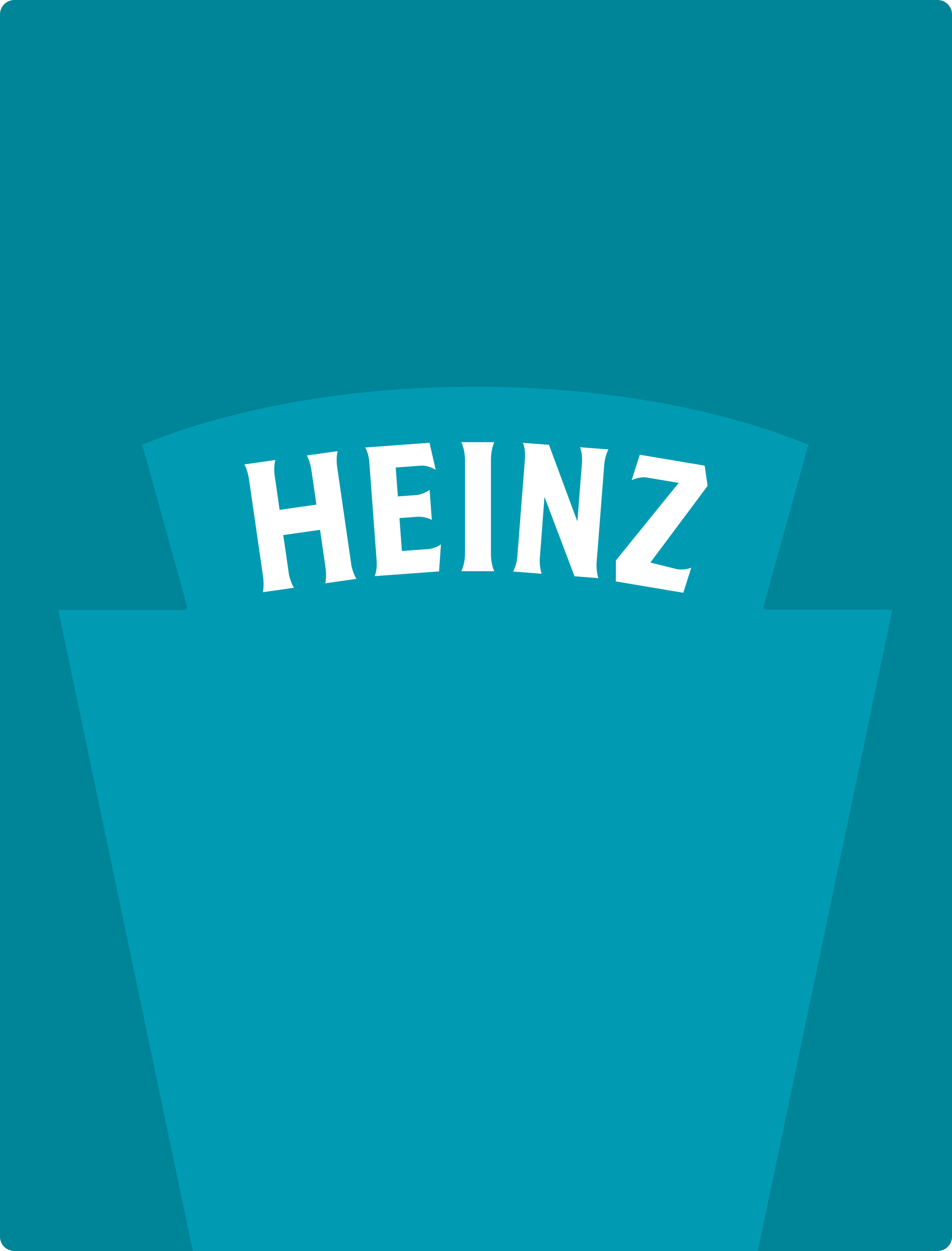


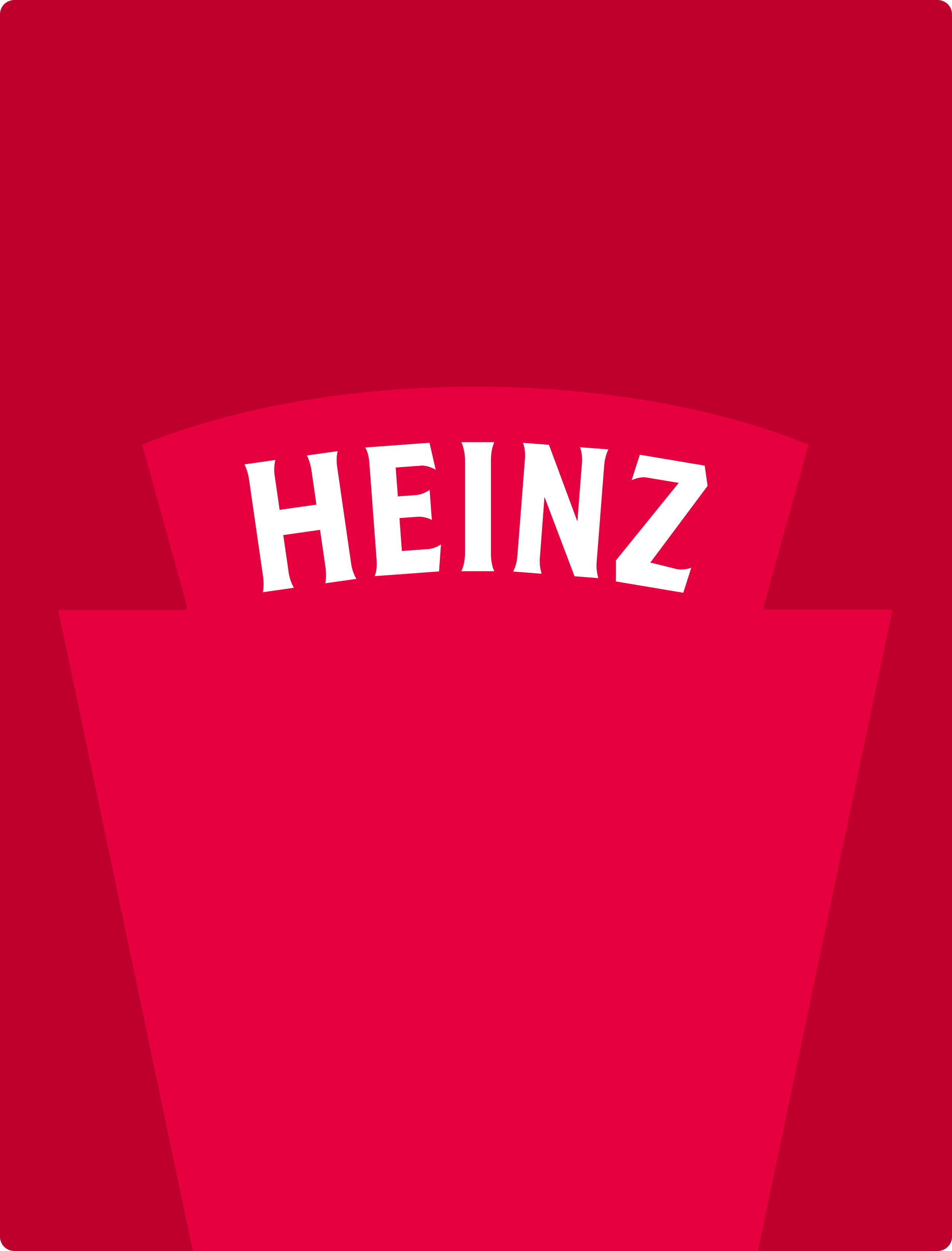
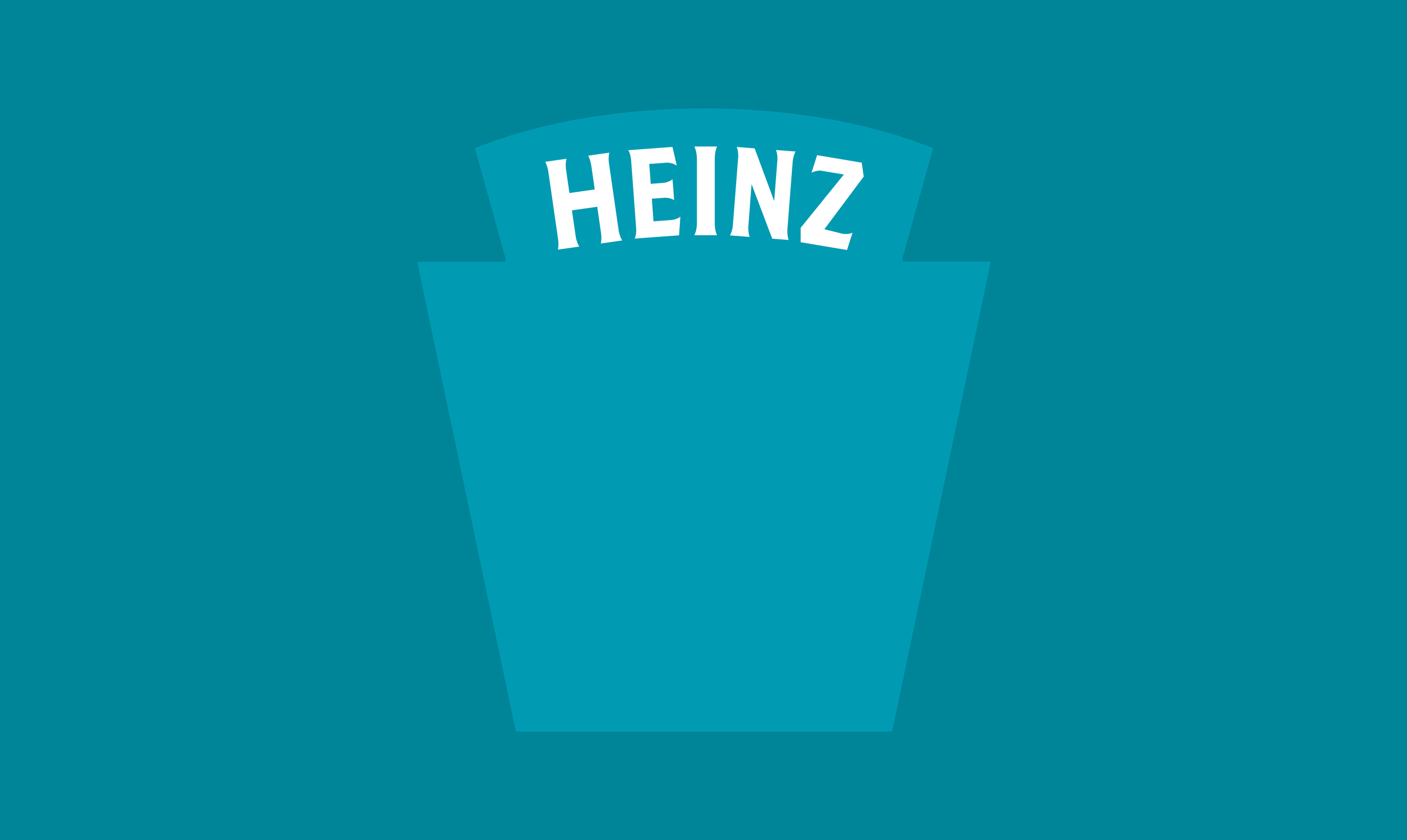
I made the logo BIGGER!

Brand Recognition
By letting that iconic Heinz shape be the hero, it created a visual rhythm. The logo didn't just say "Heinz," it sang it. The branded colour blocks gave the design an exciting visual language, and capitalised on each brands unique colour within the Heinz Family.


Visual Cohesion
I designed every detail to make the product the hero. We photographed each product in soft lighting, wrapping each pack in a gentle gradient, fading from light to dark. The result felt like a time capsule, nostalgic, warm, and unmistakably Heinz.


“A few things you should know about Robinson. Paul has an artists eye for detail and can create beautiful, powerful and playful designs. He gets how people engage with the world, how to keep them captivated and enlighten them with innovative ideas. Above all he is reliable chap and fun to work with.”
Stuart Hallybone - Creative Director - Grand Union