Building Homely
Client
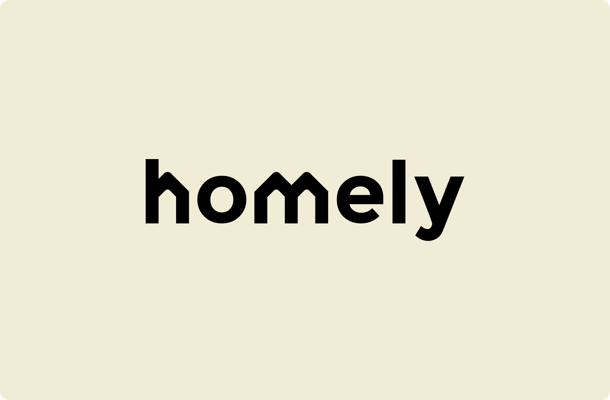
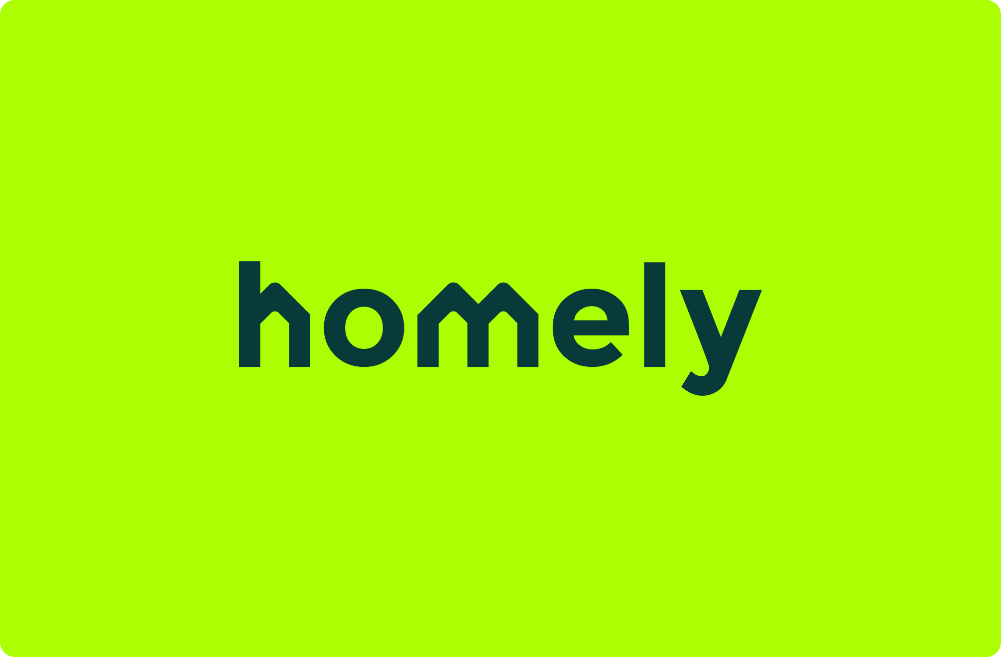
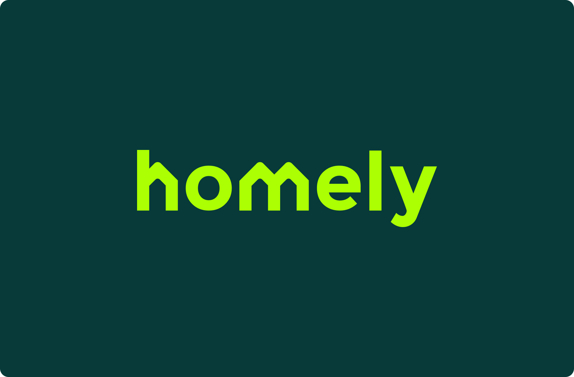
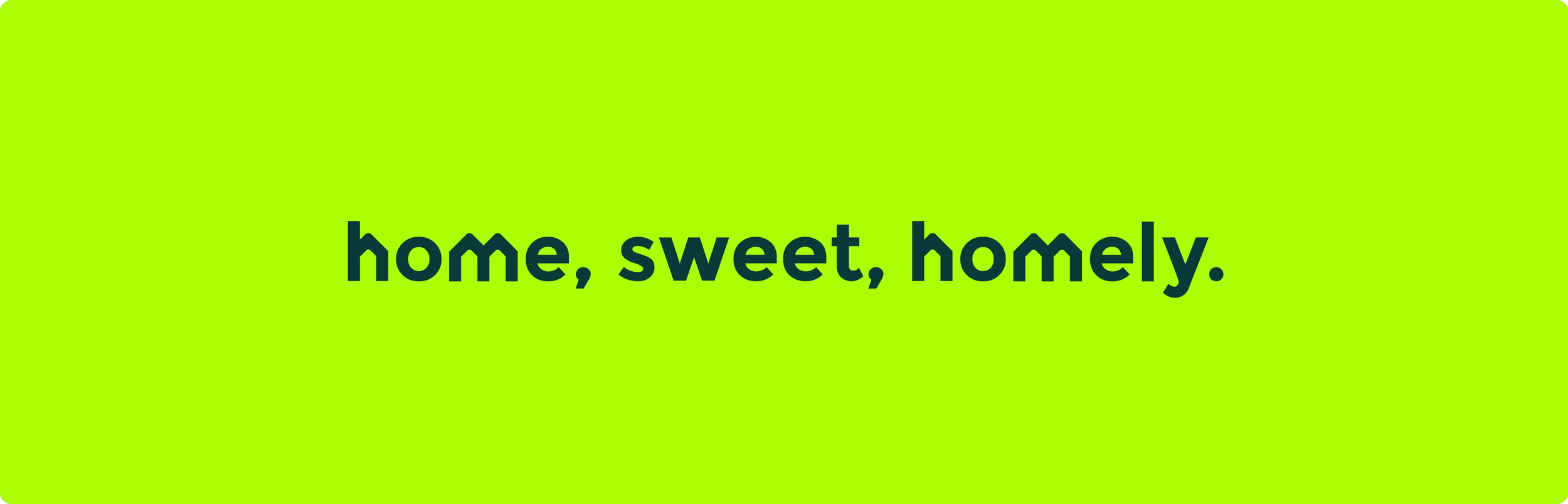
Homely
Agency
Paper Wall
My Role
Fractional Head Of Design - Start Up - IC
Skills Used
Creative Direction
Design Direction
Brand Strategy
Brand Design
Design
UX/UI Design
The Challenge
Homely entered a property market shaped by convention, where most brands felt functional, familiar and easily interchangeable. The business had a product direction, but no design system capable of expressing a clear point of difference. The challenge was not simply to make the brand look better. It was to create a visual and strategic foundation that could signal a different kind of proposition, build recognition early, and give the business the presence of a genuine challenger.
The Solution
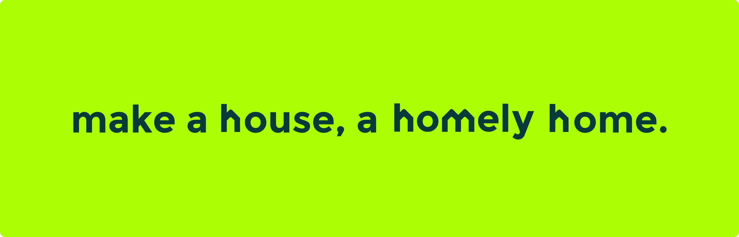
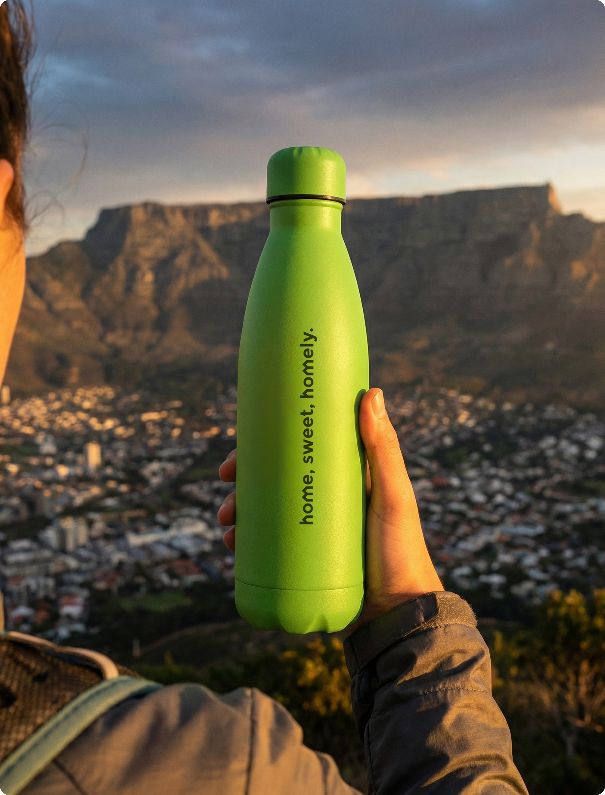
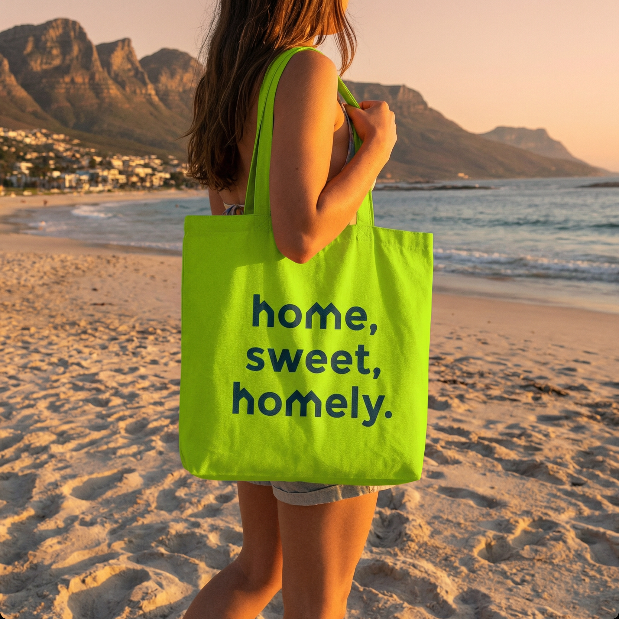
I built the identity around ownership of the “h” as a distinctive brand asset, using it as the basis for a broader visual system rather than treating it as a standalone logo gesture. That decision created a more memorable and defensible structure for the brand, allowing it to scale across product, communications, environments and campaign expression with consistency. The work focused on creating a system with strategic intent, one that could make the proposition feel clearer, more modern and more disruptive within a category that rarely looks or behaves differently.
The Impact
The result was a more ownable and coherent brand presence that gave Homely a clearer role in market. By turning a single visual idea into a repeatable system, the identity became more than recognition. It became a way to express the company’s ambition, sharpen its challenger positioning and support growth across every touchpoint.
Deep Pool
084A4A
Mid Pool
1A8888
Pool
45BEC1
Grass
9EFF00
Braai
000000
Dusk
F1ECD6
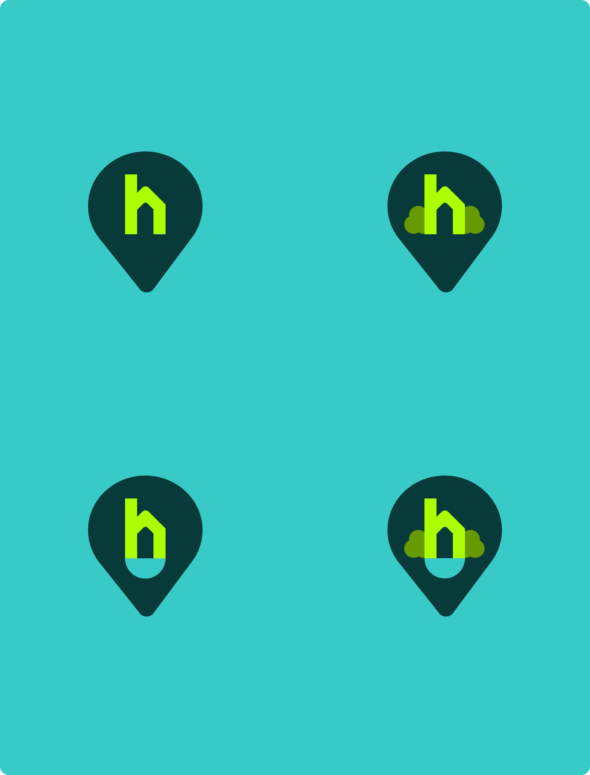
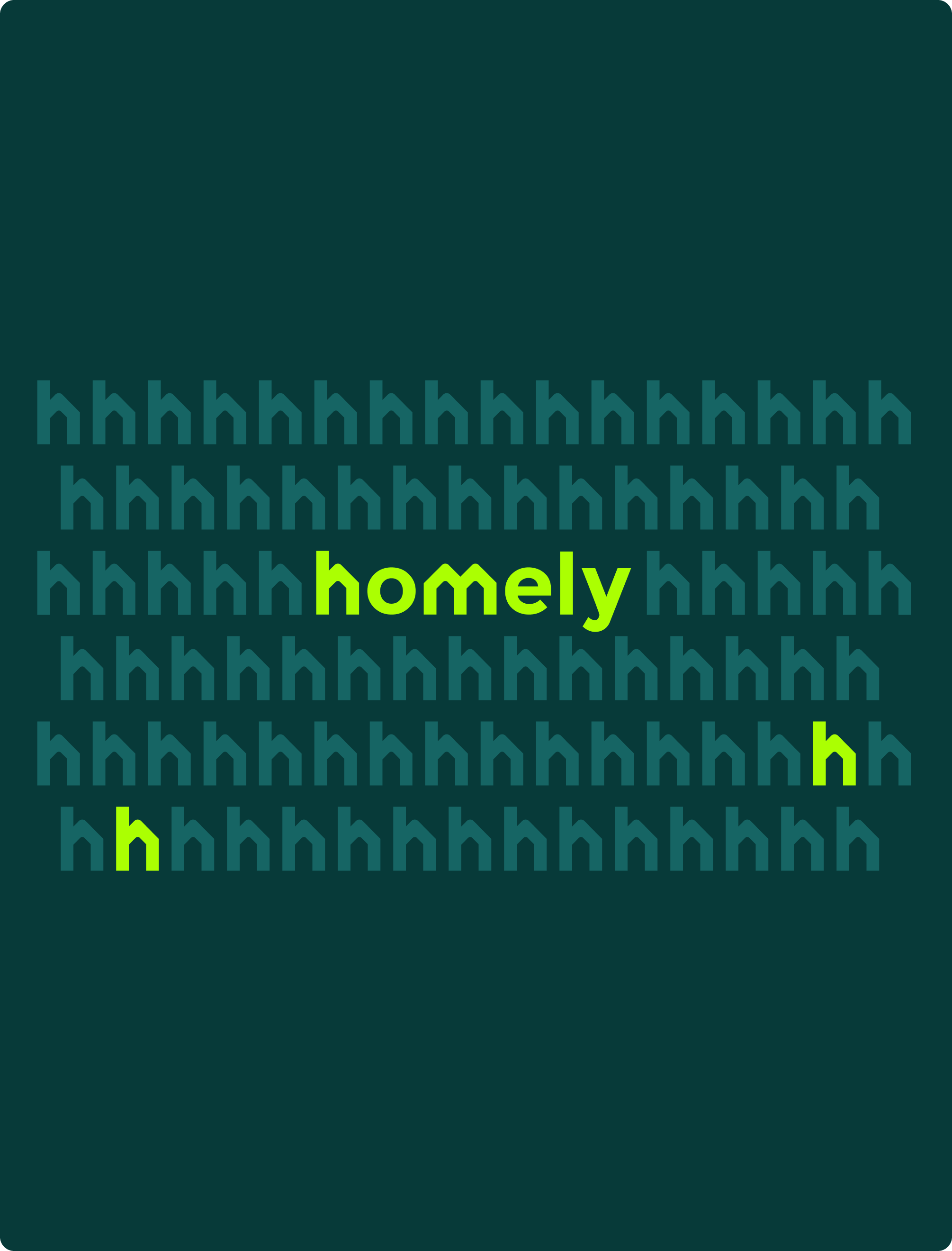
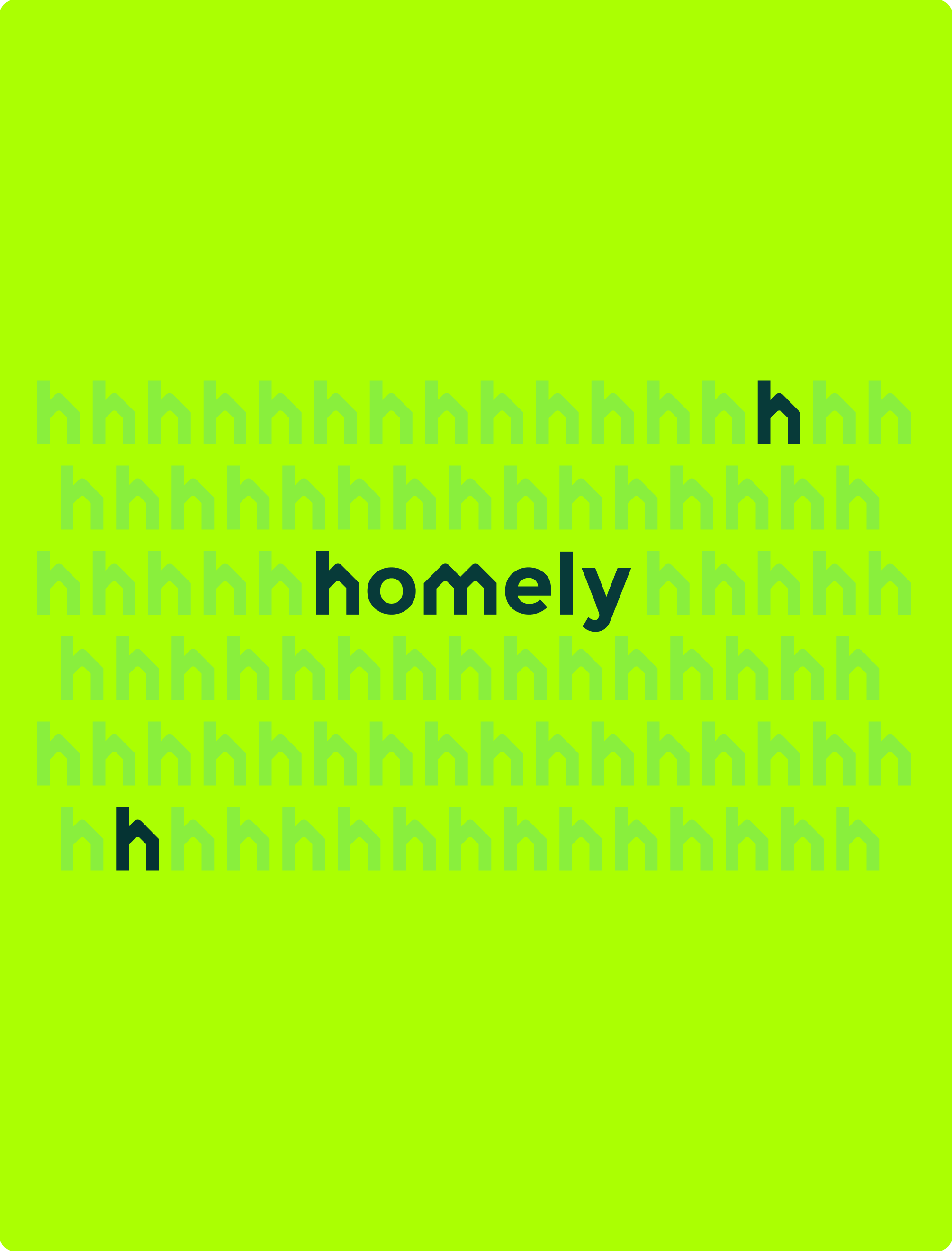
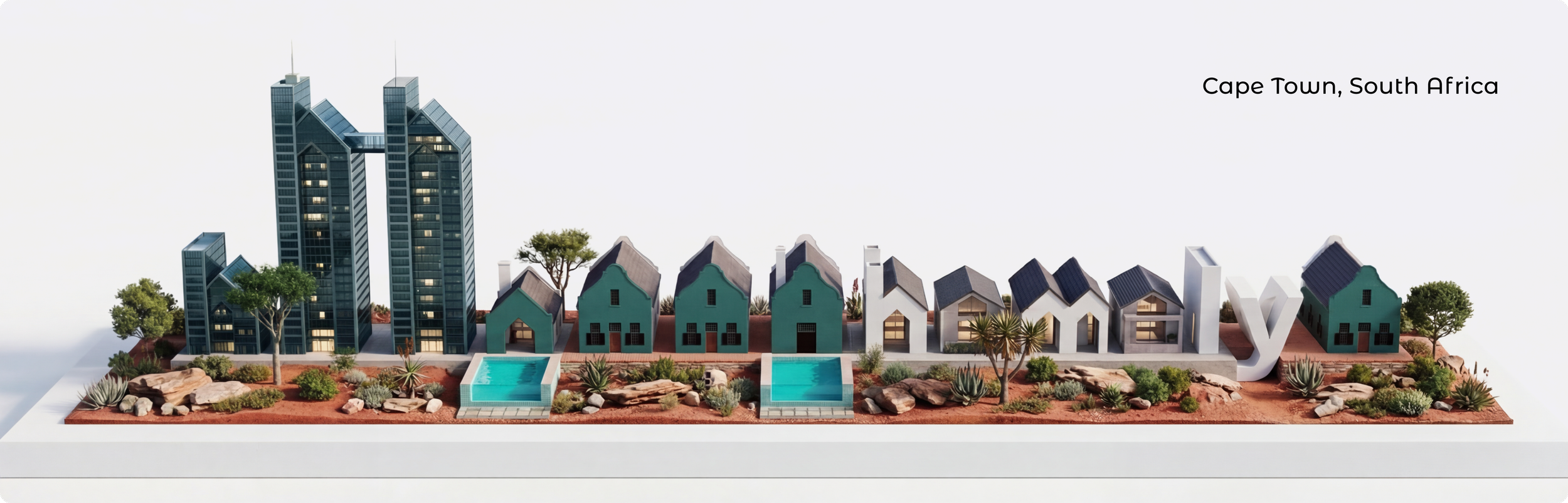
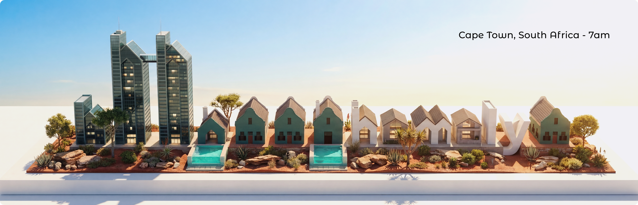
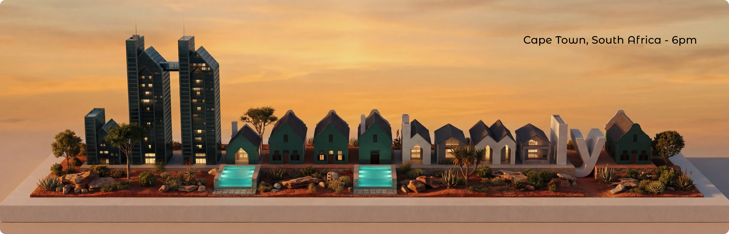
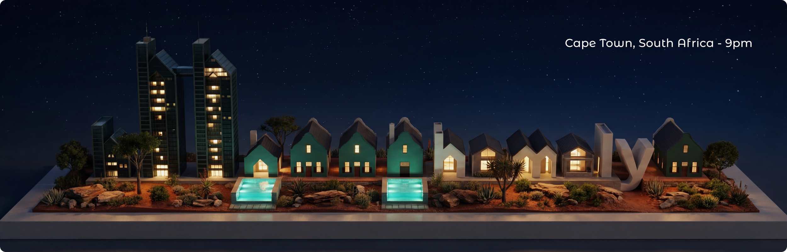
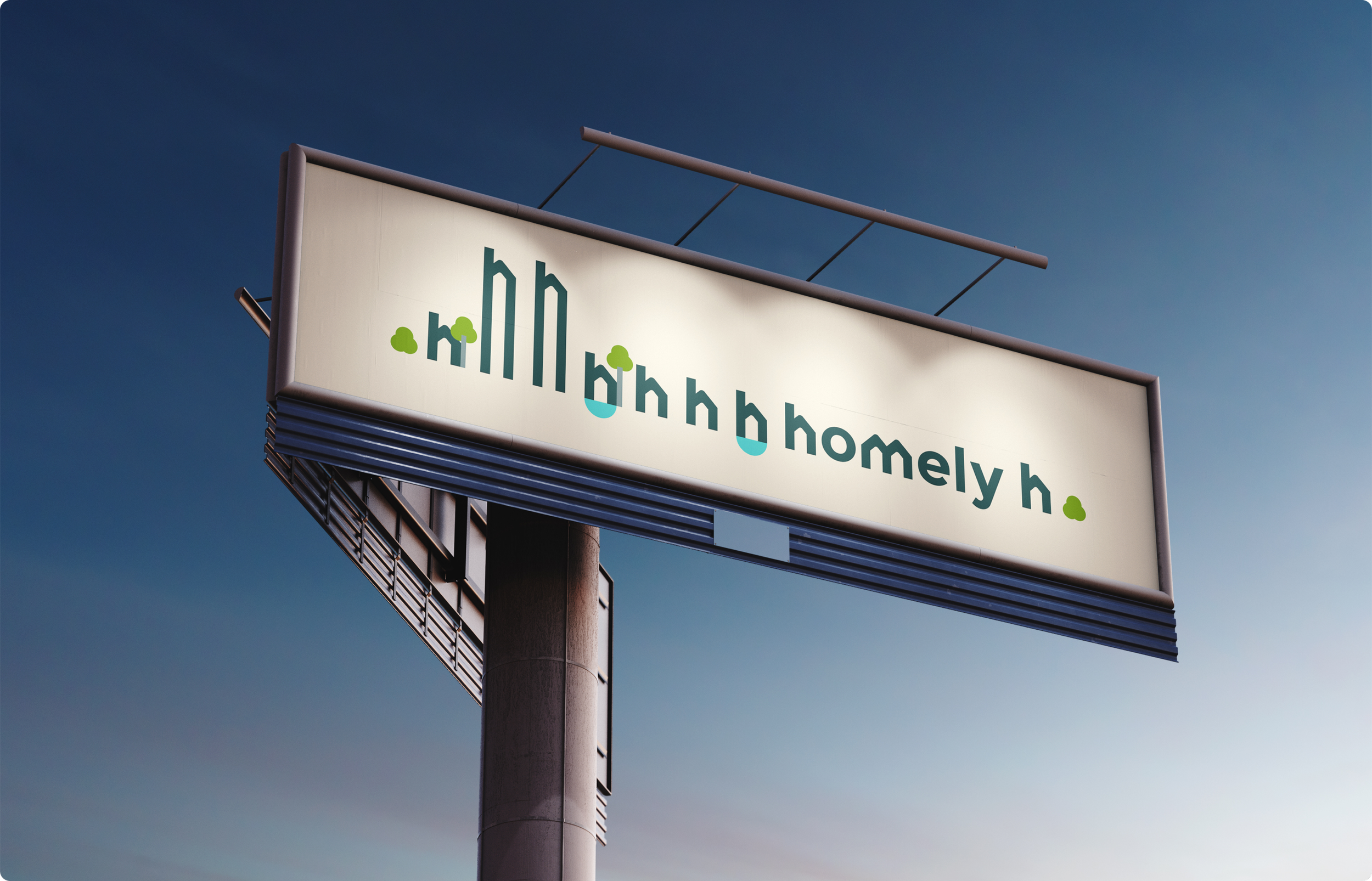
h for homely
In a category crowded with expected property signals, I wanted to avoid the obvious and create something more distinctive. The house-shaped “h” gave Homely an asset that felt immediate, recognisable and scalable.
The house is not a symbol added to the brand, it is built into the brand. That shift makes the identity more distinctive, more memorable and far less generic.
More than a logo, it became the foundation of the system. A device that could carry across product, brand and campaign, building consistency, recognition and a clearer challenger presence in market.


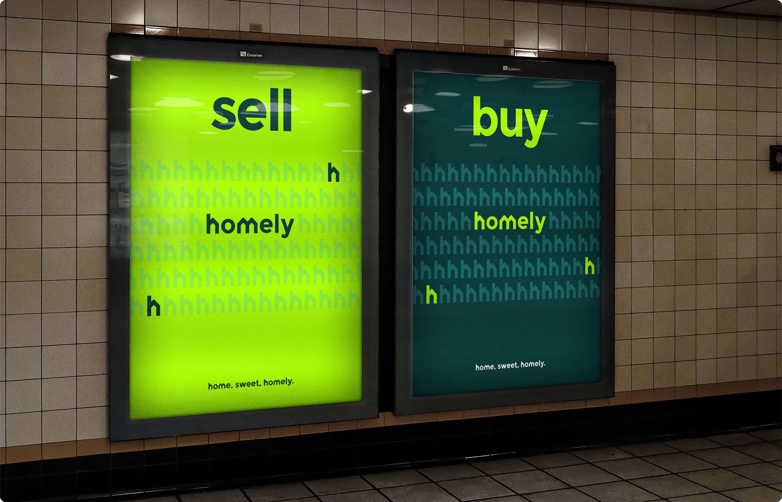
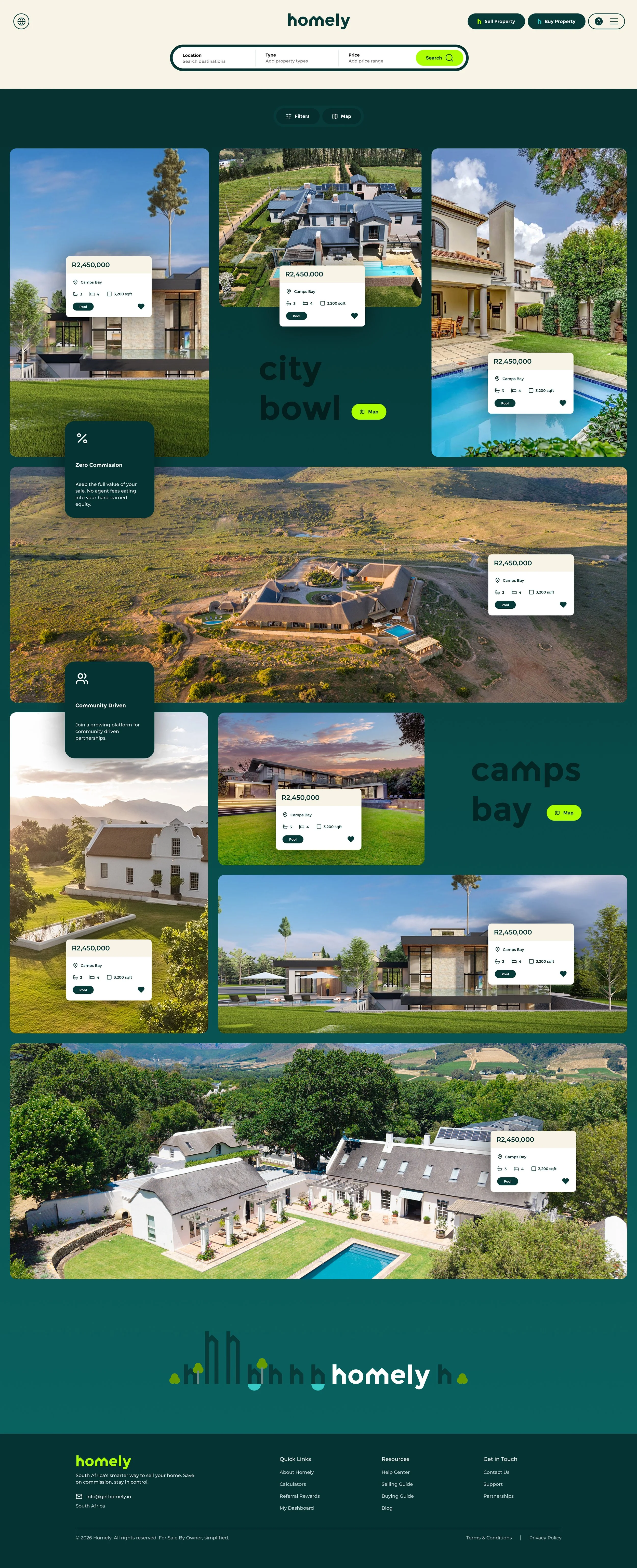
A System Shaped by Place
The houses were designed as a living system that could evolve across regions, audiences and moments, giving Homely the flexibility to feel local without losing consistency. The houses can change in form, colour and composition to reflect different communities.
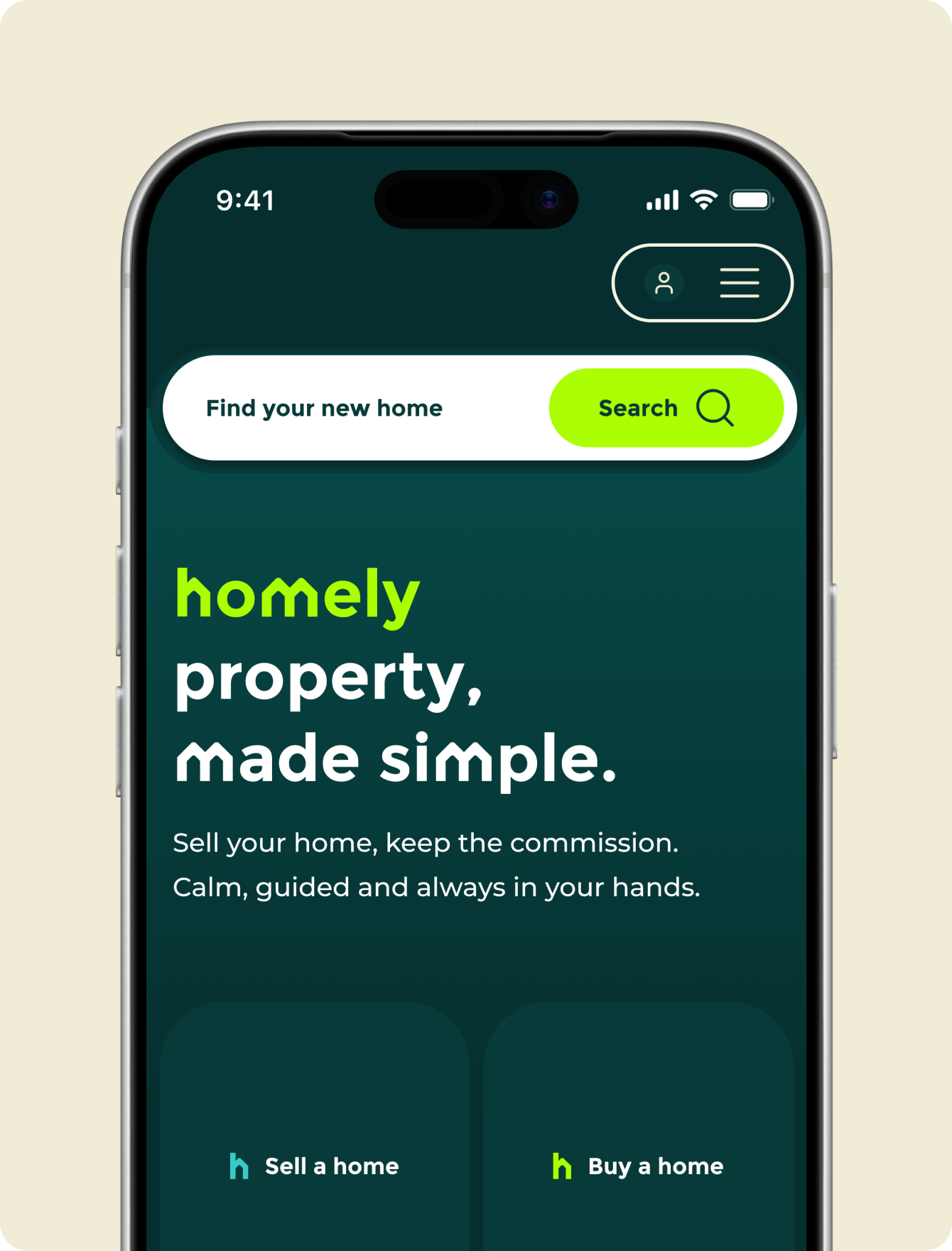
Designed To Guide, Not Overwhelm.
Colour was used to create rhythm, focus and recognition across the site. Paired with a clear hierarchy, it helped shape a digital experience that felt bold, intuitive and easy to move through.

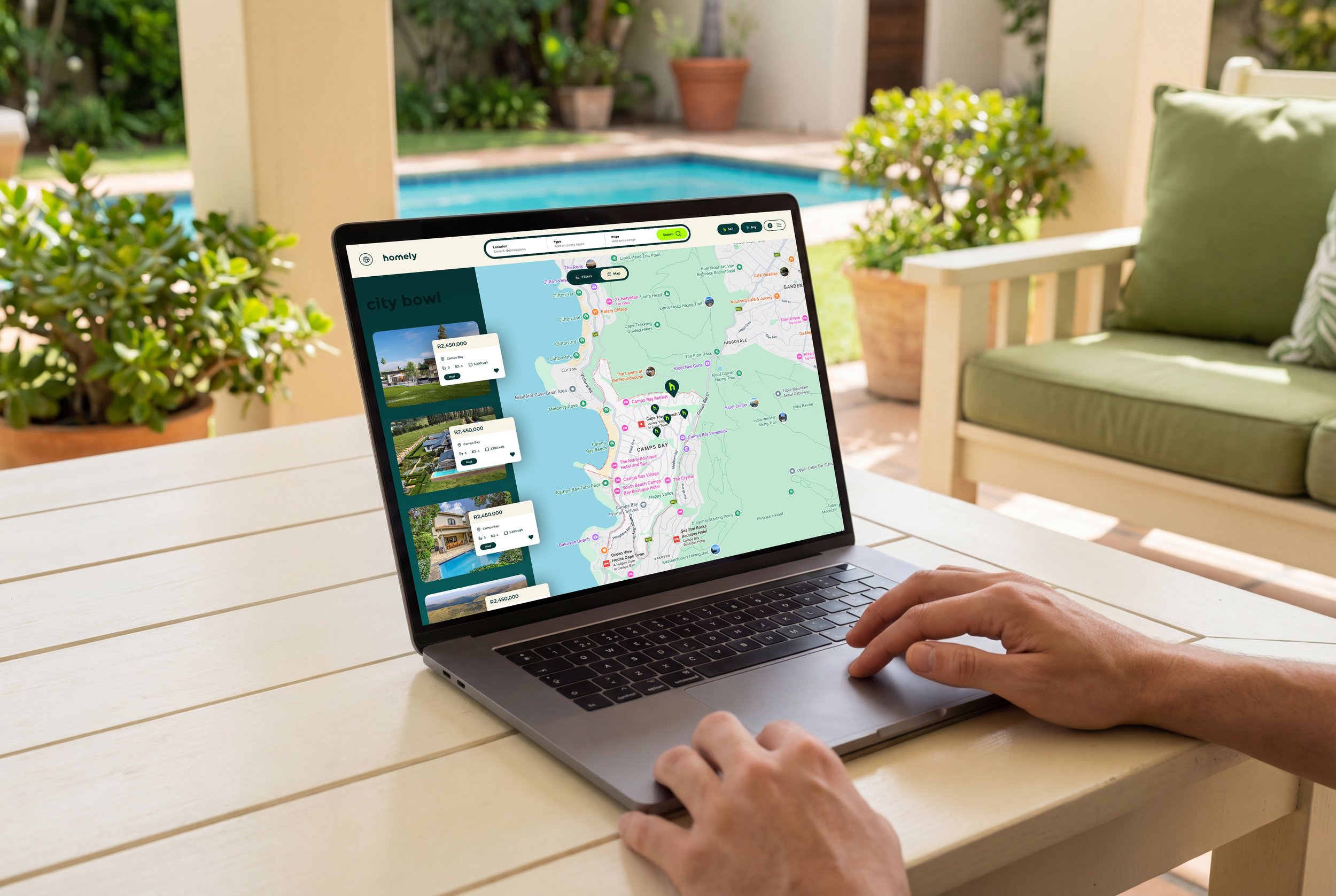


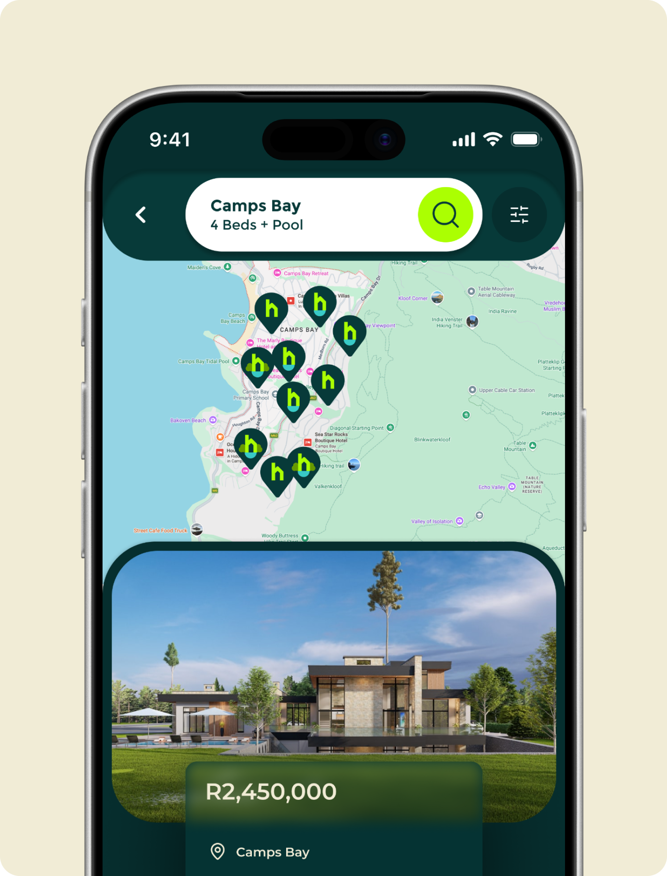
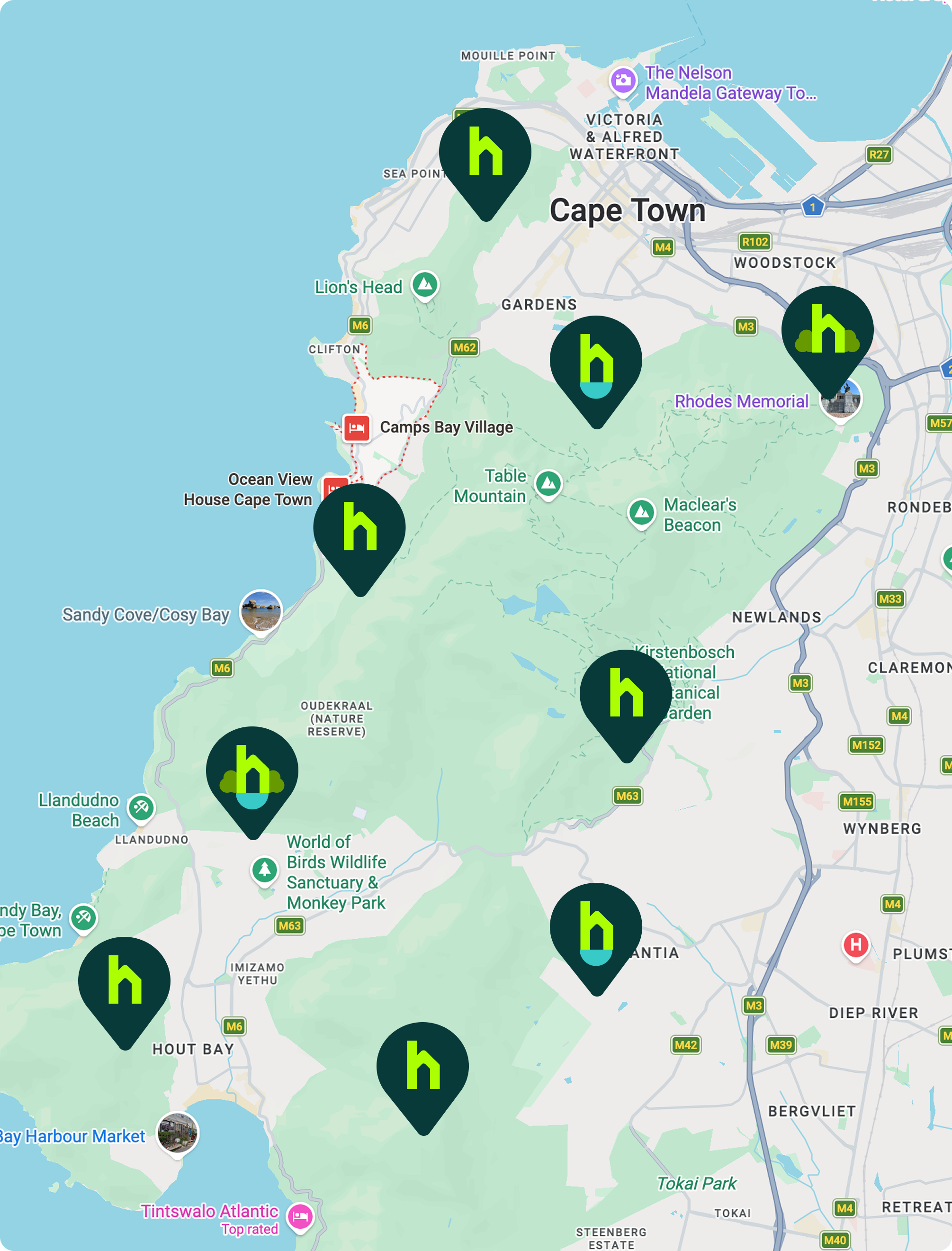
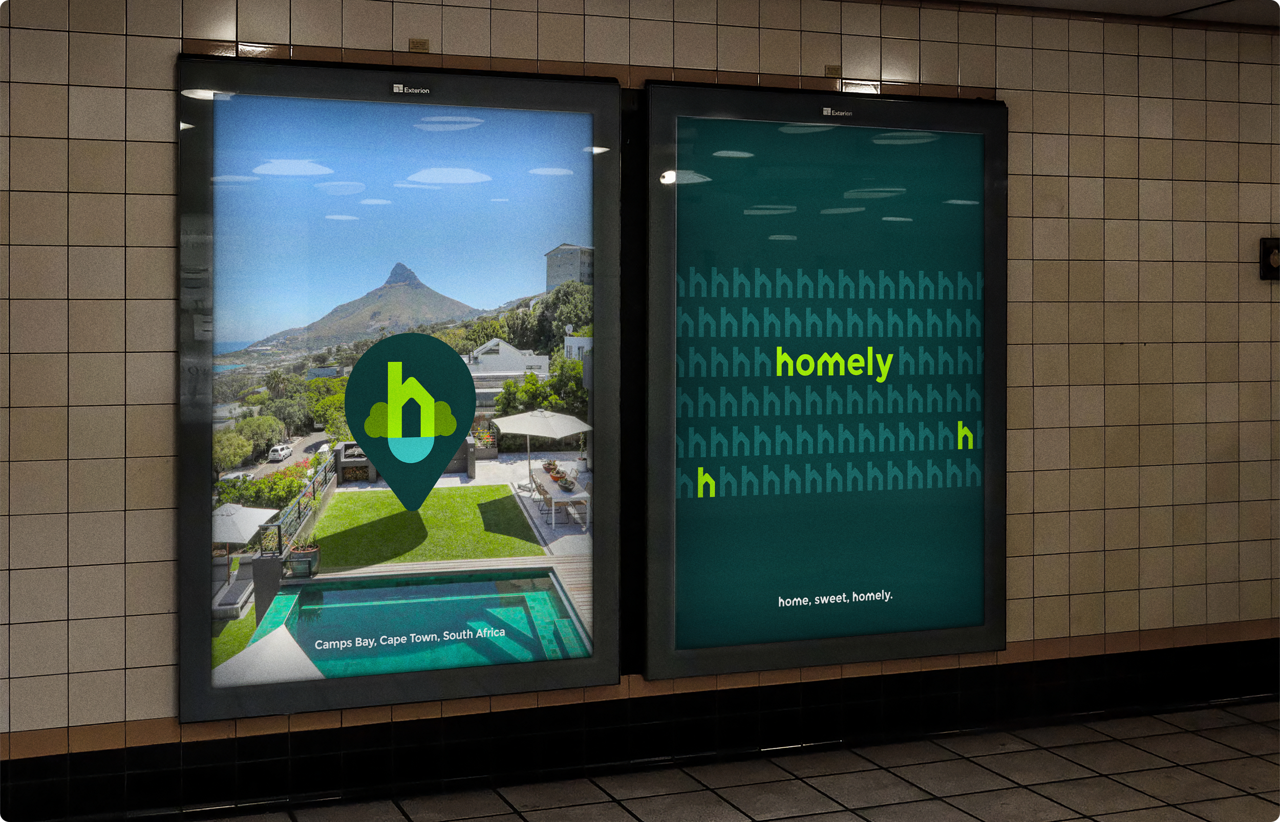
Putting The “H” On The Map
The map pin system extends the “h” into location, using subtle variations like pool and non-pool states to add useful meaning without losing consistency. It keeps the experience recognisably Homely while making the interface clearer, smarter and more informative.