
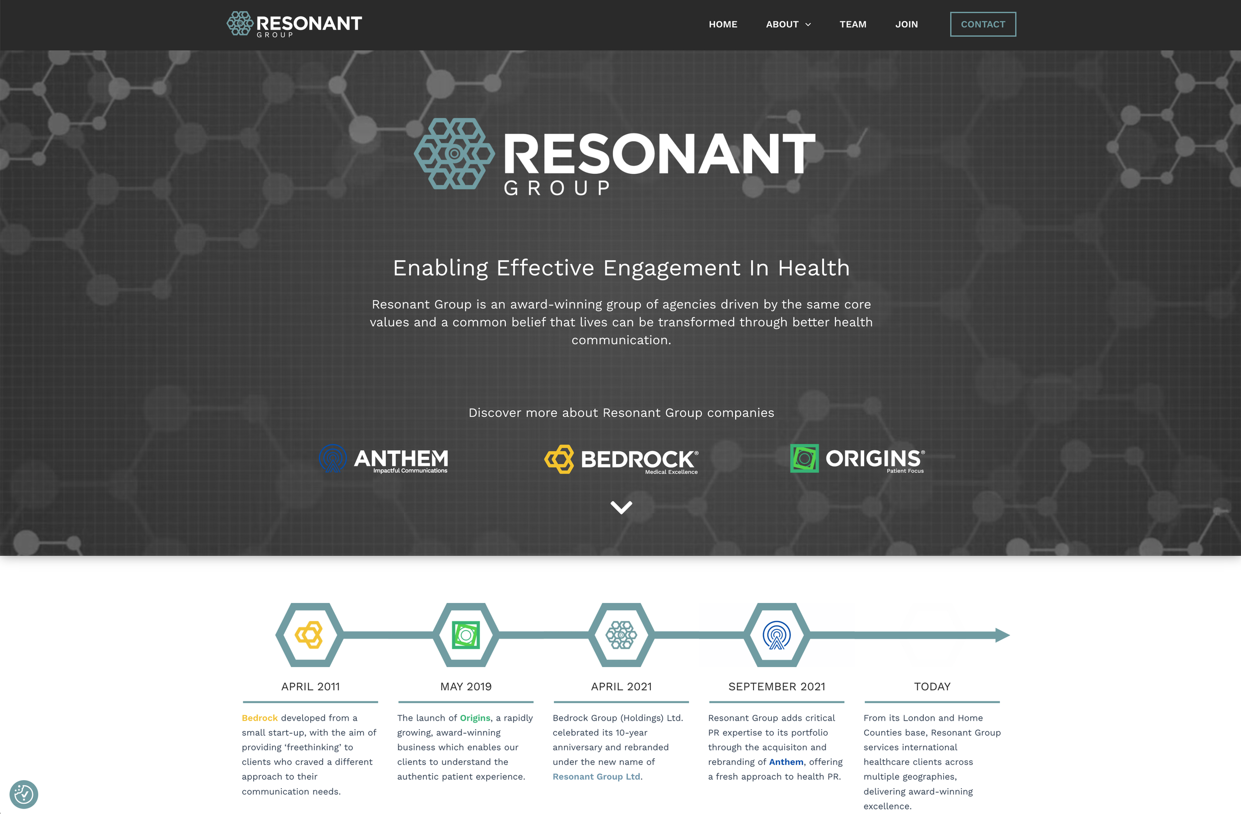
Creating a Bold New Brand System for Growth
Client
Resonant Group
Agency
Paper Wall
My Role
Creative Director/Design Director IC
Skills Used
Creative Direction
Design Direction
Brand Strategy
Brand Design
Presenting to C-Suite
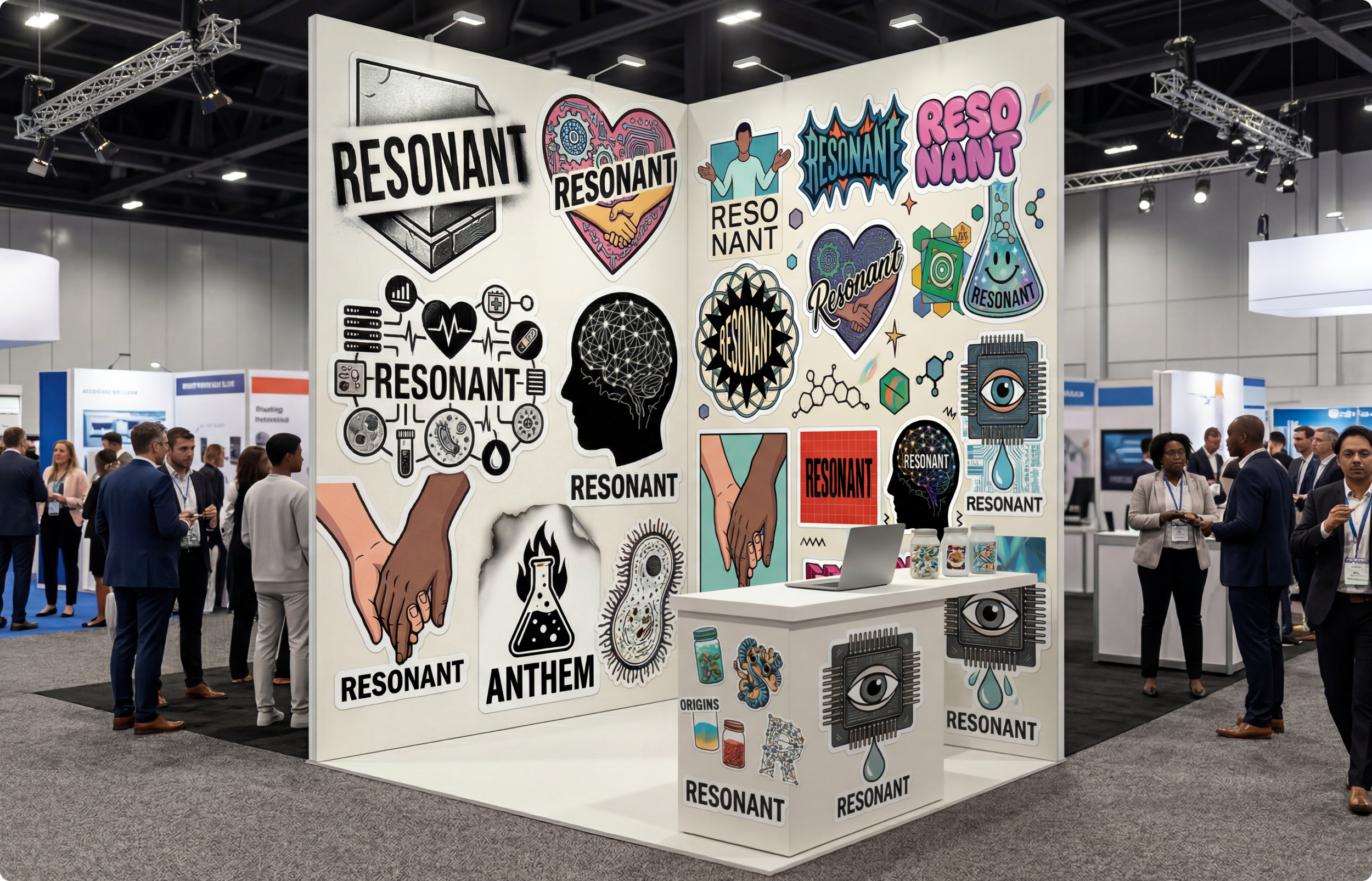
Exhibition Design
Design
UX/UI Design
Illustration
Animation
The Challenge
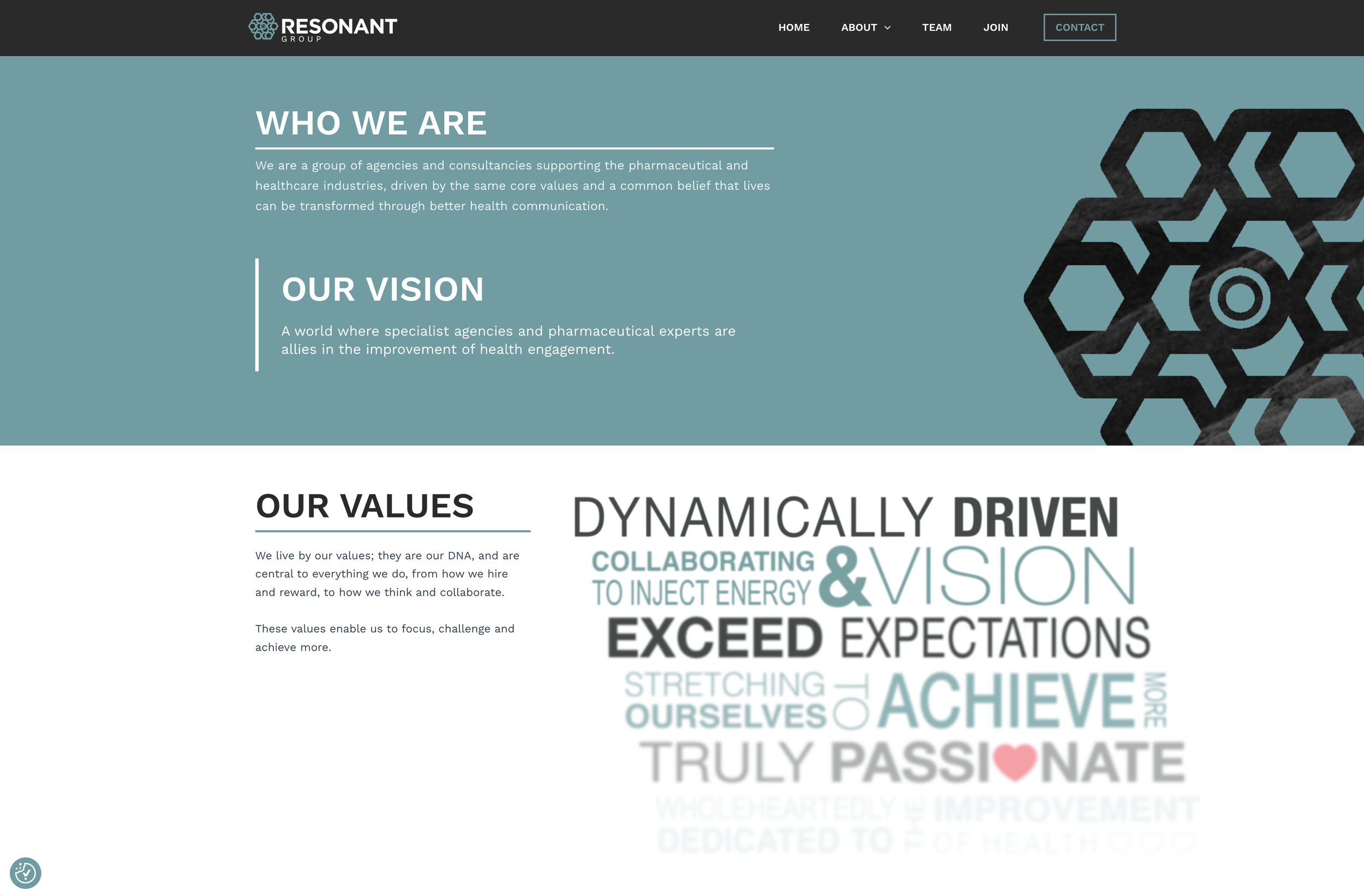
Resonant needed to evolve its brand to reflect a sharper strategic proposition while standing apart from faceless healthcare networks through a more distinctive and human presence.
The Solution
I led the creative evolution of the brand, developing a culture-forward visual system that translated Resonant’s revised positioning into something more confident, ownable and scalable. This included shaping the creative platform and applying it across priority touchpoints, from conference stand design and credentials presentations to web, illustration, motion and core brand assets.
The Impact
The project gave Resonant a clearer and more differentiated market presence. The new system created greater consistency across digital, physical and presentation touchpoints, while helping the group communicate its expertise with more confidence and authority. Crucially, it turned an evolving proposition into a tangible brand experience that could support growth, business development and future roll-out.
Resonant
Teal
1FAEC1
Origins
Green
13B16A
Bedrock
Orange
F7A625
Anthem
Blue
2758EC
Black
Core
000000
White
Core
FFFFFF
The Old
The previous design had been built up over time without a clear system. Colours across the brands felt disconnected, logo weights were inconsistent, and the group logo was used more as decoration than with purpose. It talked loudly about brand values, but did not say anything memorable or distinctive. The result was a site that lacked personality and a clear point of view.


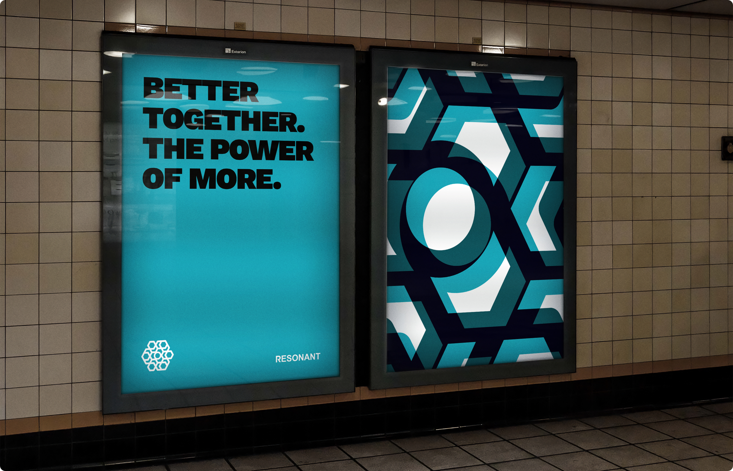
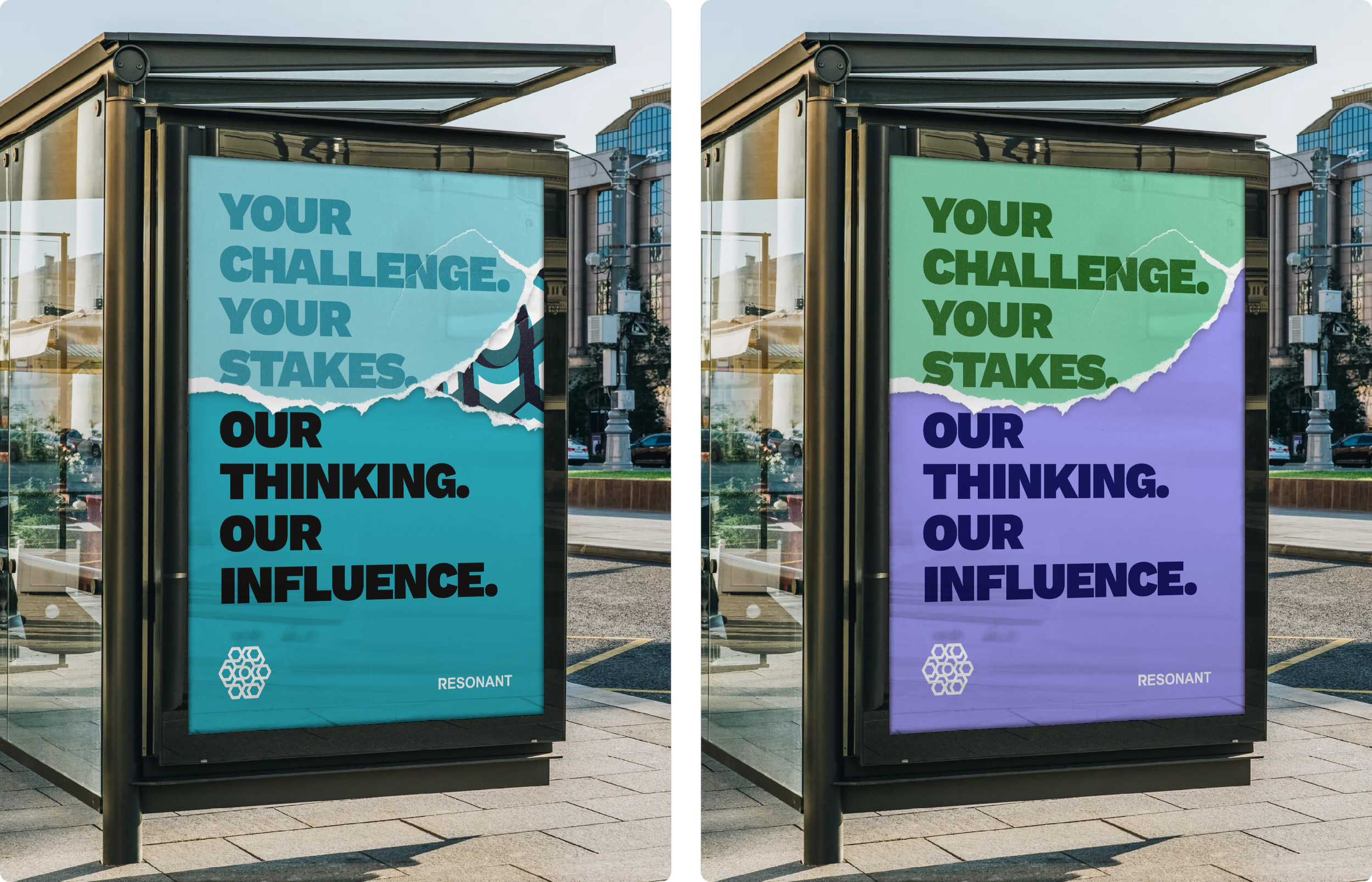
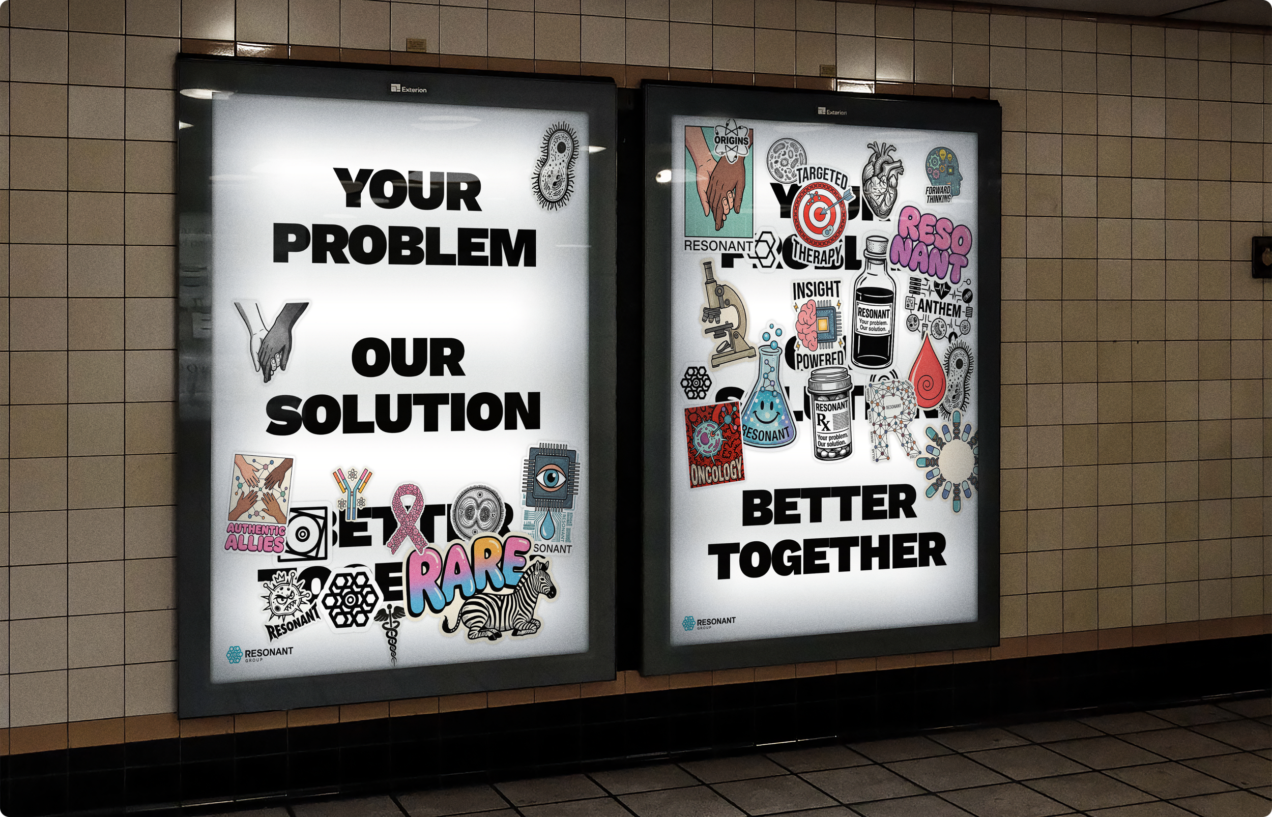
Your + Our = More
A bold, modular system that positions Resonant as a partner that adds capability, not complexity. By pairing the client’s challenge with Resonant’s thinking, influence and delivery, the route makes the offer feel clear, credible and commercially sharp.
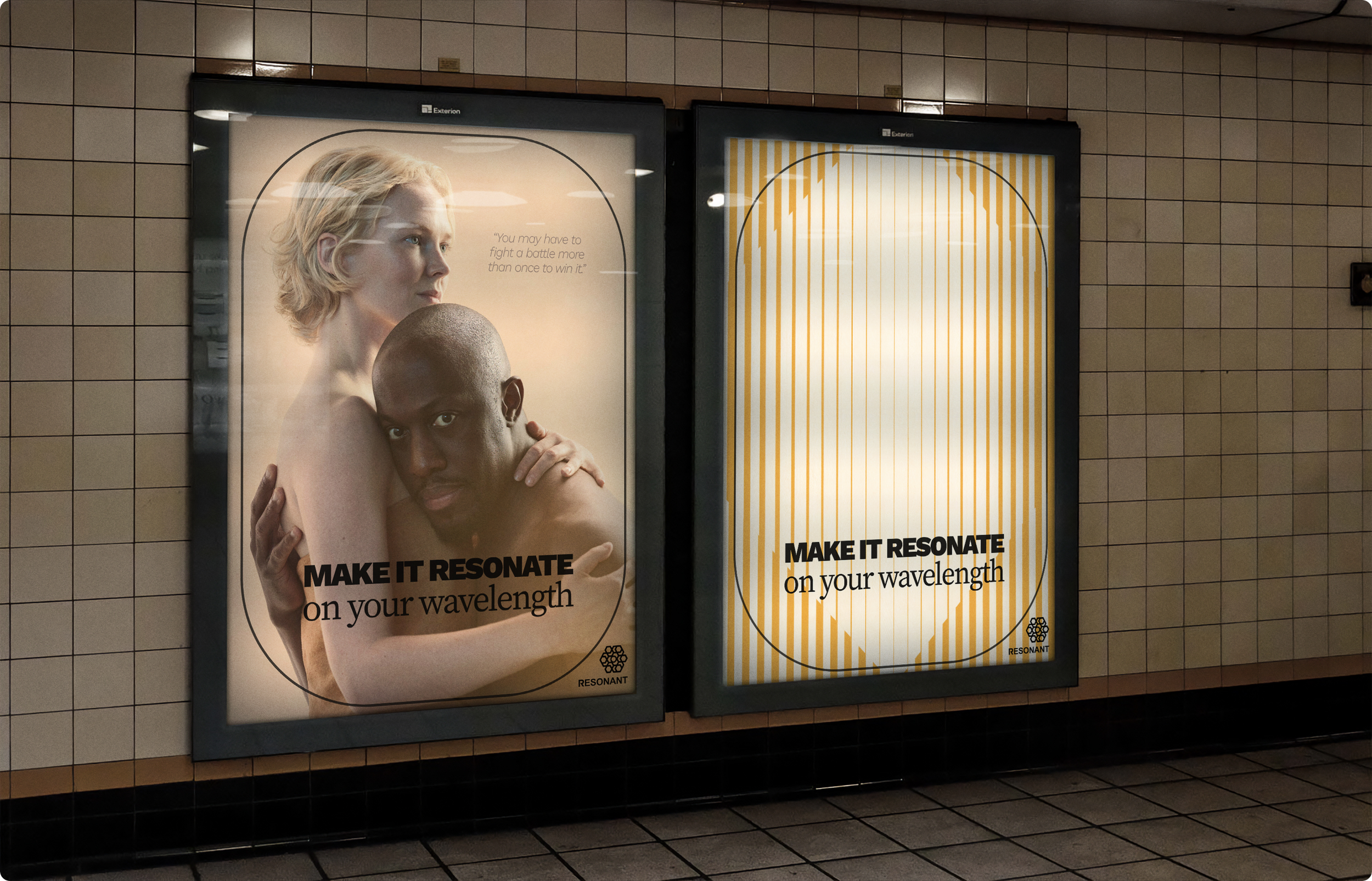
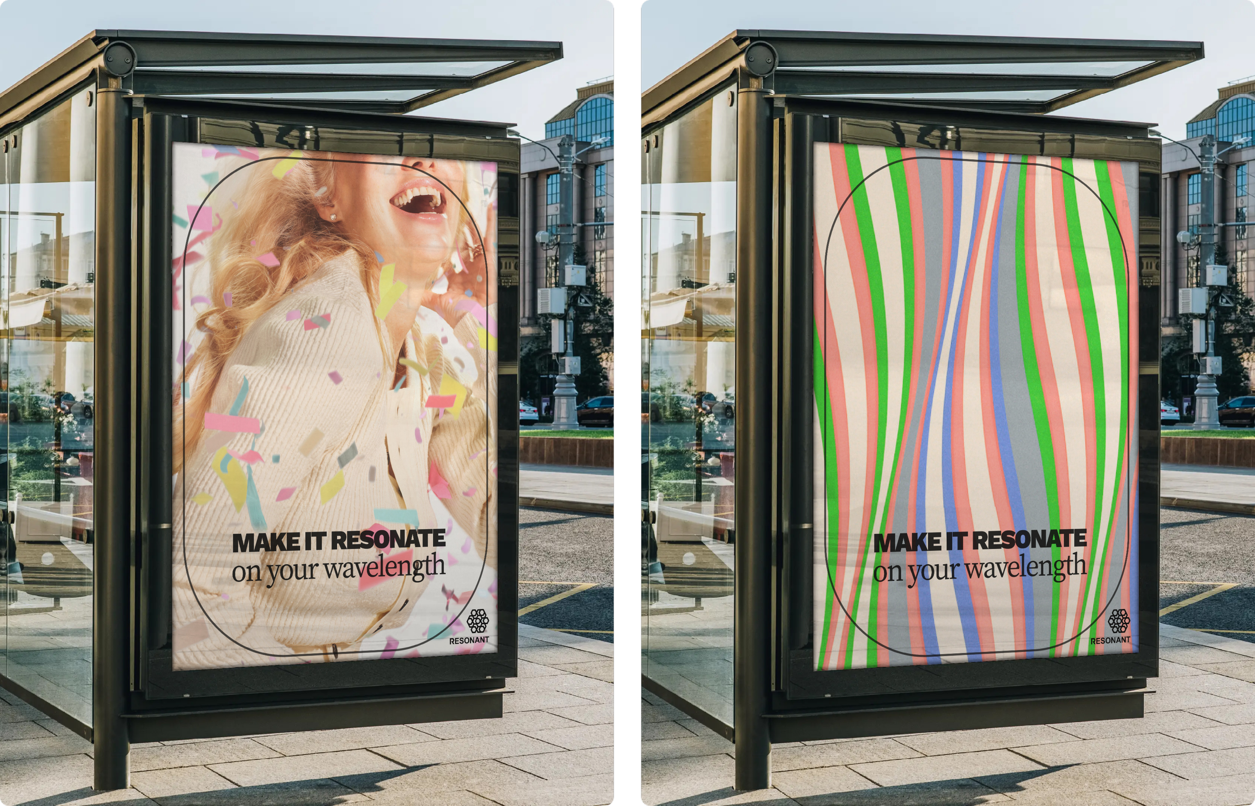
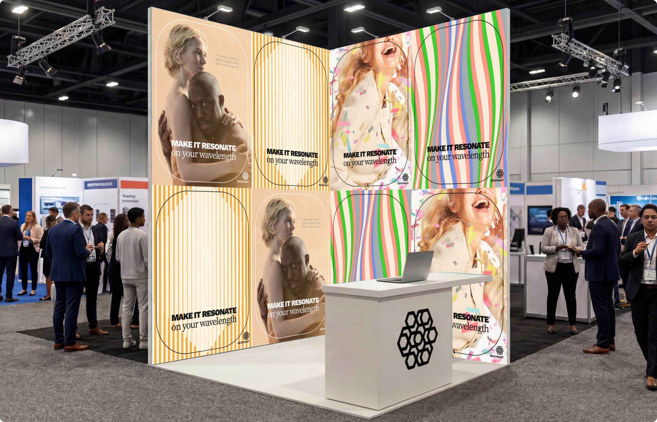
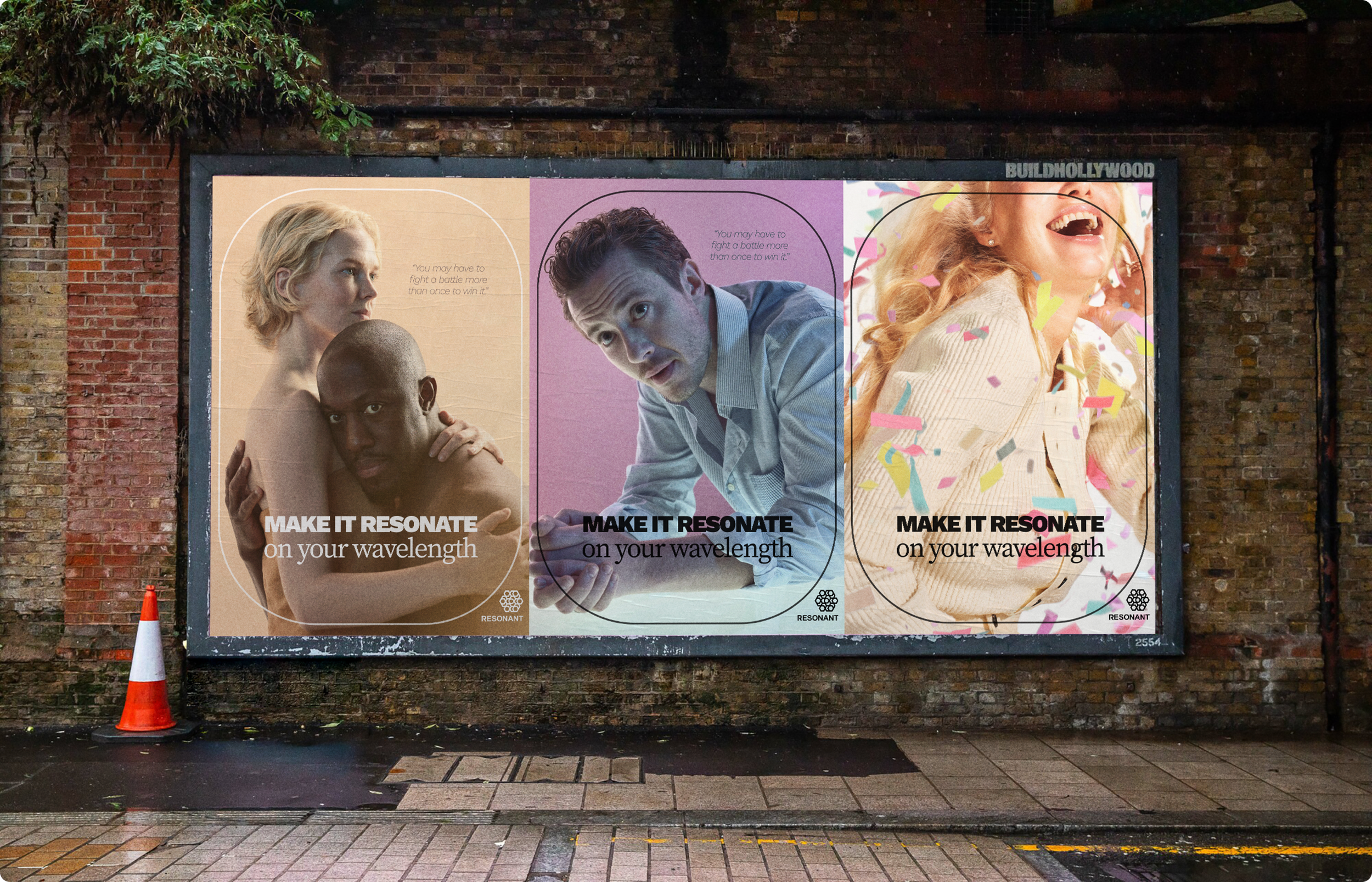
Make It Resonate
A human-led route built around emotionally driven photography, designed to express connection, relevance and range. Soundwave-inspired art brings frequency, movement and energy, creating a recognisable signature without overpowering the content.
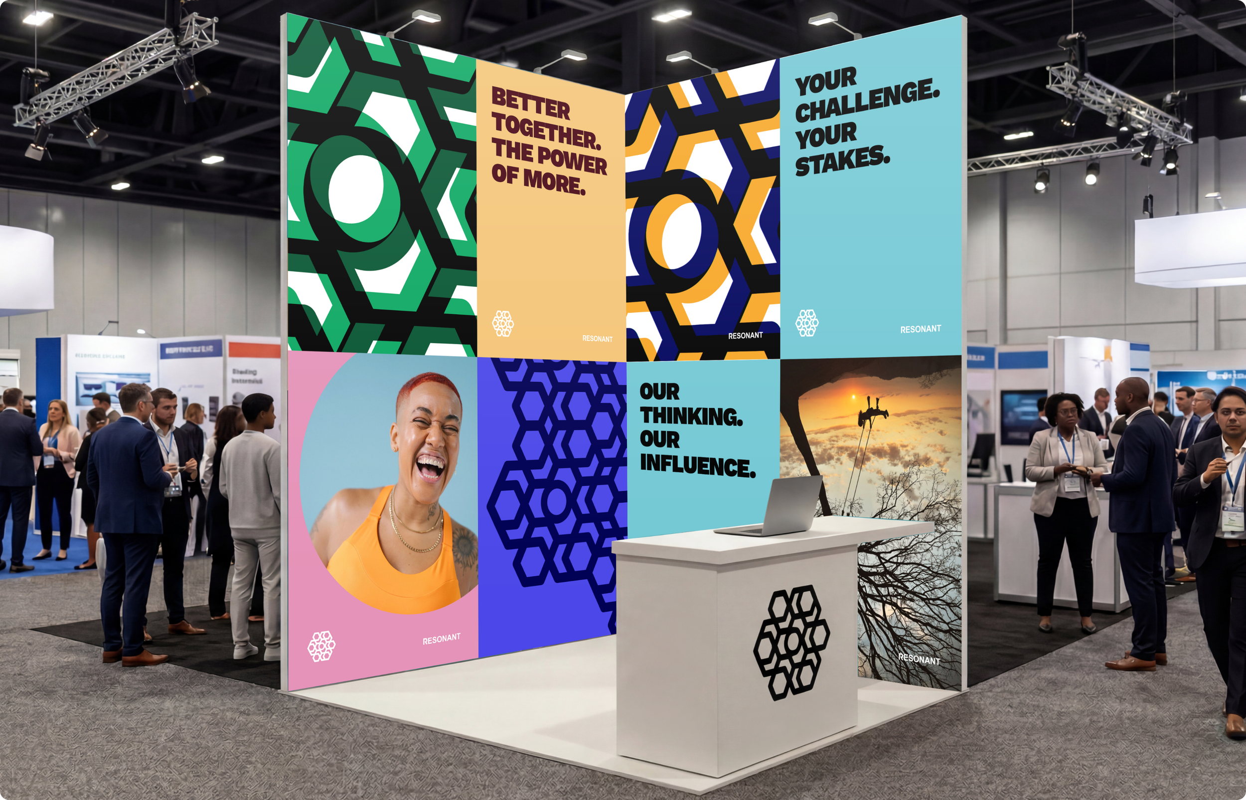
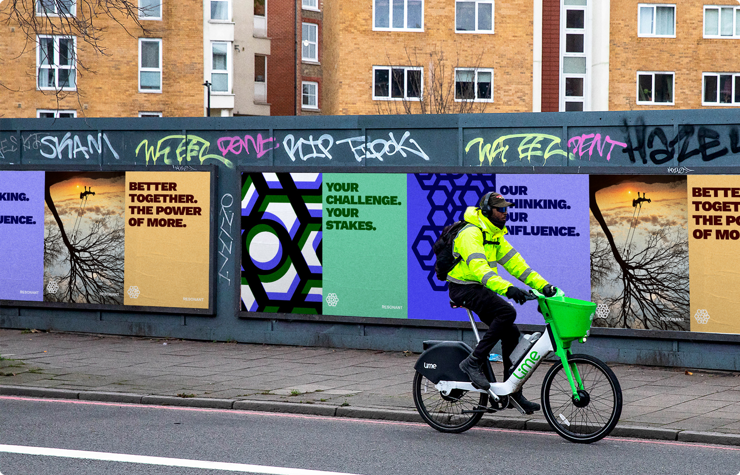
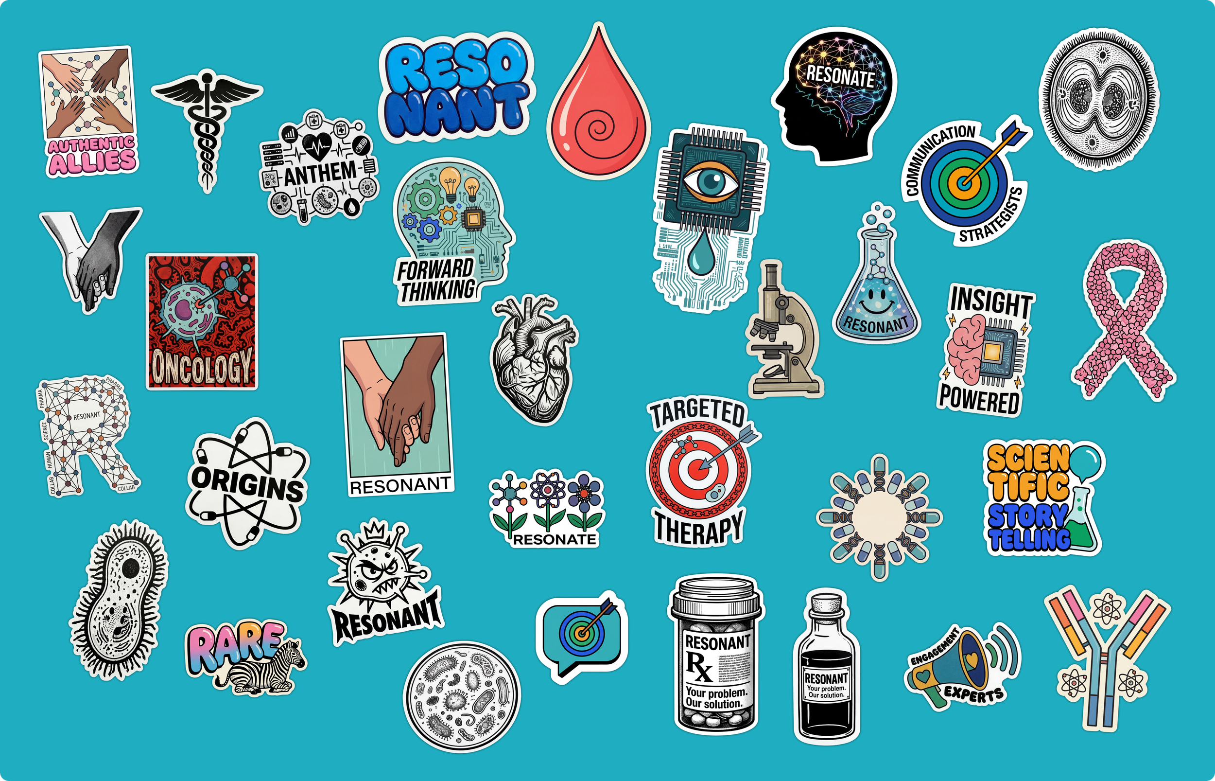
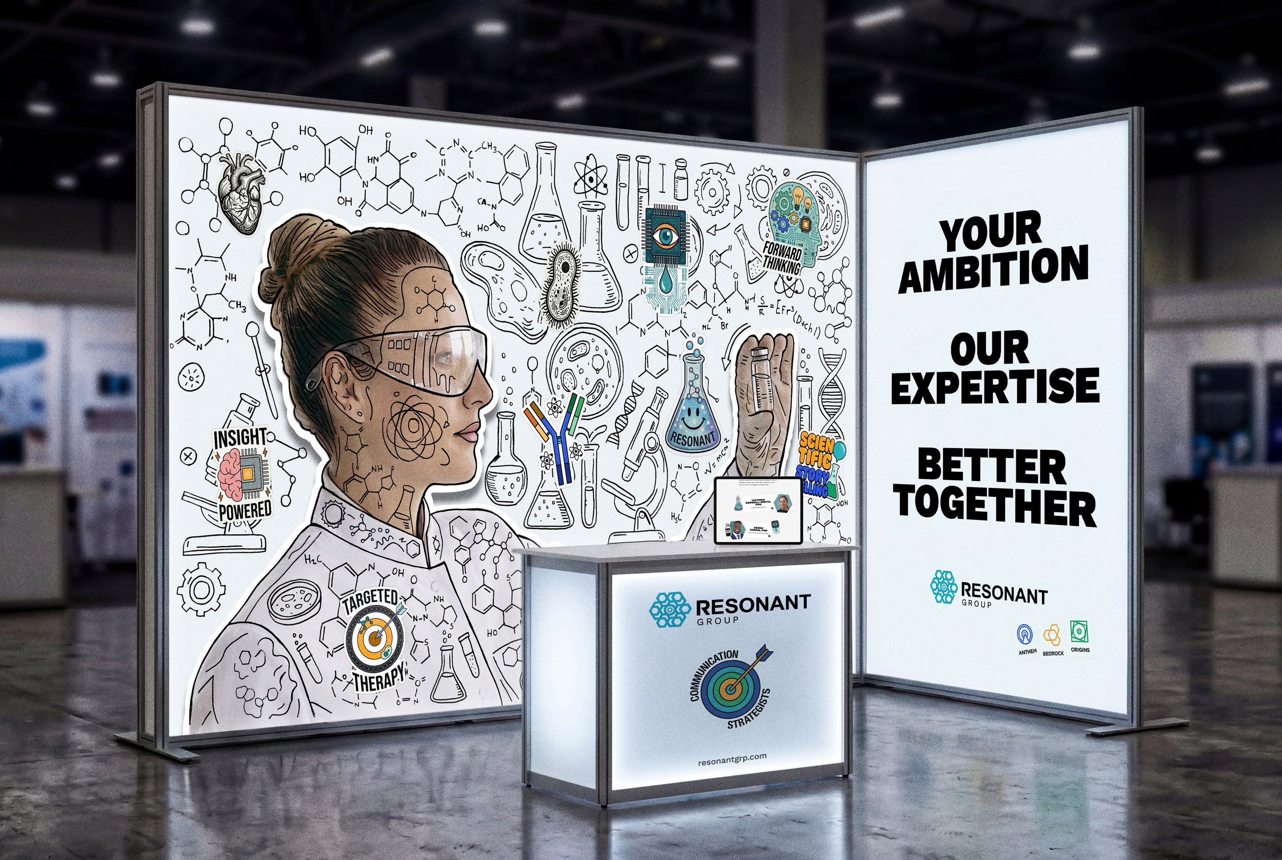
Built to Stand Out
(The Chosen Direction)
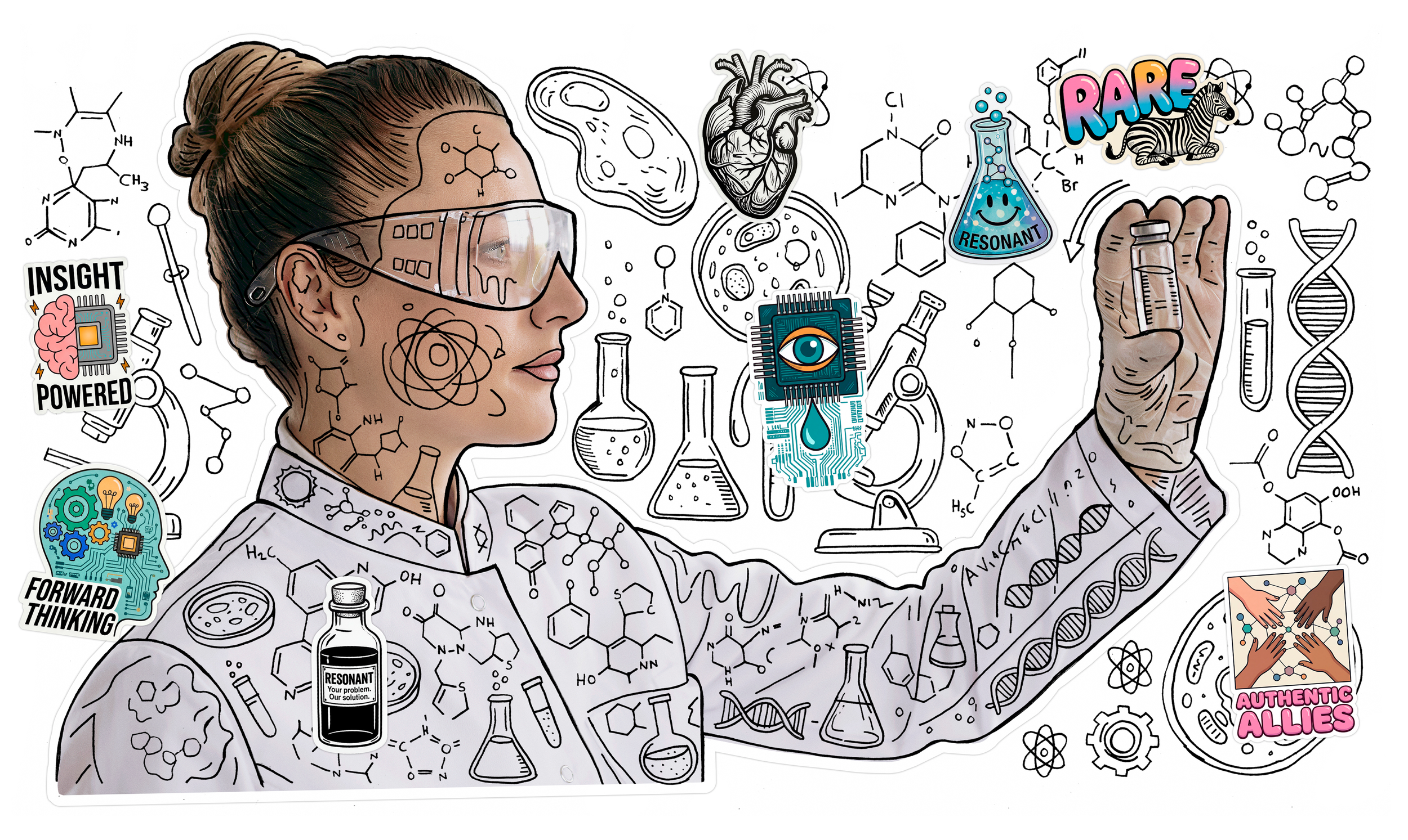
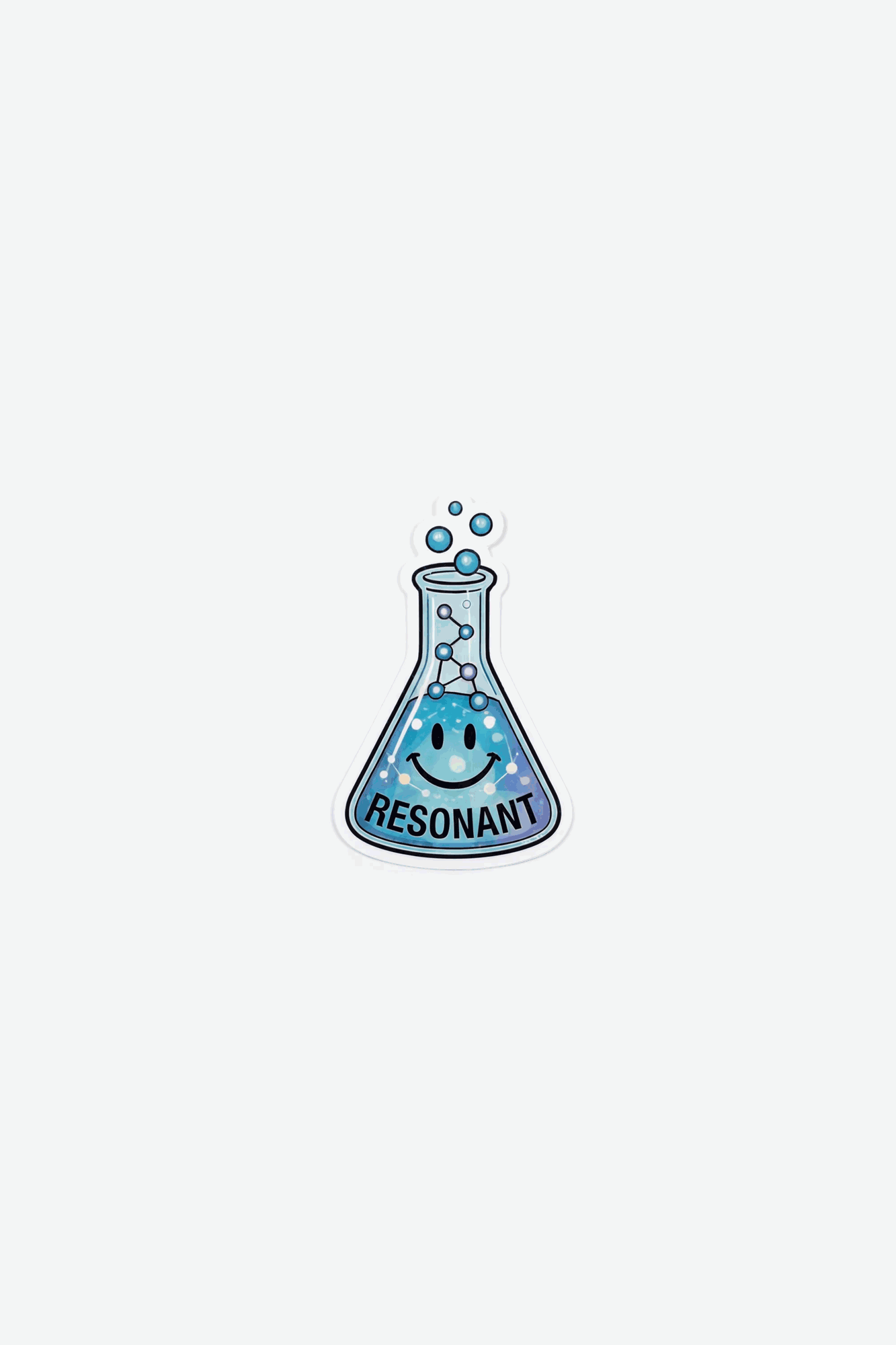
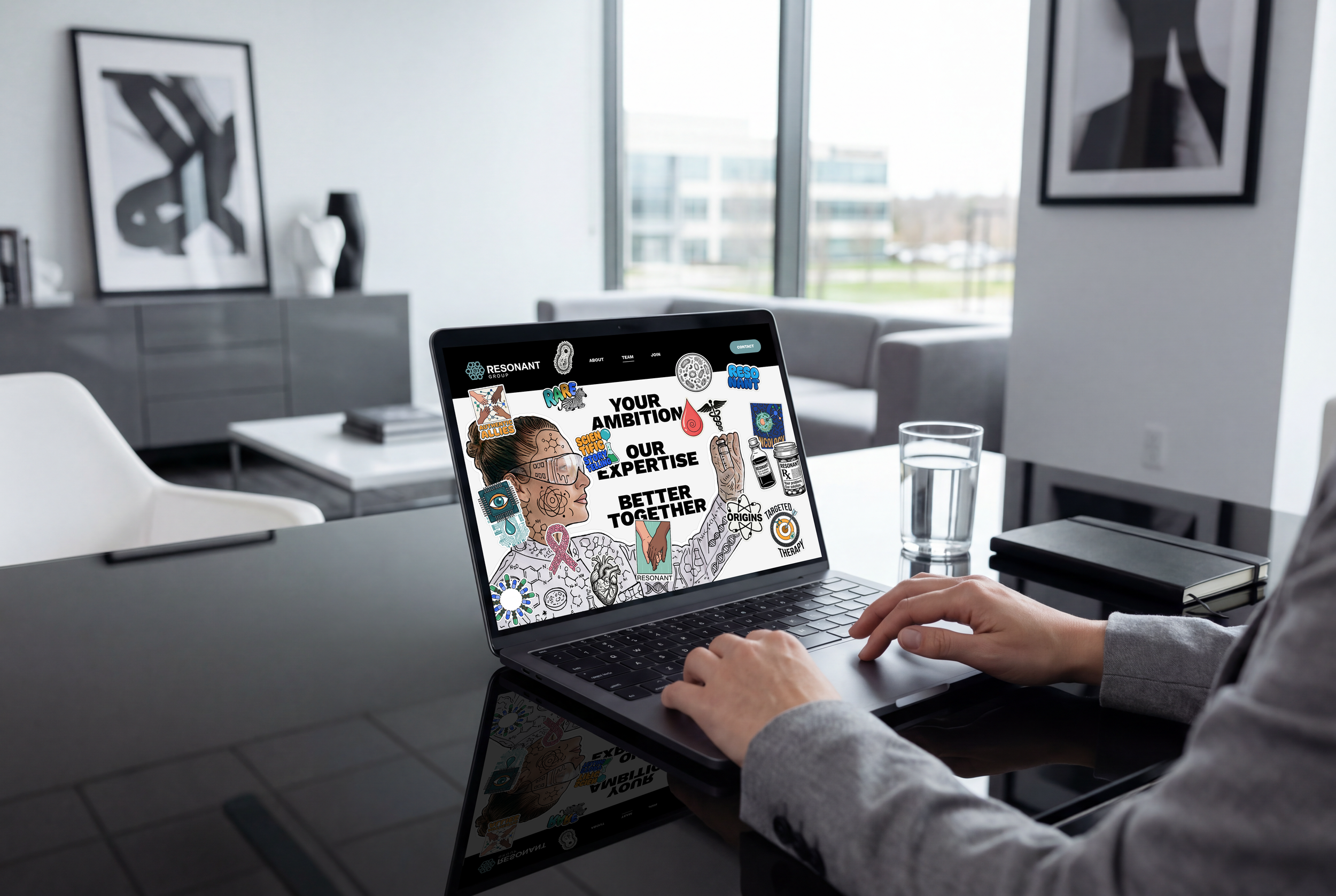
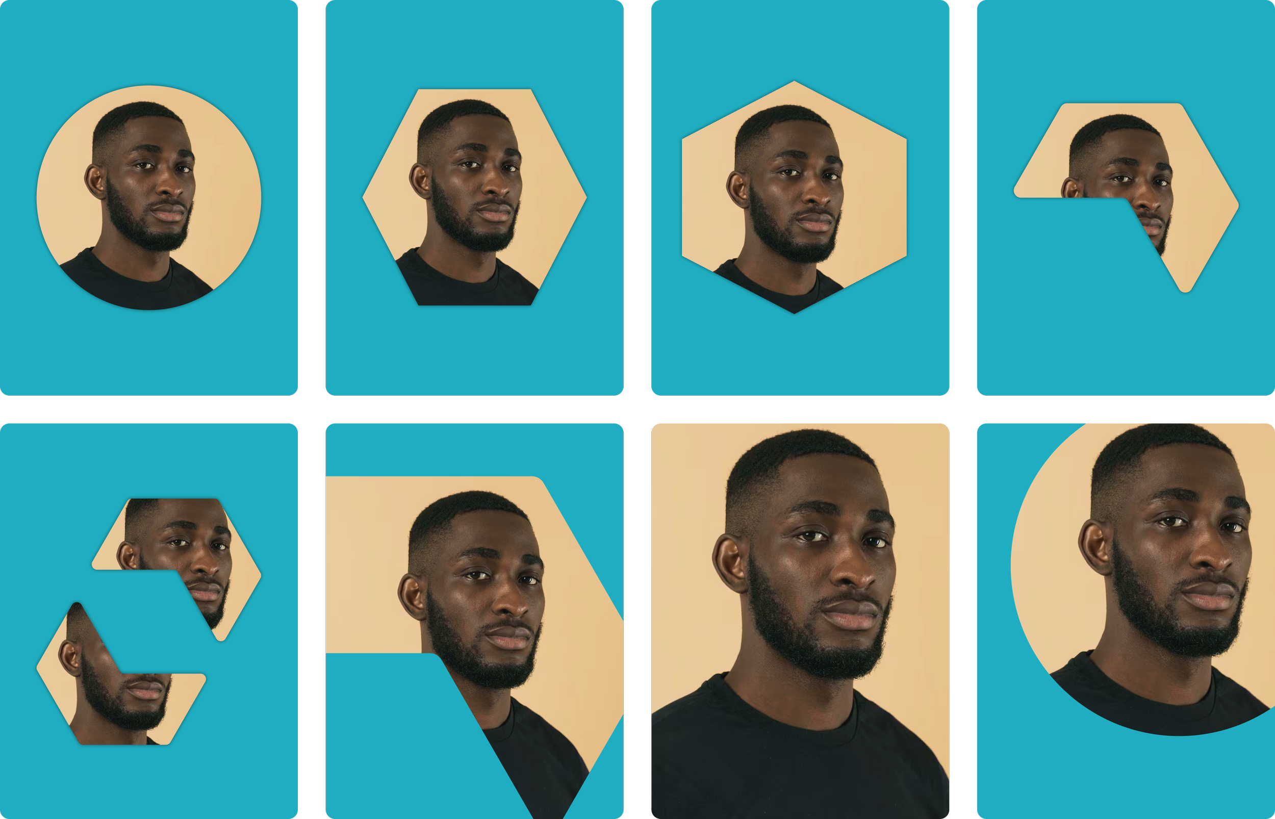
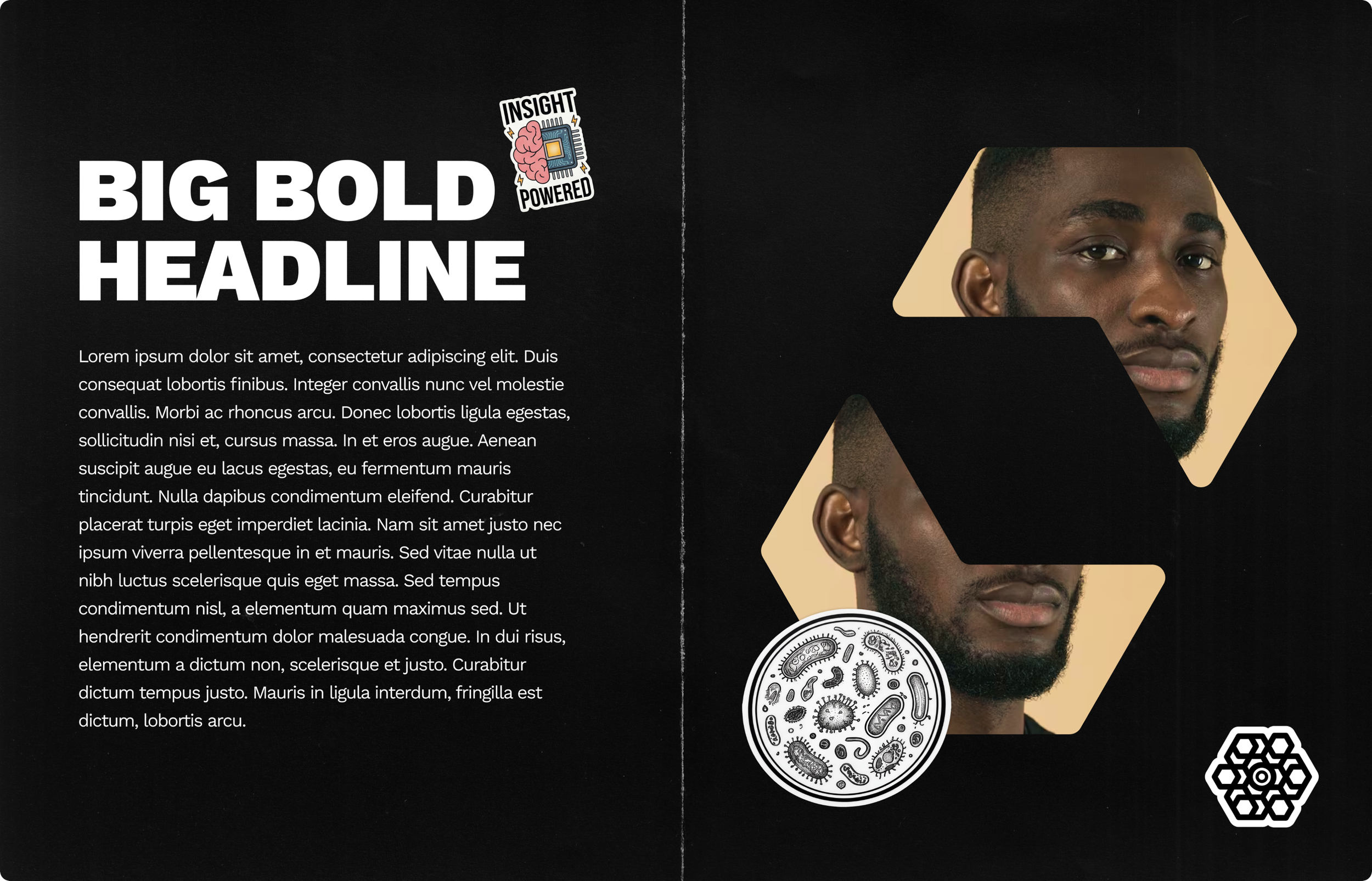
A bold collage-led system designed to make Resonant feel culturally current and instantly recognisable. Layers of stickers, illustration and graphic fragments create depth, energy and personality, turning engagement into something visible and memorable.
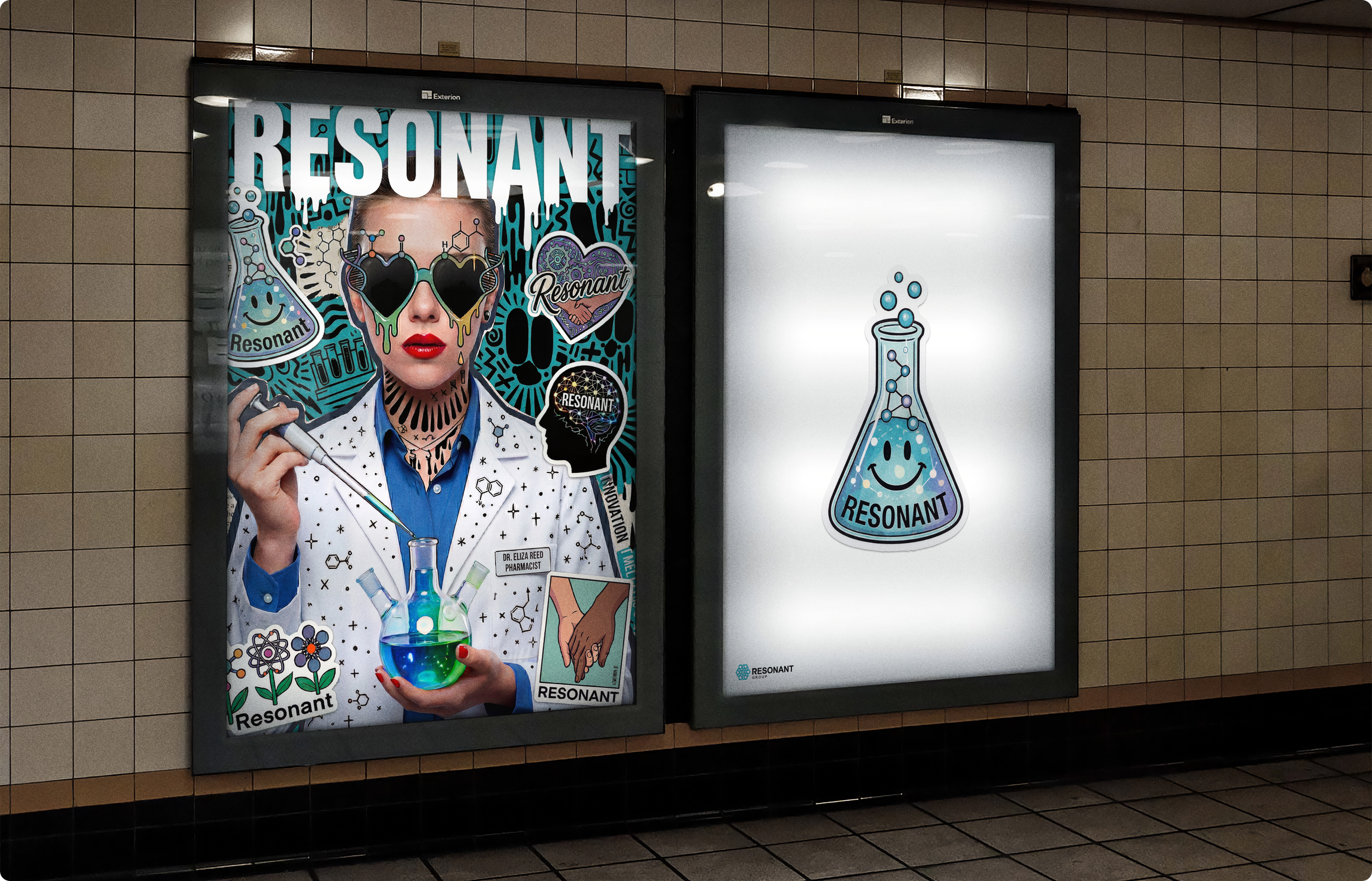
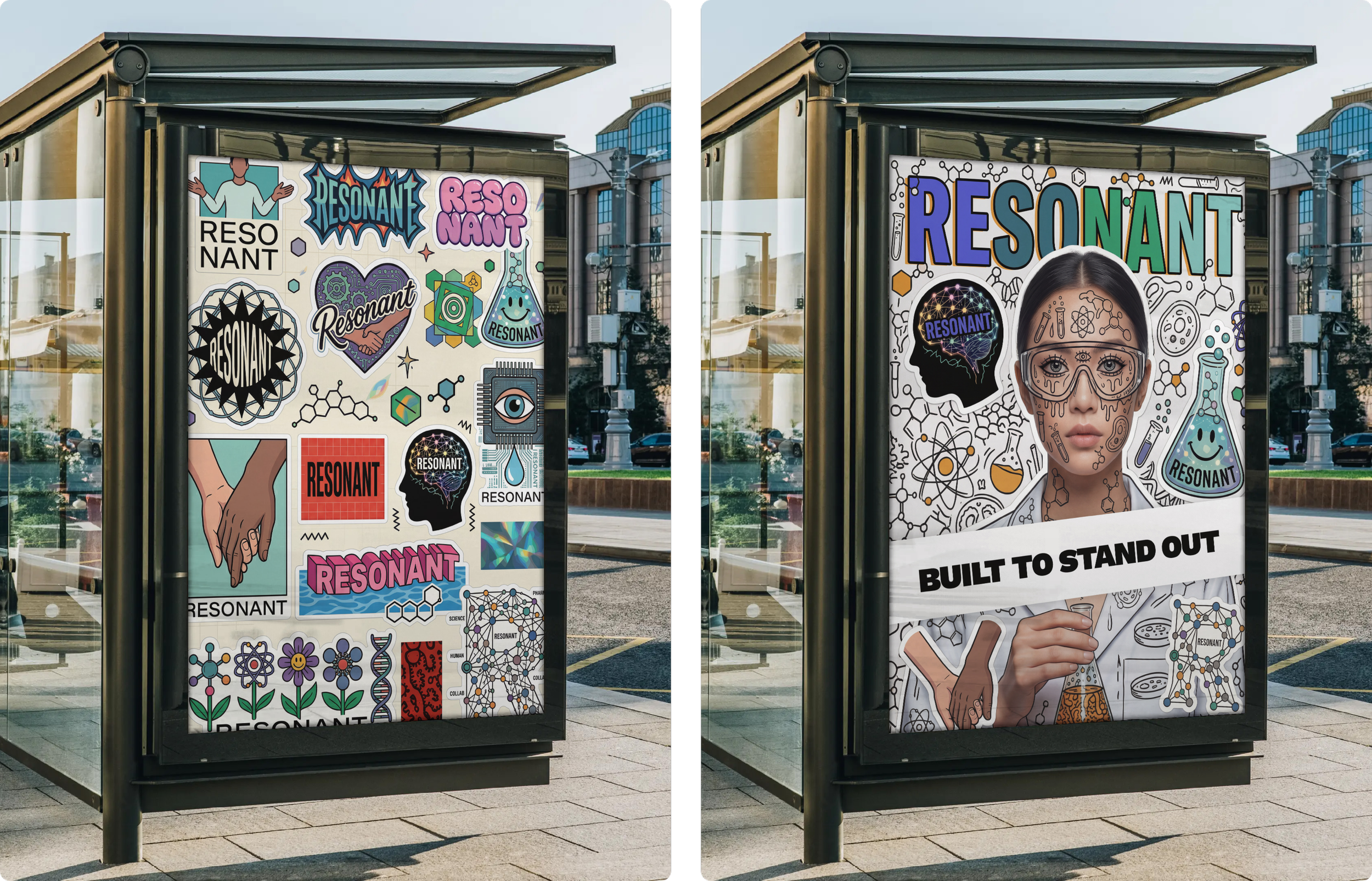
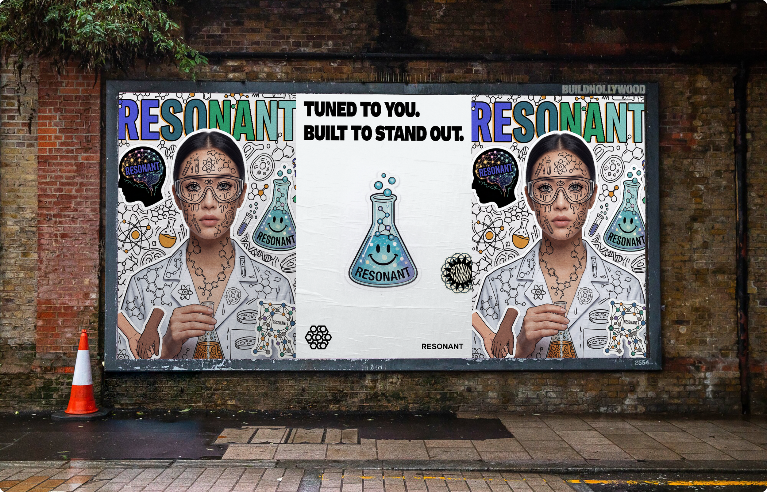
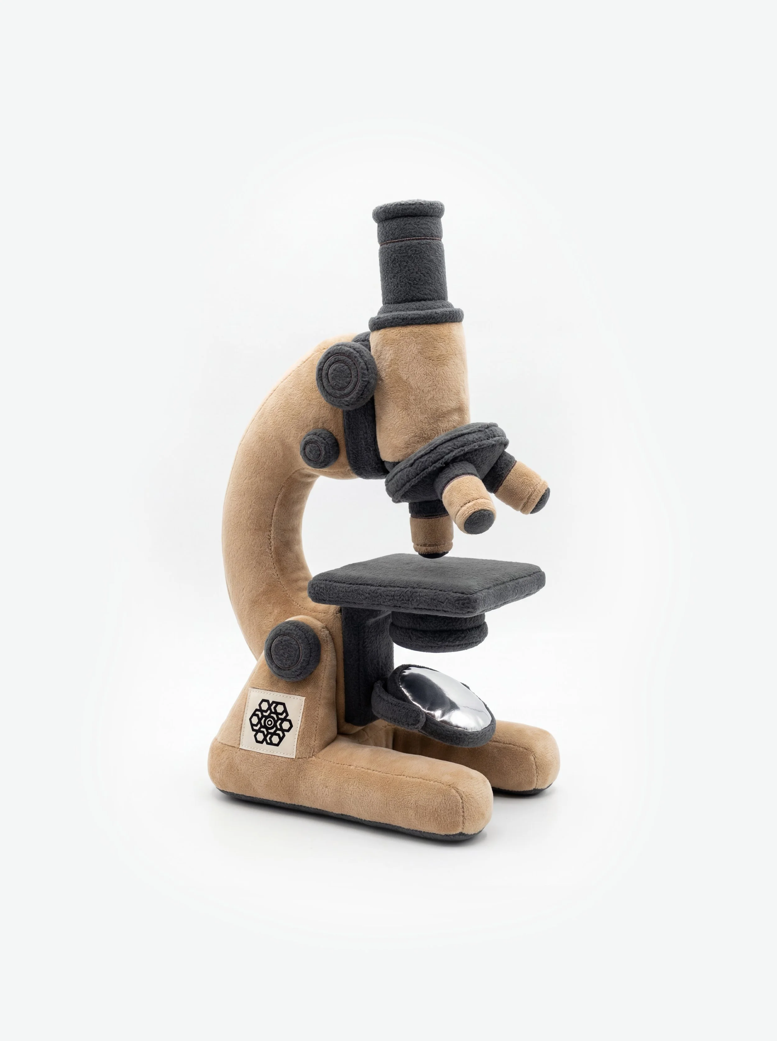
Visual Craft
I felt it was important to hand-draw the illustrations rather than make them purely digitally. It gives the line work a more authentic, human quality. The creative direction is rooted in art, illustration and stickers, drawing on the visual language of subcultures, independent publishing and design.
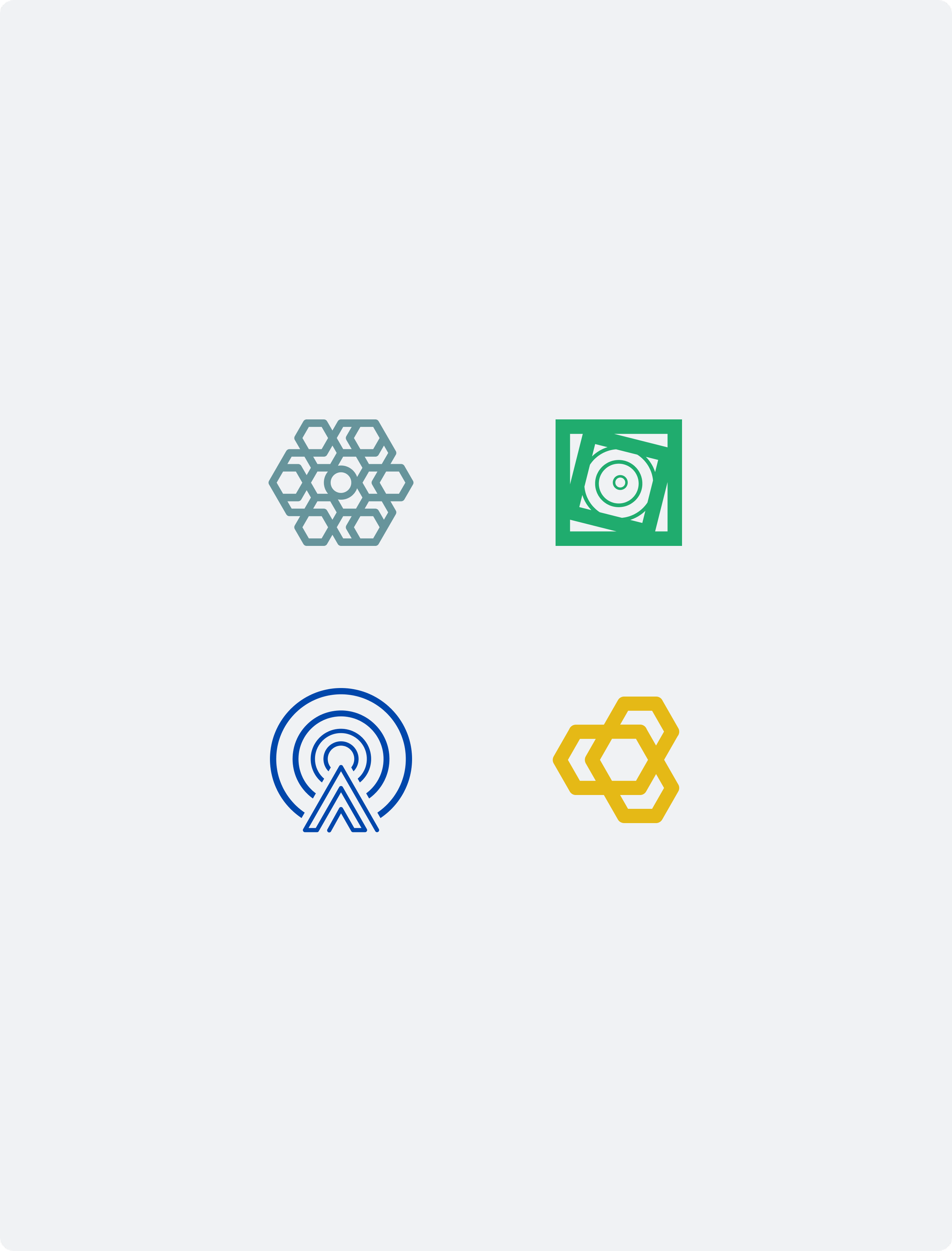
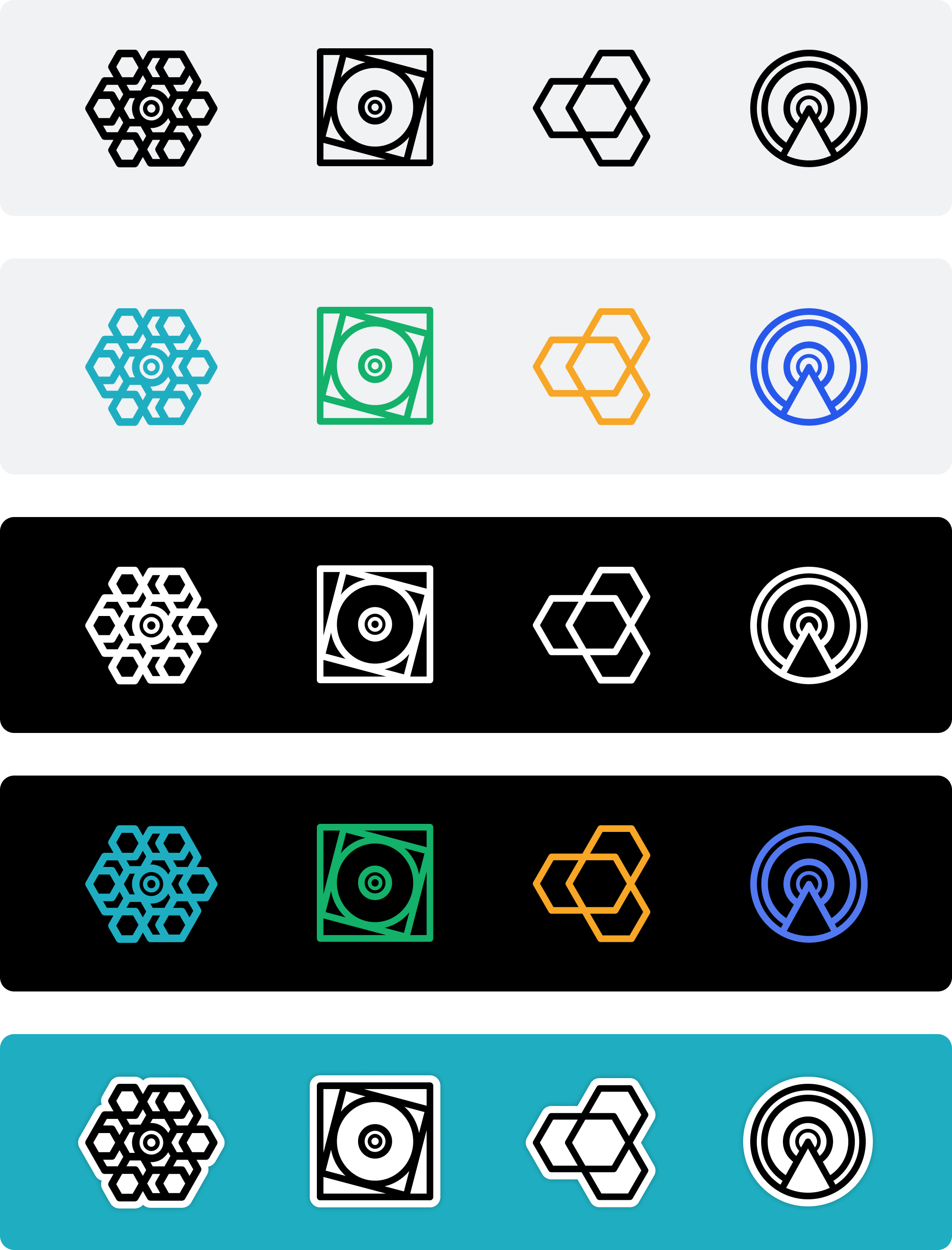
Logo Mark Alignment
Because the each logo had been created over time, they no longer worked consistently as a family. On the left you can see differences in line weight, proportions, corner radius, which all made the suite feel mismatched. The redesign on the right focused on alignment rather than reinvention so the system felt more unified, scalable and considered.
Messaging Concept
To explain Resonant’s model simply, I developed a messaging concept built around Your problem. Our Solution. Better Together. It captured the value of collaboration in a way that felt human, direct and adaptable. YOUR + OUR = BETTER
A flexible framework that could be applied across different business areas, offers and communications while consistently reinforcing the value of joined-up specialist thinking.

“I bloody love it!”
David Youds - CEO/Founder - Resonant Group