Training, Tracking, & Fundraising in a Single Experience
Client
Royal Flying Doctors
Agency
Homemade Digital
My Role
UX/UI Design Director
Skills Used
Creative Direction
Design Direction
UX/UI Design
Visual Design
Illustration
Prototyping
Testing (Guerrilla)
Storytelling
The Challenge
The Royal Flying Doctors, required a single product solution for their “Cloud Climb” activity that could seamlessly integrate participant training, progress tracking, and fundraising efforts.
The Solution
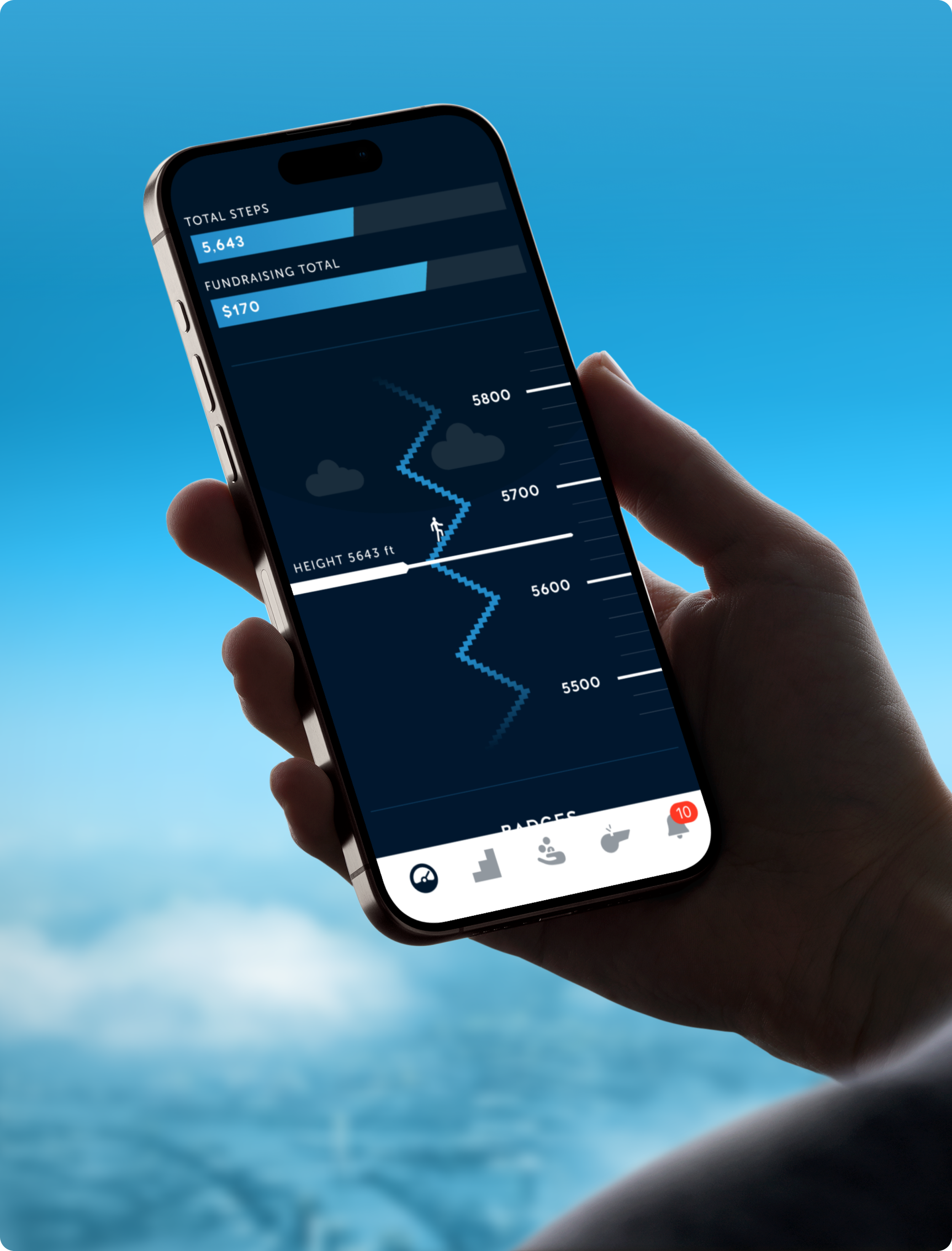
As the sole designer, I owned the end-to-end UX and UI. To maximise motivation, I designed a clean, fitness-inspired interface that used aviation dials to connect users to the charity’s story. I created a dynamic altitude tracker that mapped stair-climbing to real-world height and used landmarks as rewards. I orchestrated a streamlined native sign-up process and validated the experience through guerrilla testing to ensure maximum uptake and retention.
The Impact
The product successfully unified training, tracking, and fundraising, turning physical effort into a compelling personal story. This strategic integration inspired higher participation and sustained motivation, helping participants achieve their fundraising goals and demonstrating how a concise design strategy can drive clear action.


Walking In The Clouds
I created a star climb altimeter to indicate how high users would have ascended if they were walking among the clouds.
HEIGHT 0 ft

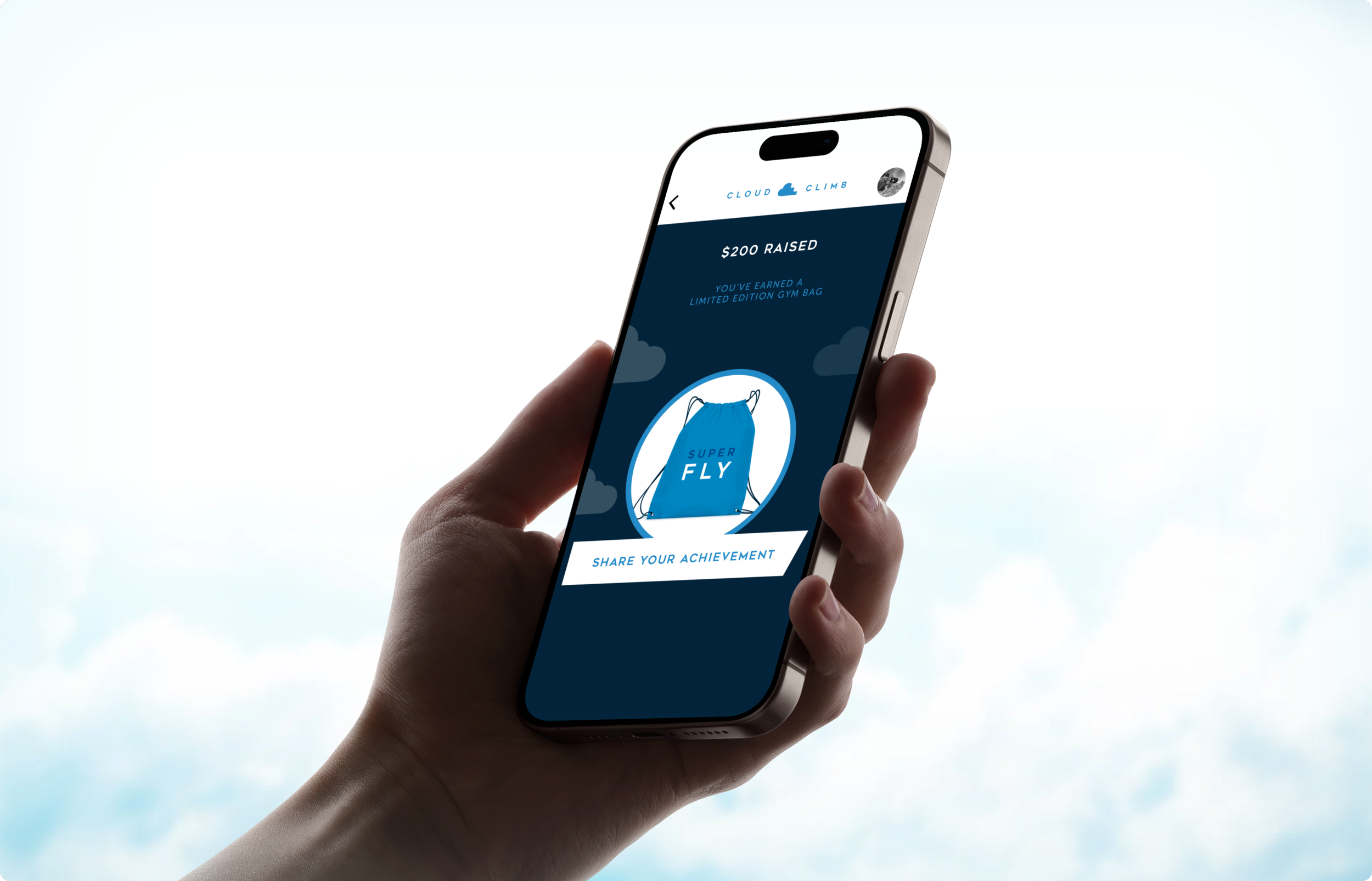
Badges & Rewards
Incentives to encourage activity and motivate fundraisers were integrated into the app, including both tangible real-world and digital rewards. The creative approach leveraged reaching great heights, focusing on iconic and seemingly insurmountable landmarks.


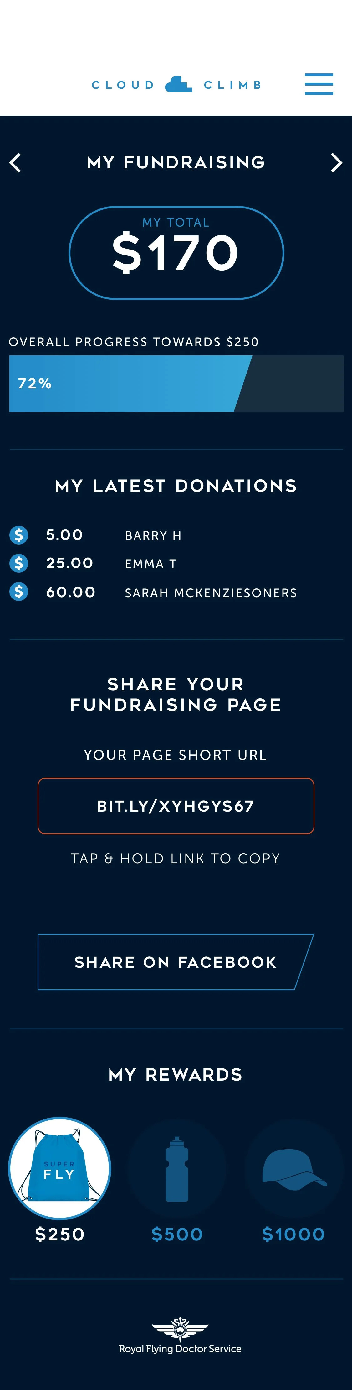
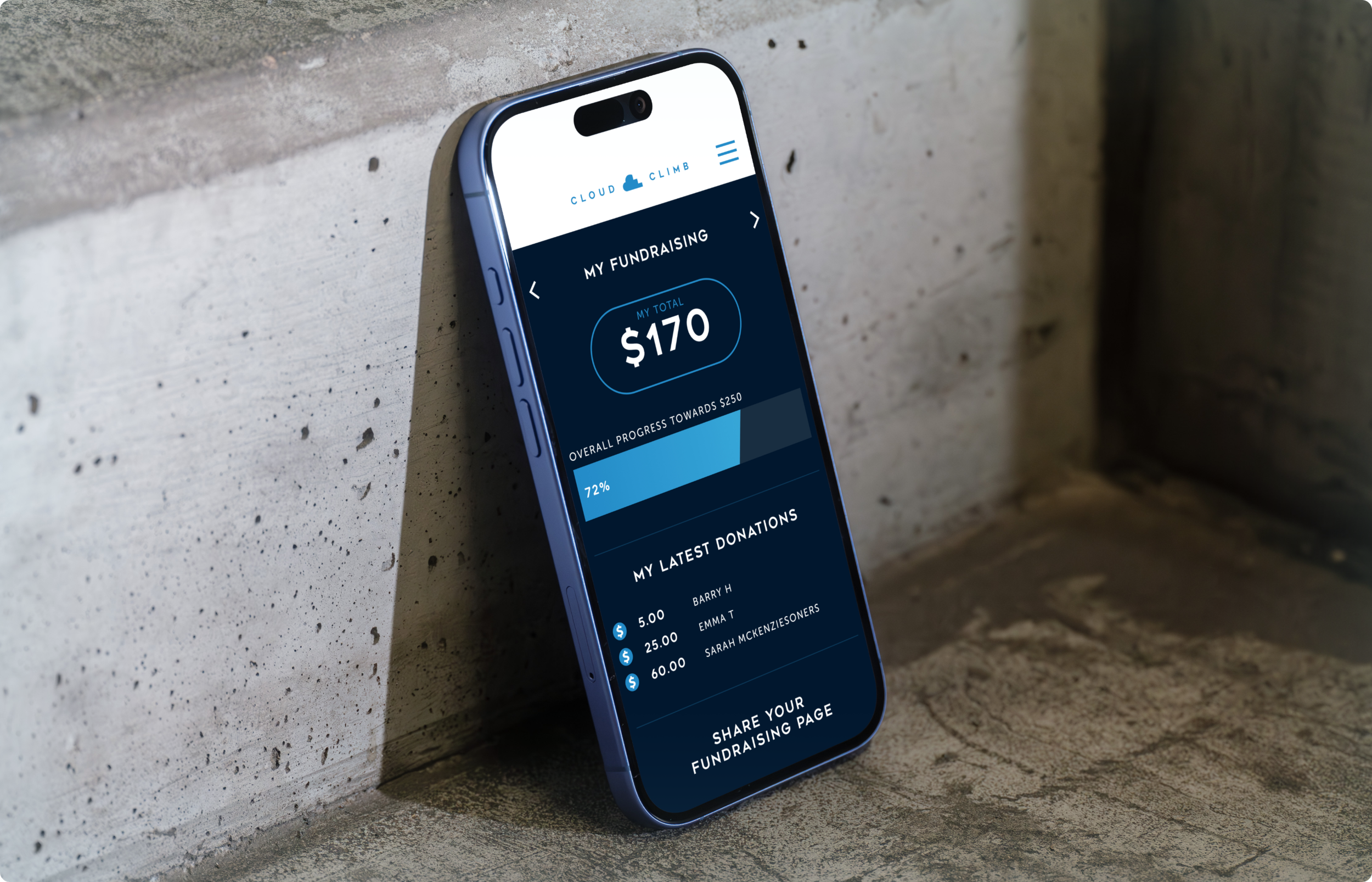
Fundraising
Focused on awareness and easy sharing to maximise donations. The app streamlined the process and introduced milestone-based rewards, boosting motivation and engagement.


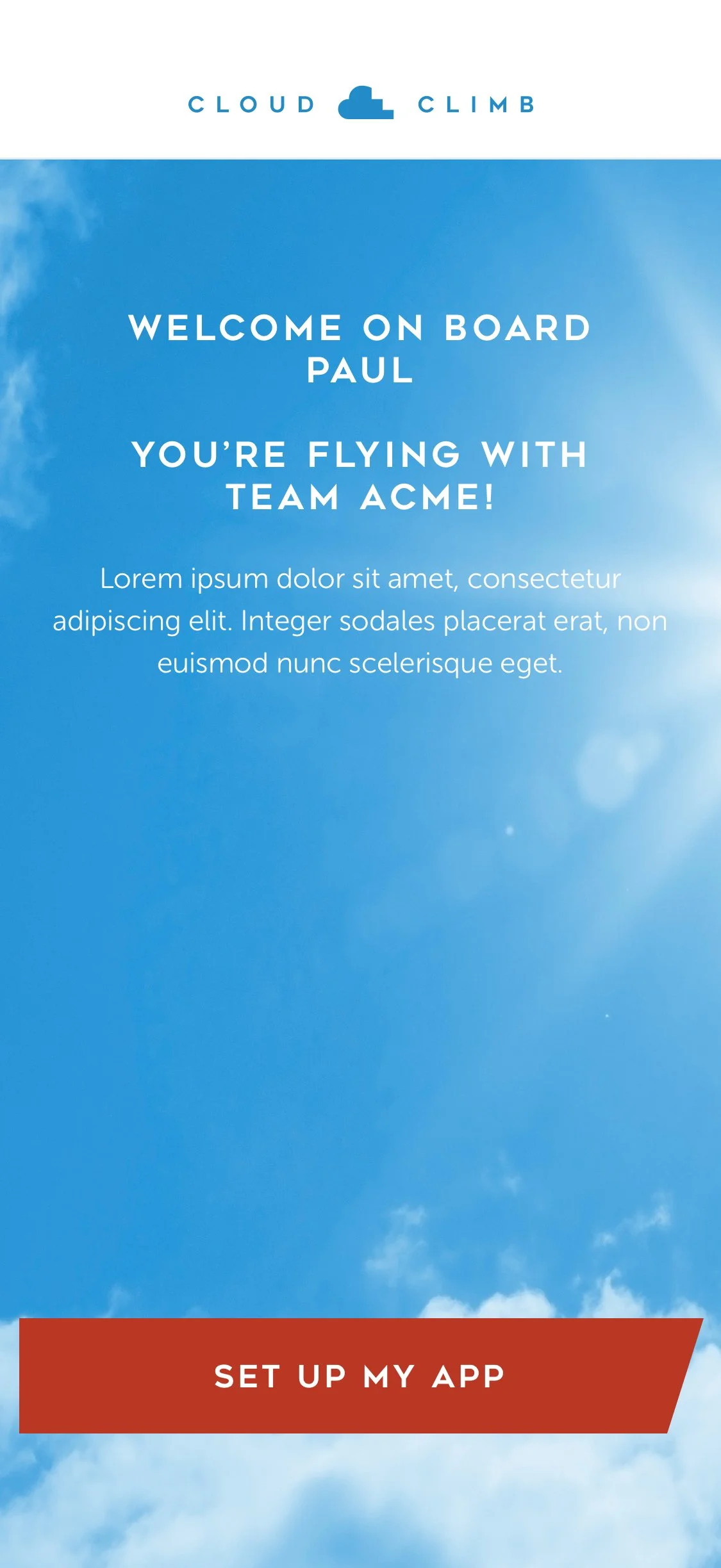
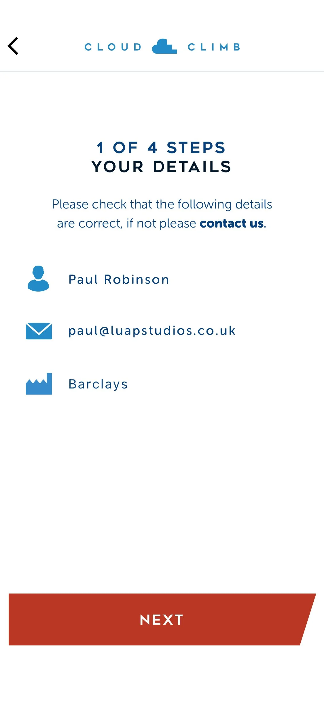
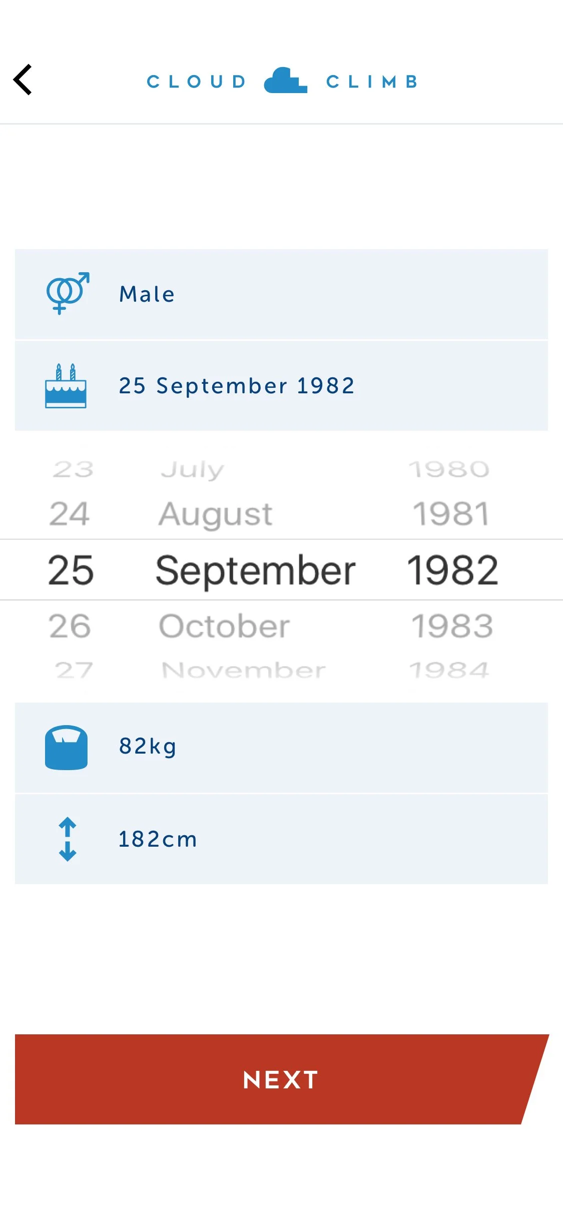
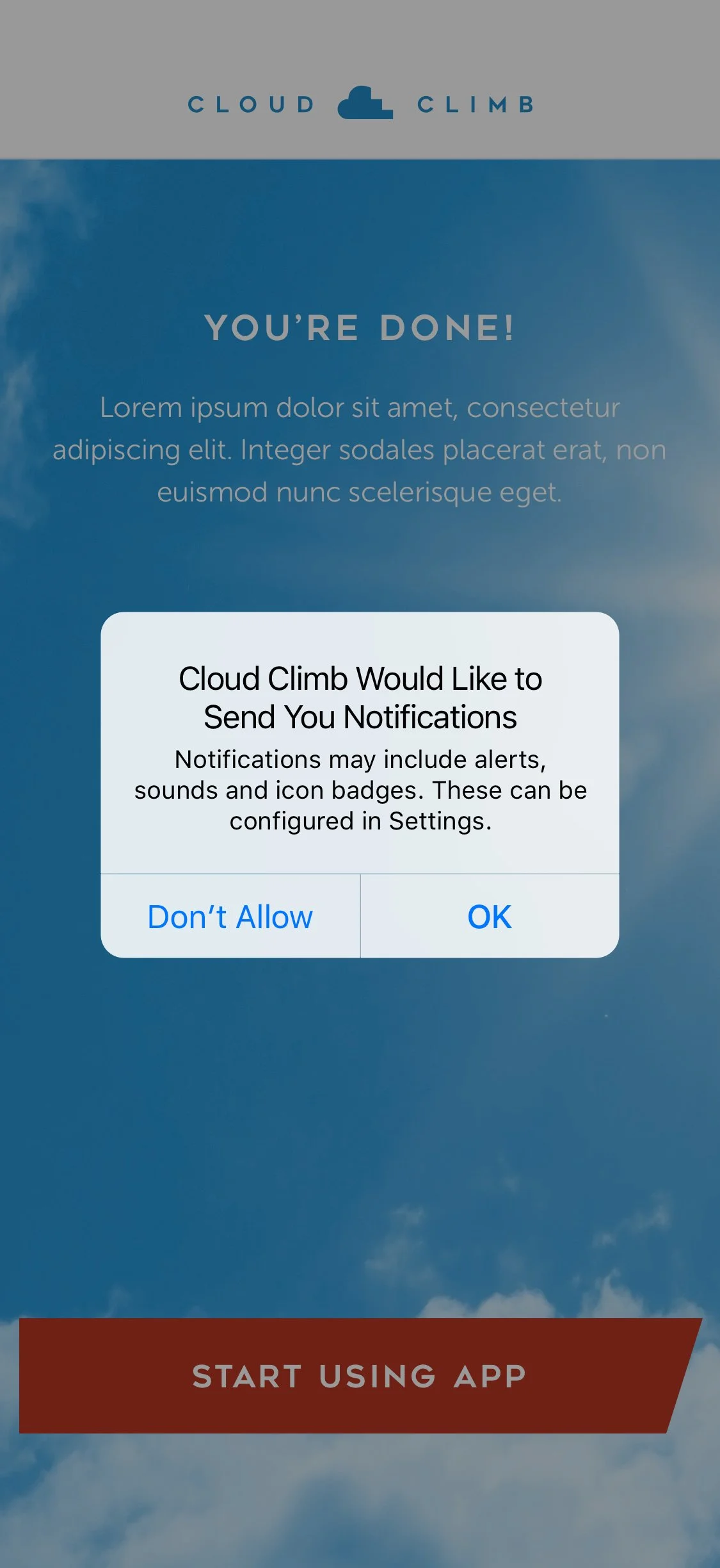
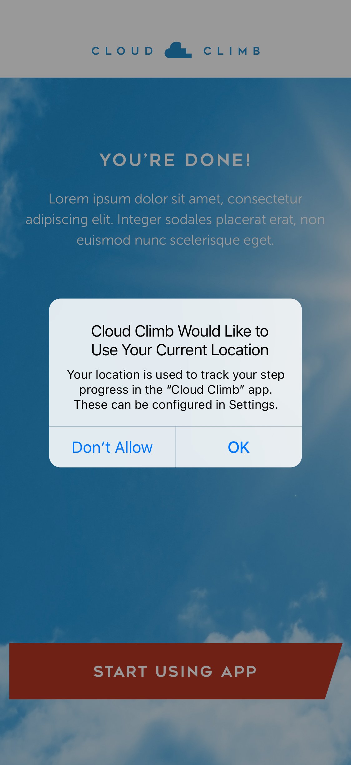
Sign Up Journey
Designed to minimise dev effort by leveraging native features. Each step stayed above the fold for a fast, scroll-free flow. Guerrilla street testing validated the design and surfaced quick UX wins.