Concept Work for the Future of Saudi Aramco
Client
Saudi Aramco
Agency
Digitas
My Role
Design Director
Skills Used
Design Direction
UX/UI Design
Concept Exploration
Storytelling
Brand Strategy
The Challenge
Digitas sought to explore strategic directions for how Saudi Aramco could evolve its digital presence to reflect global scale and future ambition.
The Solution
I developed multiple concept routes that balanced heritage and innovation. One direction drew from Islamic patterns and supported both left to right and right to left reading for cultural inclusivity. Other routes centred people and technology, using bold photography, dynamic mosaics, and scroll based storytelling to connect the brand’s scale with human impact. Each route articulated interaction models, content hierarchy, and motion language to guide an enterprise level redesign.
The Impact
The work provided executives with a clear vision for moving from a static corporate site to an immersive, future facing platform. By blending cultural authenticity with modern interaction design, the concepts set a new creative benchmark for Aramco’s digital presence and informed subsequent communication strategy.
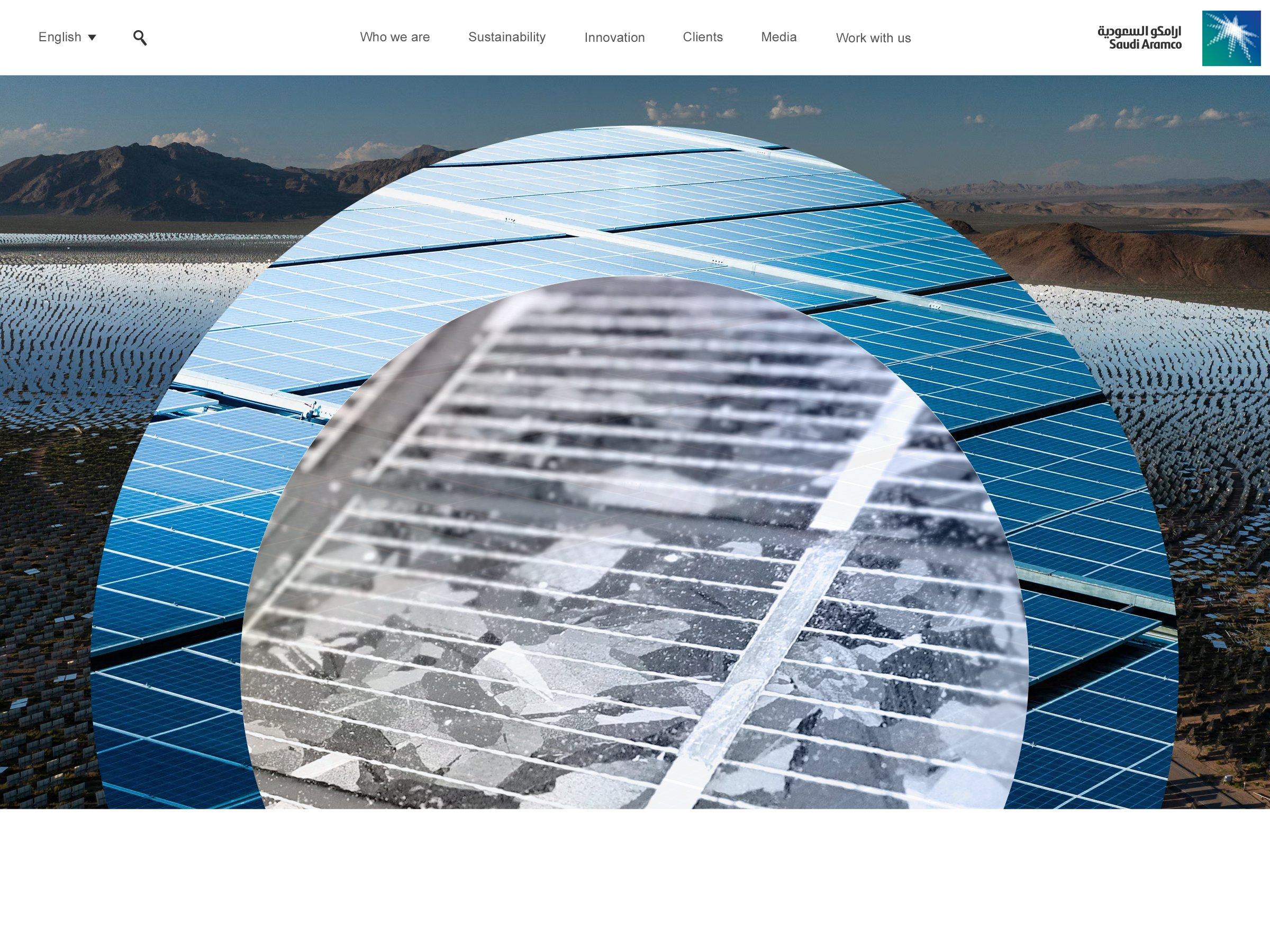
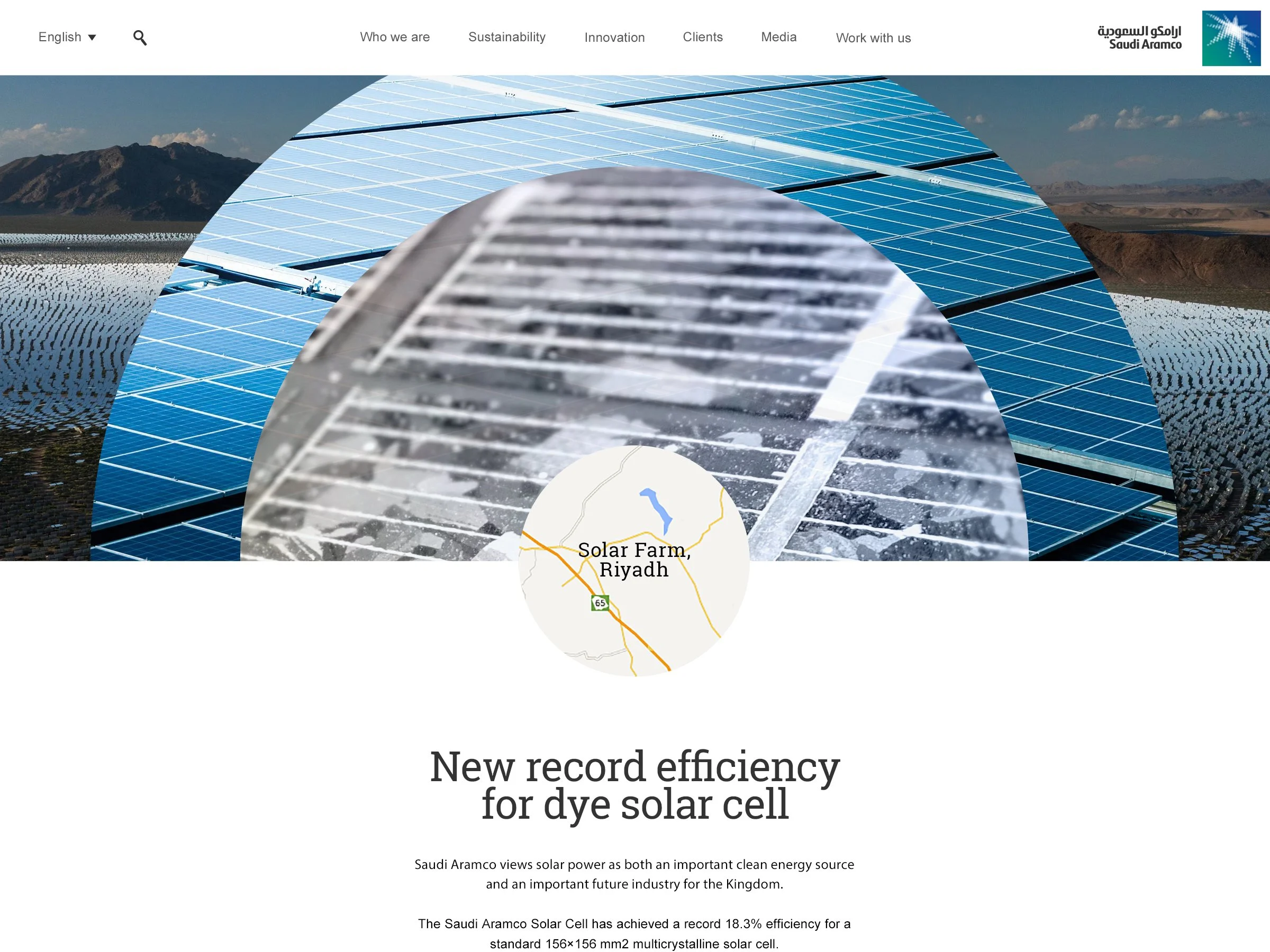
Focus: Scroll To Learn
This approach, "Scroll To Learn," was designed to take users on a journey from the big picture to the finest details of the technology. As users scrolled down the page, the content would progressively unfold, starting with a broad overview and gradually zooming in on the subject matter.
People: Tradition + Future
I used detailed patterns to honour the brand’s heritage, bold photography to create visual impact, and subtle interactivity to invite deeper engagement.
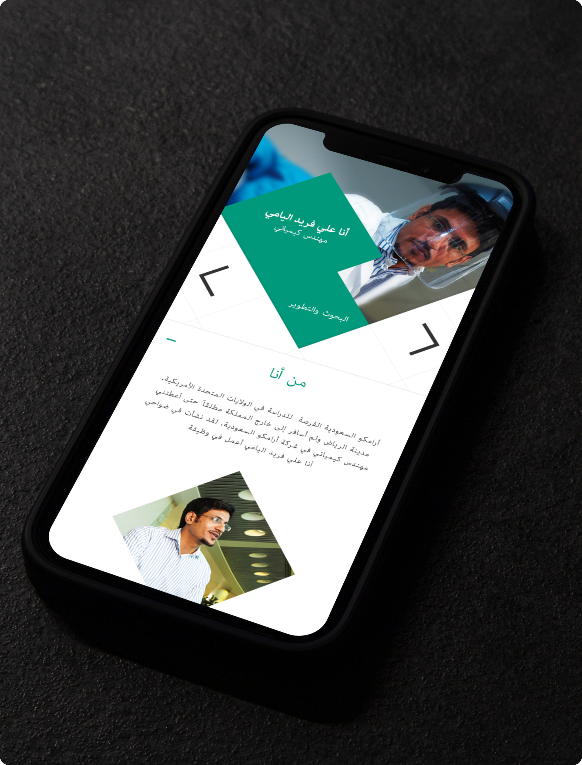
People: Centralised Layout
This approach was all about putting people first. I built a visual language inspired by traditional Islamic art. To make the experience inclusive, I designed a centrally aligned layout that supported both left-to-right and right-to-left reading. By removing fixed edges, every component could flip easily within the CMS.
Focus: Technology
I used location photography to ground the technology in the real world. Rather than relying on abstract visuals, I focused on showing the tech in action, making its purpose and impact feel immediate and tangible. This approach helped bridge the gap between innovation and everyday experience, turning complex ideas into something people could instantly connect with.
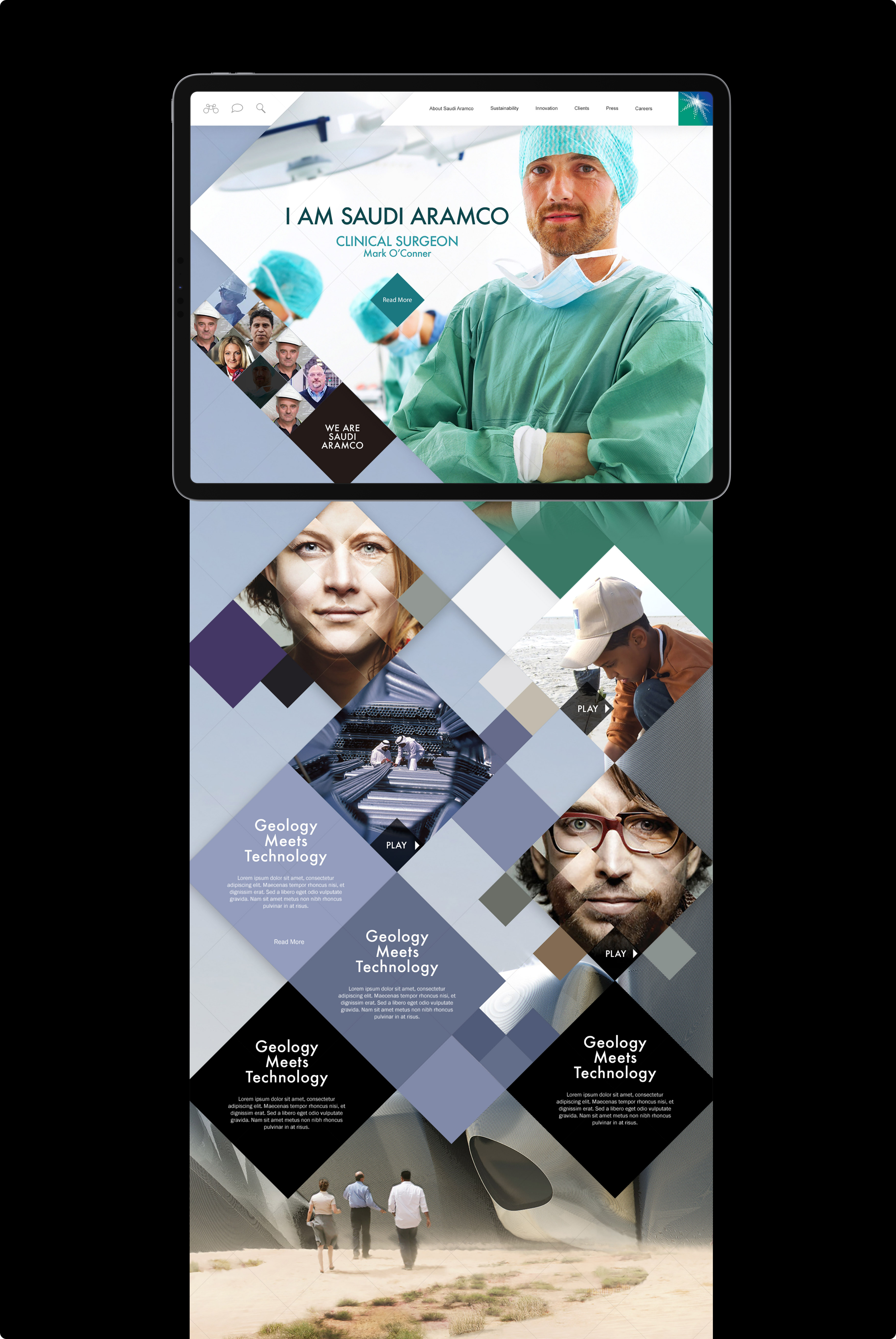
People: I am Saudi Aramco
I wanted to celebrate the diversity within Saudi Aramco by turning the people behind the brand into the heart of the experience. I designed a dynamic mosaic of faces, each "slice" revealing a short video where employees introduced themselves.
Focus: Technology
In this approach, the central focus was squarely on technology. I designed a minimalist and striking visual theme, characterised by bold typography that effectively highlighted the product as the primary focal point.
Life: News


