
Design and Testing That Unlocked Donations
Client
UK Charities
Agency
Homemade Digital
My Role
UX/UI Design Director
Skills Used
UX/UI Design
Prototyping
Testing Guerrilla
CRO Conversion Rate Optimisation
Site Audits and Optimisation
The Challenge
Homemade Digital required a review of donation flows for major UK charities to create high performance, white label templates that could be rapidly deployed across multiple campaigns.
The Solution
I systematically analysed existing journeys to identify points of friction and drop offs, then designed simplified flows that reduced steps and made giving feel faster and more intuitive. Wireframes were rigorously validated through guerrilla testing before being applied to the distinct branding of campaigns such as DEC and Children in Need. I also created a DEC widget that consolidated key actions into one place, improving both speed and clarity.
The Impact
The redesigned Children in Need flow delivered a 3% uplift in conversions, adding £300,000 in donations. For DEC campaigns, shortening the journey from three pages to two increased completions significantly. The new widget streamlined the experience further, making donation simpler and more engaging across the entire charity portfolio.

UX Process
1.Analysing the Journey
I began with a thorough audit of the previous donation flows, identifying where users were hesitating or dropping off. This analysis helped pinpoint key friction points and areas lacking clarity or motivation
2. Rapid Ideation
Using quick, low-fidelity sketches, I explored multiple ways to reduce cognitive load and make the donation process feel faster, easier, and more emotionally compelling for users.
3. Structural Design
Next, I translated the strongest concepts into unbranded wireframes. This allowed the team to focus solely on user experience and functionality, free from the influence of visual style or colour.
4. Brand Integration
Once the structure was validated, I applied the distinctive branding of both DEC and Children in Need. This ensured a seamless, familiar user experience that was emotionally aligned with each campaign’s purpose.
5. Testing
We validated the navigation through guerrilla testing, grabbing people quickly in real-world contexts and asking them to complete a simple task. This gave us fast, honest reactions and helped confirm the system’s clarity without needing a full research setup.

UI Design
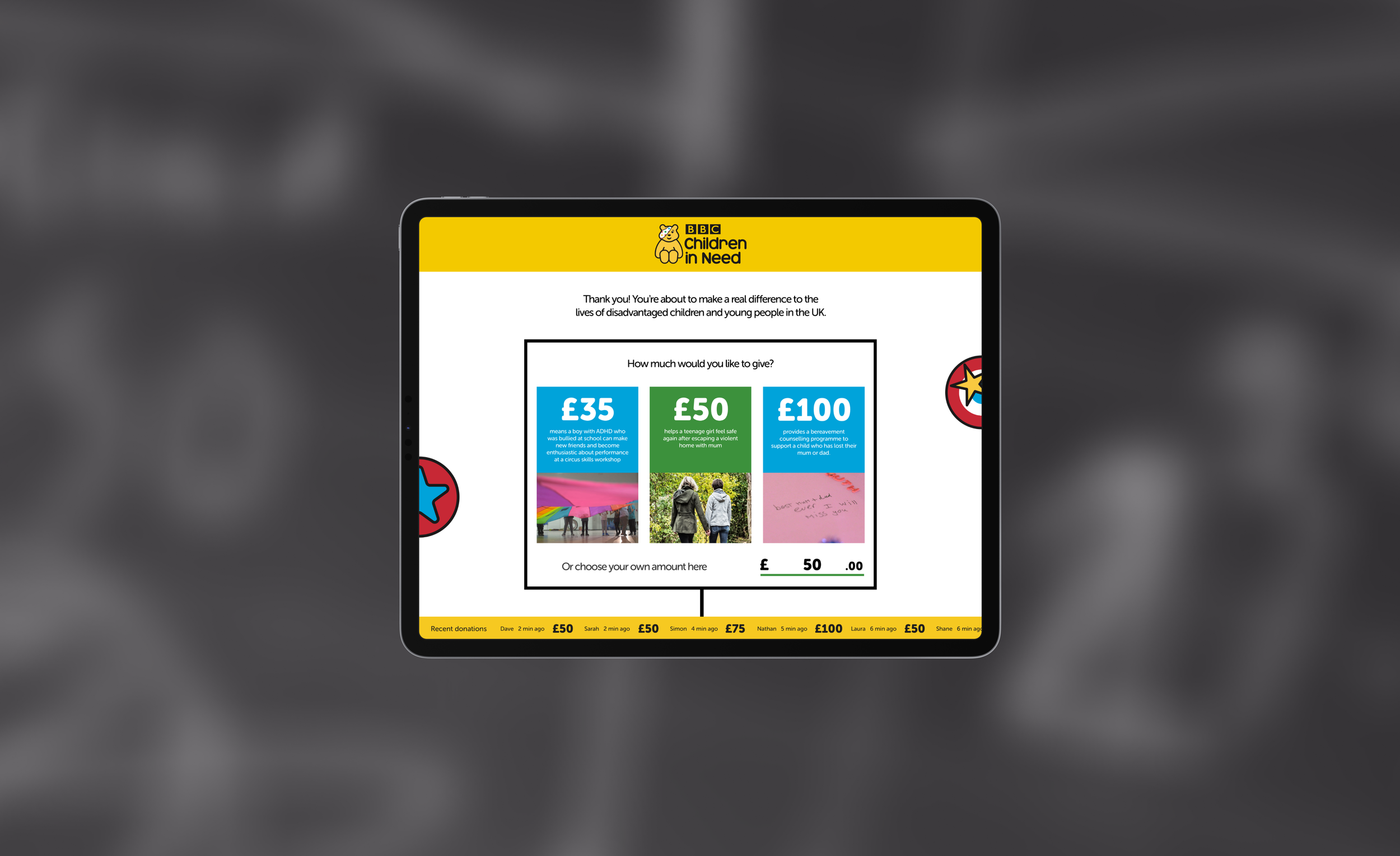
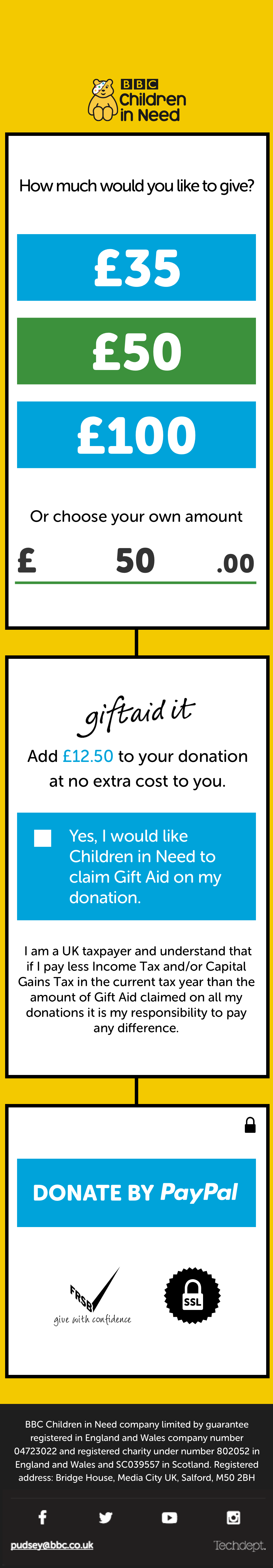
Children In Need
The 3 step (Amount, Bank Details, Thank You) redesigned UX journey for Children In Need in resulted in a ≈ 3% increase in conversions, translating to an approximate financial uplift of £300,000. This tangible outcome underscores the significant positive impact of strategic UX enhancements on campaign success.


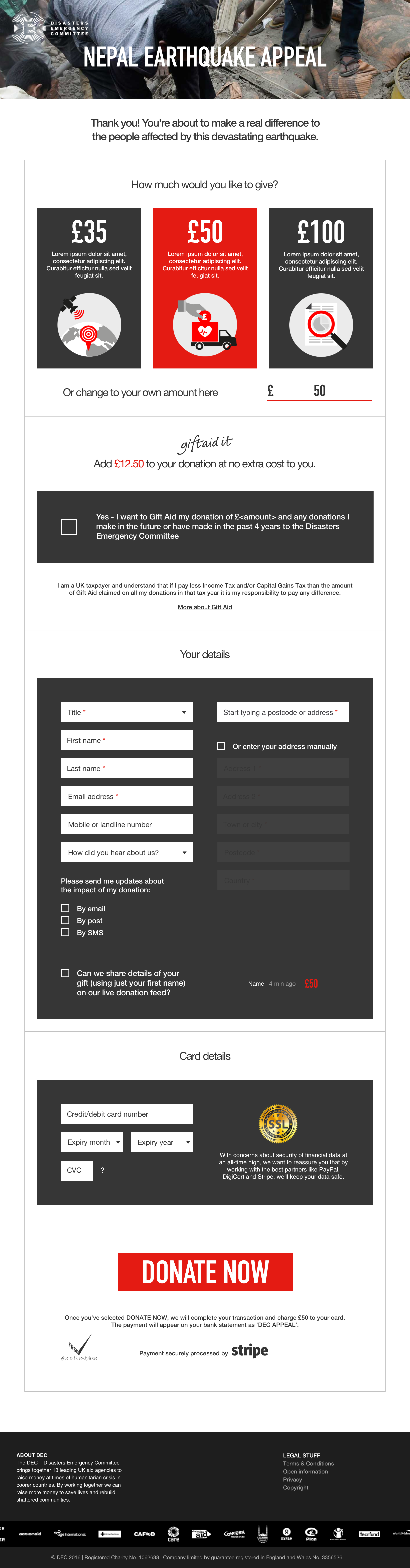
DEC
For DEC I implemented a streamlined UX design, condensing the user journey from three pages to two. This modification has led to a substantial increase in conversions, signifying the effectiveness of the new design in driving positive outcomes for DEC campaigns.


DEC Widget
The DEC widget simplifies the donation process by consolidating everything into one place, eliminating the need to scroll for a more efficient and seamless user experience.


