

Design Leadership That Inspired Millions to Move and Donate
Client
Comic Relief – Sport Relief 2012
Agency
In-House
My Role
Creative Director
Skills Used
Creative Direction
Design Direction
UX/UI Design
Design
Illustration
Accessibility (AAA compliance)
In-house Leadership
Brand Identity / Visual Language
The Challenge
For Comic Relief’s Sport Relief 2012 campaign, I was tasked with creating a distinct visual identity that supported national-scale participation while avoiding conflict with the London 2012 Olympics branding.
The Solution
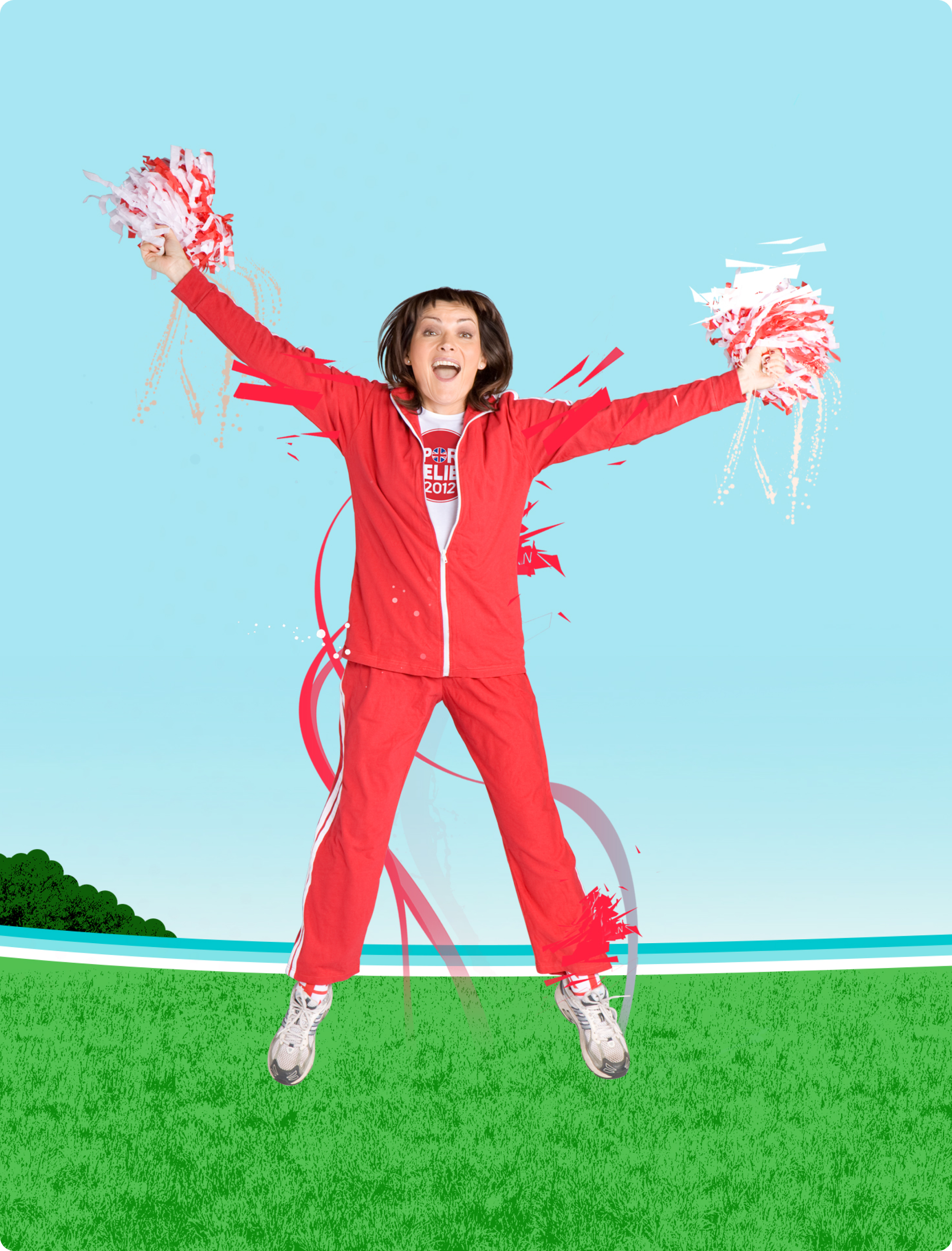
I set the creative vision around themes of progress and dynamism, translating them into a distinctive identity built on ribbons of movement and digital sports motifs. I directed the responsive UI and campaign assets, with AAA accessibility treated as a non-negotiable foundation to ensure inclusivity at a national scale. By consolidating creative work in-house, I elevated quality, reduced cost, and gave Comic Relief strategic control over one of its largest campaigns.
The Impact
Sport Relief 2012 reached millions across the UK and delivered record fundraising in an Olympic year. The clear, unified identity and accessible site ensured everyone could participate, proving that inclusive design could deliver both scale and joy while also simplifying operational costs.
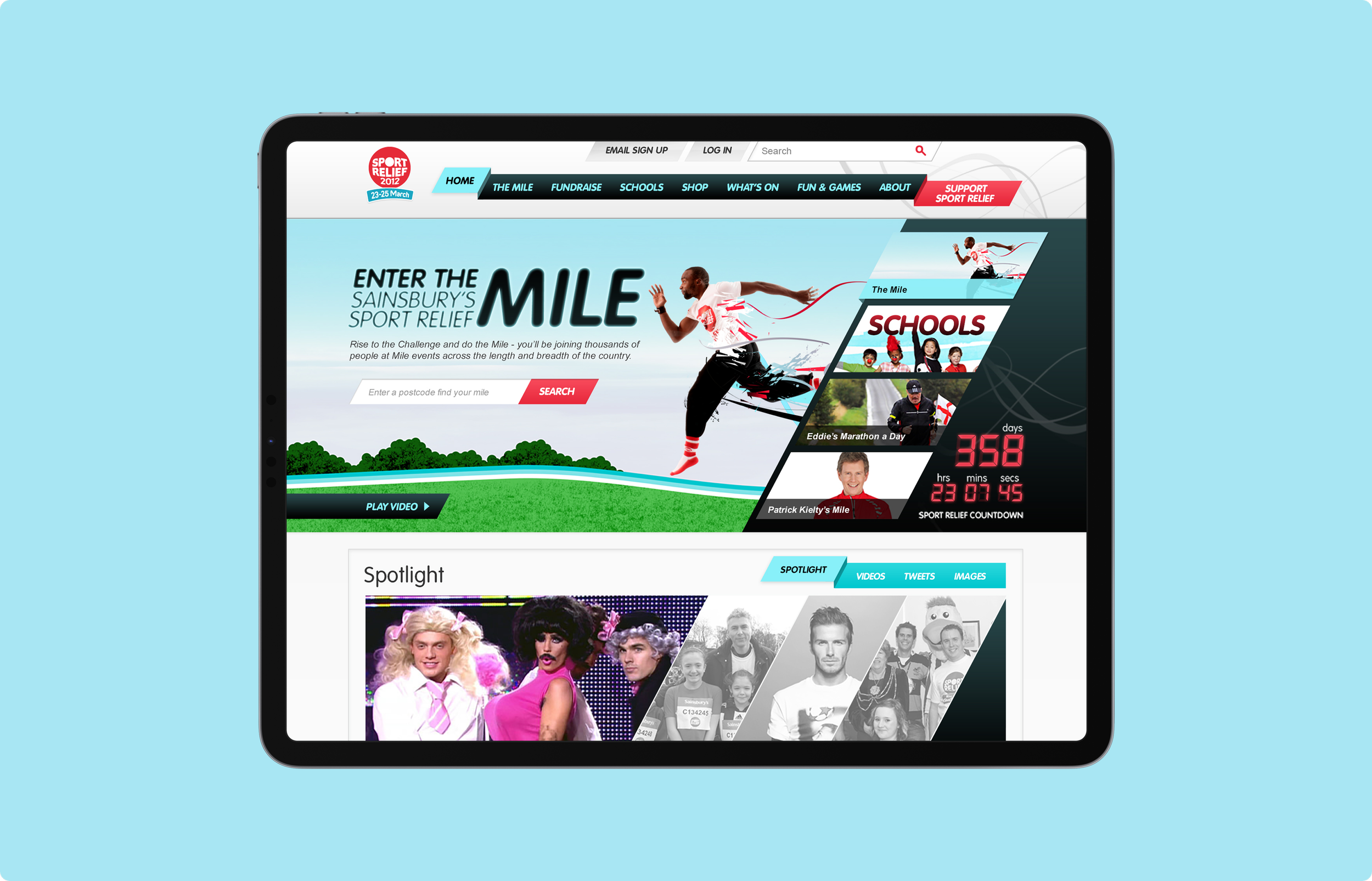
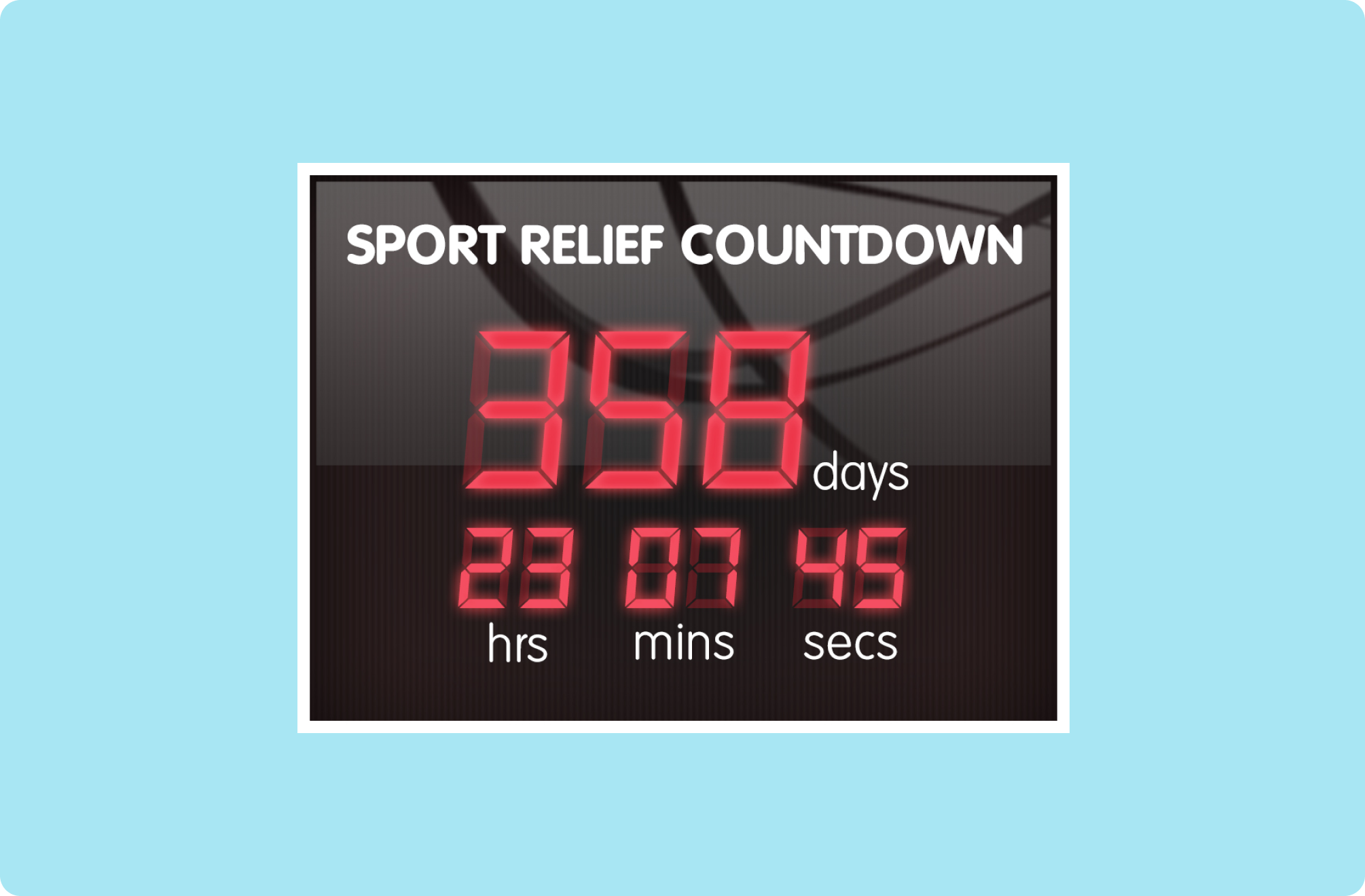
Digital Skeuomorphism
I designed the fundraising UI with a vintage digital sports aesthetic. This retro style was elevated with a glossy modern finish. Navigation mirrored finish line ribbons, but styled to make them intuitive as UI.


£0
RAISED


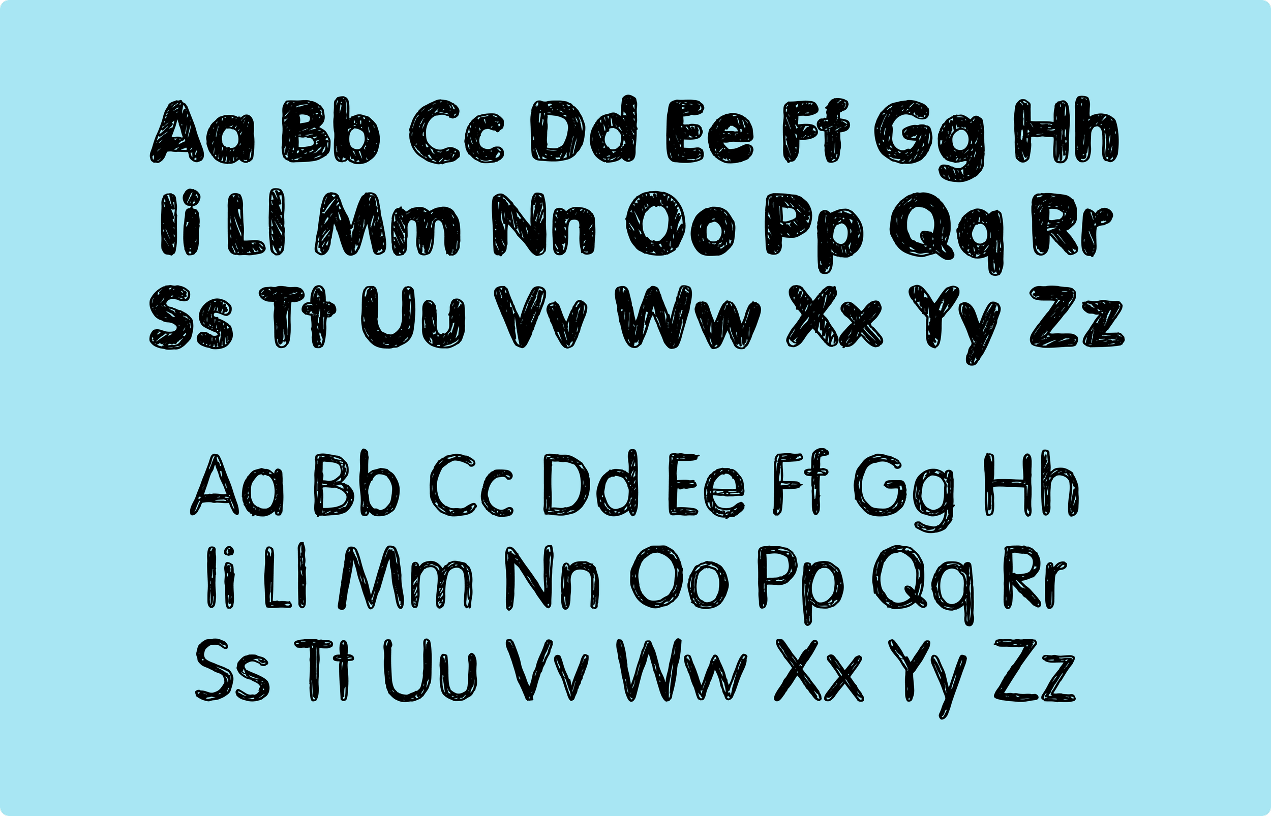
Typography
I utilised bold and friendly fonts throughout, in addition, I created a custom handcrafted font exclusively for the campaign.
Colour Palette
The palette had to feel different to the 2012 Olympic branding due to legal constraints. It also needed to meet AAA accessibility standards, so contrast was critical.
Red
E72639
Deep Red
B61121
Cyan
01C7CE
Light Cyan
88F0FF
Black
000000
Dark Gray
333333
Gray
666666
Secondary Red
FF0000
Secondary Pink
FF00B3
Secondary Cyan
00E5FF
Secondary Yellow
FFFF00
Secondary Dark Green
135E27
Secondary Green
4FBF4F
Home Page Carrousel
The homepage carousel I designed represents a journey through London, and sometimes even venturing beyond (like the North Pole). With each banner seamlessly blending into the next, the carousel presents a unified and continuous image, enhancing the user experience.


Style Guide
Upon finalising the Creative Direction for the campaign and crafting the design of top pages, I compiled a comprehensive style guide. This guide served as a reference for both my team and the organisation, ensuring uniformity across all touch points.


“Paul is one of the most creative and talented designers I have had the pleasure of working with. He has a knack of realising ideas far better than you could have imagined, and manages to turn around beautiful, imaginative and original designs at incredible speed.”
Paul Turner - Product Design Lead - Comic Relief