
Building a Global Design System That Reimagined How Design Delivers
Client
Sage
Agency
In-House
My Role
Senior Director, Global Senior Creative Director of Experience Design
(Product, Brand, Experience)
Skills Used
Executive Sponsorship and Strategic Leadership
Cross-Functional Alignment and Governance
Strategy and Design Direction
UX and UI Design
Design System Architecture and Development
Testing and CRO
Prototyping and User Research
Team Growth and In-House Capability Building
Culture, Coaching and Creative Empowerment
The Challenge
Sage’s design landscape was fragmented across product, marketing and brand, with every team solving the same problems in isolation. Inconsistent execution, duplicated effort and an ageing platform limited creativity and speed. The challenge was to create a unified design system that connected every discipline and region under one shared language.
The Solution
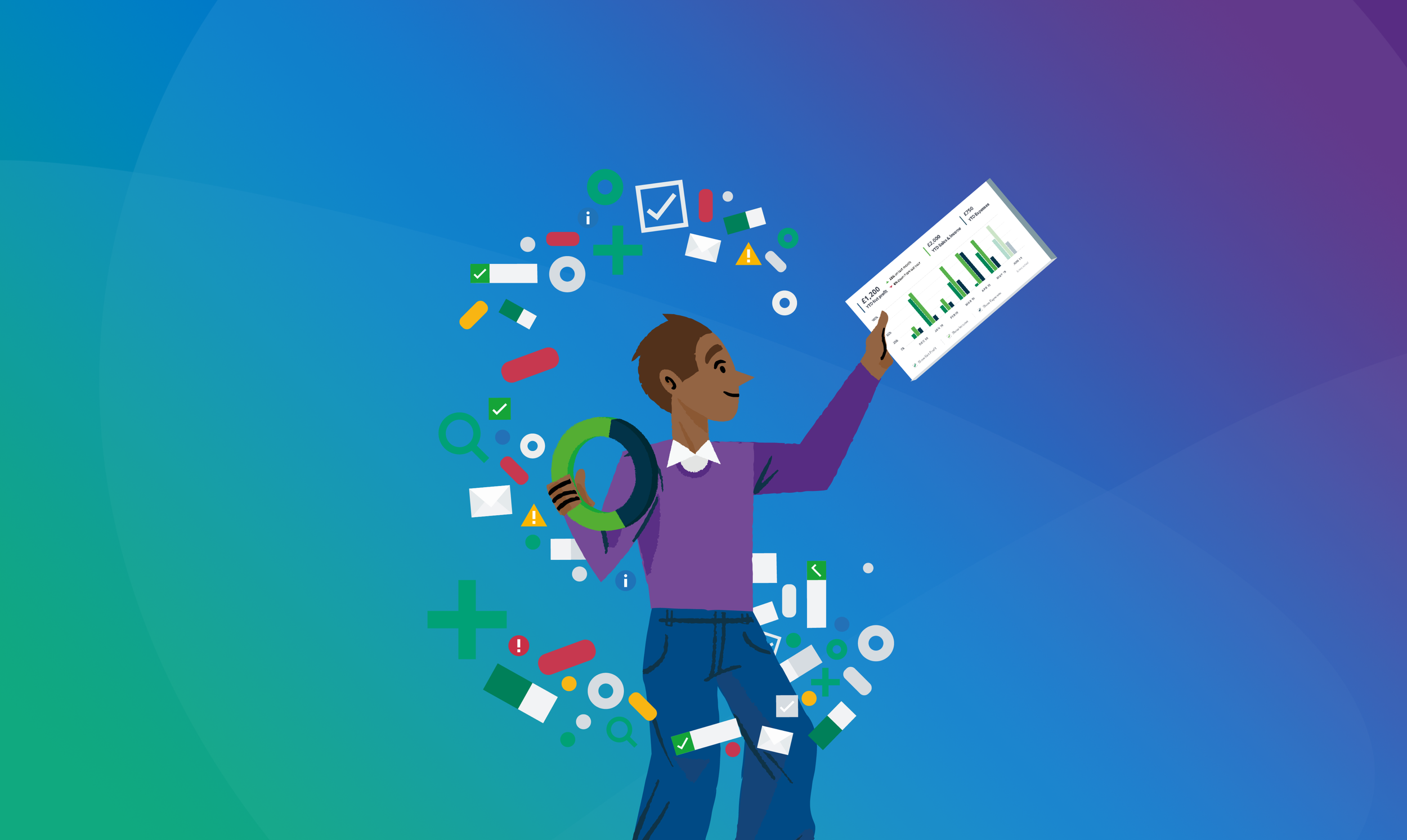
I led a three-year programme to create the Sage Design Language System. A global foundation uniting product, brand and marketing. Working hands-on across UX, UI and creative, I defined the architecture, principles and visual language that underpinned every experience. The system integrated colour, layout, motion, illustration and tone, enabling teams to design once and deploy everywhere with confidence.
The Impact
The DLS became the backbone of Sage’s digital ecosystem, powering 33 country sites, global campaigns and all major product experiences. It improved accessibility, speed and consistency while cutting duplication and cost. Performance lifted across every channel, including a 42% increase in site conversions. Beyond metrics, it redefined how design operates, from disconnected execution to a culture of shared creativity and scalable delivery worldwide.

Post Delivery Results
Proof of Impact
The redesign and launch of the Sage platform drove measurable business impact across every key performance area - demonstrating the power of design-led thinking, cross-functional collaboration, and strategic UX leadership.
Overall Performance (Year-on-Year)
+20.50% increase in Total Sessions
+42.30% increase in Site Conversions
Traffic Growth by Source (YoY)
+29.70% Organic Sessions
+42.02% Paid Search
+28.24% Social
Site Conversions by Source (YoY)
+2.41% Organic
+81.38% Paid Search
+8.09% Social
Results (Two Weeks Post Launch)
The short-term performance surge further validated the success of the new design system and user experience overhaul
+12.90% increase in Total Sessions
+16.25% increase in Unique Users
+57.43% increase in Form Submissions (WoW)
+1,058.49% increase in Form Submissions (YoY)
+28.46% increase in eCommerce Transactions (YoY)
+44.09% increase in Site Conversion Rate (WoW)
+255.50% increase in Conversion Rate (YoY)
Project & Design Context
Challenge
When I joined Sage, I inherited a fragmented digital ecosystem.
A website redesign was already underway without brand involvement
All departments (Product, Brand, Marketing, CX) were working in silos
Mismatched branding, colour, logos, messaging and tone of voice
A rigid legacy platform (Sitecore) blocked innovation
Stakeholders were not aligned, and design had low influence
What I Did
Over three years, I led a global transformation that reshaped how Sage approached design, collaboration, and brand. This wasn’t just system-building, it was a cultural shift that unified teams and elevated design to a strategic function.
Strategy
Reframed the DLS as critical business infrastructure
Tied design to outcomes like scalability, consistency, and ROI
Alignment
Connected Product, Brand, UX, and Engineering around shared systems
Introduced rituals, processes, and feedback loops to break silos
Built collaboration frameworks that scaled globally across departments
Vision
Created a flexible visual system informed by semiotics and psychology
Defined full guidelines for colour, type, layout, tone, and accessibility
Mapped product tiers to intuitive visual cues and brand architecture
Engagement
Ran live workshops across London, Newcastle and San Francisco
Unified more than 30 design and marketing teams across geographies
Built buy-in through open collaboration and inclusive decision-making
Execution
Prototyped components, layouts, and DLS modules for real-world use
Led the full redesign of Sage.com alongside the DLS rollout
Authored documentation and design guides now used company-wide
Legacy
Sage is now seen as a design-led business that attracts talent and builds brand trust. The DLS I initiated became the foundation for its global experience, scaling consistently across regions and touchpoints.
What started as a self-driven vision became a business-wide reset of how design is seen, practiced, and valued.
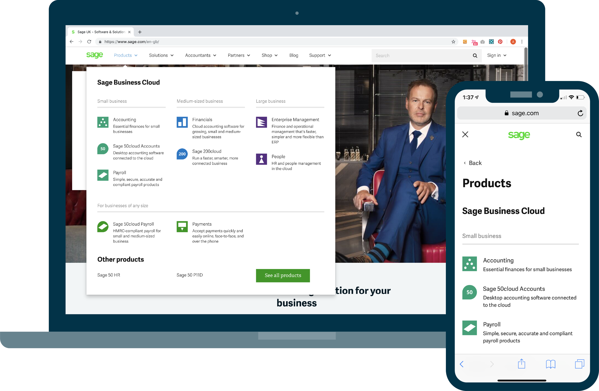
1 - .COM Clean Up
Stabilise First. Scale Second.
Before introducing any new design language, I prioritised stabilising the existing website. This first phase was focused on delivering immediate improvements while laying the technical and design groundwork for long-term transformation.
I worked closely with engineering to rebuild the UI at the atomic component level, ensuring consistency, clarity, and performance. At the same time, we aligned the platform with Sitecore’s capabilities, preparing it for future scalability across markets and regions.
Cleaned up and standardised key UI components
Applied consistent brand look and feel across templates
Ensured full Sitecore compatibility for multi-market rollout
Worked with engineering to future-proof the front-end architecture
Created a robust base for the global Design Language System (DLS)
This collaborative foundation meant that once the DLS was ready, Sage could scale design improvements at speed across global markets — without starting from scratch.

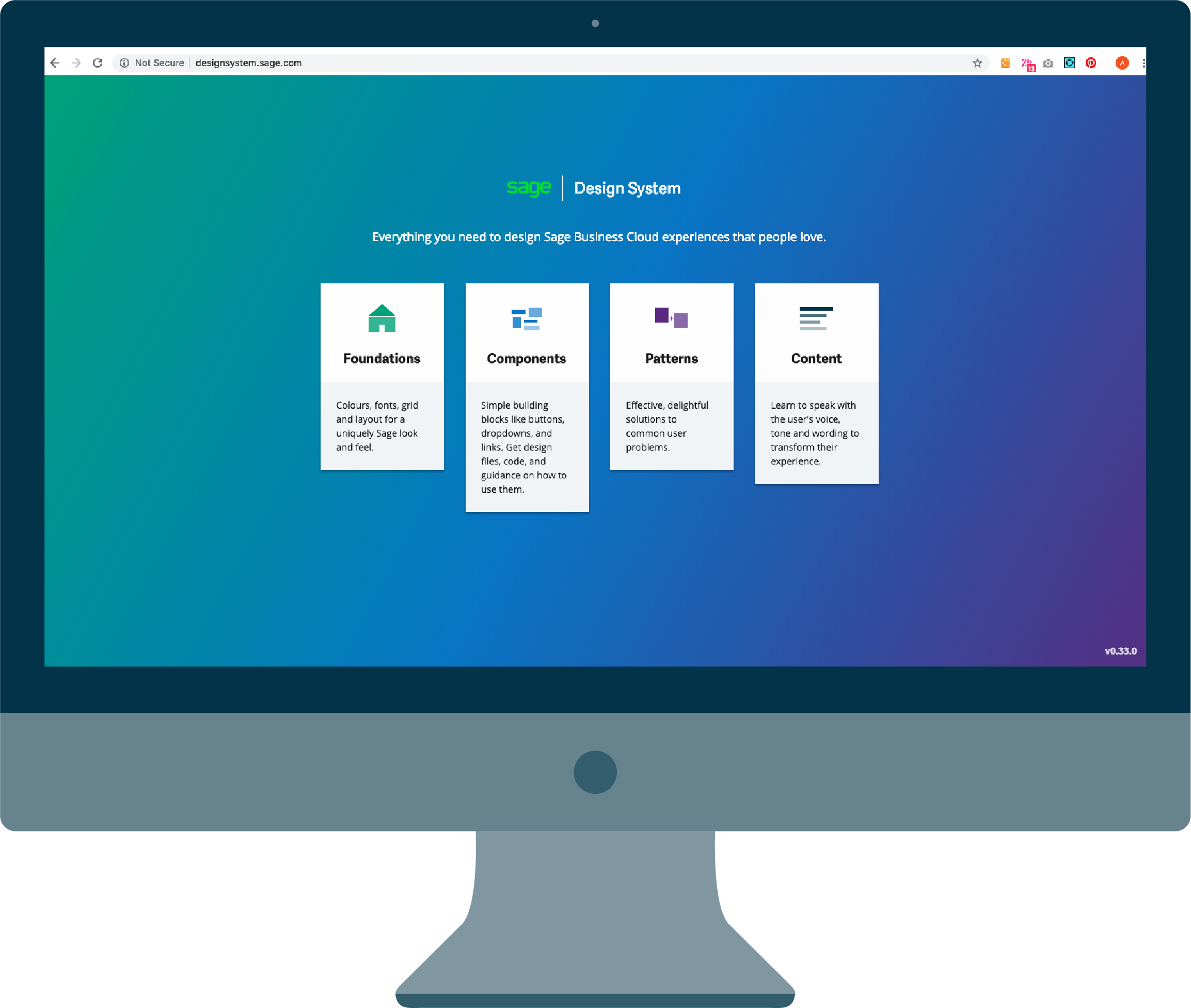
2 - Need For The Design Language System
The Need for a Unified System
It became immediately clear that consistency, scalability, and cross-team clarity were not possible without a unified design system. Multiple markets were re-creating their own versions of everything from icons to page templates, and the brand itself felt fragmented and outdated.
To solve this, I led the creation of the Sage Design Language System (DLS), building it from the ground up as a strategic tool that would serve every part of the customer journey, from offline advertising to post-purchase product support.
DLS covered every touchpoint
Offline Advertising
Online Advertising
Website Content
Printed Collateral
Product Onboarding
Product Setup
Product Usage
Product Support
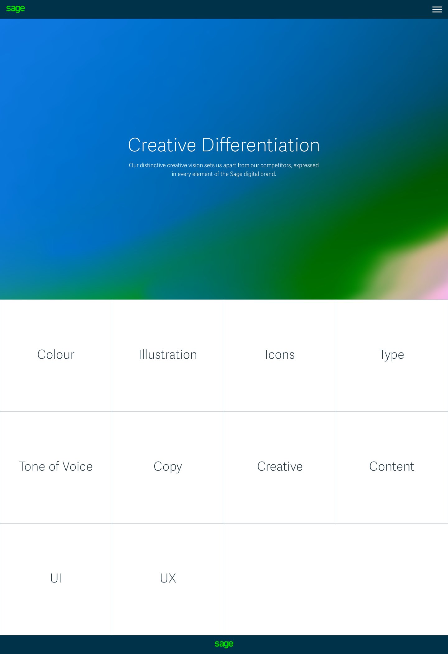
Core system elements
This foundation enabled Sage to deliver brand and product experiences with greater cohesion and clarity, regardless of platform, department, or region.
Animation
Colour
Iconography
Illustration
Layout
Photography
Sonic Identity
Typography
Built-in Benefits
The Design Language System was more than a visual refresh. It became a full-spectrum toolkit that aligned Sage’s brand and product ecosystems, reducing friction and increasing impact.
Scaled faster with less duplication and confusion
Ensured accessibility and compliance across all interfaces
Delivered consistency across regions and platforms
Freed teams to solve real UX problems, not recreate components
Reduced design and development costs
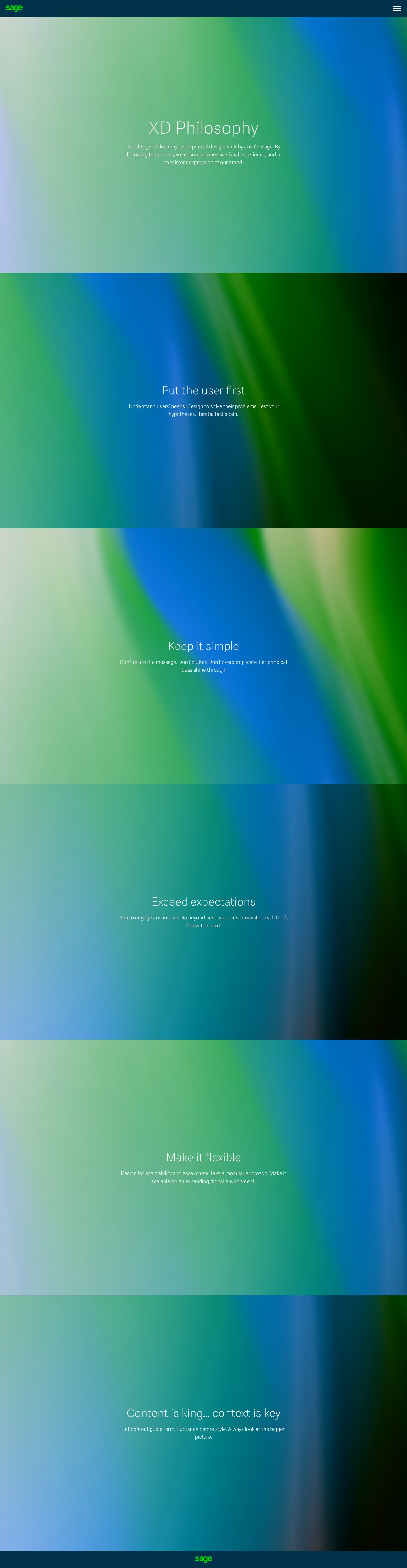
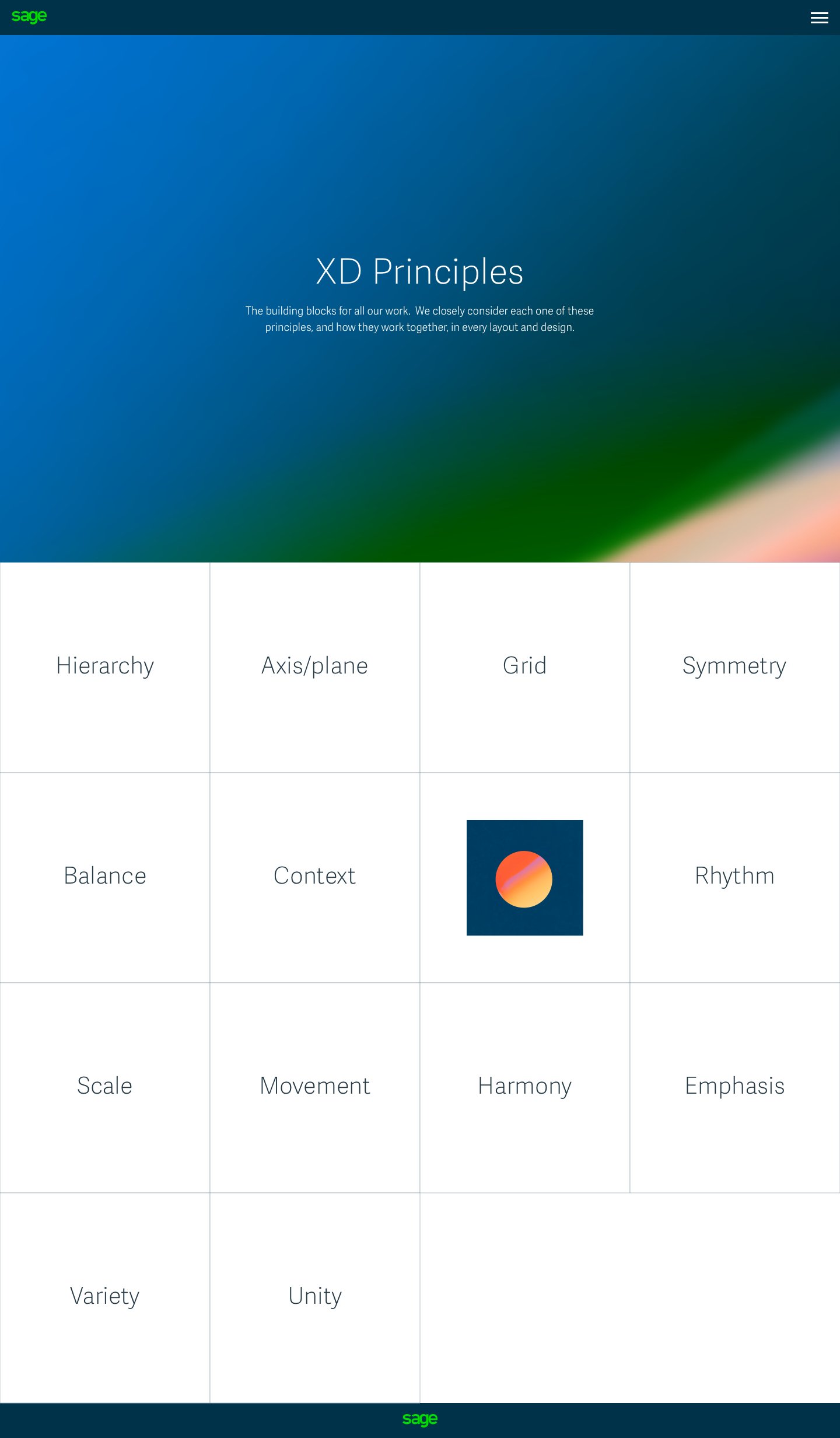
Why Design Systems Matter
A well-crafted system provides the foundation for designing experiences users love.
Creates seamless, consistent journeys from advertising to product
Speeds up delivery through shared components and patterns
Supports accessibility by design
Lets teams focus on innovation, not repetition
3 - Defining the Design Direction
Vision
Setting the vision, experimenting with identity, and inspiring a new visual language. This phase focused on aligning the brand team with a new, cohesive design direction, one that would modernise Sage’s identity and resonate with audiences in today’s SaaS market. My goal was to unify the company’s fragmented aesthetic and reimagine the visual and experiential language for a global business.
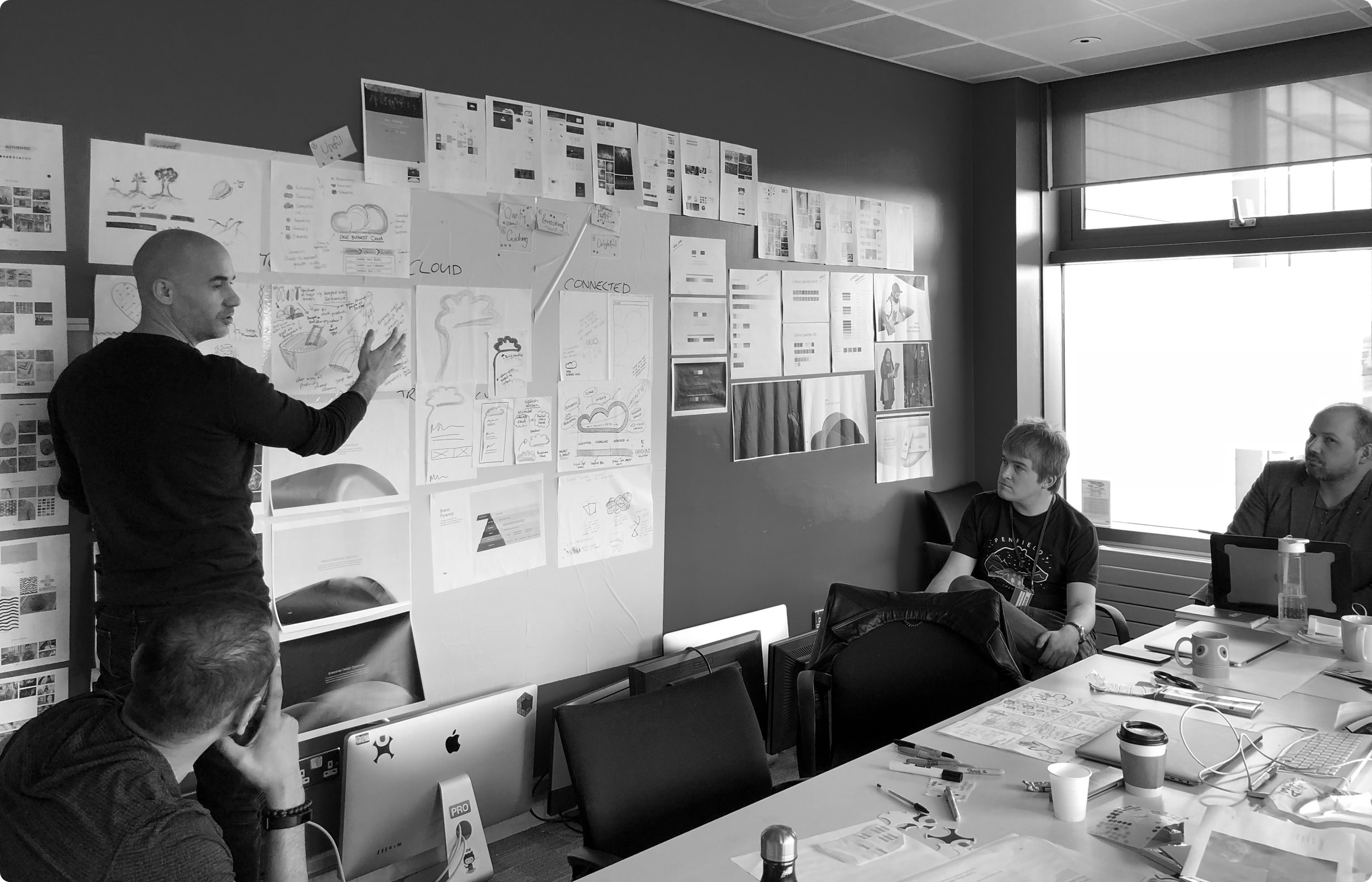
Discovery Workshops
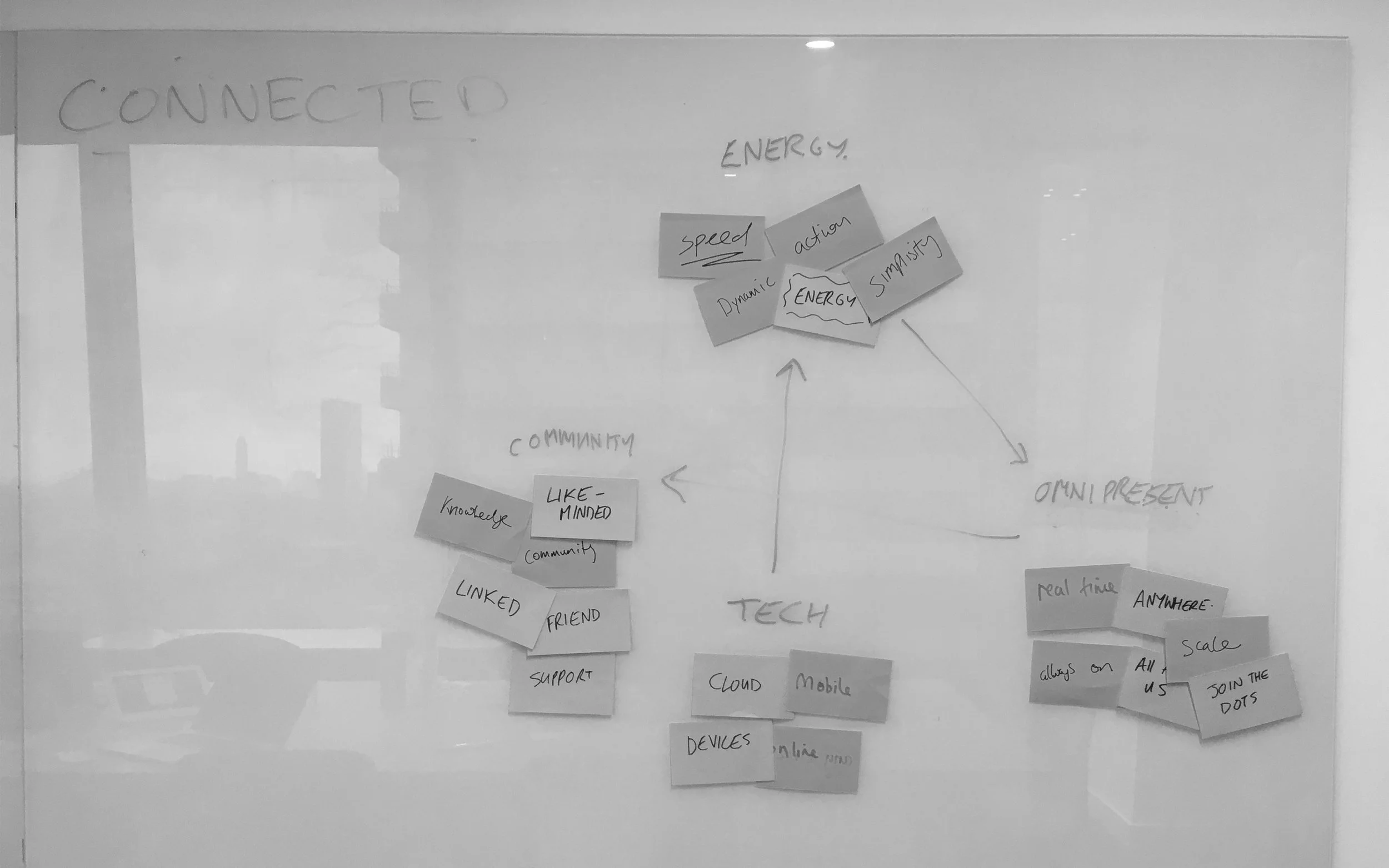
I kicked off a series of workshops in London with our UX, Design, and Tech teams. These sessions set the conceptual foundations for what would become the Sage Design Language System (DLS). They allowed us to generate, test, and refine creative ideas before bringing the wider organisation on board.
Drawing on my deep interest in semiotics, I introduced the idea that our design system should be rooted in symbolism and meaning. By focusing on the psychological impact of colour, shape, motion, and form, we ensured that every creative decision would connect intuitively with users, not just look good.


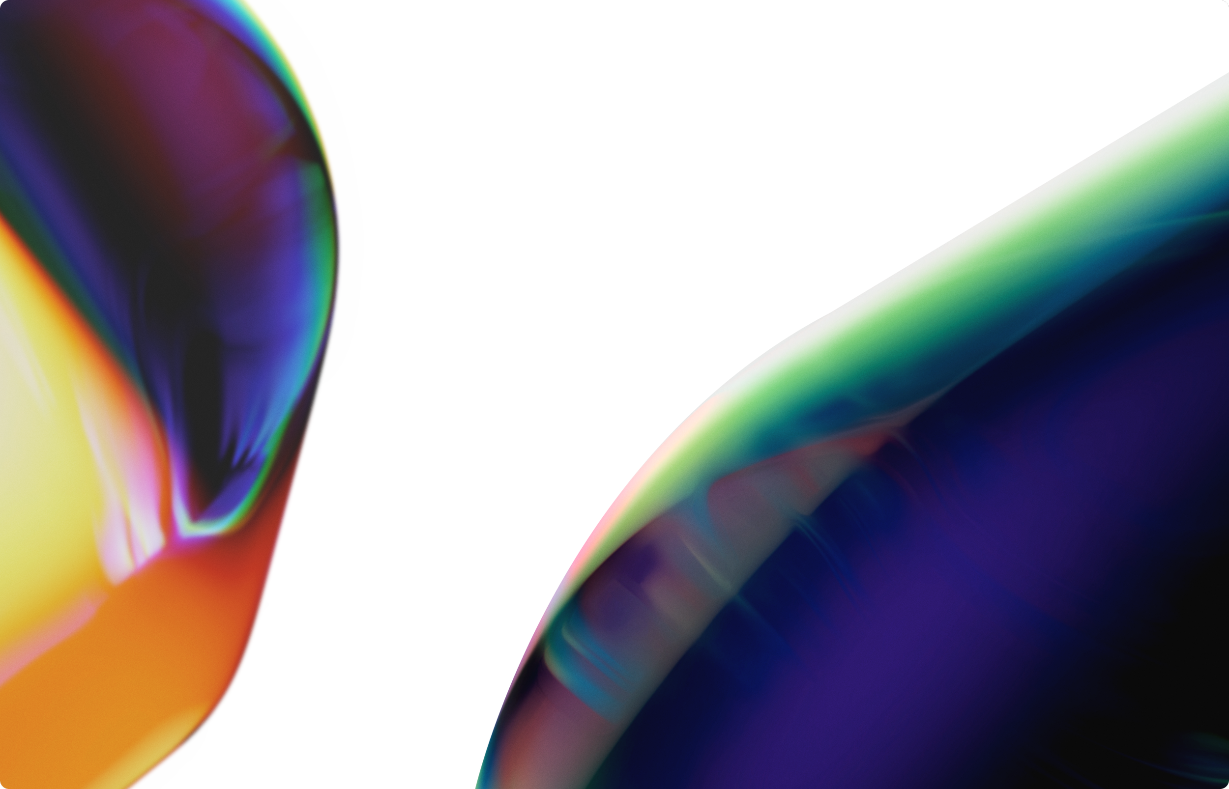
Connected Gradients
Instead of following generic SaaS design trends, I pushed for visual storytelling that felt fresh, ownable, and emotionally resonant. This led to the creation of a new gradient system, used to differentiate products and convey core themes.
The flow of data
The motion of cloud connectivity
The transfer of energy between Sage and its customers
Each product had its own gradient and colour logic, tying back to our semiotic foundations.
B2C approach to B2C
Although Sage is a B2B business, our research revealed that small business owners resonated more with B2C brands, those that felt human, relatable, and emotionally rich. With this insight, I challenged Sage’s corporate image and encouraged a new tone.
I proposed replacing lifeless stock photography with custom illustration to better represent real small businesses. At the time, this was seen as too radical. I was told "no" that it was too much illustration for a brand like Sage.
But I stood by the idea. I integrated illustration into our early DLS visual exploration and showed how it could infuse UI, marketing, and brand communications with vibrancy and personality.
Eight years later, illustration is now core to Sage’s global brand identity - a quiet confirmation that the vision was simply ahead of its time.


DLS Guides
While exploring early concepts, I also designed dynamic DLS guides. These were created to be responsive to business type and scale. They adjusted colour palette and brightness to reflect whether a user was a sole trader, small company, or enterprise.
This approach gave the brand flexibility and adaptability while maintaining consistency. It reflected the idea that design at scale doesn't have to feel generic, it can be personal, contextual, and inclusive.


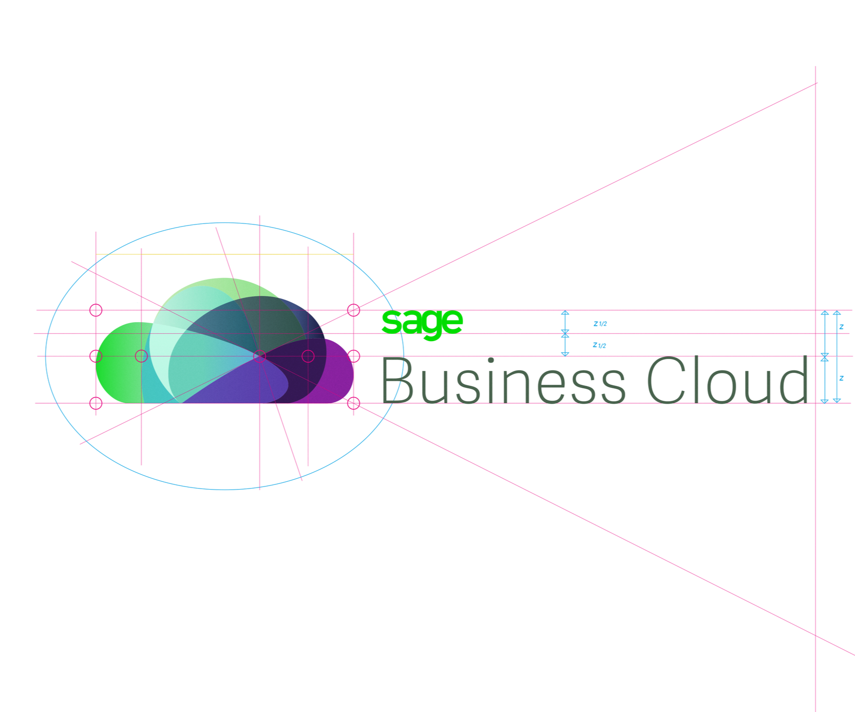
Logo Exploration & Strategy
I led the development of a conceptual logo that visually captured the vision behind Sage Business Cloud. The idea was to treat the cloud not as a metaphor, but as a literal system of connected products.
Each shape in the logo symbolised a product within the Sage ecosystem, representing collaboration, integration, and growth. It was bold, simple, and scalable, reflecting the very principles behind the DLS itself.
4 - Company Wide Restart
And then…start again
After presenting the designs to the head of brand and wider team, they expressed their enthusiasm and admiration for the work. However, they now desired to embark on a new phase with their team actively involved.
This shift in direction exemplified the dynamics at Sage for the next three years. The analogy often used was akin to manoeuvring a massive ship in the vastness of the ocean, a slow and intricate process. We frequently found ourselves having to pause, pivot, and accommodate various stakeholders before proceeding on our journey to a new destination, albeit sometimes less desirable.
Despite the challenges, as we concluded the London stage, it felt as though we had arrived at a new place, ready to for the next journey ahead.
Breaking Silos and Building Unity
When I joined Sage, the design and creative teams worked in silos. Collaboration across departments and regions was rare, and many felt that true alignment was impossible. I saw an opportunity to fix that.
I led inclusive workshops across London, Newcastle, and San Francisco - bringing together Product, Brand, UX, and Marketing for the first time. These sessions became a turning point in creating a shared language and unified direction.
What I Did
Built strong relationships across departments and global teams
Created the first cross-functional workshops in Sage’s history
Re-established shared rituals and ways of working
Encouraged mutual respect and creative openness
These workshops were the turning point, the cultural catalyst that enabled the wider rollout of a unified design system. We moved from duplication to alignment, from fragmented thinking to shared goals. This was the groundwork that turned the DLS from a design asset into a company-wide transformation.
We began by defining what makes Sage unique, gathering input from teams across the business to shape the core principles of the design system.


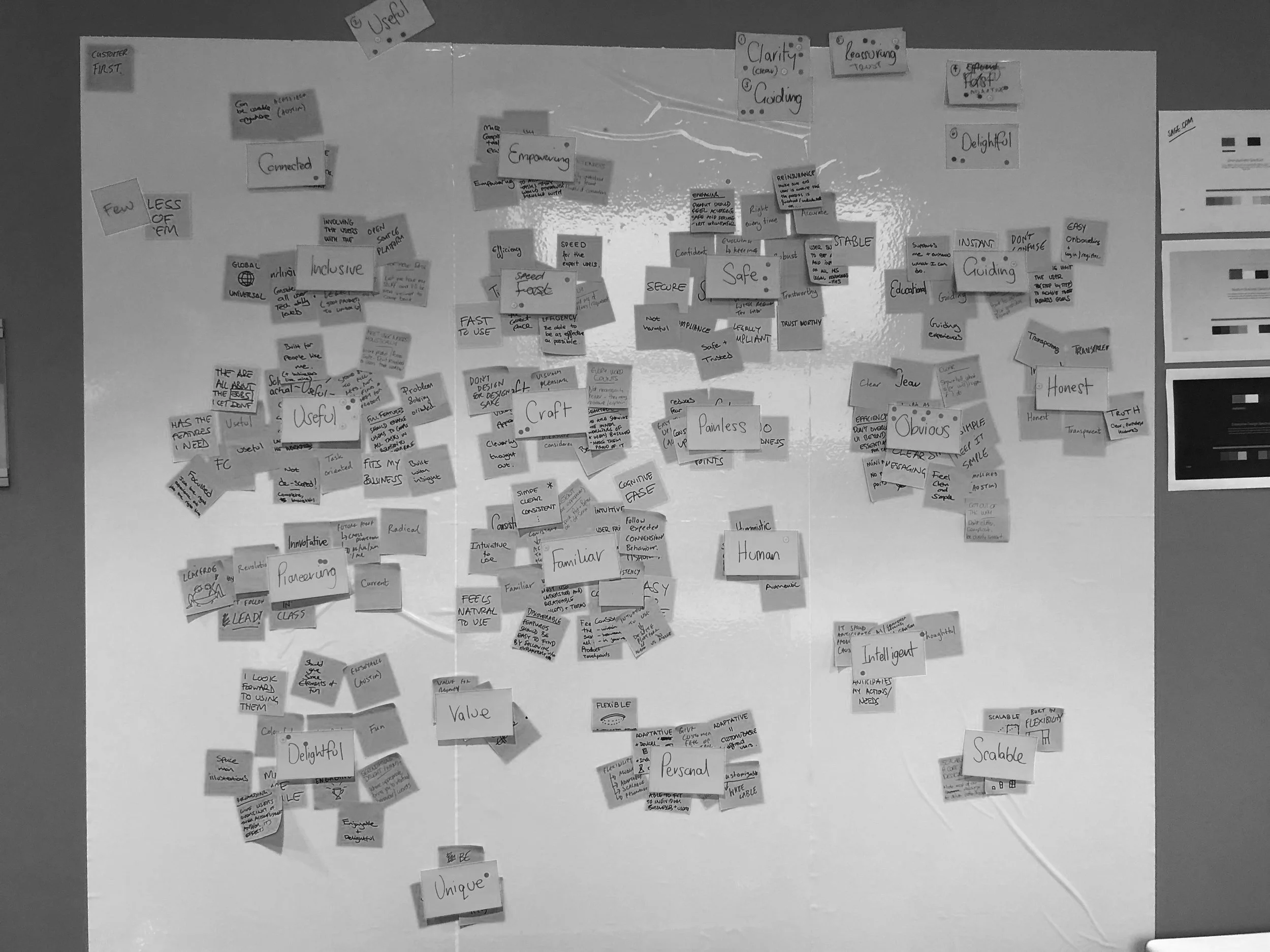

To foster unity, I ran group sorting and voting exercises. It was essential that every team member felt heard and included, especially as this was the first time the full team had worked together.


Establishing Design Principles
To set a shared foundation, we asked teams what Sage meant to them. Through group discussions, sorting, and voting exercises, we defined a set of core design principles that would guide everything that followed:
The Sage Design Principles
Clear and Guiding
Reassuring and Trustworthy
Delightful and Useful
Adaptive and Contextual
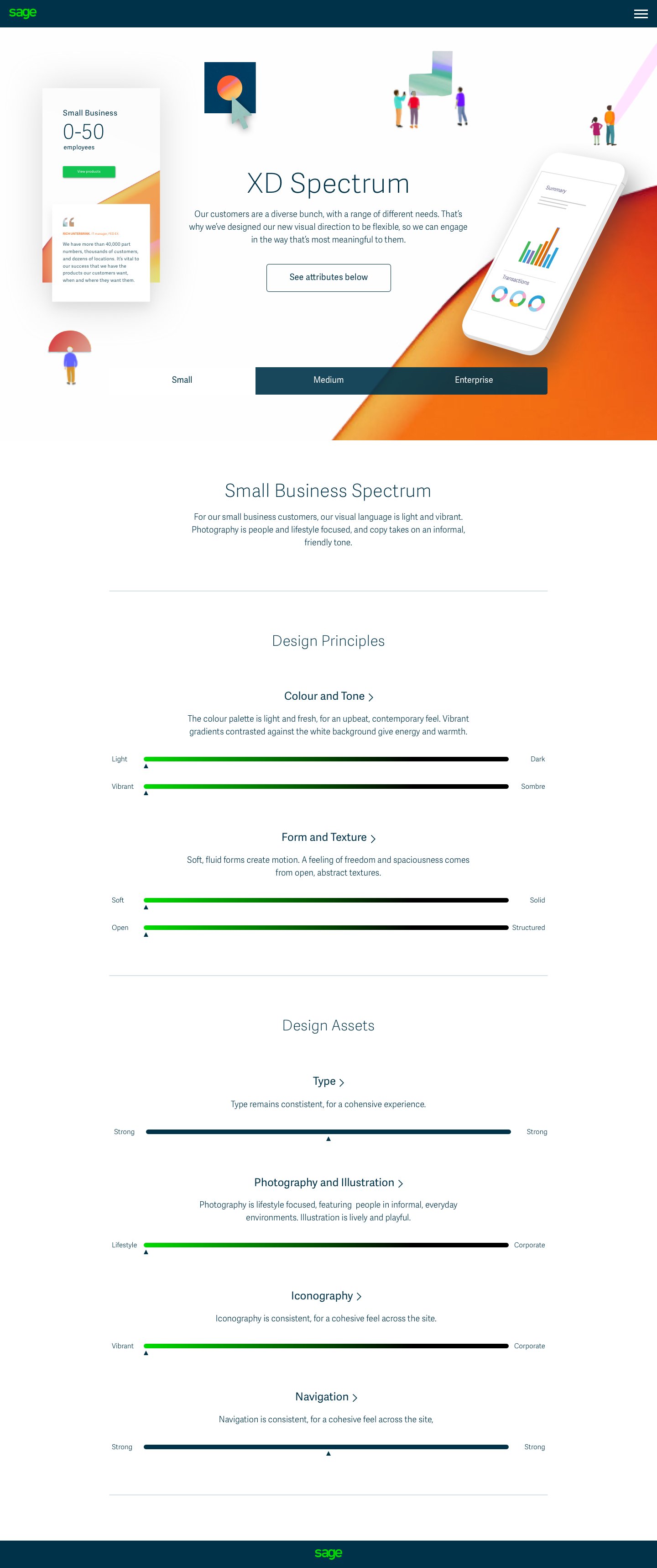
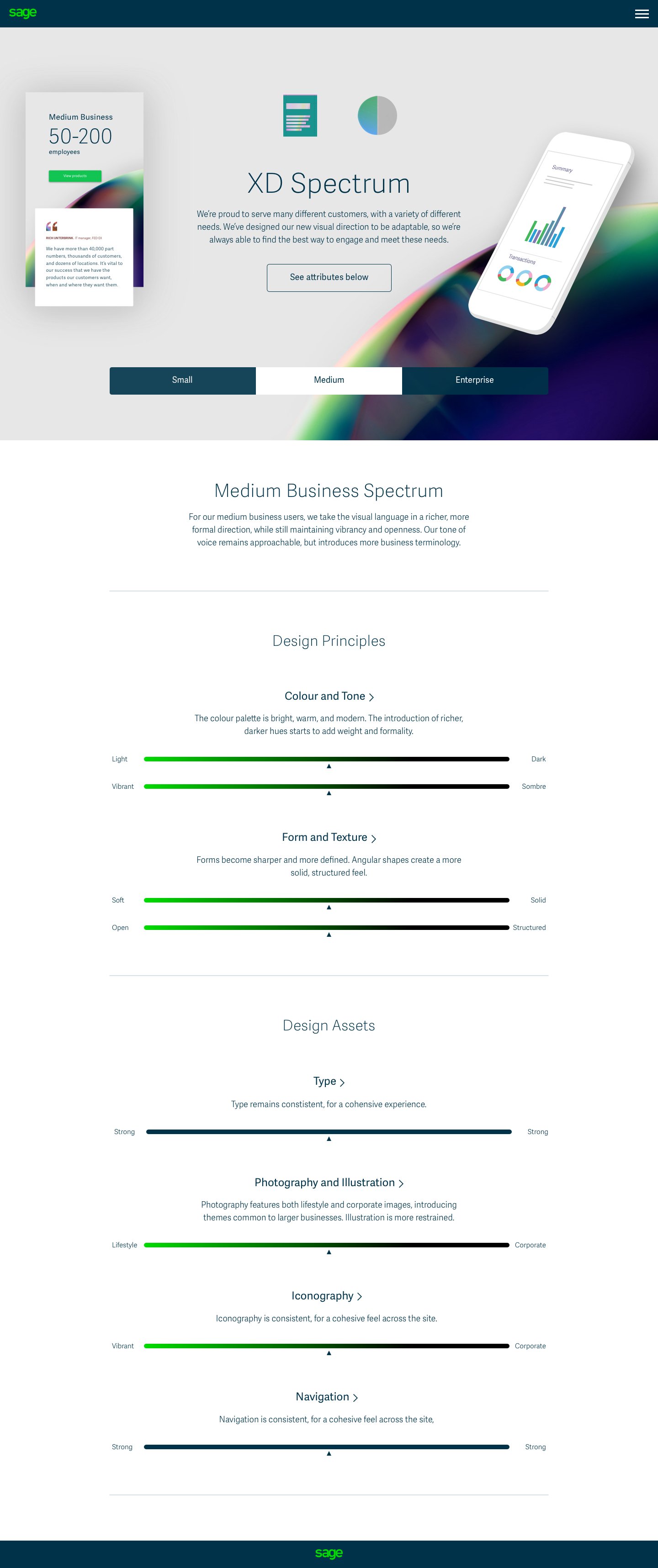
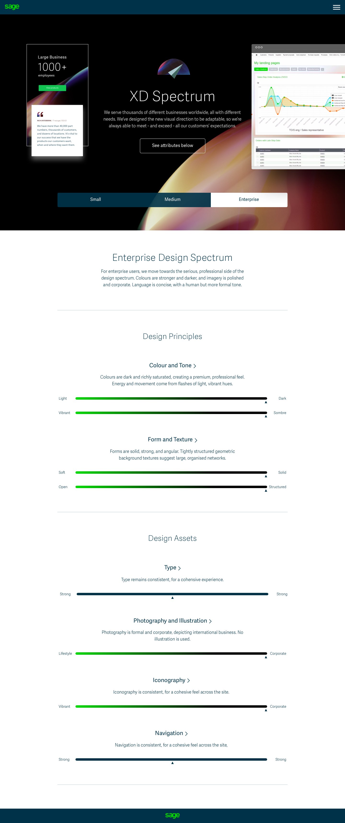
Crafting the Product Spectrum
To make Sage’s product suite easier to navigate and more emotionally resonant, I led the development of a clearer product spectrum. We had already tested this approach in London across 250 customers using brand-affinity and marketing preference tests and the results were obvious.
Key improvements:
Applied colour psychology to reinforce hierarchy and intent
Mapped colour to value: green for entry-level, blue and purple for premium
Made visual tone and UI adaptable by business size
The spectrum created clarity internally and externally and is still used across Sage's design ecosystem today.
Visualising Unity Through the Cloud
A core concept I pushed was the idea of a translucent, overlapping cloud, merging the product colours and semiotics we had explored during the London sessions.
This became a powerful visual metaphor for Sage’s connected ecosystem. Each product was symbolised by a shape and colour, integrated into a single, coherent form. It linked the DLS back to our original gradient work and became a fundamental expression of unity across the brand.

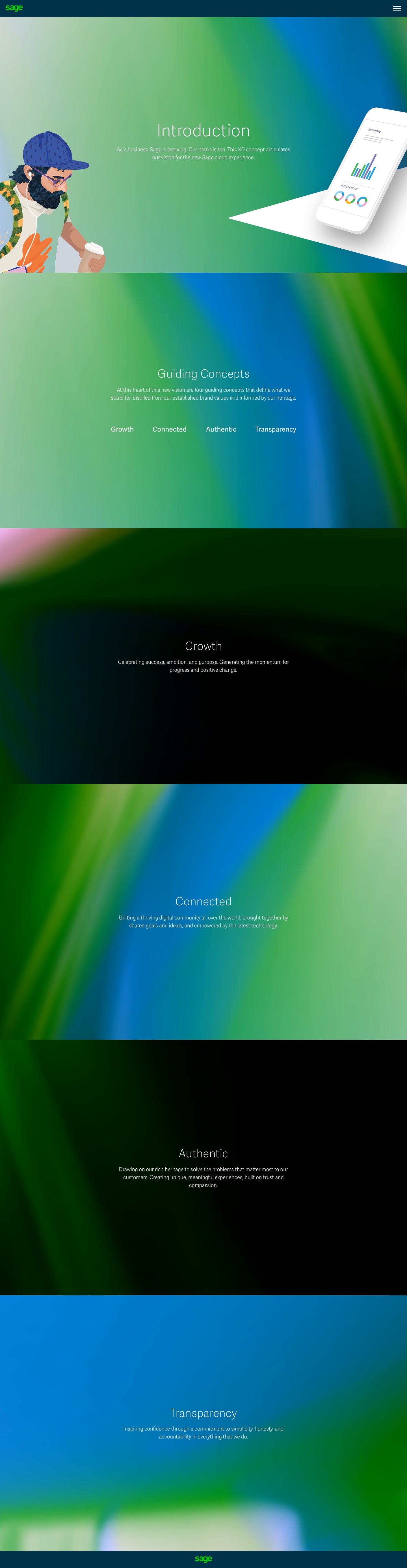
5 - Three Directions
Direction 1
A design that is user-focused, uncluttered, and honest. An idea to create unique, meaningful experiences, built on trust and compassion.


Direction 2
Layers overlap and merge, connecting and creating new forms. A celebration of our global community of business builders, united by shared goals and ideals.


Direction 3
Product-focused, futuristic, dynamic. Designed to inspire. Driving success, ambition, and purpose, and generating the momentum for positive change.


Preference Testing
As part of the DLS workshops, we ran small-scale preference testing to validate creative directions.
In-person sessions with 13 customers
Online testing with 200 participants
What We Learned
The outcomes were decisive:
Route 2 was the top choice for product visuals
Route 3 was the clear favourite for outdoor campaigns
Route 1 the “safe” route requested by the CMO performed poorly
All outperformed the existing brand look, reinforcing that users were ready for something fresher, bolder, and more connected.

6 - The Double Cross
Overcoming Resistance and Staying the Course
In the final stages of the defining the design, we encountered unexpected resistance from the highest levels. Despite months of collaborative work and positive internal feedback, our presentation to the CMO was blocked.
The global head of brand disowned the project during the final presentation.
This came despite his team’s earlier involvement and endorsement.
The reason cited was a perceived departure from Sage’s traditional brand image.
Route 1 was the safest option, but had limited support across the business.
This moment could have derailed the work, but instead, it became a turning point in how we approached change under pressure. Wew knew we needed to step forward as what currently existed didn’t work.
Realigning and Moving Forward
Rather than stop, we recalibrated. We found a path forward that honoured the creative direction while aligning with new boundaries.
Agreed on a more conservative direction.
Reframed the Design Language System (DLS) as a scalable toolkit, not a rebrand.
Continued rollout across digital platforms while maintaining UX and design quality.
Demonstrated how the DLS improved clarity, efficiency, and consistency.
This period tested our resolve but also proved the strategic value of design leadership, staying adaptable without compromising on vision.
7 - The “Compromise” DLS
The Outcome
While the outcome was more conservative than my original ambition, it allowed the system to progress without losing momentum.
Components were refined in a shared DLS library
Visual updates were aligned company wide
The system remained modular, scalable, and accessible
Design quality and UX clarity were maintained throughout
This phase proved that even with creative compromise, a strong system could still deliver value, enabling consistency, accelerating delivery, and improving experience across Sage’s digital ecosystem.


Sage Design System Rollout
The building blocks our people need to design Sage Business Cloud experiences users love.
One ecosystem: from .com to product. Beautifully seamless and consistent.
Complementing third party design systems like SalesForce Lightning, iOS and Android.
Achieves competitor parity in UI fidelity.
Shifts design resource from replicating standard components, to the cutting edge.
Sage takes its place in industry - the design system as a product of value itself.

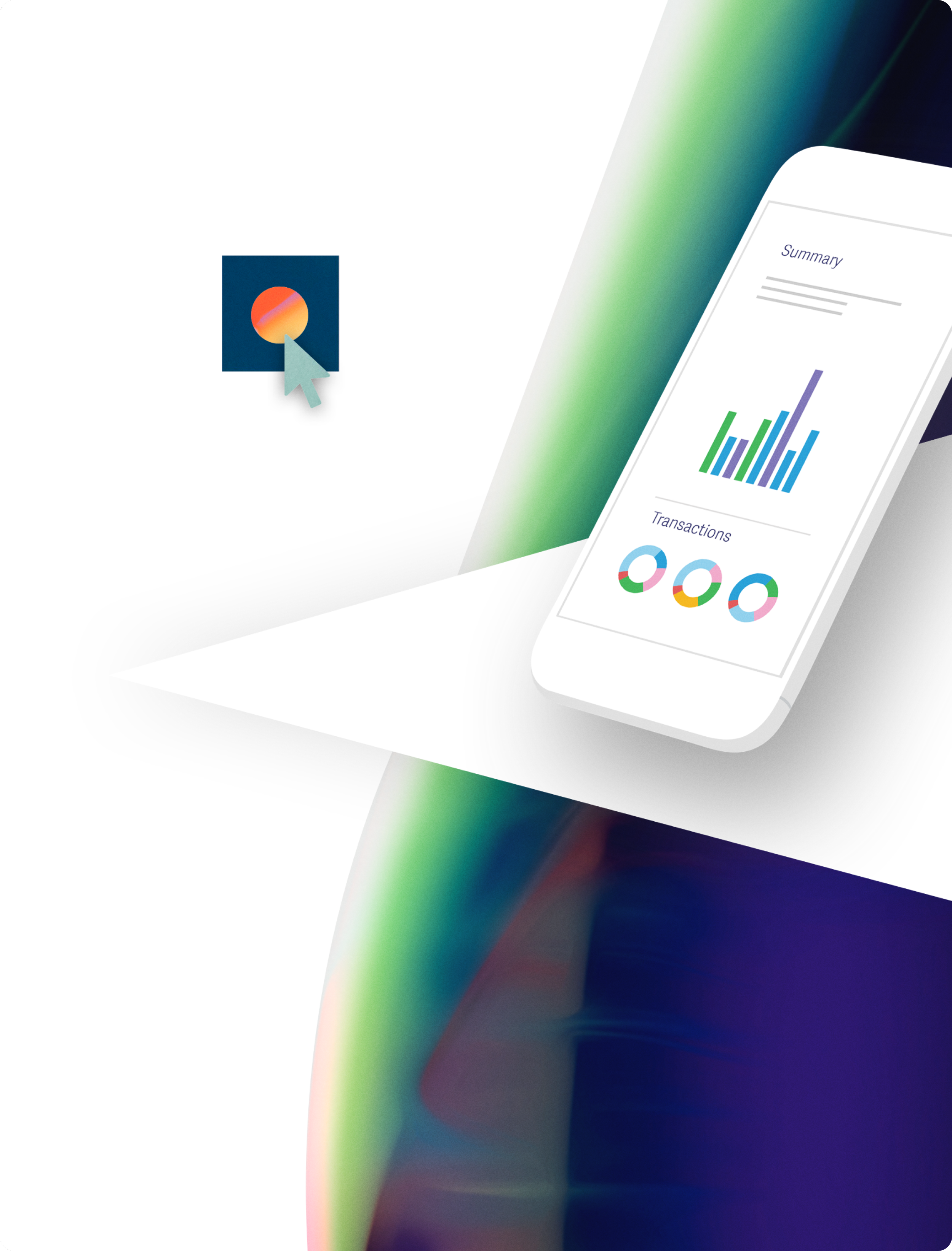
Colour Themes
Color themes were created for each business segment.
The Cloud
Indicates Sage Business Cloud products and services.
Colour elements overlap and unite to create a single shape.

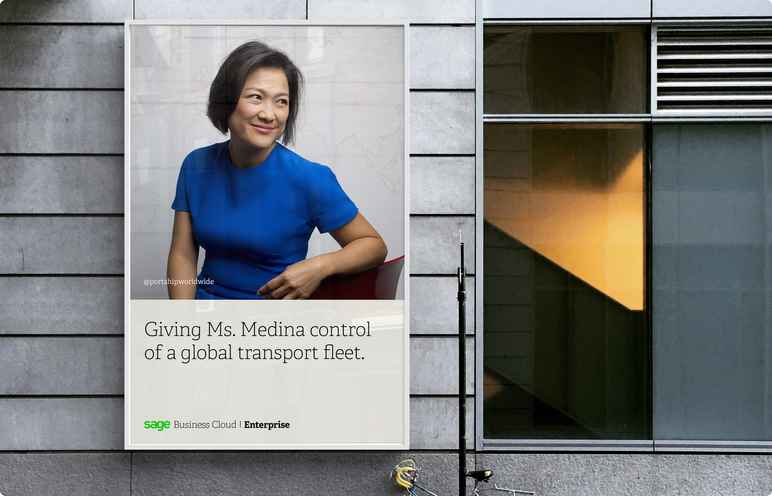
Photography
I overhauled the photography as the imagery was dark and oppressive.


Illustrations
Bring Sage Business Cloud to life, with a fresh, vibrant, and unique style.
The Sage illustrative world is not bound by reality, making it a great way to convey abstract concepts that cannot be conveyed with photography.


Illustration Placement
Effective use of illustration with a consistent style help users easily recognise Sage products and features.
Illustration can be used in instances where photography can't depict what you need to say.

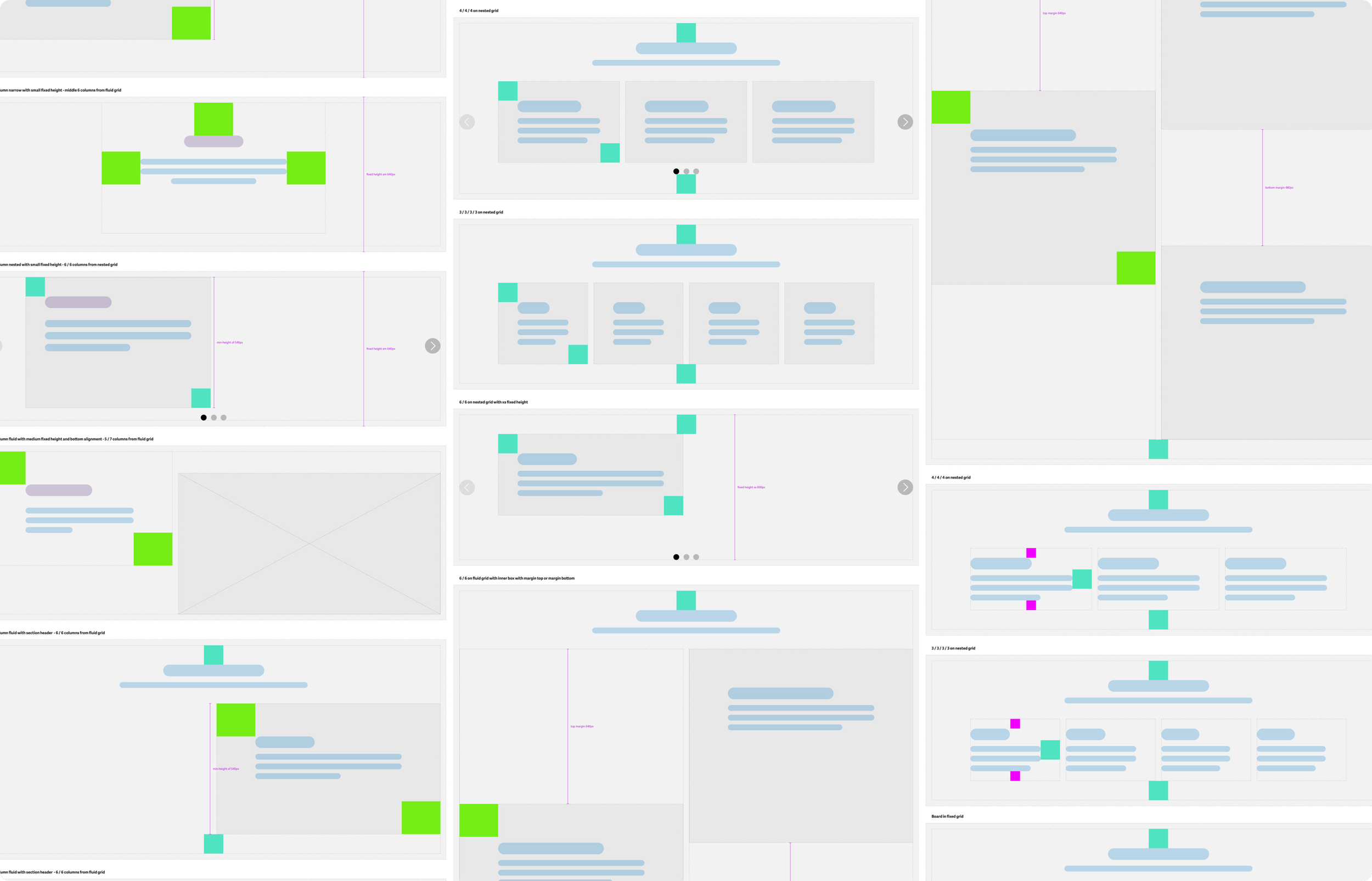
Building blocks for incredible experiences
Dozens of building blocks and hundreds of configurations offer infinite possibilities across web, product and apps.

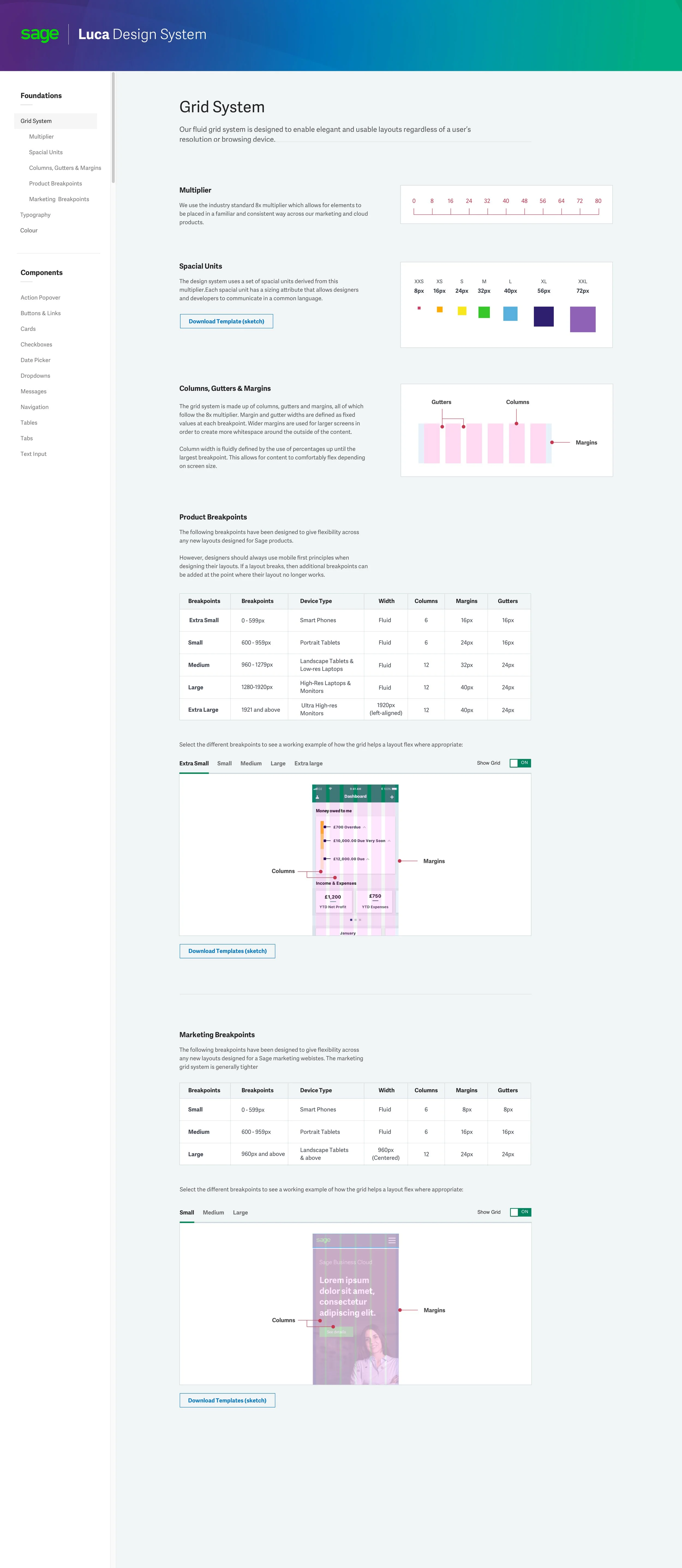
Grid
A scalable grid system applied across desktop and mobile.

Layouts
A variety of layouts to best showcase products and customers.
Typography
We pair fonts to balance uniqueness and readability. Responsive type scale optimises our content to look stunning on any device.

Icons & Product Logos
We designed unique logos for each product, incorporating graphic representations that aligned with the product's business size and colour. For example, the "A" for Accounting is inspired by an abacus, while the "E" for Enterprise Management resembles a warehouse on its side. Each of the 200 logos featured a unique creative concept and adhered to a defined grid.
As a result of these design improvements and through testing, we could determine that users were able to quickly and easily identify their products.

8 - Global DLS Launch
Global Rollout
We successfully launched the improved design across 33 international markets, all running on Sage’s legacy Sitecore platform. Despite its technical constraints, the new DLS-enabled design delivered a consistent and elevated experience worldwide, demonstrating that meaningful transformation was possible even within an ageing infrastructure.


Leading an In-House Success Story
Under my leadership, the in-house UX team, spanning the UK, Ireland, USA, and Canada, became the first to fully implement the new Design Language System. Working closely across regions, we delivered the project ahead of schedule and within budget.
The result: a significant uplift in performance, including a 42.3% increase in site conversion rates. This success proved that a unified design approach could drive measurable business impact, even within a complex, global enterprise.
Overall Performance (Year-on-Year)
+20.50% increase in Total Sessions
+42.30% increase in Site Conversions
Traffic Growth by Source (YoY)
+29.70% Organic Sessions
+42.02% Paid Search
+28.24% Social
Site Conversions by Source (YoY)
+2.41% Organic
+81.38% Paid Search
+8.09% Social
Results (Two Weeks Post Launch)
The short-term performance surge further validated the success of the new design system and user experience overhaul
+12.90% increase in Total Sessions
+16.25% increase in Unique Users
+57.43% increase in Form Submissions (WoW)
+1,058.49% increase in Form Submissions (YoY)
+28.46% increase in eCommerce Transactions (YoY)
+44.09% increase in Site Conversion Rate (WoW)
+255.50% increase in Conversion Rate (YoY)
9 - Positive Change
Lasting Change Through Design Leadership
Over three years, I didn’t just build a design system, I helped reshape how Sage sees and values design.
What began as a self-initiated idea grew into a global transformation, uniting fragmented teams, modernising the brand, and elevating user experience across 33 markets. I led with vision, but also rolled up my sleeves, prototyping components, running workshops, and collaborating across time zones.
The results speak for themselves: measurable uplifts in engagement, conversion, and customer experience. But more importantly, design at Sage moved from the margins to the centre.
Today, Sage is recognised as a design-led organisation. The DLS became the foundation for faster scaling, stronger brand coherence, and a better experience for millions of users worldwide.
Key Takeaways
Repositioned design as strategic infrastructure, not just visual output
Unified teams and systems across brand, UX, product, and marketing
Scaled a flexible design system across 33 global markets
Delivered measurable growth in traffic, engagement, and conversions
Paved the way for a design-first culture that continues beyond my tenure
It was a turning point in how design leadership can drive business