


I built the in-house design function, led the platform redesign, and delivered growth across every channel.
Client
TravelSupermarket
Agency
In House
My Role
Head of UX, Design, and Creative
Skills Used
Cross functional in house leadership
Strategy
Product and Design Leadership
Creative Direction
UX/UI Design
Prototyping
Testing Guerrilla, Quant, and Qual
CRO
Partnered with MD
Team Growth 1 to 30
Technology Strategy and Change
Content Strategy and Migration
The Challenge
The business faced an existential challenge: replatforming on an aging technology stack, redesigning all customer booking channels, and migrating 6,000 SEO rich pages without losing critical search performance.
The Solution
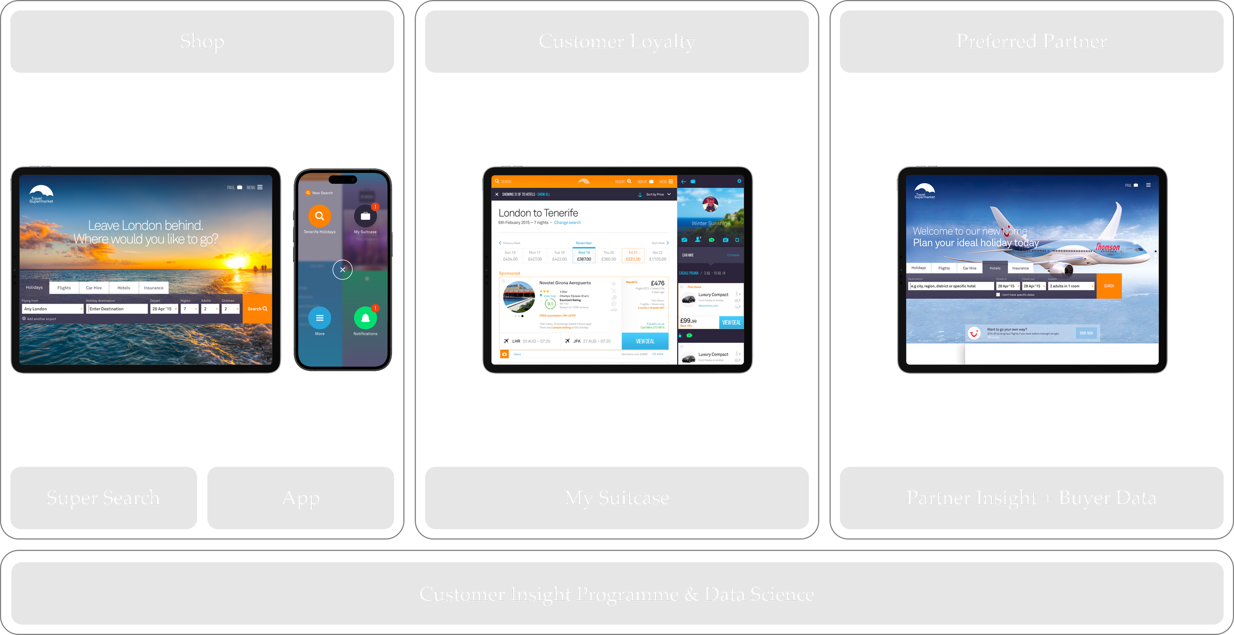
I led the replatform and redesign across every major channel, including hotels, flights, car hire, holidays, and insurance. We replaced more than 20 legacy templates with a modular system, raised accessibility standards, and shifted the model from cluttered paid media towards cleaner, conversion focused design. I built the design team from the first individual hire to an embedded team of thirty, and in parallel I directed a dedicated content team to migrate 6,000 SEO pages, ensuring brand and accessibility guidelines were met in full.
The Impact
Monthly visitors doubled from 2.4M to 4.8M, conversions improved across all channels, and SEO visibility was retained through the migration. The redesign delivered a cleaner, faster, and more coherent platform, proving how hands on leadership can deliver strategic transformation at enterprise scale.

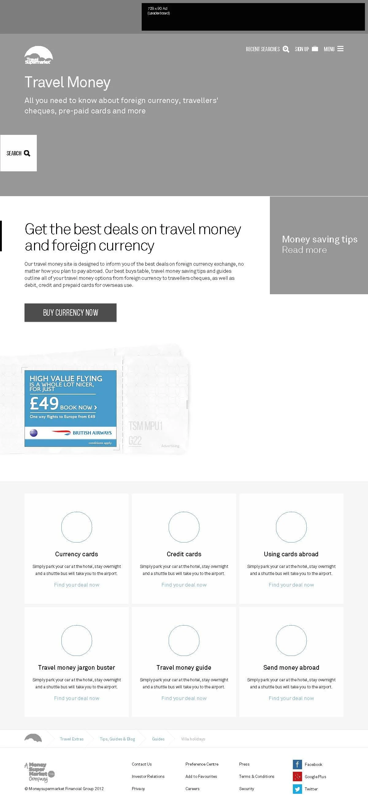
Overview
Overview
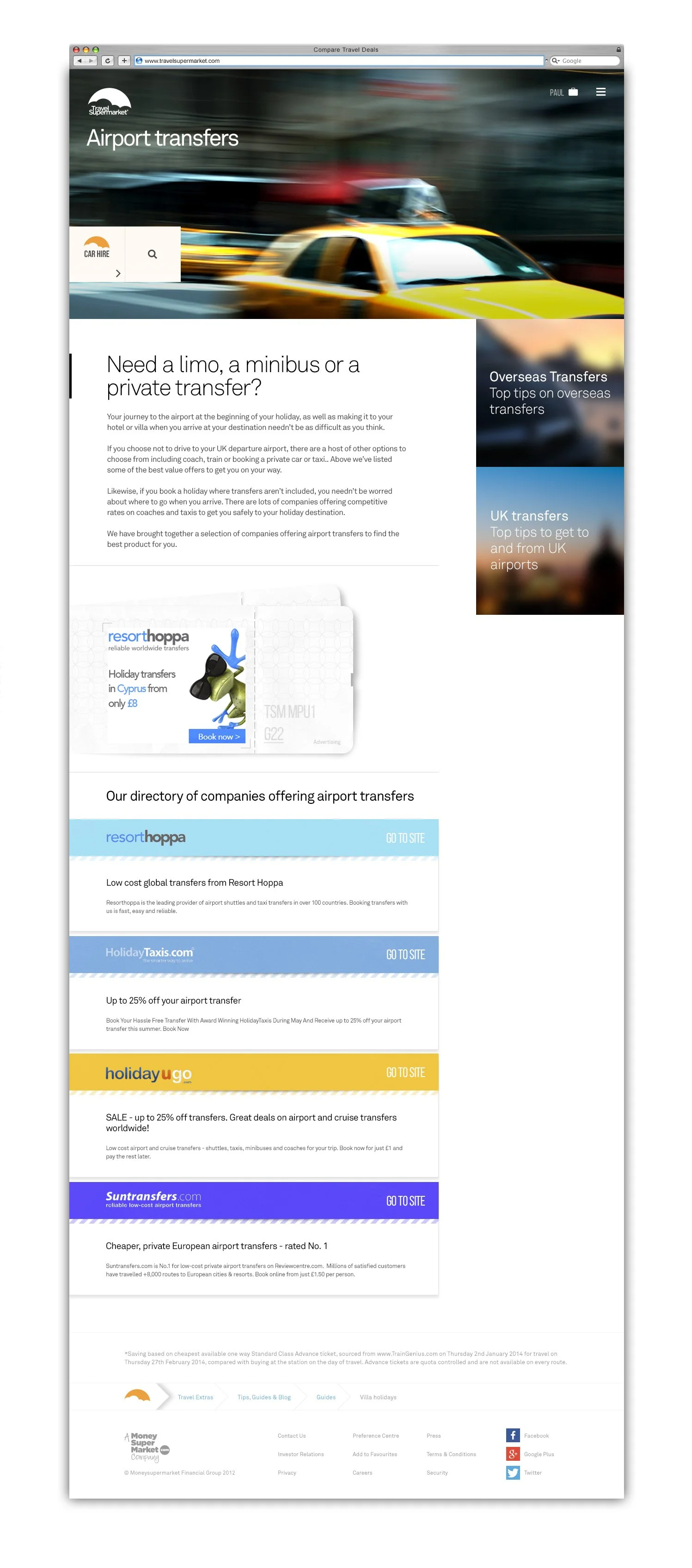
TravelSupermarket brings together hotels, flights, car hire and package holidays from a large network of partners. The brief was to modernise the entire platform while protecting the SEO foundation that sustained traffic. The site ran on outdated technology that slowed innovation, so a complete rebuild was essential. Every decision was shaped by mobile-first thinking, accessibility and clarity across all devices.
Post Transformation Conversion Funnel
-
![]()
1. Timing
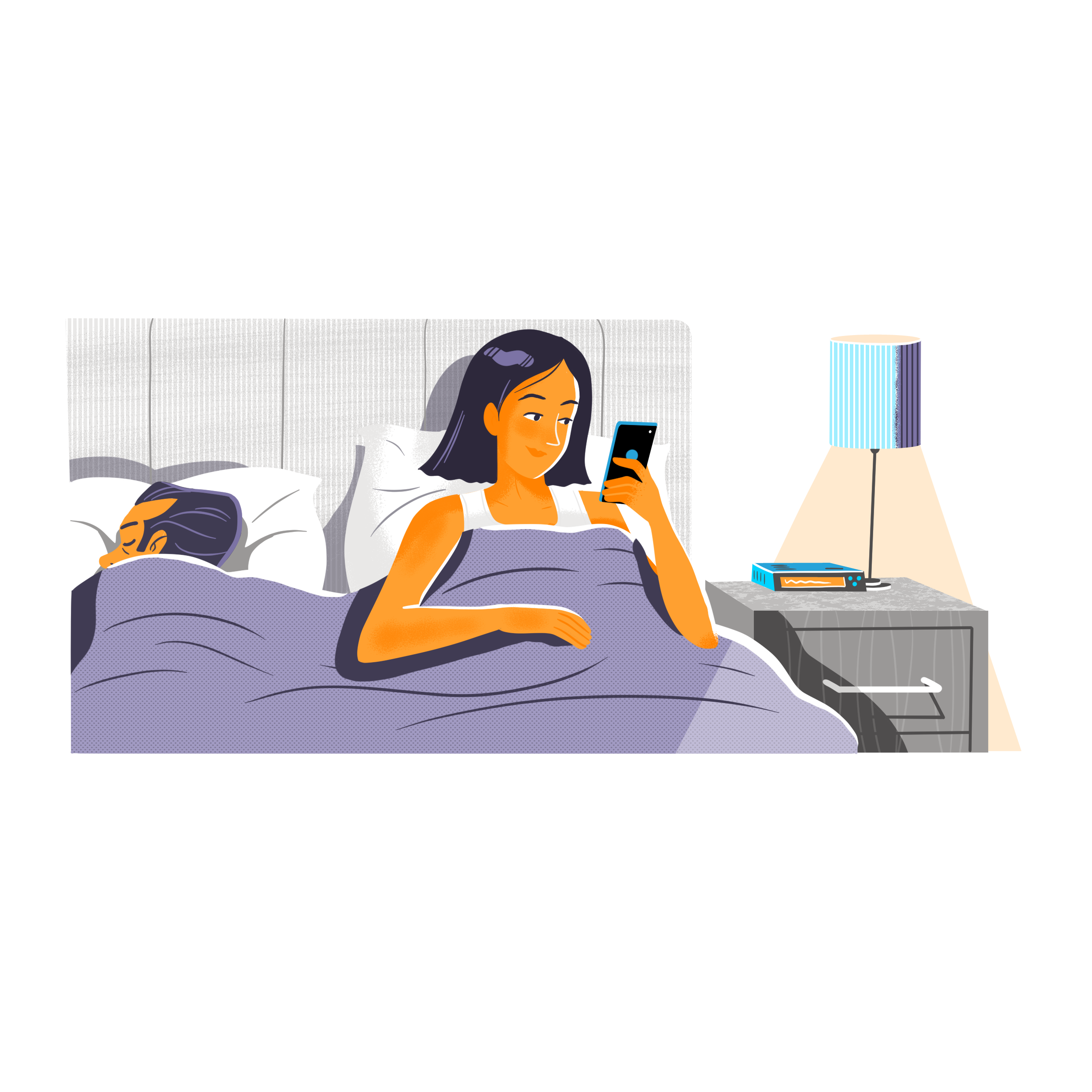
It's cold outside, but Jane is inspired by the TSM TV ad and a chat with friends to plan her next getaway. The idea is now top-of-mind.
-
![]()
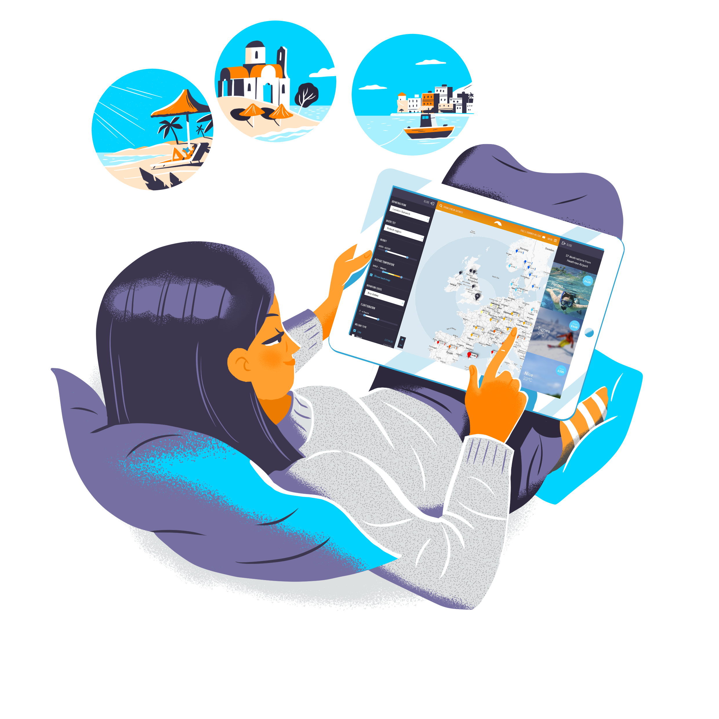
2. Supersearch
She uses the simple, on-screen prompts of super search to easily filter for her complex criteria: Easter, all-inclusive, activities and within a clear budget.
-
![Using on-screen prompts to create some holiday options she finds it so much easier than last year. Storing all her deals in her virtual suitcase, 3 different holidays fit the bill.]()
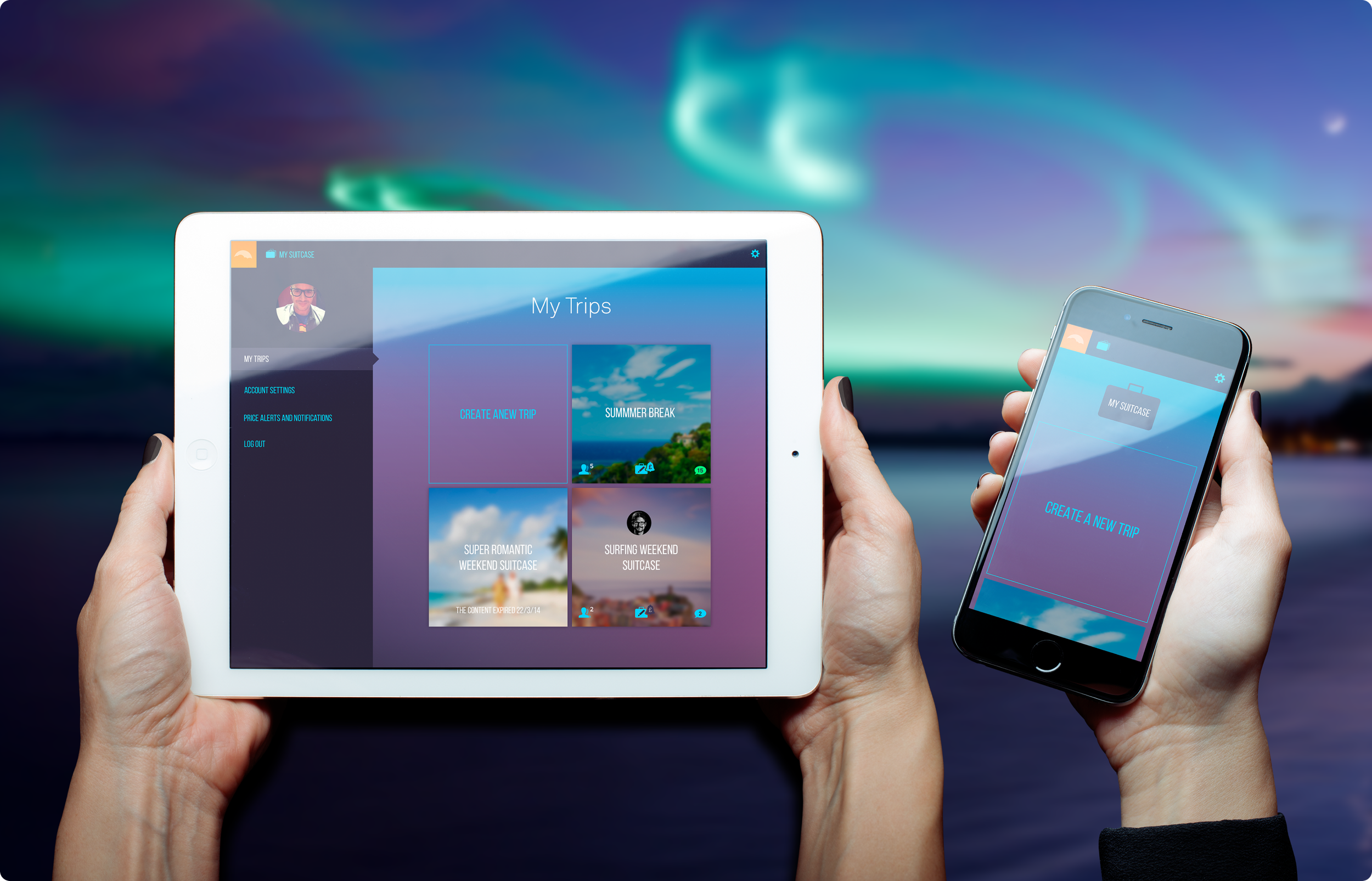
3. Creating A Suitcase
Jane finds three great holiday options and stores them securely in her virtual 'My Suitcase', finding the process much simpler than last year.
-
![]()
4. Sharing The Suitcase
Consulting the family, she seamlessly invites her husband (laptop), daughter (iPhone), and son (phone) to view her 'Easter Holiday' shortlist.
-
![]()
5. Invite & Voting
Her daughter instantly accepts via the new TSM iPhone App, and the whole family checks the options, quickly voting on their favourite destination.
-
![]()
6. Notifications
Jane is instantly notified that they have all agreed on the winning holiday, finalizing the research phase faster than ever before.
-
![]()
7. Price Alerts
Having activated Price Alerts, she receives an alert the following day that prices have slightly increased, a crucial prompt to book immediately.
-
![]()
8. Cross Sell
Jane uses the TSM app to refresh prices. She notices a well-priced car hire deal is suggested. She messages Paul to get his opinion. After all he's driving.
-
![]()
9. Holiday Booked
Jane adds the suggested car hire to the basket and books the trip immediately. Job done.
-
![]()
10. Cross Sell
Within a few days, she receives a proactive notification: "Easter holiday protected? Insure today and get cancellation cover." She buys it straight away, grateful for the reminder.
-
![11. Engagement]()
11. Engagement & Cross Sell
Jane receives her holiday countdown reminder email, which includes a useful packing checklist, prompting her to set to work and book airport parking.
-
![]()
12. Before You Fly
A week before departure, she receives a downloadable guide to Tenerife with tips and key phrases, along with an offer for an airport lounge and fast track security.
-
![]()
13. Welcome Back
After a great trip, she receives a welcome back email from TSM asking her to rate the service and her holiday experience. She also shares her 'My Suitcase' trip with friends.
-
![]()
14. Next
A personalised email on 'Bargain short breaks for families' for the upcoming bank holiday arrives, pulling Jane back to her saved 'My Suitcase' for the next booking.


Audit
Challenges
The project’s scale was daunting and carried real risk to the business. We were re-platforming an ageing codebase while redesigning every major booking channel and safeguarding 6,000 SEO pages that powered traffic. The legacy stack limited innovation and mobile speed, and over 20 disconnected layouts created confusion for users. Search engine API limits added further complexity. This became an opportunity to rebuild the experience from the ground up and modernise TSM for the future.
Project Drivers
Business growth was limited by old tech
Competitors were innovating faster and TSM risked falling behind in UX and features
Hotels channel growth constrained by reliance on white-labelled search engine
Success hinged on finding harmony between commercial goals and real user needs
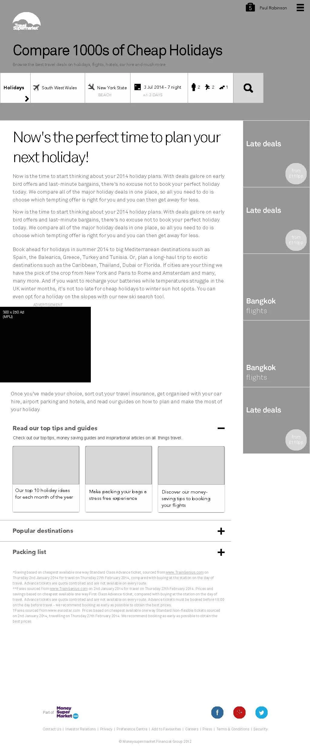
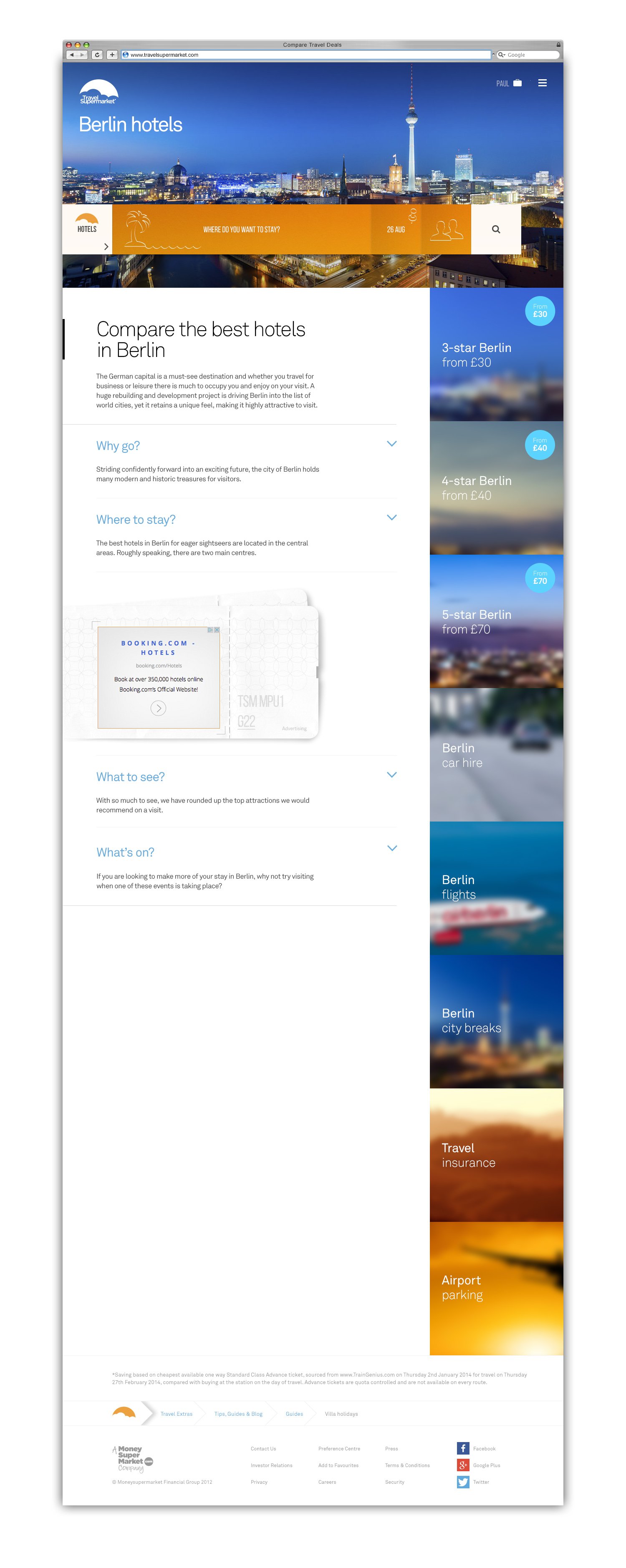
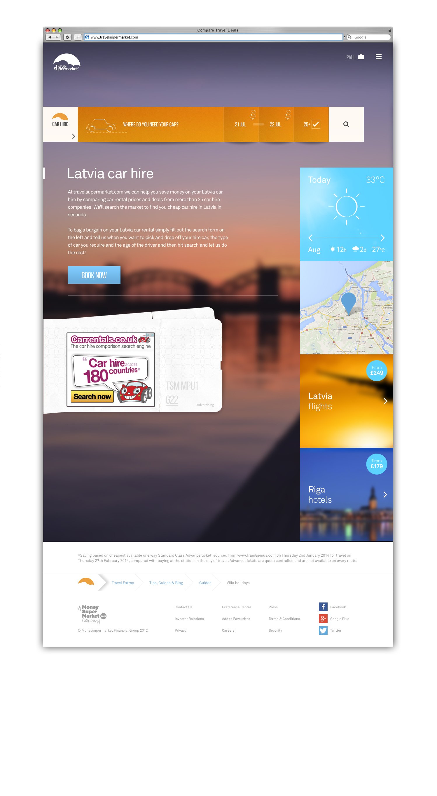
TSM Site & Content Audit
I began by mapping the entire ecosystem to expose weaknesses and opportunities. The audit revealed inconsistent layouts, duplicate patterns and inaccessible templates across the platform. It also highlighted SEO dependencies that required surgical precision during migration. This insight guided both the redesign and the re-platforming roadmap, ensuring every improvement was tied to business impact.
+20 Old Site Templates

Old Search

Strategy
Business Model
TSM earned commission per booking or click-through and on advertising, making traffic volume critical to revenue. With over 6,000 SEO-optimised pages, content was the engine of growth. Every design decision had to balance user trust, conversion and organic visibility.

SEO content strategy
The strategy treated content as a strategic asset, not an afterthought. Our goal was to preserve TSM’s search equity while lifting overall quality. We redefined how pages were structured, imaged and linked to support both human and algorithmic understanding. Every page became part of a unified content system that drove visibility, trust and conversion at scale.
Partner Strategy
The partner strategy focused on balancing clarity for users with visibility for hundreds of travel brands. We needed to bring order to a chaotic mix of legacy logos while preserving each partner’s identity. The solution was a cohesive design framework that standardised placement, scale and contrast so every mark felt intentional rather than intrusive. This consistency strengthened trust, improved recognition, and elevated TSM’s credibility as a neutral comparison platform.

TSM Brand Strategy
We refreshed the brand to reflect a confident, modern marketplace. The new identity was embedded across every channel through consistent typography, colour and interaction design. It positioned TSM as a trusted travel utility with personality and clarity.
Mapping the Customer Journey
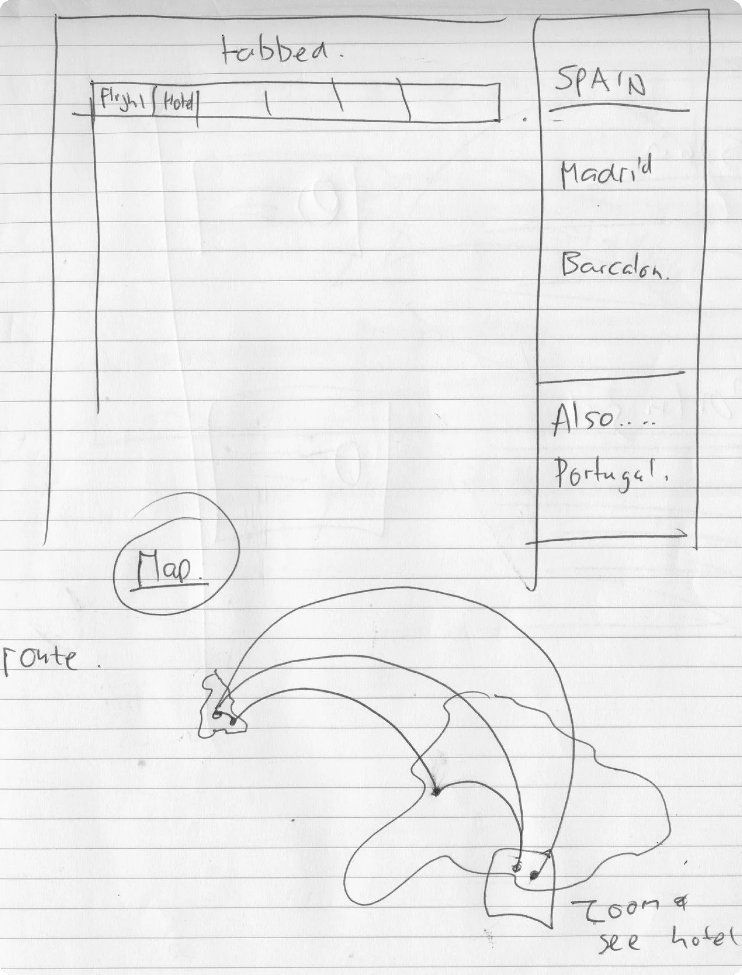
We ran workshops to map the customer journey from inspiration to booking. This revealed pain points in research, comparison and mobile switching. The process defined a new product vision and inspired features like My Suitcase, a bookmarking tool designed to deepen engagement and retention.

Restructure
The goal was to create a design system that could scale with the business, not just replace what existed. The old site had more than 20 disconnected layouts, slowing change and fragmenting the experience. The restructure defined a single modular framework that united design, content and technology around shared principles. It gave TSM the agility to adapt, evolve and deliver faster across every channel.

Ideation
Sketching & Group Sessions
The creative UX/UI process started with rapid sketching to capture ideas before refining them digitally. Collaborative sessions brought together design, engineering and business stakeholders, encouraging open discussion and fast iteration. Concepts were explored on walls and notepads, tested for resonance, then developed into digital prototypes that fed directly into the transformation programme.

Innovation Pipeline
Alongside the core product I ran an innovation pipeline with the team so that we could push our ideas further. Some ideas made it into the product and delivered big improvements like “My Suitcase”. Some ideas where just too far ahead of the technology at the time. But I strongly believe that is where the best ideas are. Not following trends, but setting them.


Design - Colour
Accessible Elegance
The colour strategy positioned TSM as vibrant and distinct within a category dominated by blue and teal. We chose an orange and purple pairing inspired by sunsets to evoke energy, warmth and optimism. The palette was tested for contrast and legibility, ensuring accessibility without losing character. It created a cohesive identity that felt both confident and inclusive, translating seamlessly across digital and brand touchpoints.
Dark Orange
FF8201
Light Orange
FFA030
Dark Blue
27A3D9
Light Blue
00D3FE
Dark Purple
2D283C
Medium Purple
403A54
Light Purple
7C72A7
Black
000000
Dark Grey
4C4C4C
Medium Grey
9A9A9A
Med Light Grey
E1E1E1
Light Grey
F7F5F6
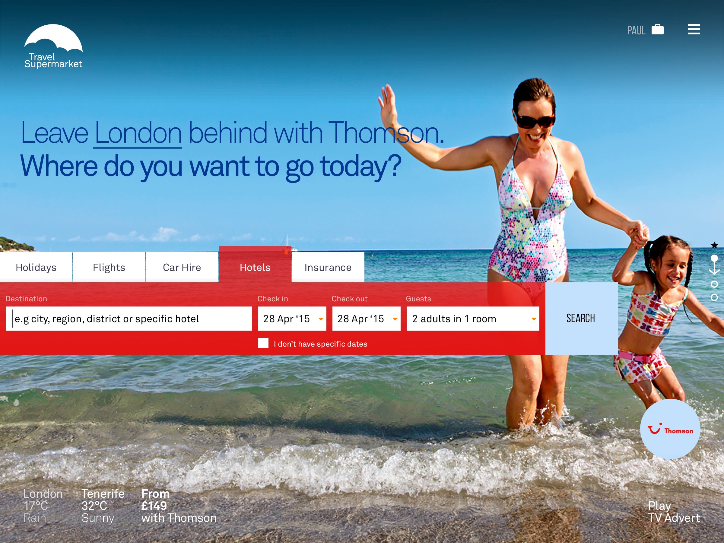
Design - Home
A Clean Home
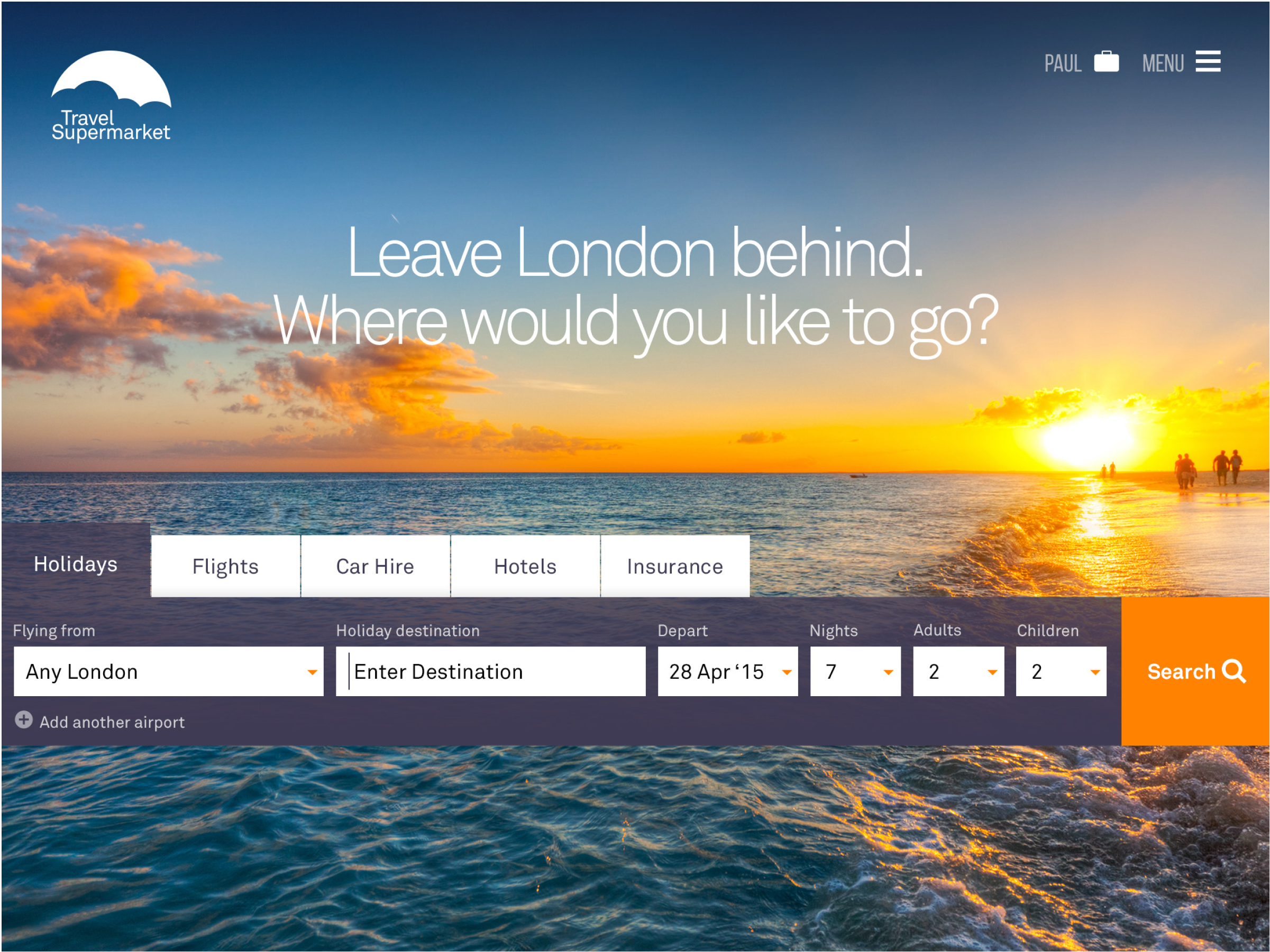
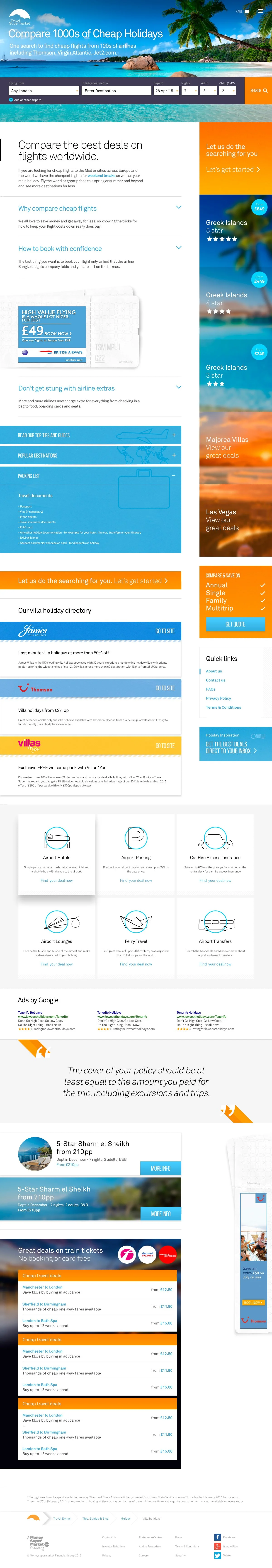
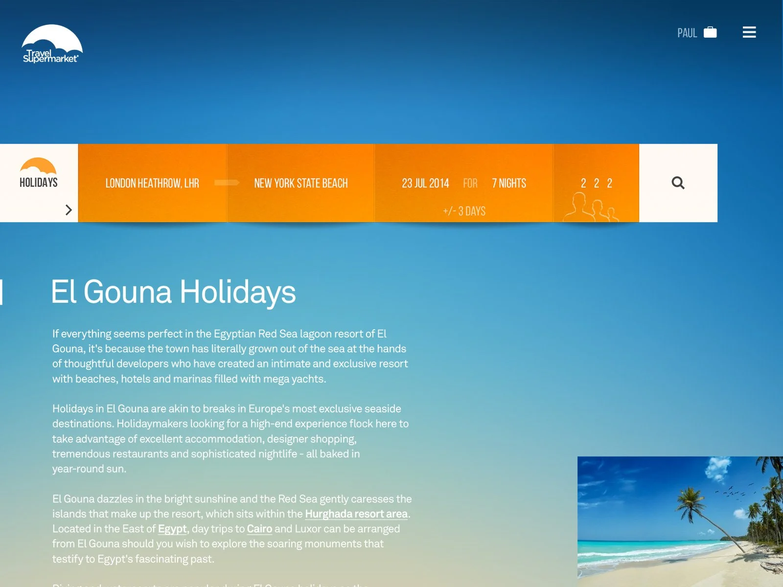
The new homepage became part of the search journey, not a space for ads as previously. By removing clutter, we created a seamless path from intent to results and built trust through focus and clarity. The shift supported a performance-based model and positioned TSM as a cleaner, more user-centred brand.
Design - Search
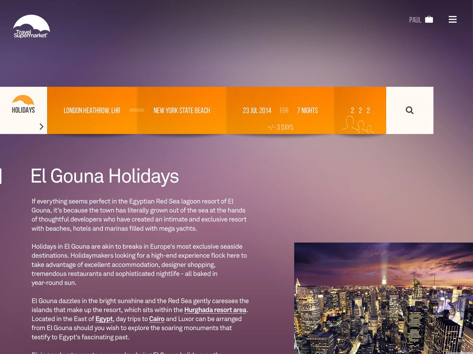
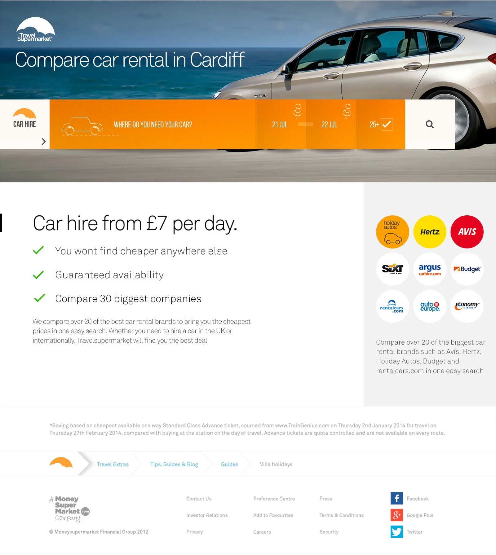
Search UX/UI Design Approach
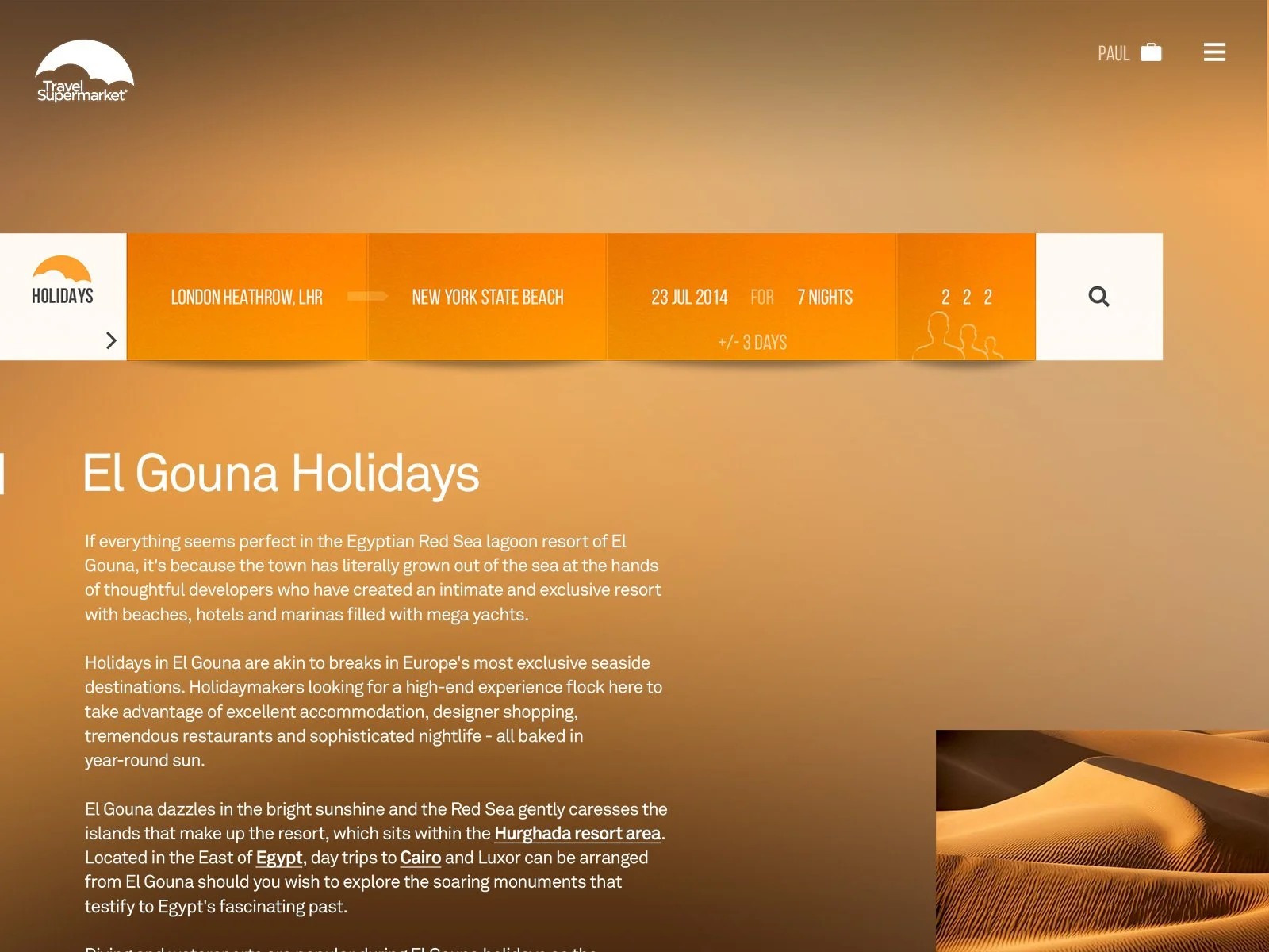
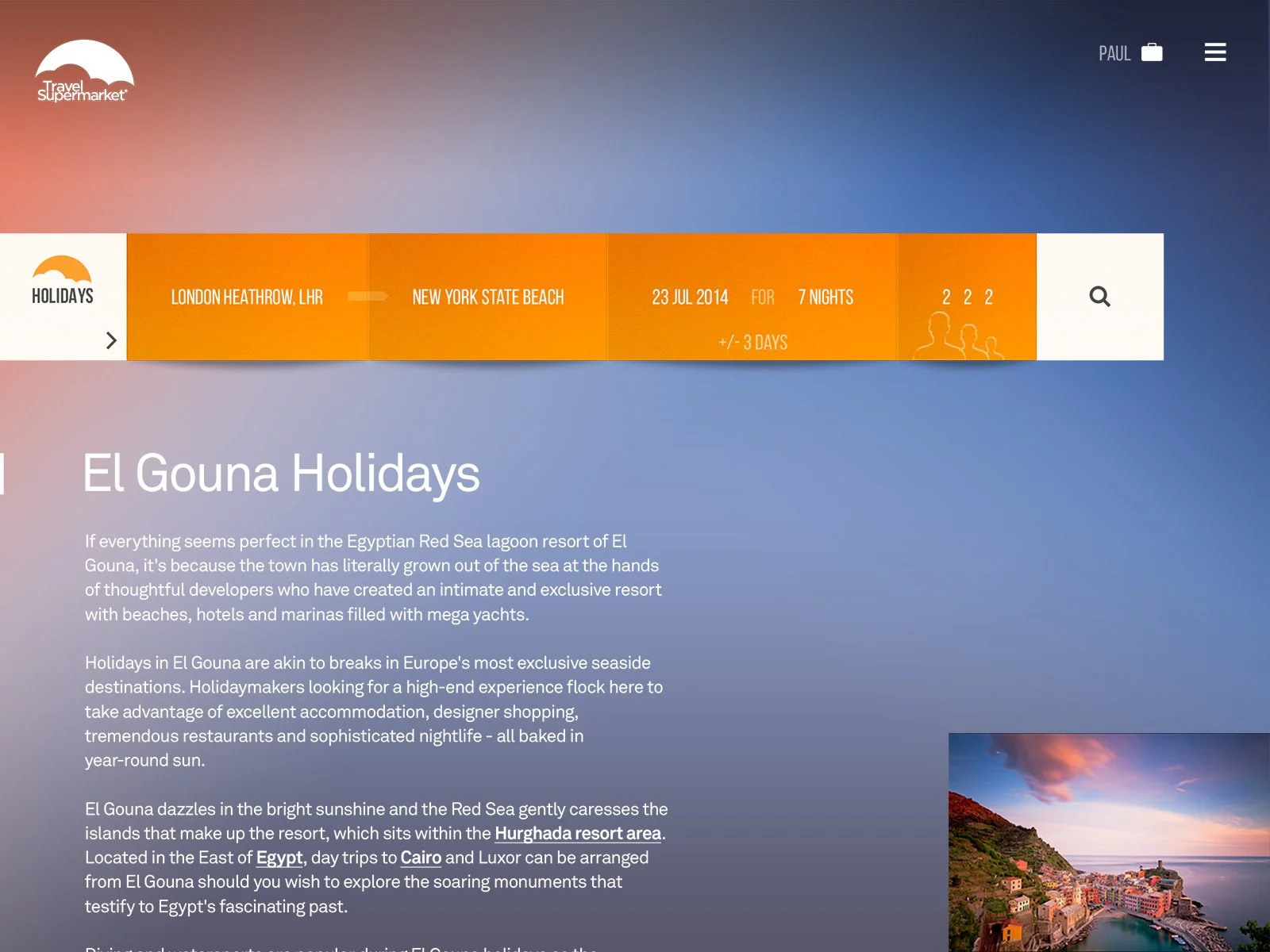
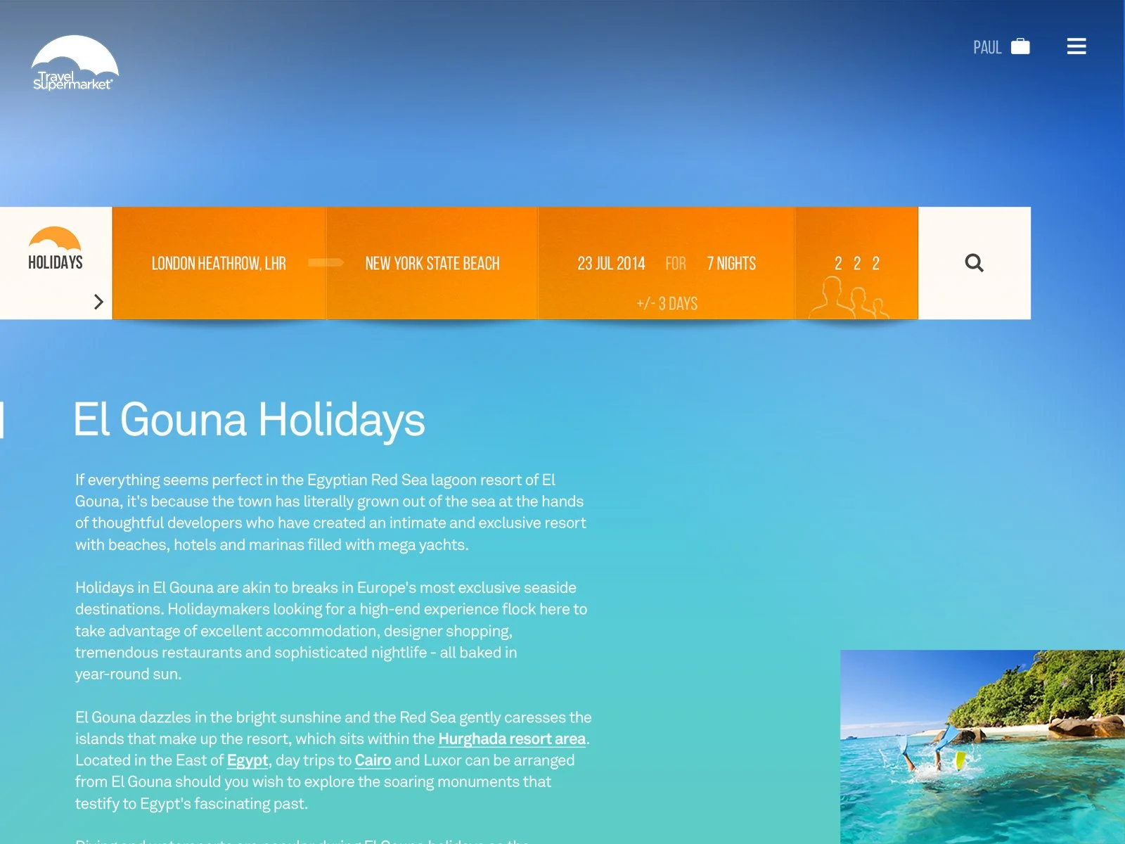
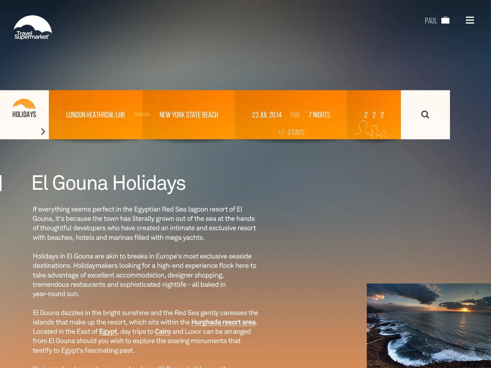
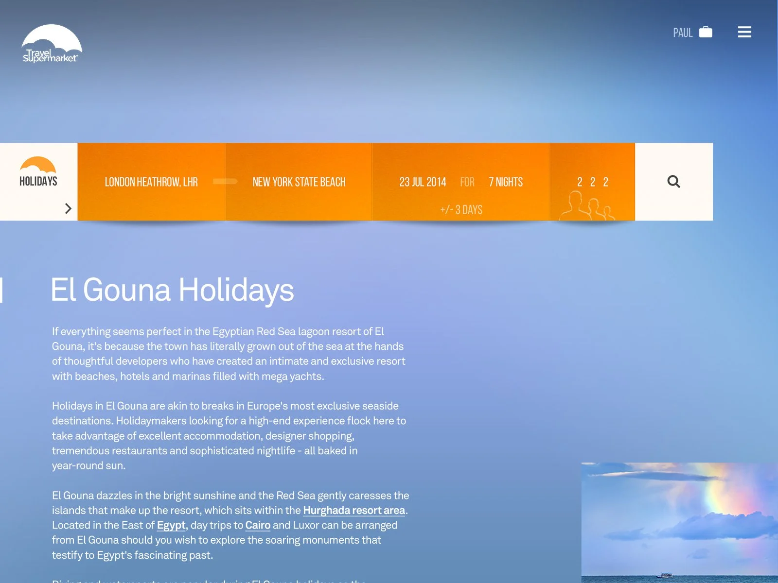
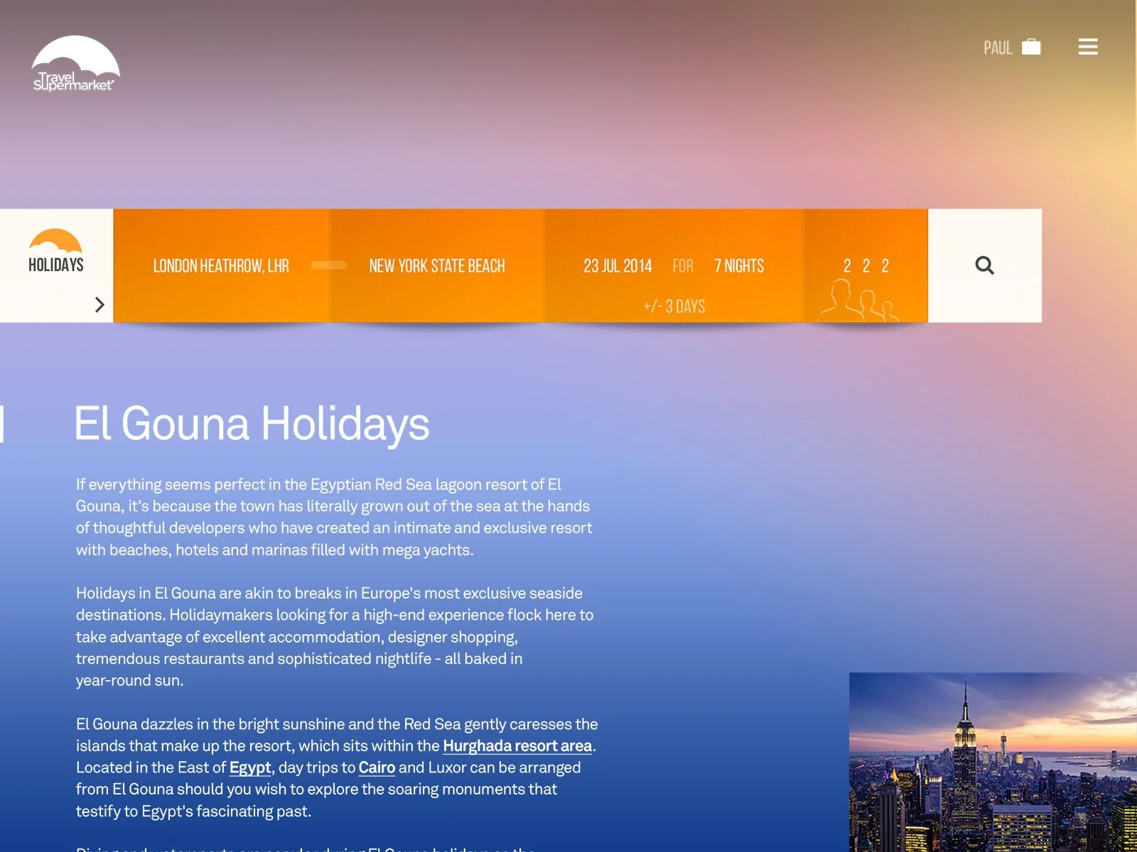
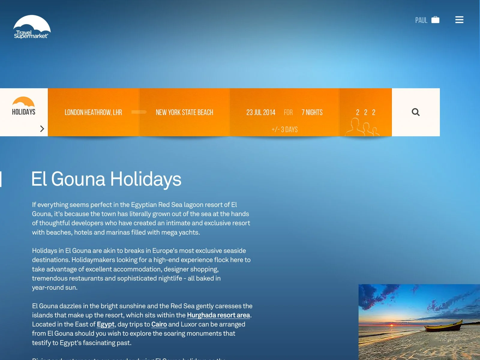
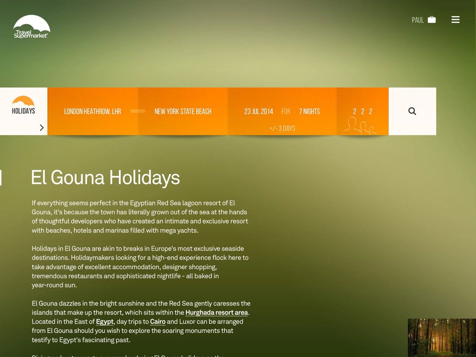
Search is the starting point of every trip, where clarity and speed matter most. We rebuilt it as a single, focused entry that worked consistently across holidays, flights, hotels and car hire. Every field and label was tested to remove friction and guide users with confidence. By treating search as a core product, we turned the first interaction into a moment of trust.


Animated Testing
Search UX/UI Design Approach
I created two search concepts with the same functionality and responsiveness but different personalities. One took a clean, familiar route, the other a more visual and expressive approach. Testing showed users preferred clarity but responded to the warmth of the visual style, so the final design blended both to balance usability and character.


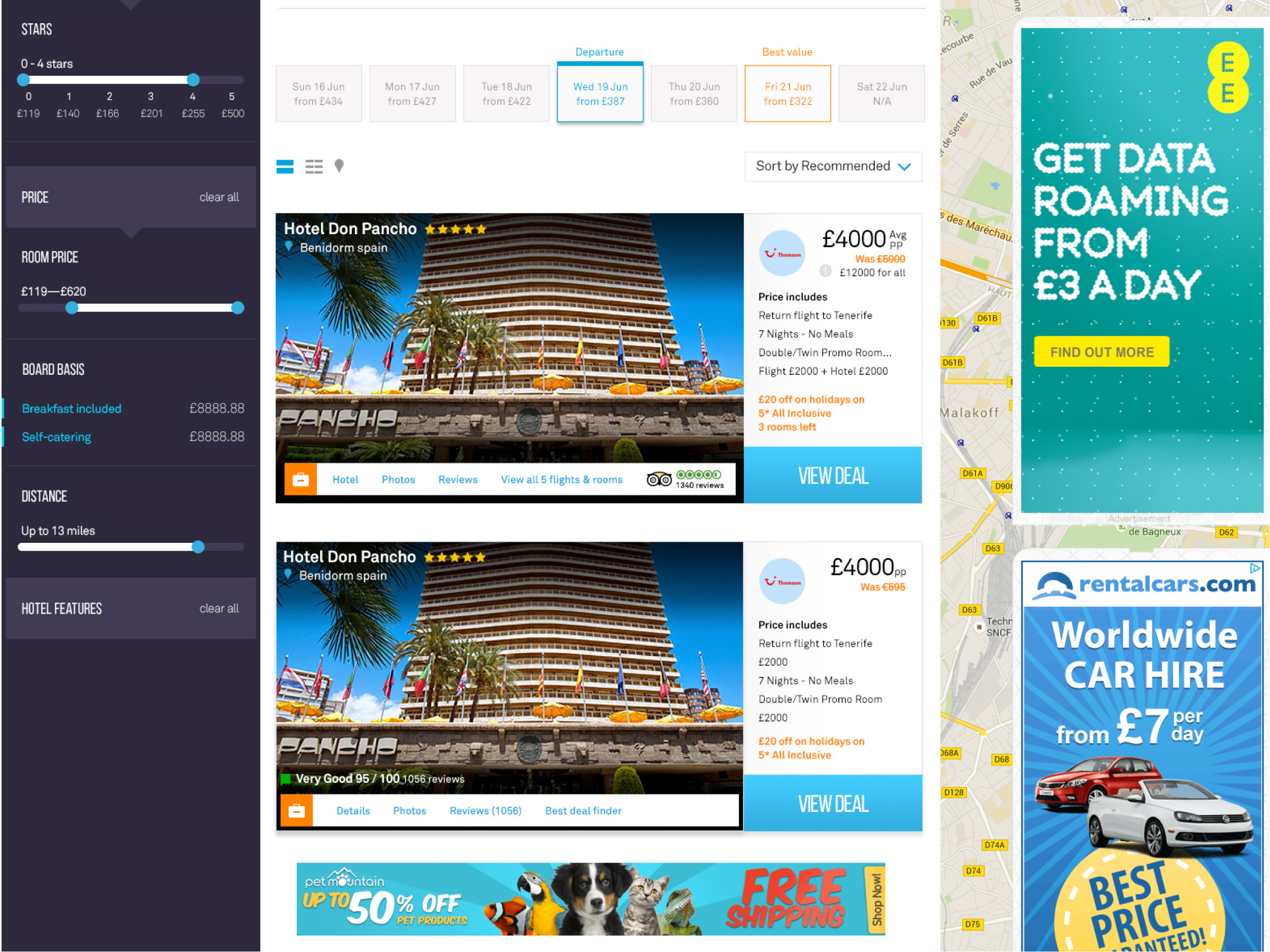
Design - Search Results Cards
UI Design Approach
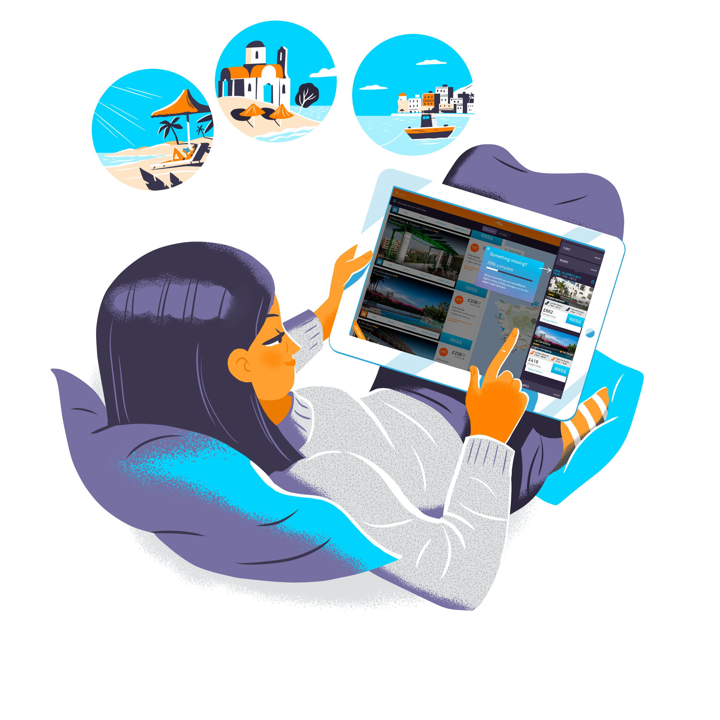
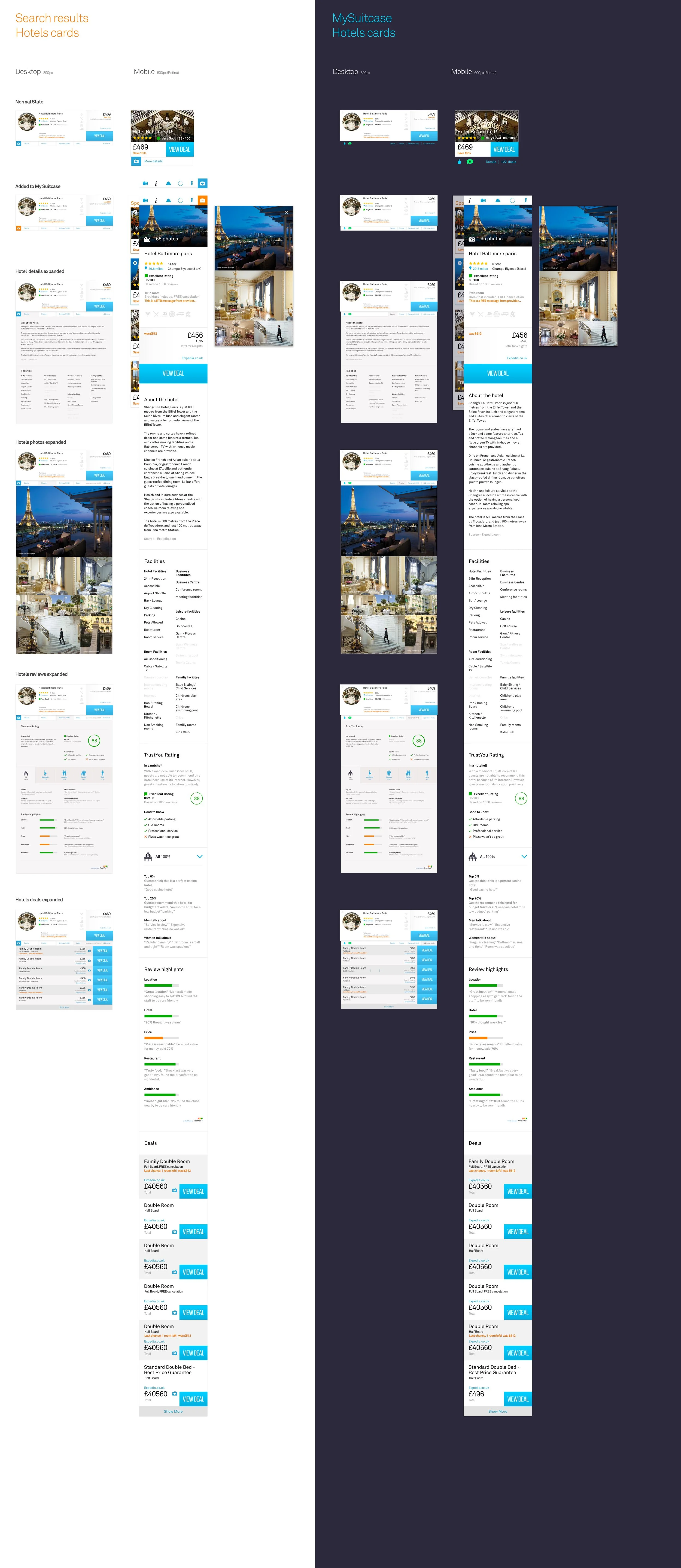
Search results are where the real decision happens, so the cards had to work hard. Each one turned complex data into something instantly clear and comparable across hotels, flights, holidays and car hire. The design balanced hierarchy, readability and brand tone, helping users scan, trust and choose fast. Every card also needed to align perfectly when shown together in My Suitcase, demanding a single, consistent system across all products.


Design - SEO Content
Two Layout System
SEO was a core growth driver but the old content felt flat and lifeless, long blocks of text with little rhythm or appeal. The redesign gave every page an editorial feel, using stronger imagery, structure and tone to make content more engaging and valuable. It lifted engagement and doubled traffic while protecting search performance. The new design gave real value to users, turning information into inspiration.
Two Layout System
We replaced over 20 page layouts with a single modular system. Components were built to flex around content, ensuring consistency, scalability and accessibility. The new structure simplified design, development and future iteration across every channel.
UX Wireframes


UI Designs


6000+ Hero Images
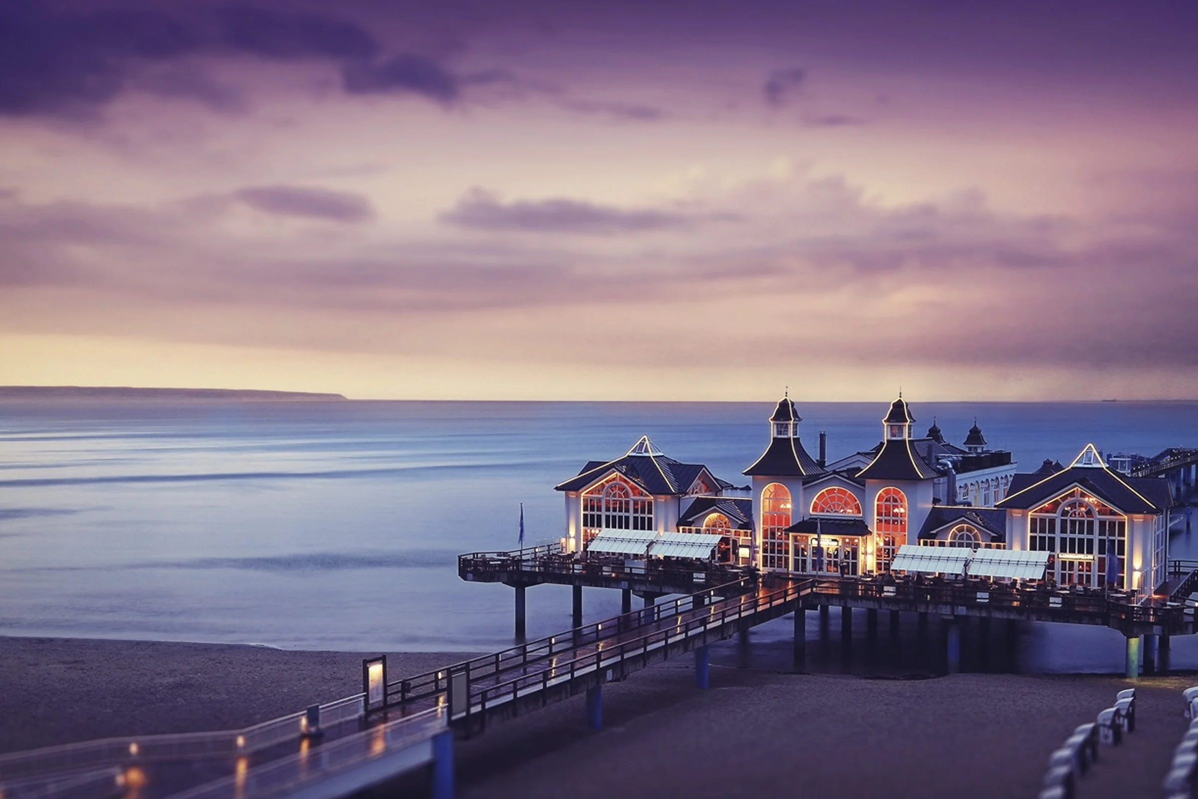
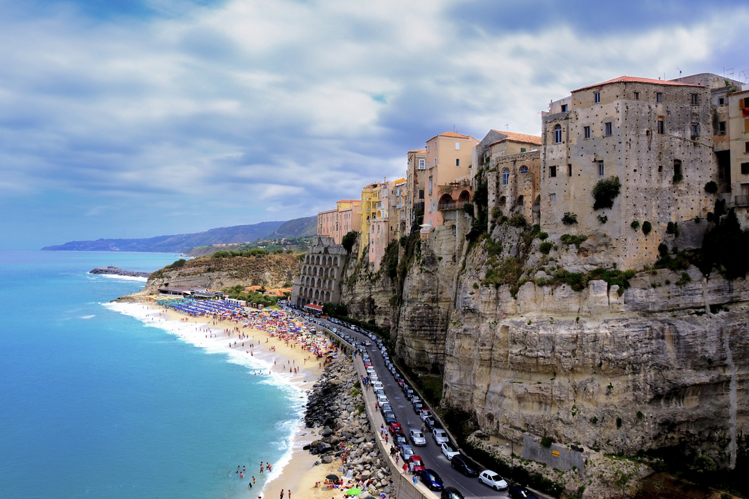
The old site used low-quality imagery that flattened the experience. We rebuilt the visual layer from the ground up, sourcing over 6,000 new hero images to give every page energy and context. Each image was selected, cropped and approved through a scoring system to ensure consistency and quality across templates. The new library transformed perception, creating a unified, modern brand that lifted engagement and doubled traffic without increasing production cost.


Full Page Fallback Grads
When images failed to load or connections were slow, the experience still had to feel complete. We designed a gradient fallback system that reflected the sky tones of the brand, keeping pages warm and polished even without imagery. It meant the site always looked intentional, protecting trust and visual quality in every scenario.
Blog
The blog extended TSM’s SEO strategy by turning search traffic into genuine engagement. It offered destination stories, travel tips and insights that built authority and trust beyond comparison tools. Each article was designed to keep users exploring the site, deepening brand connection while strengthening organic visibility.


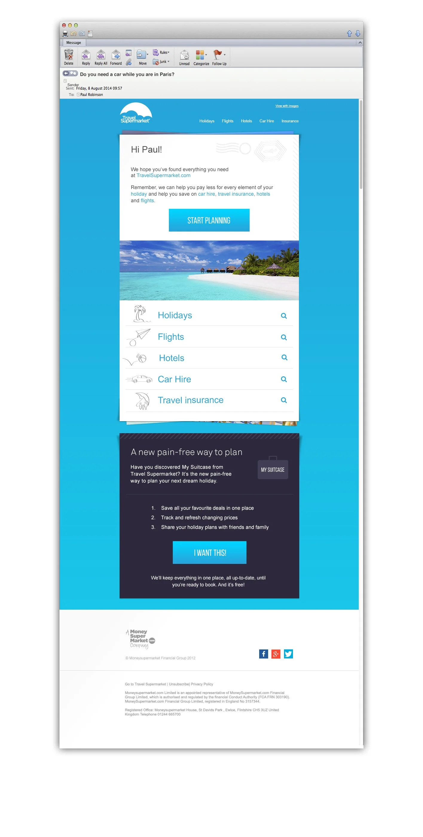
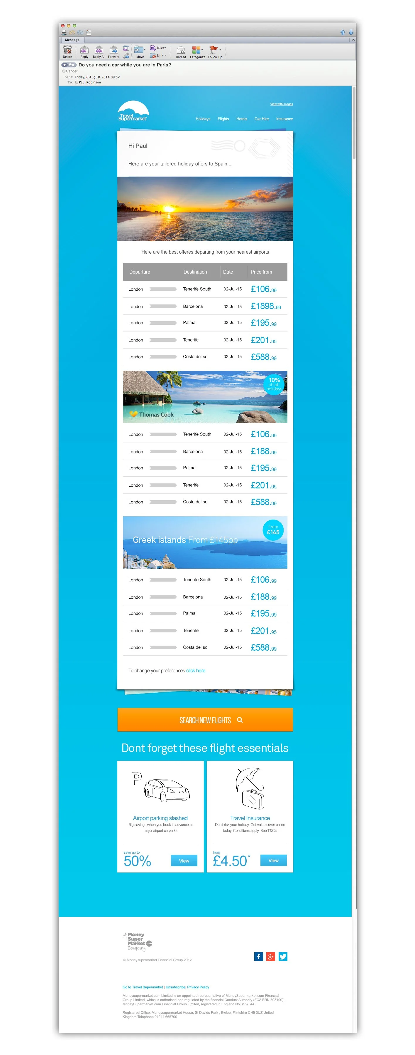
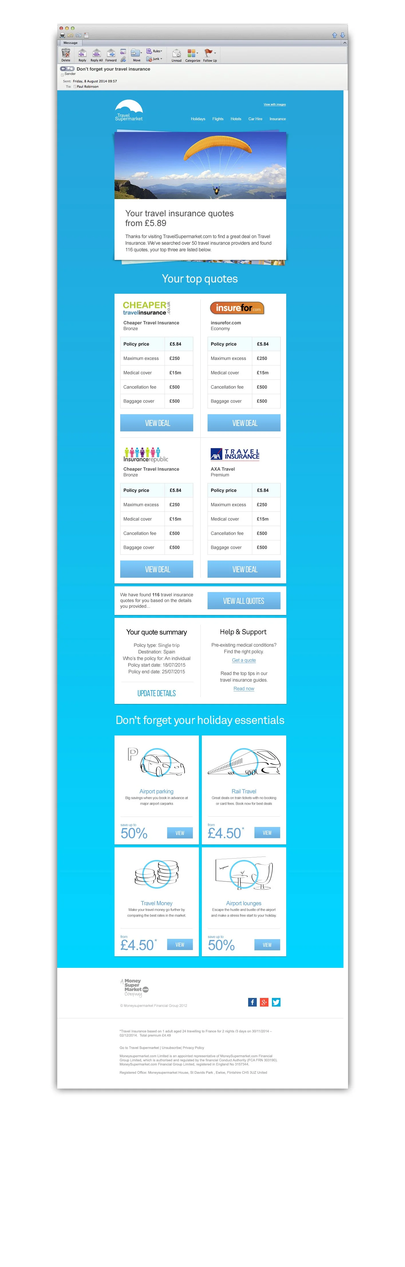
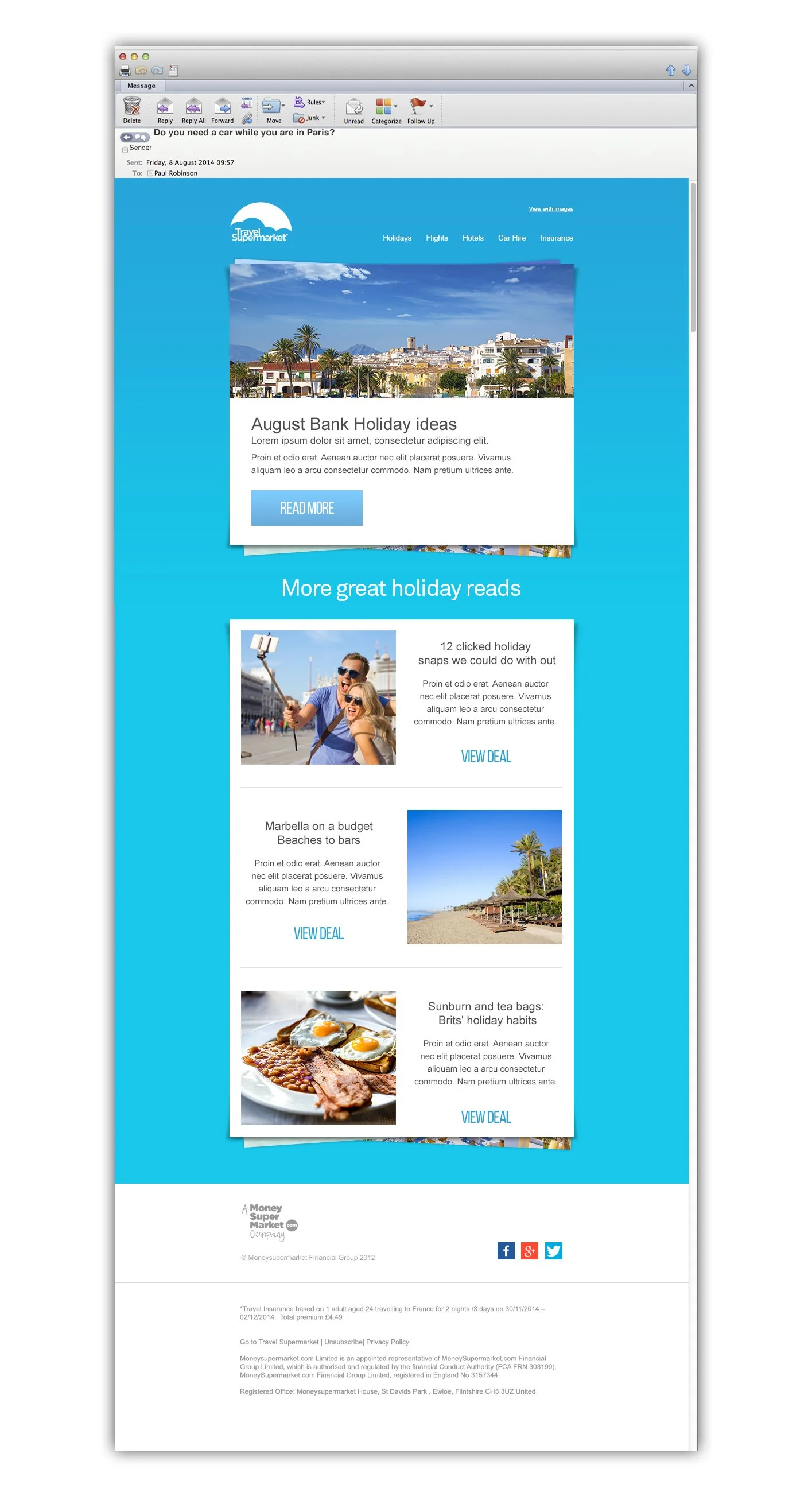
Emails
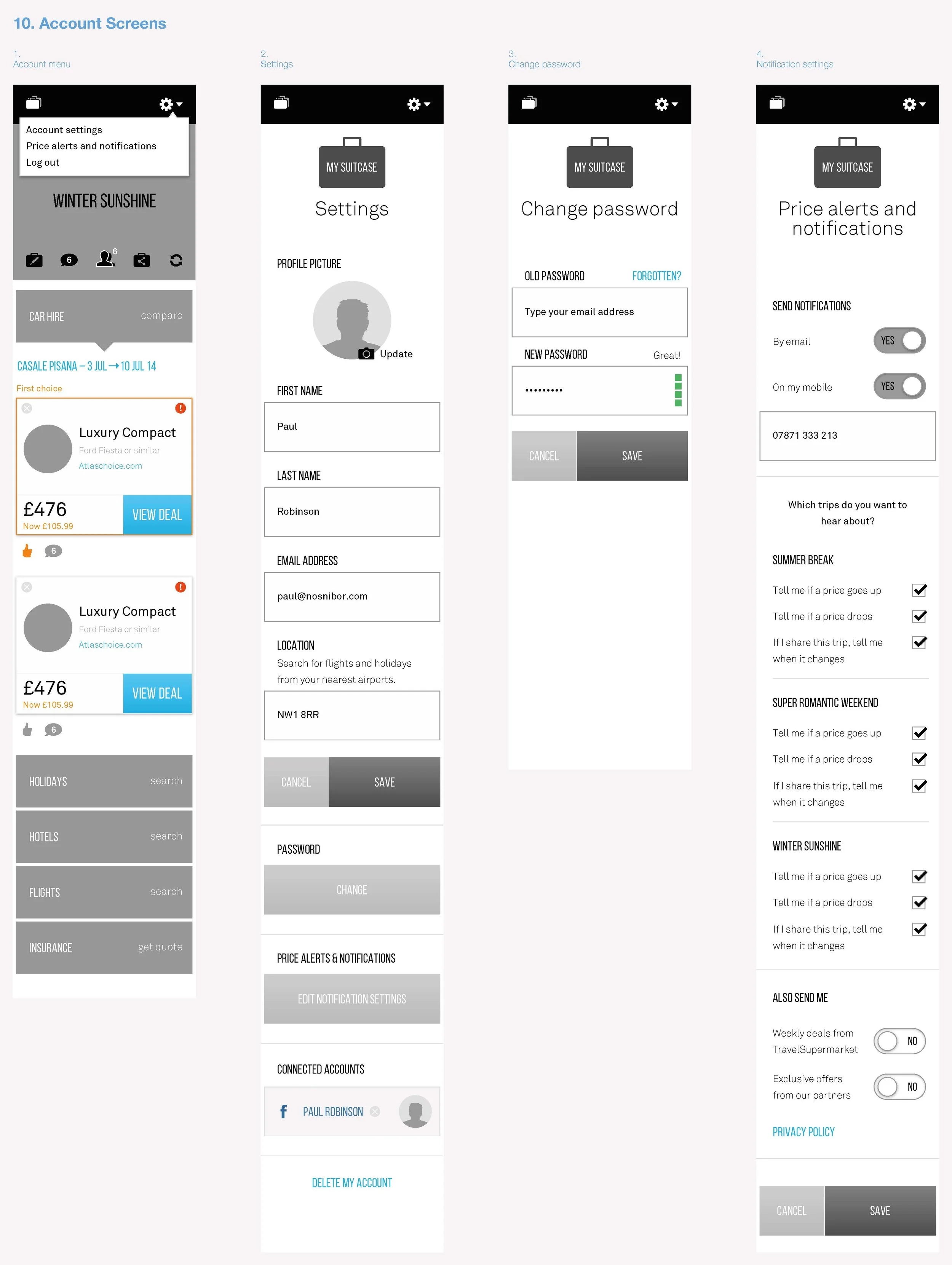
Emails & CRM
Emails were as important as the website. Every touchpoint was designed to feel connected so the journey stayed seamless. Templates were rebuilt for mobile and accessibility, and the CRM system restructured to make campaigns faster, more personal and more consistent with the brand.


Paid Advertising
Ads
Advertising remained a major revenue stream. My design strategy was to manage this complexity by aggressively minimising user disruption while maximising partner visibility through high-value placements, such as the integrated Home Takeover format. This ensured commercial needs were met without sacrificing user experience integrity.


My Suitcase - Customer Retention
My Suitcase
My Suitcase let users save and share shortlisted trips, combining flights, hotels and car hire in one place. It turned casual browsing into planning, encouraging return visits and collaboration. The feature deepened engagement (LTV) and helped TSM become part of the user’s travel planning, not just a one-off search.

User Journey Wireframes
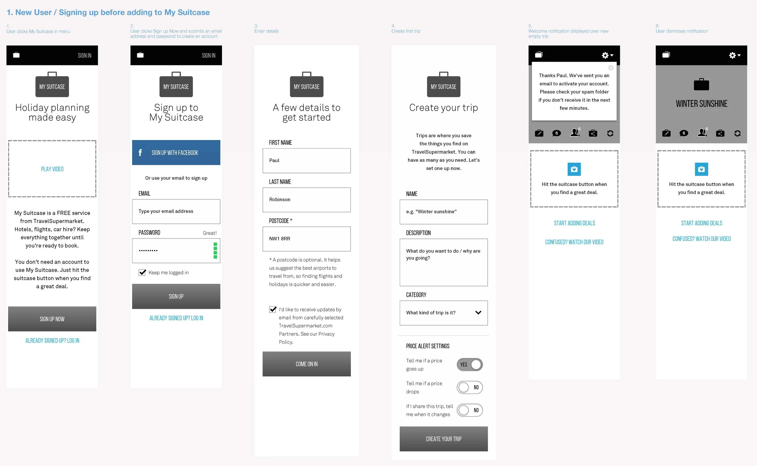
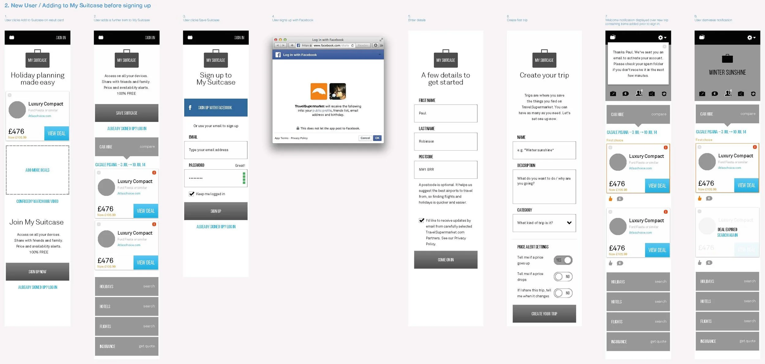
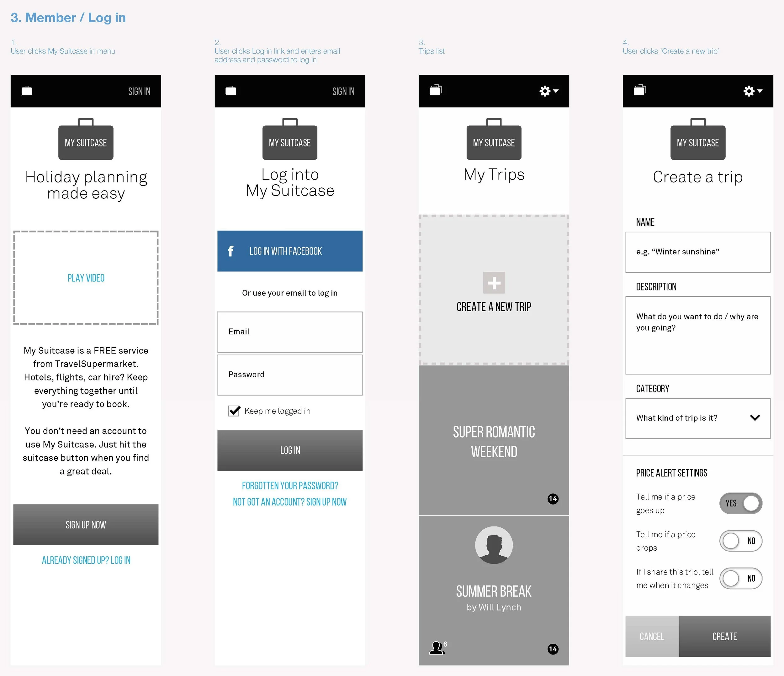
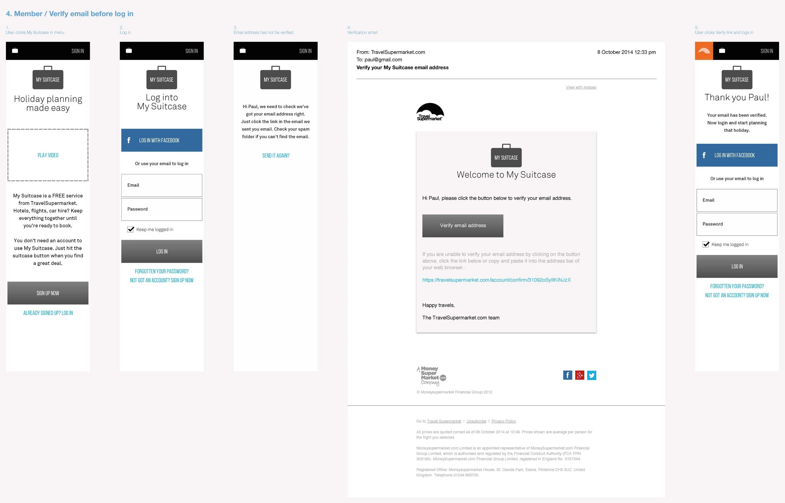
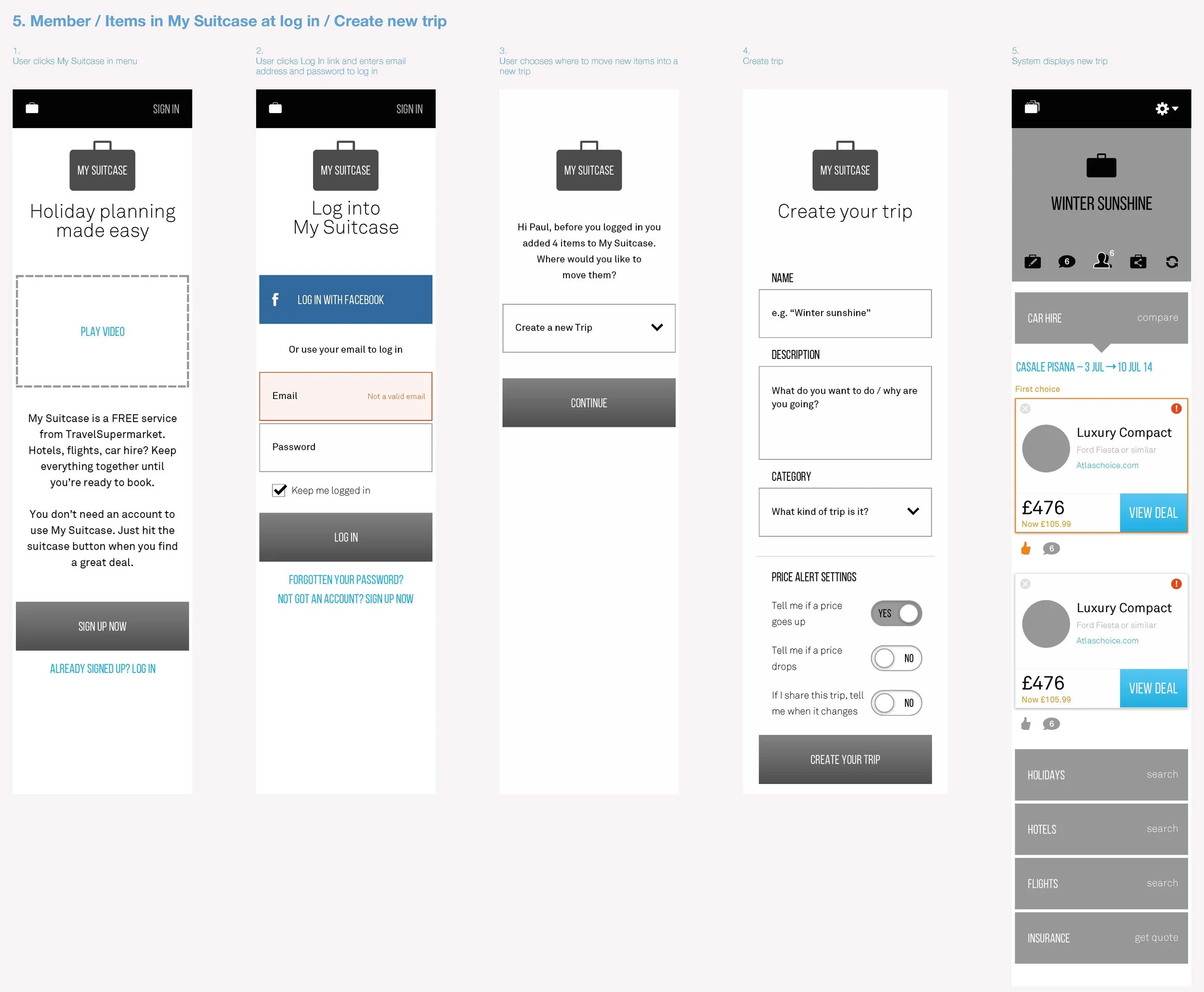
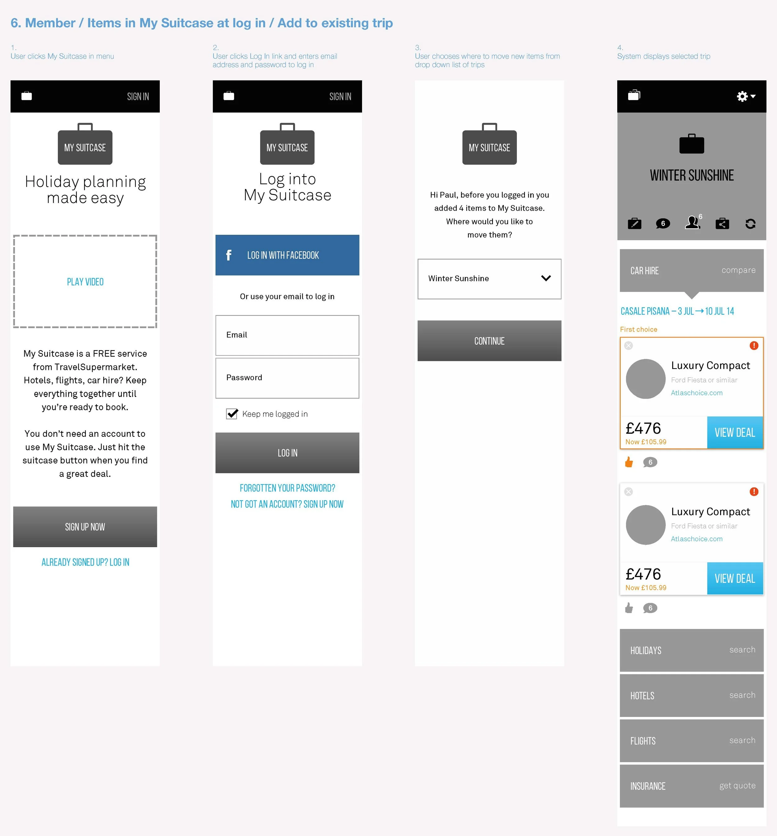
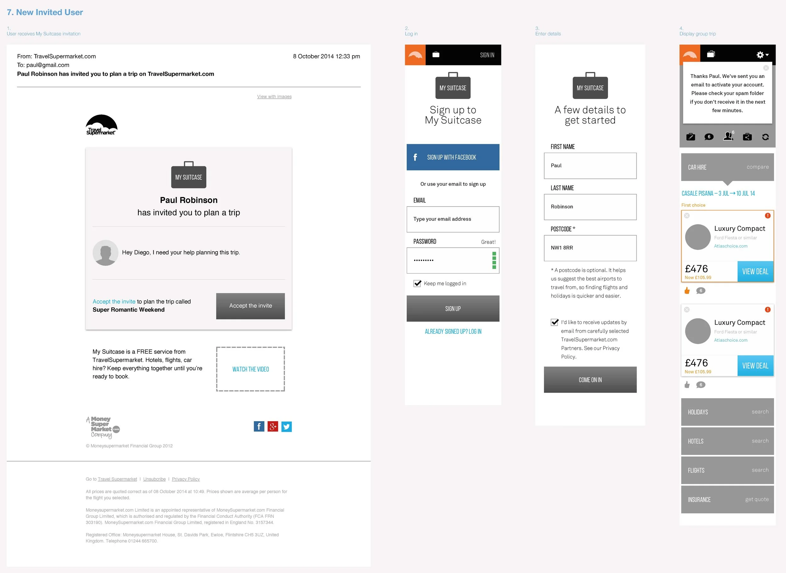


UI Designs


App
The App
For the app, I redesigned booking and comparison flows around speed, clarity and touch. A custom navigation pattern outperformed the native approach in testing, and simplified filters and selectors made choosing faster and easier. Accessibility was engineered in from the start. Building the in-house design capability ensured the app could keep evolving with the platform.


User Testing
User Testing
User testing wasn’t an afterthought, it was woven into every sprint. We built HTML prototypes to test designs early, combining guerrilla tactics with lab-based research to get unfiltered feedback before handover.
One-to-one, hour-long lab sessions
Counterbalanced task order (half on new site, half on old)
Sessions included interviews, core tasks, and follow-ups
Users voiced thoughts aloud while searching, filtering, and saving holidays
Direct user insight informed every key decision


“Paul brings a wealth of experience and is an enormously talented Creative & Product Director. His attention to detail and ability to absorb our brand proposition into what he created was exceptional, and he worked seamlessly with creative, tech and web development teams to deliver transformation at scale.”
Wil Lynch, Chief Product Officer, TravelSupermarket